the next 98
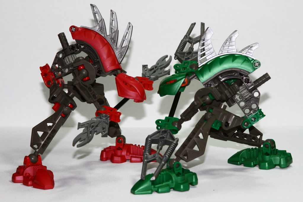
Tried to go with a big mix of all the advise from my first attempt. I think I have an inner darkness that always wants to show because I'm not feeling the white backdrop as much as a black one but I'm thinking that is just me.
With the white back, I aimed for more lighting. This one used two 27w CFL lights above, One 13w CFL backlight and a +1 pop-up flash.
Depth of field and asthetics still confuses me I guess. In this case, I aimed to get the figures in focus as much as possible while blurring out the detail of the canvas board in the background. I think this worked out well. Sometimes I am not really sure if I should be letting a subject drop out of focus or aim to keep the whole subject within the DoF. As I look at it, the left green foot is bothering me more than the detail of the canvas would.

0
Comments
www.katetaylor.smugmug.com
"You cannot depend on your eyes when your imagination is out of focus." Mark Twain
A photograph is an artistic expression of life, captured one moment at a time . . .
http://bartlettphotoart.smugmug.com/
To me though, a more connection between the 2 contrasting colors would be better...
TravelwaysPhotos.com ...... Facebook
VegasGreatAttractions.com
Travelways.com