Cape Disappointment

NorthernFocusNorthernFocus Registered Users Posts: 1,347 Major grins
edited March 15, 2012 in Landscapes
Three different views of the same location. Which one works best? Better lighting would have been nice but this is what I had to work with. The dark sky would have really worked well with a few rays of sun on the lighthouse. But....:dunno

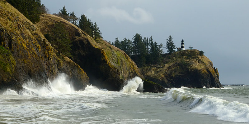
142070285.jpg

142066186.jpg

142061575.jpg
Dan

My Photo Gallery:Northern Focus Photography
I wish I was half the man that my dog thinks I am...

Comments

  • squirl033squirl033 Registered Users Posts: 1,230 Major grins
    edited March 14, 2012
    i kinda think the second one is the best overall... the first shows the lighthouse well, but the rest of the image leaves me a bit flat. the last one has a great foreground, but that foreground overpowers the rest of the photo. #2 has a nice balance of perspective, and also shows more of the rocky headland and the power of the surf...
    ~ Rocky
    "Out where the rivers like to run, I stand alone, and take back something worth remembering..."
    Three Dog Night

    www.northwestnaturalimagery.com
  • kdogkdog Administrators Posts: 11,681 moderator
    edited March 14, 2012
    I'm torn between 2 and 3. 2 has that delicious wave action. But 3 has that superb foreground. Gonna have to call a tie here. deal.gif
  • Stella7dStella7d Registered Users Posts: 201 Major grins
    edited March 14, 2012
    kdog wrote: »
    I'm torn between 2 and 3. 2 has that delicious wave action. But 3 has that superb foreground. Gonna have to call a tie here. deal.gif

    Ditto this!thumb.gif
  • PappyRootPappyRoot Registered Users Posts: 174 Major grins
    edited March 15, 2012
    My vote would be for two. I love the wave action. 3 with the wood in the FG is a huge distraction to me. I realize it just might be me. And 1 is too blah. That is Darryl's 2 cents worth.

    Thank you for sharing

    Darryl
    Sometimes, it is better to be kind than to be right. We do not need an intelligent mind that speaks, but a patient heart that listens. Unknown
    *************
    irpappyroot2.photoshop.com
    My flickr Account
  • David_S85David_S85 Administrators Posts: 13,245 moderator
    edited March 15, 2012
    I prefer the second. The triple layering on the bluffs is very interesting and makes the bluffs look dangerous. The many angry waves tells the story of why the light house is there.

    The third shot is too busy; what's the subject there? The debris on the beach or the light house? If it is the light house, then the portrayal of it is too small - makes it insignificant by comparison.

    This looks like Lake Superior??
    My Smugmug
    "You miss 100% of the shots you don't take" - Wayne Gretzky
  • NorthernFocusNorthernFocus Registered Users Posts: 1,347 Major grins
    edited March 15, 2012
    Thanks for all the comments and feedback, folks. The second shot is far and away the consensus favorite from everyone I've asked. Dave this is Cape Disappointment on the Washington side of the mouth of the Columbia River. The cape overlooks what is widely regarded as one of the roughest river entrances in the world.
    Dan

    My Photo Gallery:Northern Focus Photography
    I wish I was half the man that my dog thinks I am...
Sign In or Register to comment.