I like the floating card shot... that's a laugh.
I think I like the second one for an entry shot, but it needs to be a little lighter at least on my screen...
But well done...
just in case anyone thought I was cheating with photoshop or other by pasting/importing the card into the shot......not so. Is something like this to anyone's taste for the challenge or should I stick with the hand/card shots??????
I like the crop in the second one and the way you captured the motion but that's just my taste. Of the last ones I like the one where you are eyeing the card like mad. :cool
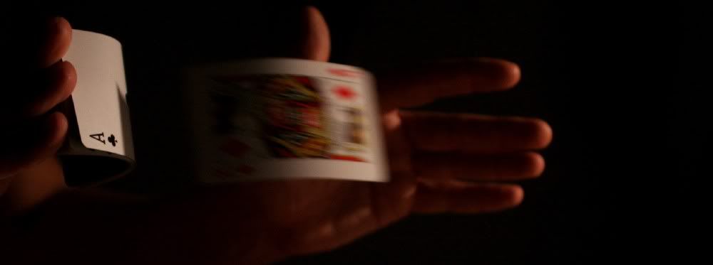
The first of the floating cards is my favorite of that series. The first shot of the first series is also a winner.
BTW, all your shots above seem too dark on my monitor.
Thanks for your comments (& others)
The first shot and the floating card shot's were taken in the dark with a lamp light trying to throw light onto the cards only, keeping myself in the dark.
How dark do they seem, are the cards too dark as well?
For instance the first shot should show the light captured on the ace card, the fast King and just some light captured on the hands only.
The second shot is too dark and didn't turn out too well.
Both floating ace shots seem ok on my monitor, whilst the first one the light is warmer, the 2nd I de-saturated to get rid of the reddish glow but on both you can see very little detail of myself and hardly none of the background.
It may be just my poor taste in this department but I thought the limited lighting offers more 'mystery' to the shots and keeps the focus on the 'magic' theme. Or are these too dark overall?
Thanks for raising the point (& JW) I need further opinion so I can correct if I am making a mistake.
edit: I've had a go at lighting these two, any better or still too dark? I can always re-shoot. Also I think I prefer the longer crop on the 1st one or as below?


Comments
Problem is I took so many shots that I can't decide on what I like and what I don't. What do you make of this 'mad' shot??? Gotta be worth a laugh?
I don't normally look this crazy
I think I like the second one for an entry shot, but it needs to be a little lighter at least on my screen...
But well done...
http://brit.smugmug.com
I like the crop in the second one and the way you captured the motion but that's just my taste. Of the last ones I like the one where you are eyeing the card like mad. :cool
Erich
BTW, all your shots above seem too dark on my monitor.
"You miss 100% of the shots you don't take" - Wayne Gretzky
Thanks for your comments (& others)
How dark do they seem, are the cards too dark as well?
For instance the first shot should show the light captured on the ace card, the fast King and just some light captured on the hands only.
The second shot is too dark and didn't turn out too well.
Both floating ace shots seem ok on my monitor, whilst the first one the light is warmer, the 2nd I de-saturated to get rid of the reddish glow but on both you can see very little detail of myself and hardly none of the background.
It may be just my poor taste in this department but I thought the limited lighting offers more 'mystery' to the shots and keeps the focus on the 'magic' theme. Or are these too dark overall?
Thanks for raising the point (& JW) I need further opinion so I can correct if I am making a mistake.
edit: I've had a go at lighting these two, any better or still too dark? I can always re-shoot. Also I think I prefer the longer crop on the 1st one or as below?