Constructive Criticism
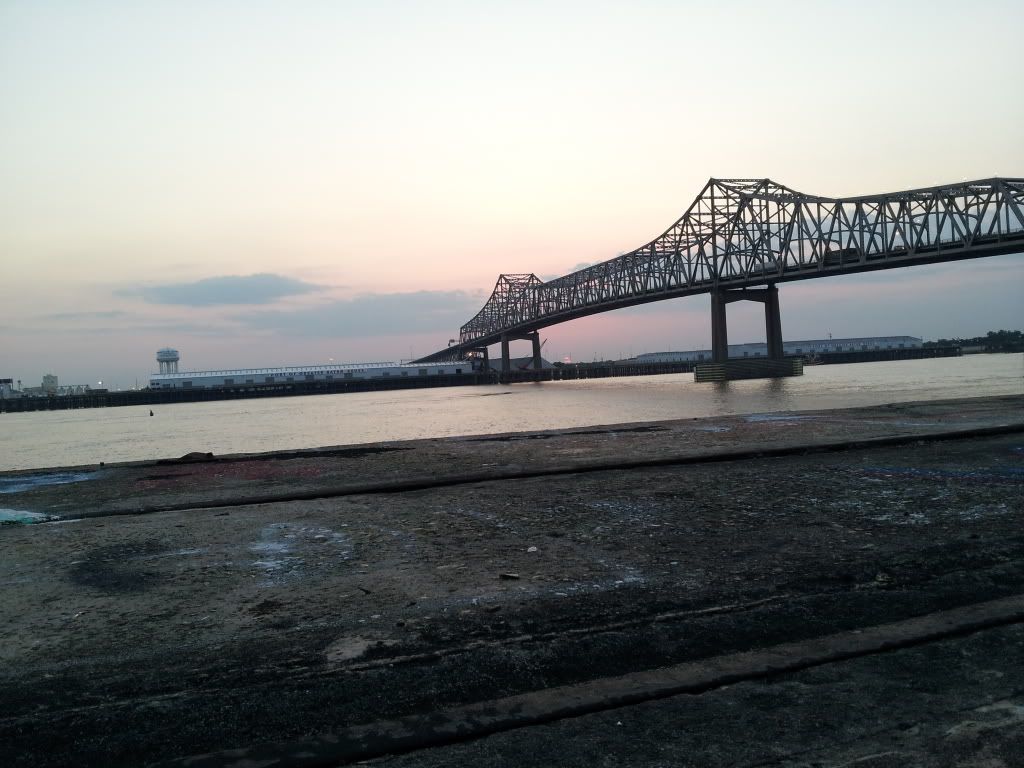
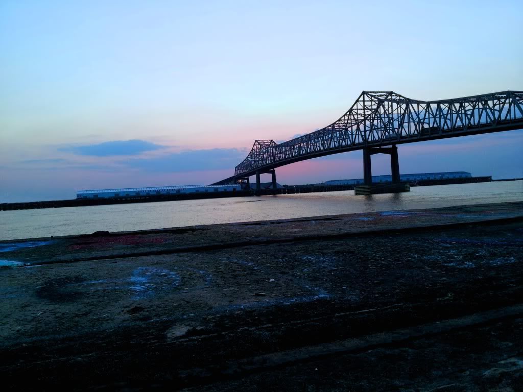
Okay, so I recently took interest in photography and I don't know too much about techniques. I spent a few hours one day going around my city taking shots. This is one of my favorite shots. I'll still like it whether you guys care about or not. I did a little editing with removing some of the background and playing with the levels, curves, and the basic stuff (saturation, contrast, etc...) I would just like to know if any of you see something in this shot. Is it a terrible shot, nothing special, decent, okay, good, or impressive?
Thanks for all the feedback.


Thanks for all the feedback.


0
Comments
My first impression of this photo is that the horizon is severely tilted, and the tilt does not
work. Sometimes, a tilted horizon works, but not here. My second impression is that the
dark area in the foreground adds nothing to the image, but dominates it.
It's nice that you like it, but I don't see much of anything here.
http://tonycooper.smugmug.com/
The biggest thing I would do right off is level the horizon. Maybe crop out some of the foreground so it looks more like a panorama, but the fact that you did have a foreground is great! I may consider increasing the saturation or vibrance a bit more, and possibly, but maybe not (haha) darken the whole thing a tad.
www.zblackwood.com
Jonny
You asked if the shot works or not, but your question seems to be suggest a need to have an ability with techniques. To me, technique is just a method of doing something using a special skill that you have developed. In photography that normally suggests an ability to use the camera, and/or editing shots in Photoshop.
Another, and perhaps more important aspect is to have a creative 'eye' and to know 'what works'. That's a far more intuitive and personal thing than technique, which is just the mechanical 'do this, do that'. I find it helpful to look a lot at other people's photographs and consider why they work, or not. That inevitably means you end up copying others... but we all copy from somewhere.
To add a further shot to your original post just edit it and you should have the insert image icon on the edit bar. If not, try selecting 'go advanced' if it's there.
So: WHY did you tilt your image? WHY did you choose the composition you chose? What attracted you to this scene?
Once you got into editing mode: WHY did you shift the colors? Why did you darken the foreground? Why did you make the changes you made to the image?
What specific vision did you have for this shot when you started working on it?
Too often our answers are along the lines of: i was playing around in Photoshop and accidently made it look like this, and decided I liked it. Nothing wrong with playing around, but it's not an effective way of editing your work. (And I'm not saying that's what you did!) For one thing, it takes too damn long. For another, you end up "polishing turds" that should have been deleted and your effort better spend working on your best images.
So what I would ask you is what was your goal in capturing this image, and why did you choose the editing choices you made?
14-24 24-70 70-200mm (vr2)
85 and 50 1.4
45 PC and sb910 x2
http://www.danielkimphotography.com
a) Your horizon doesn't work. It would be more visually appealing to have the horizon in the top or bottom third of the frame. A crop should help this. And straight horizons are usually best, and I think would improve this shot.
b) Diagonal lines rock. You could have captured a more stellar shot where the bridge shoots on a more extreme upward angle.
c) Your colours are kinda blah. You need brighter brights, you have too many mid-tones.
I hope you don't mind, but I played around with your photo some more and came up with this variation:
J