Edit help

ChaKiraChaKira Registered Users Posts: 163 Major grins
edited August 22, 2012 in Finishing School
Not sure this goes here but hey!

Is there any way to edit the middle person (me!) out so it looks like it was just the two of them??
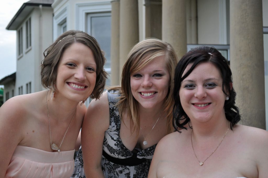
DSC_0030-1.jpg
Until one has loved an animal, a part of one's soul remains unawakened - Anatole France

Megan Amelia Photography

Comments

  • PeanoPeano Registered Users Posts: 268 Major grins
    edited August 2, 2012
    Not convincingly, no.
  • SamSam Registered Users Posts: 7,419 Major grins
    edited August 2, 2012
    It can be done. here is a FAST / CRUDE example.

    Sam
  • ChaKiraChaKira Registered Users Posts: 163 Major grins
    edited August 2, 2012
    I didn't think so - Thanks anyway! :D
    Until one has loved an animal, a part of one's soul remains unawakened - Anatole France

    Megan Amelia Photography
  • kdogkdog Administrators Posts: 11,681 moderator
    edited August 2, 2012
    Piece of cake. :D

    i-t9nw5mW.jpg
  • PeanoPeano Registered Users Posts: 268 Major grins
    edited August 2, 2012
    Oh yeah ... now that's convincing! clap.gif :ivar wings.gif :jawdrop :photo 9496500-Ti.gifcheerleader.gif :bigbs blbl.gifdrums.gif :flush
    kdog wrote: »
    Piece of cake. :D

    i-t9nw5mW.jpg
  • RichardRichard Administrators, Vanilla Admin Posts: 19,962 moderator
    edited August 3, 2012
    It won't be easy, but I think it's possible--and you don't need clone stamp palms lol3.gif. The trick is to isolate the two women you want to keep on separate layers and position them as Sam did, moving the left woman into the position that you are occupying. The woman on the right should be on top, followed by the woman on the left. The position of her left shoulder will be a little tricky, I think. You should crop it so that only the columns of the building on the right show, not the lighter building on the left. Now create a new background layer with no people by using the clone stamp or content aware fill to extend the columns all the way down, or at least just a little past the position of the figures. Put this layer on the bottom and season to taste.
  • kwcrowkwcrow Registered Users Posts: 132 Major grins
    edited August 10, 2012
    How about this?
    CropOutMiddleGirl.jpg
    As Richard recommended.
    Made several copies of original layer.
    Isolated the girls from the background on one layer (Quick selection tool) and expanded the selection by 10 pixels (give content aware fill some room to work.) Did content aware fill on selection and used that as the background. Used stamp tool to fix it up where content aware didn't do very well.
    selected each girl in the end photo and pasted them to their own layer on top of the background with no girls and then positioned them together.
  • PeanoPeano Registered Users Posts: 268 Major grins
    edited August 10, 2012
    kwcrow wrote: »
    How about this?

    As I posted earlier, I don't think it can be done convincingly. Multiple obvious telltale
    signs of alterations here.

    unconvincing.jpg
  • JBHotShotsJBHotShots Registered Users Posts: 391 Major grins
    edited August 20, 2012
    Peano wrote: »
    As I posted earlier, I don't think it can be done convincingly. Multiple obvious telltale
    signs of alterations here.

    unconvincing.jpg

    I bet it could be done; with the correct brush resizing and shaping. Would it be worth all of the work is the better question.
    Jamie
    JBHotShots.com
    Facebook
    7DII w/Grip, 50D w/Grip, 24-70/2.8L, 70-200/2.8L, 85/1.8, 50/1.8, Rokinon 8mm FE 3.2, 580EXII 430EX
  • IcebearIcebear Registered Users Posts: 4,015 Major grins
    edited August 22, 2012
    kdog wrote: »
    Piece of cake. :D

    i-t9nw5mW.jpg

    Surely you jest. That bush is WAAYYY oversharpened.
    John :
    Natural selection is responsible for every living thing that exists.
    D3s, D500, D5300, and way more glass than the wife knows about.
Sign In or Register to comment.