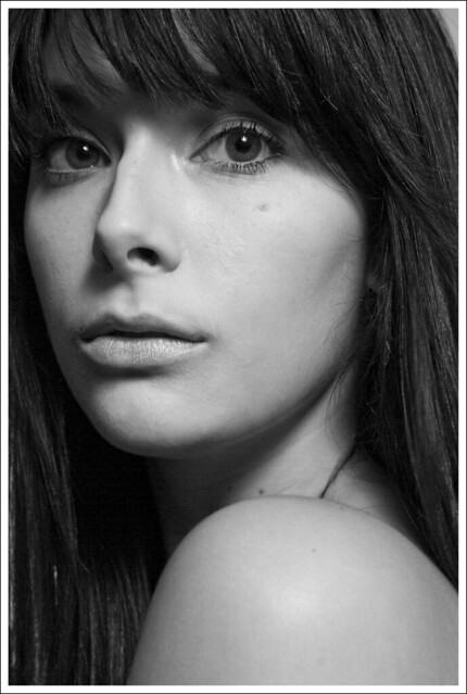
A couple more for C&C
Took these last night and Im not overly happy with how the first one turned out. I couldnt figure out how to get rid of the blue hue in the white of her eye and to me the skin tone seems off. What are your thoughts?

Untitled by SoulfulRecover, on Flickr
This one I couldt get the thick strand of hair that is tight up against her neck out and still look natural. Other than that I am quite pleased with it. Any C&C?

Untitled by SoulfulRecover, on Flickr
Thank you for taking the time to look at these

Untitled by SoulfulRecover, on Flickr
This one I couldt get the thick strand of hair that is tight up against her neck out and still look natural. Other than that I am quite pleased with it. Any C&C?

Untitled by SoulfulRecover, on Flickr
Thank you for taking the time to look at these
My Photography: http://www.flickr.com/photos/coltonstark/
0
Comments
The second photos is nice. I'd watch the nose shadow though. It's a bit too low for my tastes. I see you have the main light almost right over head. Try placing it so the catchlights are at 10 and 2 o'clock. That should get the nose shadow a little more lateral on the check and connect it to the check shadow. That hair should be pretty simple to fix with a combo of the clone tool and then clean up with the healing brush.
Moderator of the People and Go Figure forums
My Smug Site