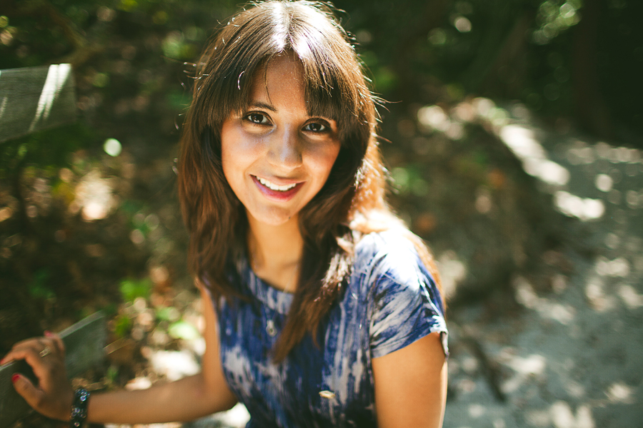
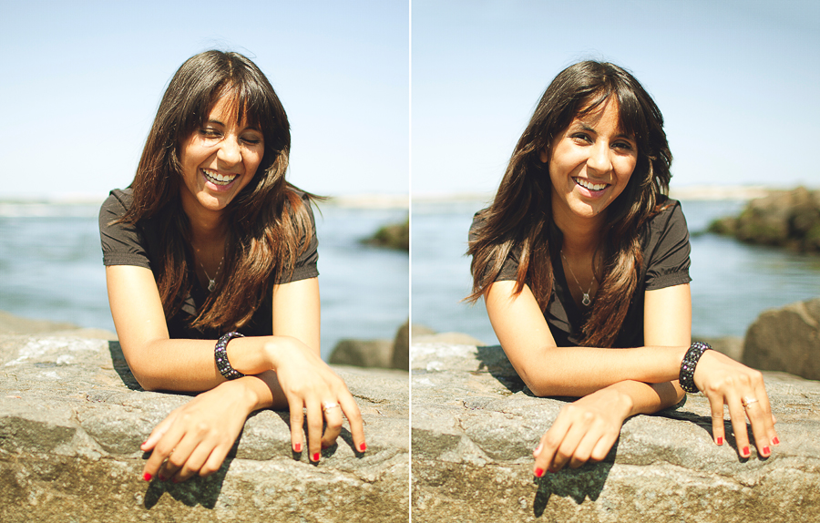
nicole's band + lifestyle portraits

michaelglennmichaelglenn Registered Users Posts: 442 Major grins
edited September 2, 2012 in People
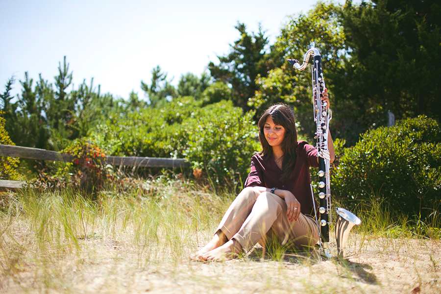
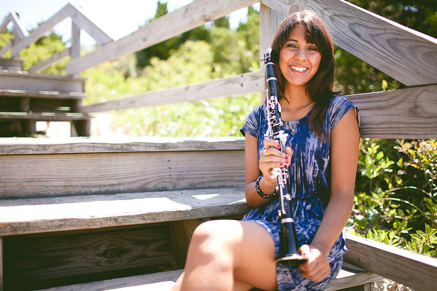
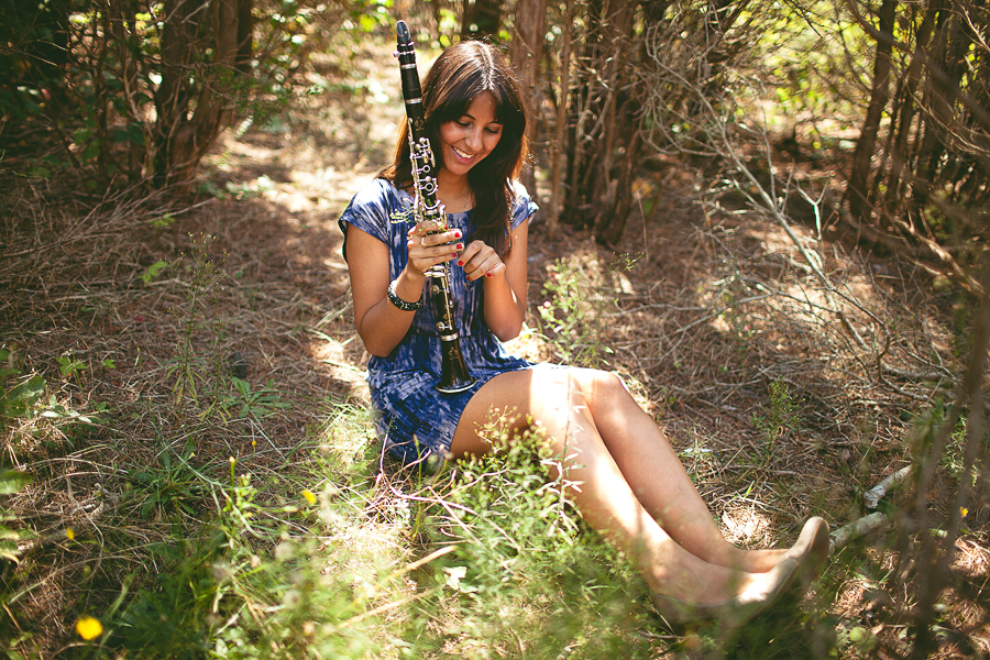
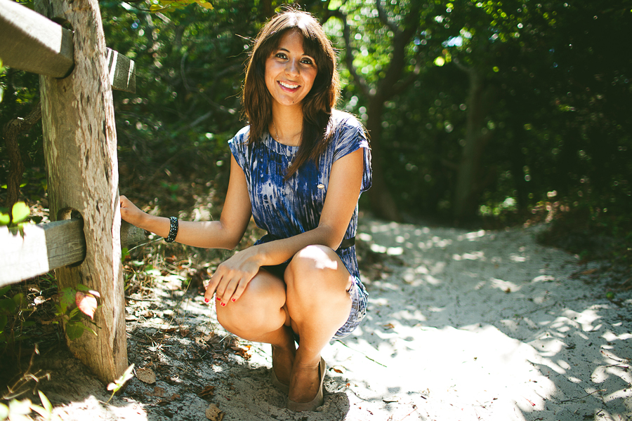
Nicole needed band recital photographs and also wanted some nice portraits. She came fully equipped and we had a blast :) Here's a nice preview, and the rest can be found on my blog

1. 8355826_orig.jpg
2. 8174531_orig.jpg

3. 9839191_orig.jpg

4. 6275563_orig.jpg

5. 8386367_orig.jpg

6. 9514933_orig.jpg

7. 4645449_orig.jpg

8. 2823834_orig.jpg
wedding portfolio michaelglennphoto.com
fashion portfolio michaelglennfashion.com

Comments

  • D3SshooterD3Sshooter Registered Users Posts: 1,187 Major grins
    edited September 1, 2012
    I would say a very good try-out. However you seem to be working in difficult light (full sun). That will cast hard shadows and it requires a camera with a large dynamic range not to lose the details in the blacks and whites. Look once under need the eyes of this beautiful lady and you will notice dark skintones under the eyes (we call them walls/bags) . That does not flatter a model.

    There are a few things you can do to avoid this;
    1. Use a fill-in Flash (on camera) , this will bring a subtile flash, just enough to lit the face but not to much.
    2. Use a large defuse screen to soften the light
    3. Blow the sunlight away with portable powerfull flash units
    4. The most easy one, make the shoot early or late in the day when the sun is low on the horizond. That creates a very nice light.
    A photographer without a style, is like a pub without beer
  • michaelglennmichaelglenn Registered Users Posts: 442 Major grins
    edited September 1, 2012
    D3Sshooter wrote: »
    I would say a very good try-out. However you seem to be working in difficult light (full sun). That will cast hard shadows and it requires a camera with a large dynamic range not to lose the details in the blacks and whites. Look once under need the eyes of this beautiful lady and you will notice dark skintones under the eyes (we call them walls/bags) . That does not flatter a model.

    There are a few things you can do to avoid this;
    1. Use a fill-in Flash (on camera) , this will bring a subtile flash, just enough to lit the face but not to much.
    2. Use a large defuse screen to soften the light
    3. Blow the sunlight away with portable powerfull flash units
    4. The most easy one, make the shoot early or late in the day when the sun is low on the horizond. That creates a very nice light.

    Thanks for the tips! This was shot around noon when the sun was at its high point. I'll keep those lighting ideas in mind for my next portrait shoot. I appreciate the feedback :)
    wedding portfolio michaelglennphoto.com
    fashion portfolio michaelglennfashion.com
  • VayCayMomVayCayMom Registered Users Posts: 1,870 Major grins
    edited September 1, 2012
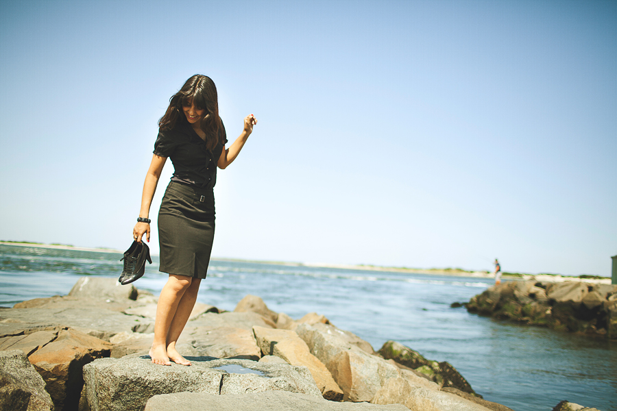
    stop #5 from going any further, the pose is extremely unflattering and too exposing of the subject. I am surprised I am the first to comment. Cool looking instrument.
    Trudy
    www.CottageInk.smugmug.com

    NIKON D700
  • michaelglennmichaelglenn Registered Users Posts: 442 Major grins
    edited September 1, 2012
    VayCayMom wrote: »
    stop #5 from going any further, the pose is extremely unflattering and too exposing of the subject. I am surprised I am the first to comment. Cool looking instrument.

    Oh my! That was actually one of my favorites from this set. I could see how it could get too exposing if she was bent a little further. The only thing I do notice is that her knees look a little larger making the pose a little less feminine. Thanks for your input though :)
    wedding portfolio michaelglennphoto.com
    fashion portfolio michaelglennfashion.com
  • divamumdivamum Registered Users Posts: 9,021 Major grins
    edited September 1, 2012
    Nice lifestyle style (is that tautologous?!) and very attractive gal. I don't get "band recital", however - more sort of senior portrait-ish than professional musician feel. That all depends on what she wanted, of course - if this is the mood she requested, then you're good to go!

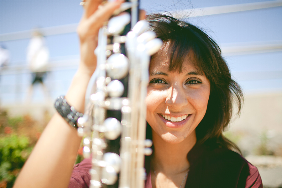
    Be careful with wider focal lengths - you're getting some distortion. Again, with the pj/lifestyle vibe I'm not sure that's as much a "rule" as in other genres, but in some shots - 6 for instance - the distortion's a little prominent. Just something to consider.

    Even though the light is harsh, it kind of works for me with the lifestyle vibe you're going for. I like the set overall and the comments are mostly "photographer nits" thumb.gif
  • trooperstroopers Registered Users Posts: 317 Major grins
    edited September 1, 2012
    The pics with instruments feel out of place/context. The location/background doesn't work for me.
  • michaelglennmichaelglenn Registered Users Posts: 442 Major grins
    edited September 1, 2012
    divamum wrote: »
    Nice lifestyle style (is that tautologous?!) and very attractive gal. I don't get "band recital", however - more sort of senior portrait-ish than professional musician feel. That all depends on what she wanted, of course - if this is the mood she requested, then you're good to go!

    Be careful with wider focal lengths - you're getting some distortion. Again, with the pj/lifestyle vibe I'm not sure that's as much a "rule" as in other genres, but in some shots - 6 for instance - the distortion's a little prominent. Just something to consider.

    Even though the light is harsh, it kind of works for me with the lifestyle vibe you're going for. I like the set overall and the comments are mostly "photographer nits" thumb.gif

    The client wanted photographs on the beach, and also wanted to photographs without her instruments as well. I probably should have thought out a better location for the instruments, although part of me still feels it looks unique to have it done on the beach instead of something generic like in an auditorium setting or against a blank wall posing with the instrument.

    And thanks for the heads up, it's my biggest struggle this year especially with some wedding portraits. However, the shot for #6 I kept extra wide and autofocused on her left eye on purpose. I've seen some photographers do this and I really enjoy the look. There are a couple other shots from my blog where I see there is some "softness" due to shooting wide. I'm trying to avoid that with more practice (hopefully it will become routine by next year)

    Also, I tend to break a lot of photography rules. So everyone here will either love or hate my work! No in between! rolleyes1.gif

    But seriously though, I appreciate all the critique (good or bad). It's my 2nd year shooting photography, and this is my first year branching out professionally.
    wedding portfolio michaelglennphoto.com
    fashion portfolio michaelglennfashion.com
  • divamumdivamum Registered Users Posts: 9,021 Major grins
    edited September 1, 2012
    I probably should have thought out a better location for the instruments, although part of me still feels it looks unique to have it done on the beach instead of something generic like in an auditorium setting or against a blank wall posing with the instrument.

    I don't think it needs generic, but I do think final use needs to be considered and, like it or not, there are expectations. If you look at musician websites, you'll typically find that they use artistic/lifestyle/fun photos for their websites, album covers, "get to know me" informal promotional materials, but a more traditional/formal shot for programs and/or concert venues that still want that more old-fangled style for their own publicity machine. A program image is typically very small, hence why they're usually headshots - a big full-length artsy image isn't really going to say much in a 1" square b&w on a page with 15 others.....

    Just my 2c. Styles are always evolving and I think it's cool to break the rules sometimes, but still need to consider the end use of the image IMO thumb.gif
  • anonymouscubananonymouscuban Registered Users, Retired Mod Posts: 4,586 Major grins
    edited September 1, 2012
    OK... I'm going to go against the grain here. With the exception of the harsh lighting, I think you did quite well. I really enjoy the relaxed feel of these. I like the locations, the compositions you chose and the posing seems very natural and relaxed. Each one of us may have shot this completely different but I would bet money that she is going to love these. Even the lighting. We as photogs no the lighting could be a lot better but average person has no clue. I think it's your responsibility to give the client the best product possible and I think you can have done much better had you shot these later in the afternoon or used some sort of diffuser to knock down the sunlight but not bad.

    Do these exact shots again in better light and these would be pretty damn good. Just my opinion of course.
    "I'm not yelling. I'm Cuban. That's how we talk."

    Moderator of the People and Go Figure forums

    My Smug Site
  • Quincy TQuincy T Registered Users Posts: 1,090 Major grins
    edited September 1, 2012
    Definitely a good start.
  • michaelglennmichaelglenn Registered Users Posts: 442 Major grins
    edited September 2, 2012
    divamum wrote: »
    Just my 2c. Styles are always evolving and I think it's cool to break the rules sometimes, but still need to consider the end use of the image IMO thumb.gif

    I completely agree. The client showed me some samples of previous posters. All of them were different. Some indoors and some outdoors. Some with instruments, some without. Because of this alone, I decided to have open range with the lifestyle shots. Trust me, if the client needed a certain style or look, I would have stuck to it thumb.gif
    OK... I'm going to go against the grain here. With the exception of the harsh lighting, I think you did quite well. I really enjoy the relaxed feel of these. I like the locations, the compositions you chose and the posing seems very natural and relaxed. Each one of us may have shot this completely different but I would bet money that she is going to love these. Even the lighting. We as photogs no the lighting could be a lot better but average person has no clue. I think it's your responsibility to give the client the best product possible and I think you can have done much better had you shot these later in the afternoon or used some sort of diffuser to knock down the sunlight but not bad.

    Do these exact shots again in better light and these would be pretty damn good. Just my opinion of course.

    Thanks! When the client saw the blog, she was thrilled. I agree I should have shot this at a different part of day. I even had control over what time of day this could have been shot. It was something that never dawned on me to even think about what time of day to shoot. I could have had complete control over the angle of the sun! This is something I won't forget with my bookings from now on.

    I'm glad I joined these forums. A lot of lessons learned.
    wedding portfolio michaelglennphoto.com
    fashion portfolio michaelglennfashion.com
  • jmphotocraftjmphotocraft Registered Users Posts: 2,987 Major grins
    edited September 2, 2012
    troopers wrote: »
    The pics with instruments feel out of place/context. The location/background doesn't work for me.

    Agreed. The setting would work with a banjo, not a... baritone sax? Nor a clarinet.
    -Jack

    An "accurate" reproduction of a scene and a good photograph are often two different things.
Sign In or Register to comment.