Manatee

Dr CalohandreDr Calohandre Banned Posts: 213 Major grins
edited November 3, 2012 in Landscapes
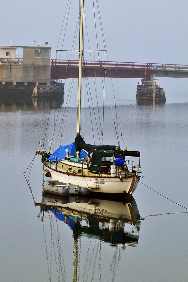
Cannot decide if the boat and its reflection are too saturated and need opening up a bit, or ...or what. Any suggestions?
8141630702_a719725896_o.jpg

Comments

  • Dr CalohandreDr Calohandre Banned Posts: 213 Major grins
    edited October 31, 2012
    Cannot decide if the boat and its reflection are too saturated and need opening up a bit, or ...or what. Any suggestions?

    8141630702_a719725896_o.jpg

    I've actually answered my own question by revisiting an old technique of using an inversion blend and mask. I think this side by side comparison shows the original to be way over saturated and overly contrasty. Learning is fun; relearning is even more fun.

    8142848170_ee1bda162d_o.jpg
  • CWSkopecCWSkopec Registered Users Posts: 1,325 Major grins
    edited October 31, 2012
    Dr, I like the saturation and look of the boat & reflection better in your second version. But, I like the tone of the water & sky better in your first (they've taken on a bit too much grey in the redo for my taste).

    How would it look if you masked out the water & sky and left your adjustments on the boat/reflection?
    Chris
    SmugMug QA
    My Photos
  • Dr CalohandreDr Calohandre Banned Posts: 213 Major grins
    edited November 1, 2012
    Thanks for the suggestion, I'll give that a shot as it is a relatively easy fix. I think I was concentrating too much on getting the detail back into the boat.
  • Dr CalohandreDr Calohandre Banned Posts: 213 Major grins
    edited November 1, 2012
    Like thus, perhaps?

    8144598754_12d941bdb5_o.jpg
  • CWSkopecCWSkopec Registered Users Posts: 1,325 Major grins
    edited November 3, 2012
    Like thus, perhaps?

    8144598754_12d941bdb5_o.jpg

    Looks like a perfect combo of the two. Nicely done! thumb.gif
    Chris
    SmugMug QA
    My Photos
Sign In or Register to comment.