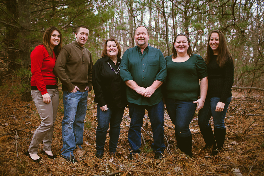
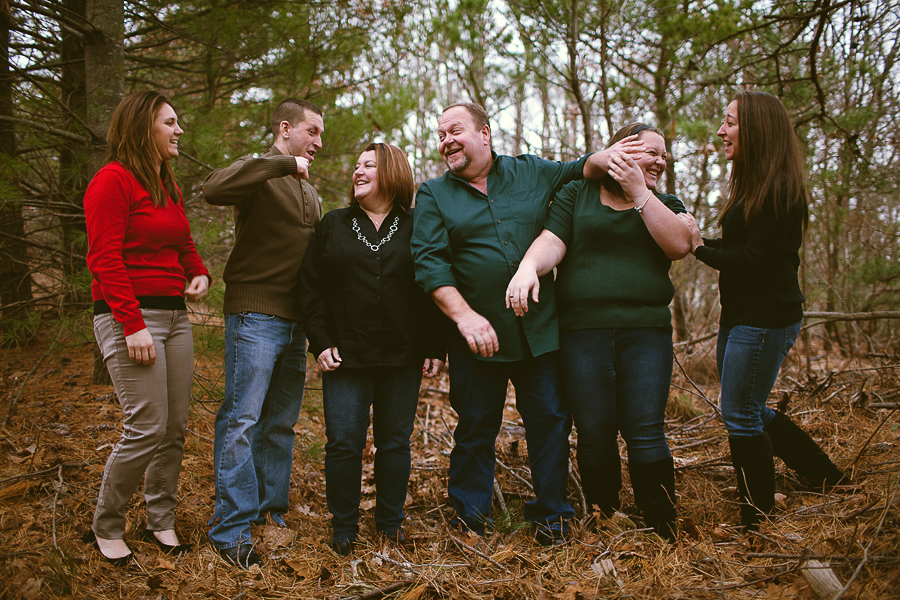
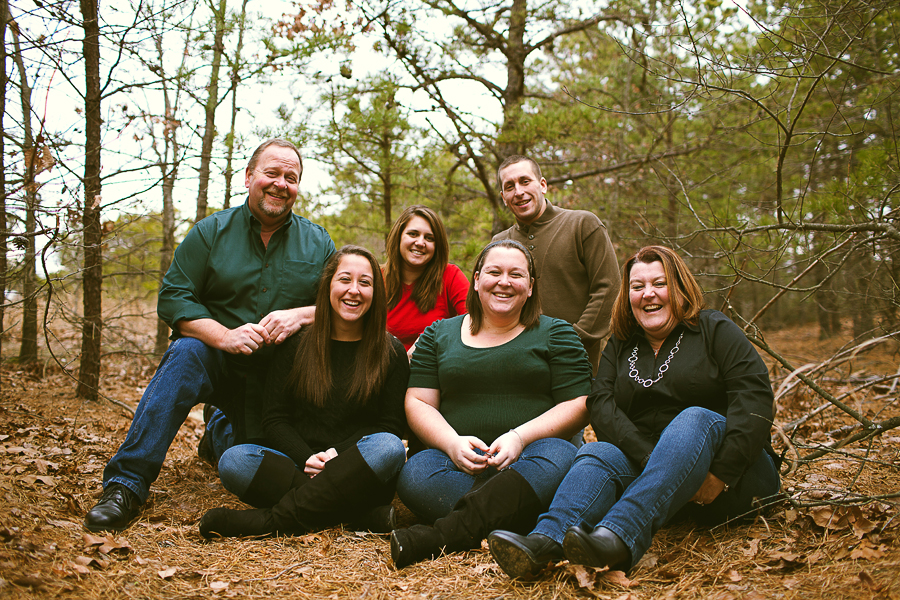
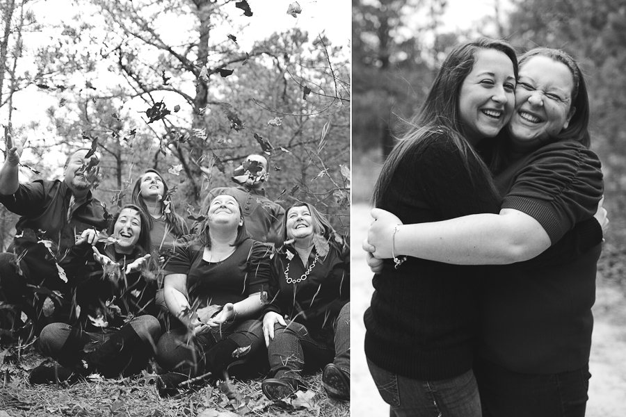
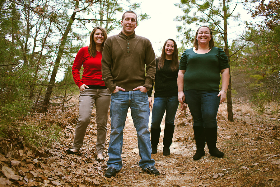
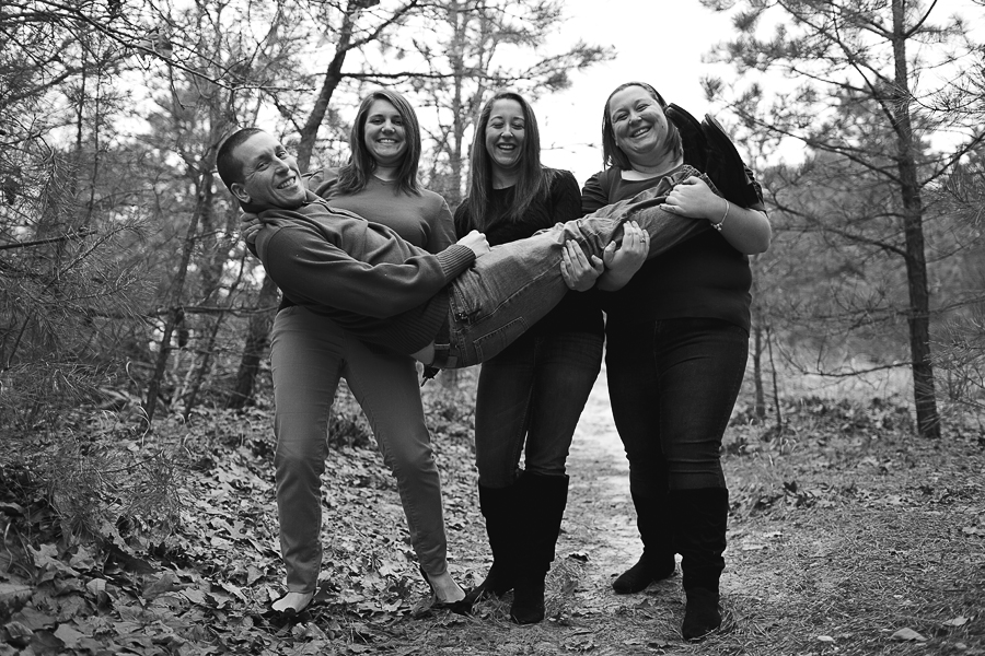
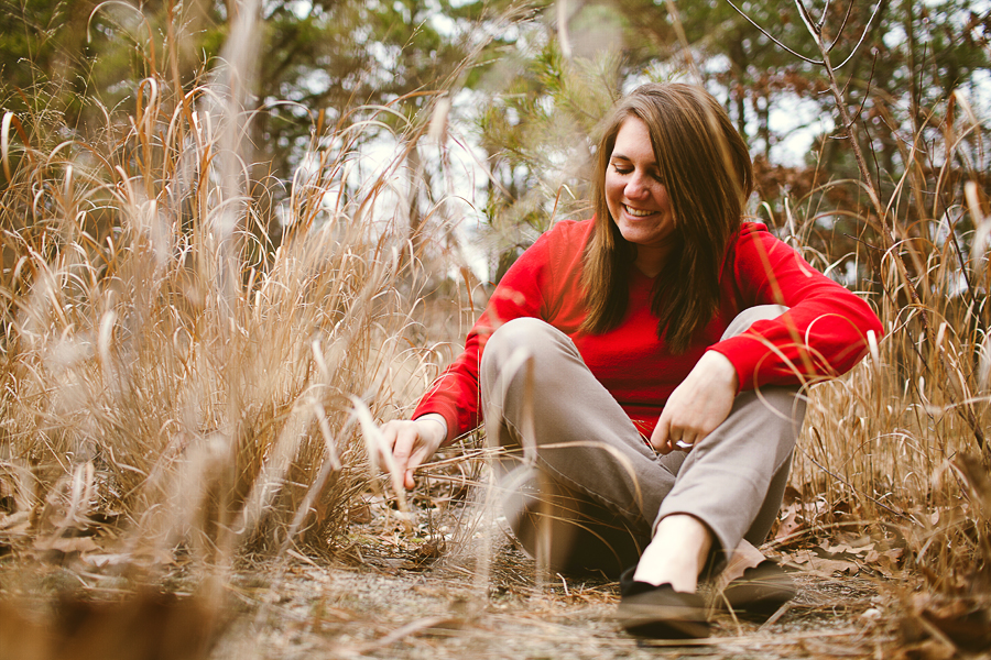
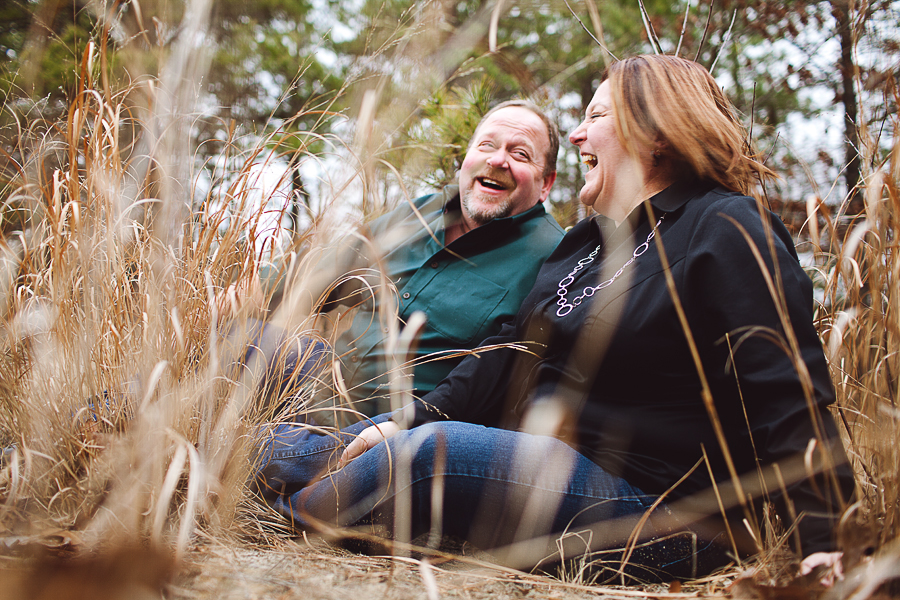
The Knox Family [Lifestyle]
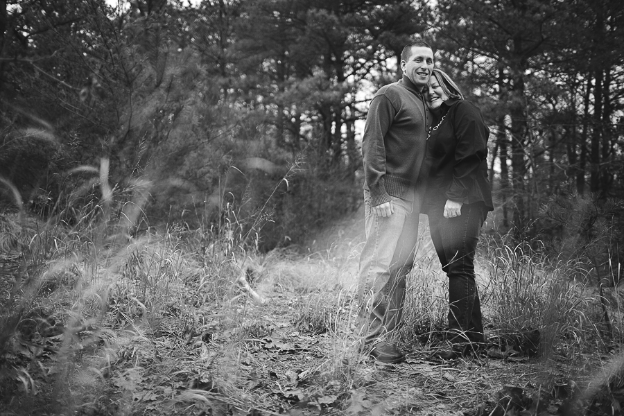
I photographed this one on New Years Day. Wonderful family, we had a lot of fun. This was my first family lifestyle session. Pretty stoked  The rest, as usual, can be seen on my blog
1.
2.
3.
4.
5.
6.
7.
8.
9.
10.
11.
12.
1.
2.
3.
4.
5.
6.
7.
8.
9.
10.
11.
12.
wedding portfolio michaelglennphoto.com
fashion portfolio michaelglennfashion.com
0
Comments
14-24 24-70 70-200mm (vr2)
85 and 50 1.4
45 PC and sb910 x2
http://www.danielkimphotography.com
Thanks Qarik! The family was a lot of fun. Very easy to work with!
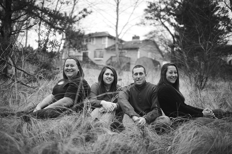
They are all really fun. 10 is weird with the house behind them, but maybe they wanted it?
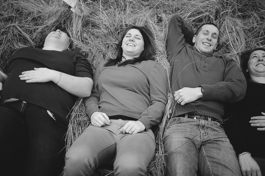
I think these are more fun than most boring portraits.
Well done.
Thanks!
All of these were shot on Canon's 35L f/1.4 lens. As for 10, it was my idea to position them there. I did it more for the open field rather than the house
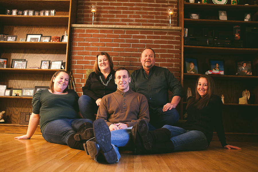
I have 3 nits.. in #11 you could do your client a favor by cloning out the exposed skin at waistline of subject on the far left, it is distracting and not flattering. I'd clone out the pocket too. In #3 and #5 the smallest member looks very small because she is farther away from the camera than larger members. Think about switching her placement next time with a larger person . You would be making them both look better. In 3 her head is about 50% smaller than the gal in front on the right. This could be fixed in PP but
is much easier to prevent. I like the house in the background, I assume it is theirs, that is a great idea!
Oh and watch the horizon, some seem to tilt down on the right, but that is a easy fix.
www.CottageInk.smugmug.com
NIKON D700
Oh they certainly did! I wish I could have easy going clients like them all the time!
As for #11, thank you for pointing that out! I totally missed that, and now it bothers me..go figure haha.
Good points for 3 and 5, I'll take that into consideration for next time. The subjects in the back were scattered, rather than lined horizontally in the background. Maybe having the subjects in the back in a flat plane would fix the size problem. I'll be more aware of this for other family shoots. Thank you for the feedback!