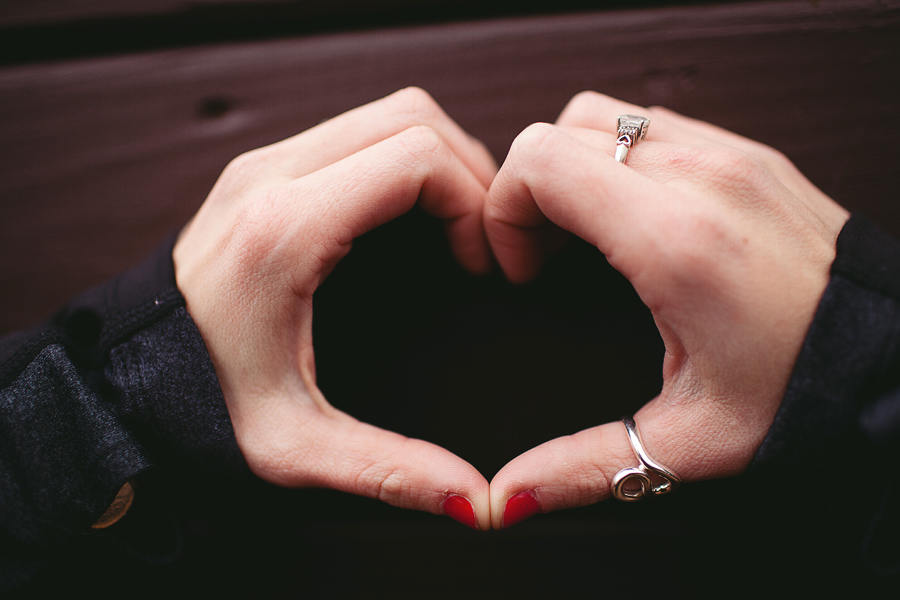
Melissa | a playground themed lifestyle session|

michaelglennmichaelglenn Registered Users Posts: 442 Major grins
edited March 11, 2013 in People
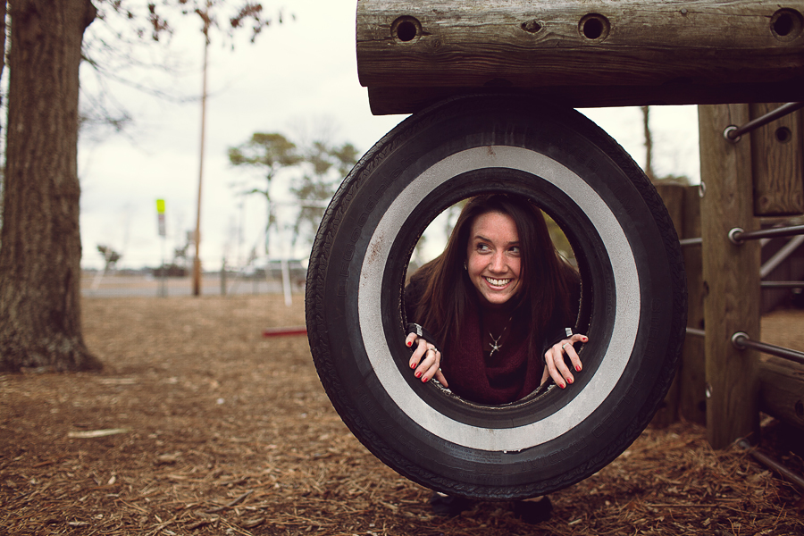
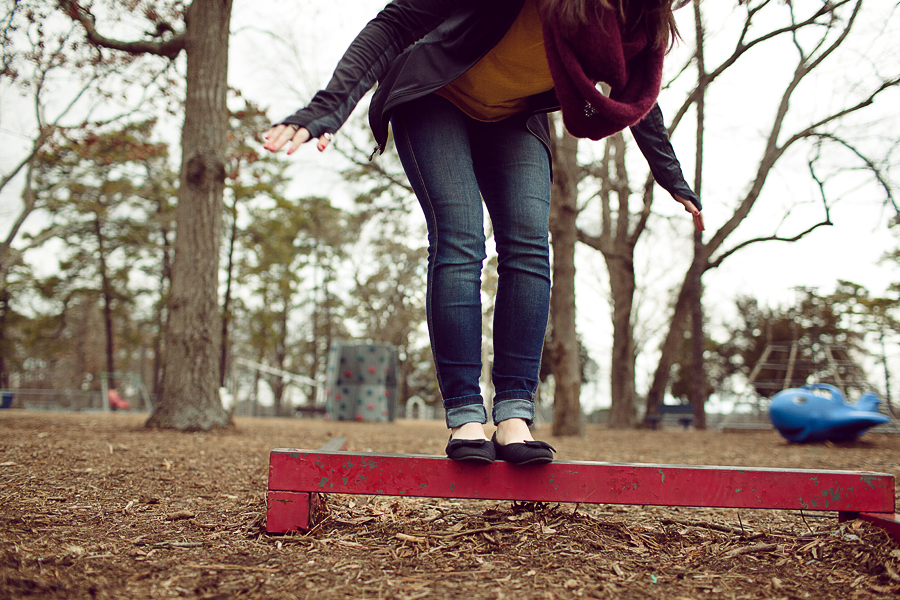
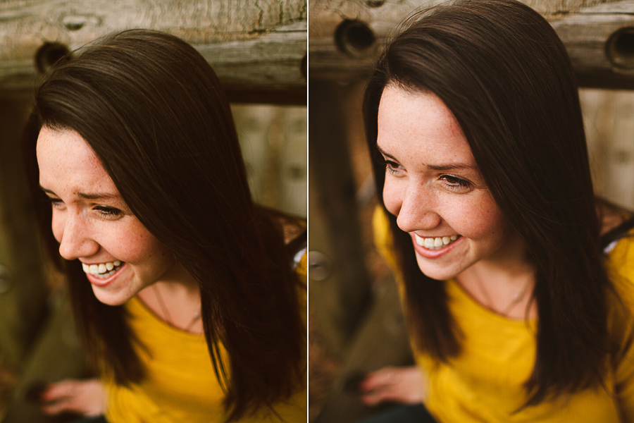
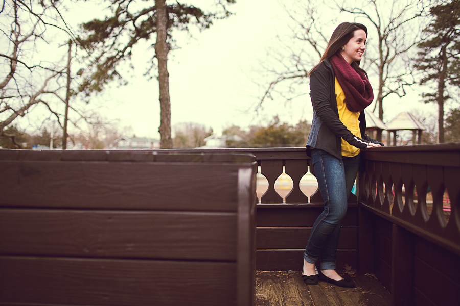
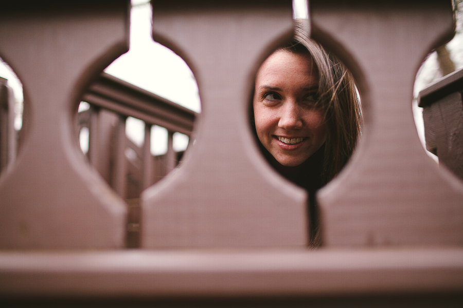
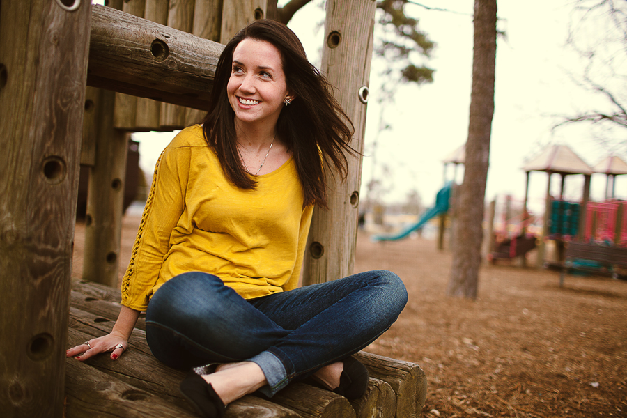
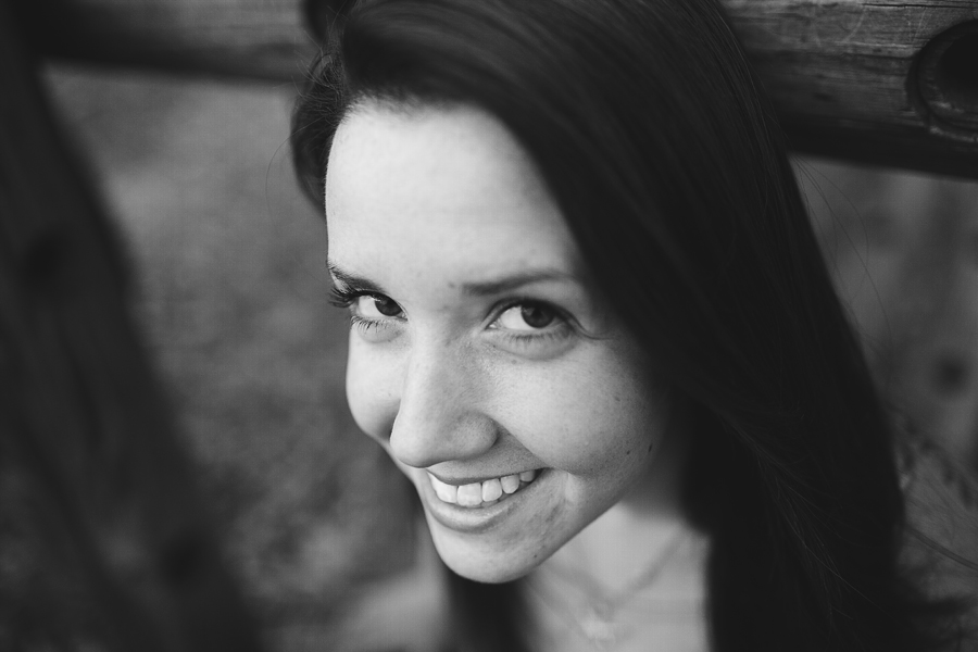
We had twenty minutes. Here's what I was able to accomplish.

1. 2969382_orig.jpg
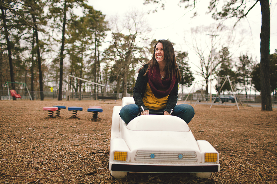
2. 2059093_orig.jpg
3. 5260352_orig.jpg
4. 3208614_orig.jpg
5. 6304939_orig.jpg
6. 4565396_orig.jpg
7. 3635355_orig.jpg
8. 1731168_orig.jpg
9. 5752103_orig.jpg
10. 2256547_orig.jpg
11. 1291920_orig.jpg
12. 9363360_orig.jpg

The rest is on the blog!
wedding portfolio michaelglennphoto.com
fashion portfolio michaelglennfashion.com

Comments

  • Bryce WilsonBryce Wilson Registered Users Posts: 1,586 Major grins
    edited March 4, 2013
    I like the creative posing, scenes and angles. I really enjoy number 7!

    They do appear a bit over saturated to me though. Also, I really don't care for the close-up shots done at 35mm.
  • LoganHLoganH Registered Users Posts: 113 Major grins
    edited March 4, 2013
    Love the tones in these images!

    I particularly like #2.

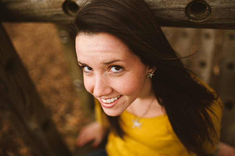
    Same as Bryce, the close ups would have been nicer at 50mm or 85mm. The distortion on her forehead is a bit harsh.

    For 20 minutes, this is great work!
  • michaelglennmichaelglenn Registered Users Posts: 442 Major grins
    edited March 4, 2013
    I like the creative posing, scenes and angles. I really enjoy number 7!

    They do appear a bit over saturated to me though. Also, I really don't care for the close-up shots done at 35mm.

    Thanks Bryce! I'm pretty heavy handed in post. I think I might have overdone the yellows a bit (especially in the close up 35mm shots).

    LoganH wrote: »
    Love the tones in these images!

    I particularly like #2.

    Same as Bryce, the close ups would have been nicer at 50mm or 85mm. The distortion on her forehead is a bit harsh.

    For 20 minutes, this is great work!

    Thanks! As for the distortion, it was intended. I did it to draw attention to her eyes thumb.gif. Some like it, others don't. It's the artsy/hipster in me rolleyes1.gif

    Edit: now having looked at it more, I think I would have been better off with a 50 instead of my 35. It makes her forehead look a little disproportionate. I appreciate the feedback!
    wedding portfolio michaelglennphoto.com
    fashion portfolio michaelglennfashion.com
  • LoganHLoganH Registered Users Posts: 113 Major grins
    edited March 5, 2013
    Understandable! Everyone has their different tastes. Good stuff nonetheless!
  • QarikQarik Registered Users Posts: 4,959 Major grins
    edited March 5, 2013
    20 min? really nice and FAST work! processing is perfect for this kind of stuff
    D700, D600
    14-24 24-70 70-200mm (vr2)
    85 and 50 1.4
    45 PC and sb910 x2
    http://www.danielkimphotography.com
  • michaelglennmichaelglenn Registered Users Posts: 442 Major grins
    edited March 5, 2013
    Qarik wrote: »
    20 min? really nice and FAST work! processing is perfect for this kind of stuff

    Haha yup! I decided to do a special on lifestyle sessions for the week. $50 for twenty minutes. It has been a lot of fun. Once I got the client comfortable and laughing, the session was a breeze. And I'm glad you're diggin the tones! :D
    wedding portfolio michaelglennphoto.com
    fashion portfolio michaelglennfashion.com
  • Gaby617Gaby617 Registered Users Posts: 218 Major grins
    edited March 5, 2013
    Cool shots.. I like the processing you chose to change what otherwise was quick looking snapshots to some shots w/ some character.
  • ChrisLeeChrisLee Registered Users Posts: 20 Big grins
    edited March 8, 2013
    I like them! 8 is my favorite!
  • michaelglennmichaelglenn Registered Users Posts: 442 Major grins
    edited March 10, 2013
    Gaby617 wrote: »
    Cool shots.. I like the processing you chose to change what otherwise was quick looking snapshots to some shots w/ some character.

    thank you! the day was rather cloudy, so I wanted to process these in a way where they would be more vibrant for the viewer.
    ChrisLee wrote: »
    I like them! 8 is my favorite!

    thanks! I'm a big fan of 8 as well thumb.gif
    wedding portfolio michaelglennphoto.com
    fashion portfolio michaelglennfashion.com
  • divamumdivamum Registered Users Posts: 9,021 Major grins
    edited March 10, 2013
    These are really fun. The distortion would bother me in a more "formal" portrait, but as part of a lifestyle/PJ set, I don't mind it at all. As always, terrific use of the light!
  • reyvee61reyvee61 Registered Users Posts: 1,877 Major grins
    edited March 11, 2013
    I can tell you both had fun, that alone counts for a lot.
    The fact that you captured it well, is on you as well :D
    Yo soy Reynaldo
Sign In or Register to comment.