Options

A sensuous session at the Watermark + Asbury. - MG Collaboration Part Three

michaelglennmichaelglenn Registered Users Posts: 442 Major grins
edited June 2, 2013 in People
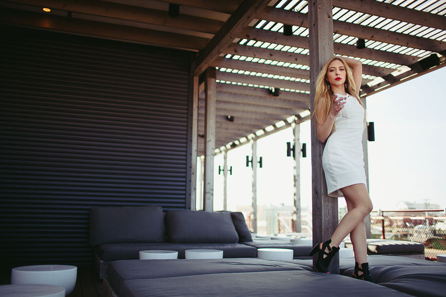
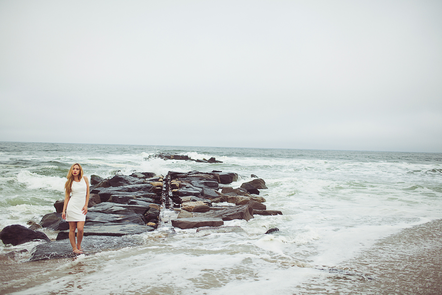
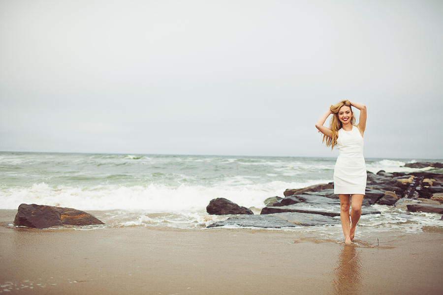
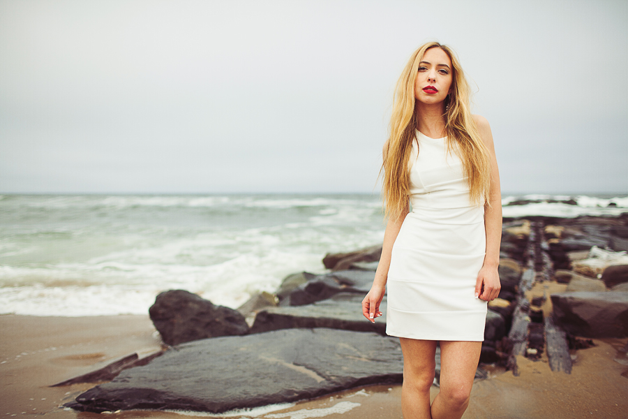
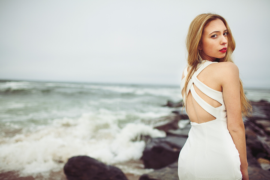
Here it is, folks! Part three of the collboration project. Indoor shots were photographed at the Watermark. Outdoor shots were done by the jetties near Asbury Park's Boardwalk. Enjoy!

Makeup Artist: Cady Grossman
Second Photographer: Stan Stolowski
Model: Nicole C.

Be sure to check out part one and part two on Dgrin. The rest of this session can be viewed on the blog!

1. 3773930_orig.jpg
2. 186278_orig.jpg
3. 9074548_orig.jpg
4. 6102719_orig.jpg
5. 2602578_orig.jpg
6. 9482942_orig.jpg
7. 5532885_orig.jpg
8. 5939824_orig.jpg
9. 9123911_orig.jpg
10. 8951929_orig.jpg
11. 1711904_orig.jpg
12. 6990349_orig.jpg
wedding portfolio michaelglennphoto.com
fashion portfolio michaelglennfashion.com

Comments

  • Options
    QarikQarik Registered Users Posts: 4,959 Major grins
    edited May 22, 2013
    mmmmm..delicious! no nits!
    D700, D600
    14-24 24-70 70-200mm (vr2)
    85 and 50 1.4
    45 PC and sb910 x2
    http://www.danielkimphotography.com
  • Options
    michaelglennmichaelglenn Registered Users Posts: 442 Major grins
    edited May 29, 2013
    Qarik wrote: »
    mmmmm..delicious! no nits!

    Haha! Thanks Qarik :D
    wedding portfolio michaelglennphoto.com
    fashion portfolio michaelglennfashion.com
  • Options
    valdanovaldano Registered Users Posts: 14 Big grins
    edited May 29, 2013
    Simply stunning! I love every last one.
  • Options
    Bryce WilsonBryce Wilson Registered Users Posts: 1,586 Major grins
    edited May 29, 2013
    These have a very "stylish magazine layout" look and feel to them. I like em LOTS!

    Only nit I can find is the right hand image in number 4. Although there is no EXIF data, I have a feeling that the image could have benefited from a longer focal length.
  • Options
    michaelglennmichaelglenn Registered Users Posts: 442 Major grins
    edited May 29, 2013
    These have a very "stylish magazine layout" look and feel to them. I like em LOTS!

    Only nit I can find is the right hand image in number 4. Although there is no EXIF data, I have a feeling that the image could have benefited from a longer focal length.

    Yeah this was shot with the 35L. I actually love the look, but others don't. The longer focal length would appeal to the masses, but I'm just too darn stubborn! thumb.gif

    I'm glad you felt that magazine-esque vibe. The Watermark was an amazing place to photograph. The entire side of the building overlooks a beach front and fills the room with soft natural light, which worked wonderfully for this session.
    wedding portfolio michaelglennphoto.com
    fashion portfolio michaelglennfashion.com
  • Options
    PhotogbikerPhotogbiker Registered Users Posts: 351 Major grins
    edited June 2, 2013
    Very nice. Definitely "magazine quality" work. Would be proud in any portfolio to show an editor. I will agree with Bryce though on the perspective. She is a beautiful and a bit exotic looking model with large eyes that are a bit wide set and a small chin with awesome lips. Shooting from a high vantage point in the right half image exaggerates that a bit and not flattering really. The 35mm on top of the high angle is a bit too much I think. I would also drop the leg in 3, a bit distracting. The colors, composition and technical aspects are excellent. Ones for perpetual students like me to flag and study a bit more as we learn. Thanks for posting them.
Sign In or Register to comment.