Move Navbar Sub Menu Drop Down?
 leftquark
Registered Users, Retired Mod Posts: 3,785 Many Grins
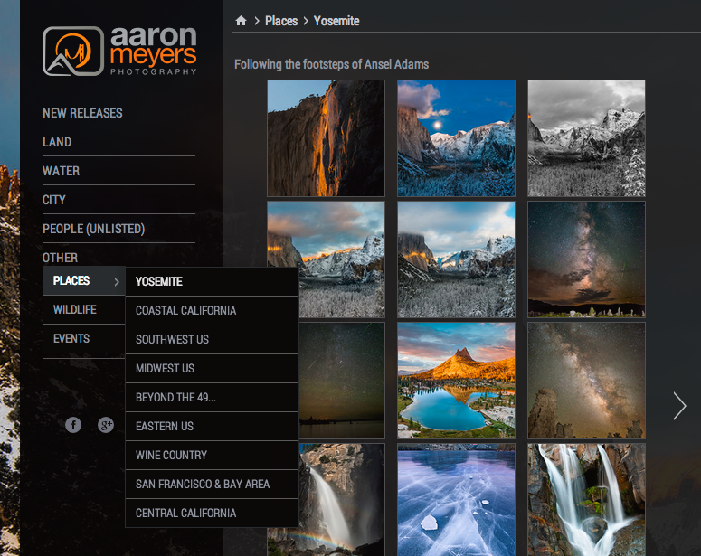
I use a vertical nav-bar on the left side of my page and I used the Menu content block to create a sub-menu within the menu. When the mouse goes over the item with a sub-menu, the sub-menu opens below the original item. All subsequent menus below that open to the right.
I would like to change the location of where the sub-menu opens. Rather than first open below the menu item, I'd like it to be to the right.
I've attached a screenshot of how it looks now. Here, I'd like the menu with "Places", "Wildlife", and "Events" to open to the RIGHT of "Other" instead of under it.
Essentially i'm looking for each new level to open to the right. Currently the first new level opens down, then all the other ones open to the right.

Note: As of Aug 25, 2013 my live SmugMug site is the Legacy Smugmug. I have not unveiled yet.
Any help?
I would like to change the location of where the sub-menu opens. Rather than first open below the menu item, I'd like it to be to the right.
I've attached a screenshot of how it looks now. Here, I'd like the menu with "Places", "Wildlife", and "Events" to open to the RIGHT of "Other" instead of under it.
Essentially i'm looking for each new level to open to the right. Currently the first new level opens down, then all the other ones open to the right.

Note: As of Aug 25, 2013 my live SmugMug site is the Legacy Smugmug. I have not unveiled yet.
Any help?
dGrin Afficionado
Former SmugMug Product Team
aaron AT aaronmphotography DOT com
Website: http://www.aaronmphotography.com
My SmugMug CSS Customizations website: http://www.aaronmphotography.com/Customizations
Former SmugMug Product Team
aaron AT aaronmphotography DOT com
Website: http://www.aaronmphotography.com
My SmugMug CSS Customizations website: http://www.aaronmphotography.com/Customizations
0
Comments
Former SmugMug Product Team
aaron AT aaronmphotography DOT com
Website: http://www.aaronmphotography.com
My SmugMug CSS Customizations website: http://www.aaronmphotography.com/Customizations
Images in the Backcountry
My SmugMug Customizations | Adding CSS to Your Site | SEO for the Photographer | Locate Your Page/Widget Number | SmugMug Help Desk
and the vertical menu where the links expand to the right.
Have you tried both?
No. I'm not using the Smugmug navigation bar anyway.
Images in the Backcountry
My SmugMug Customizations | Adding CSS to Your Site | SEO for the Photographer | Locate Your Page/Widget Number | SmugMug Help Desk
Turns out that despite spending tens of hours tweaking CSS and playing with the customizer I never realized there was a drop-down menu in the MENU BLOCK for "Vertical" menu. I had mine set to "Horizontal" menu. As soon as I set it to vertical, it moved to the right.
Now my only problem is that the sub-menu appears DIRECTLY next to the top level. There's no spacing. It's like the main level and sub-menu are kissing. I'd love to be able to push it out a couple pixels to the right.
Can't seem to get the CSS right to push it out to the right a smidge more. Anyone figure it out?
Former SmugMug Product Team
aaron AT aaronmphotography DOT com
Website: http://www.aaronmphotography.com
My SmugMug CSS Customizations website: http://www.aaronmphotography.com/Customizations
I guess you'd need a CSS code, but that's "not in my department"...
Still I'm glad I helped, at least part of the way.
Try giving the top link some right padding, something like:
.sm-page-widget-nav-toplink > a {
  padding-right: 12px;
}
-Mike
(and an avid landscape photographer - view my website)
Hey, who knew that'd work like a charm! Thanks!
Former SmugMug Product Team
aaron AT aaronmphotography DOT com
Website: http://www.aaronmphotography.com
My SmugMug CSS Customizations website: http://www.aaronmphotography.com/Customizations
Well that worked but my nav-bar has a top-padding of 7pixels and the sub-navbar then opens up 7pixels below. It looks a little strange having it off-kilter. I can't seem to find a way to move it up those 7 pixels.
nav_bar_gap.jpg
I've got the following code:
/* *********************** CHANGE THE NAV BAR LOOK *********************** */ /* Add a line underneath each link in the menu (nav) bar */ .sm-page-widget-nav-toplink { border-bottom: 1px solid #595959; padding: 7px 0px 7px 0px; width: 90%; margin-bottom: 0px !important; } /* Make sure the last item in the nav bar has a bottom line too */ .sm-page-widget-nav-toplink:last-child { border-bottom: 1px solid #595959 !important; padding:7px 0 !important; width: 90%; /* margin-bottom: 0px !important; */ } .sm-page-widget-nav-toplink > a { padding-right: 12px; } /* *********************** CHANGE THE SUB-MENU NAV LOOK *********************** */ /* Change the way the sub-menu bar looks */ .yui3-menu-item>.yui3-menu-label { padding: 7px 32px 7px 11px !important; font-size: 12px; border: 1px solid #595959; background-color: rgba(0,0,0,0.75); }Former SmugMug Product Team
aaron AT aaronmphotography DOT com
Website: http://www.aaronmphotography.com
My SmugMug CSS Customizations website: http://www.aaronmphotography.com/Customizations
/* The 7px padding causes the sub-menu to not align properly. Move it 7px up */ .yui3-menu-children { margin-top: -7px !important; }Former SmugMug Product Team
aaron AT aaronmphotography DOT com
Website: http://www.aaronmphotography.com
My SmugMug CSS Customizations website: http://www.aaronmphotography.com/Customizations
Something like this should work:
.sm-page-widget-nav .sm-page-widget-nav-popover .yui3-menu,
.sm-page-widget-nav .sm-page-widget-nav-popover .yui3-menu-children {
    background-color: #000;
    background-color: rgba(0, 0, 0, 0.6);
}
-Mike
(and an avid landscape photographer - view my website)