SmugMug Layout Displays Wrong on iPad / Small Screens
 leftquark
Registered Users, Retired Mod Posts: 3,785 Many Grins
leftquark
Registered Users, Retired Mod Posts: 3,785 Many Grins
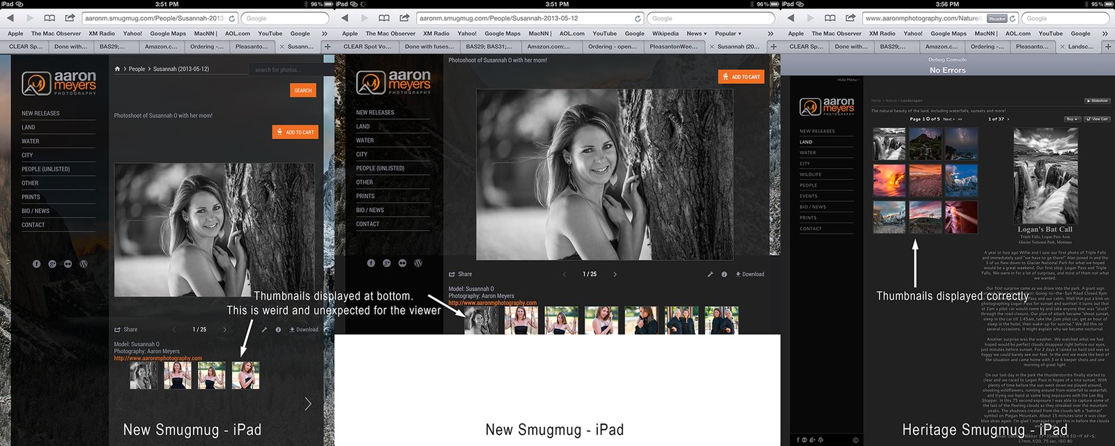
When I display my New SmugMug (still not unveiled yet) on a large desktop screen or on my iPhone, the site displays properly. I have my galleries set to the SmugMug theme. On a large desktop the thumbnails are on the left and the selected image on the right. On the iPhone (small mobile screens), the layout changes properly: when viewing a gallery only thumbnails are shown and clicking on the image brings it up in lightbox. This is all good. It's when I checked it on the iPad/small screens that it breaks...
On the iPad and small screen's SmugMug thinks the display is big enough to show both the thumbnails and the image. Instead of the thumbnails showing up on the left, they end up BELOW the photo and below the caption. The user is not expecting this and is left confused as to where the images in the gallery are. Additionally, it only shows 1 small row of images and makes the user have to scroll through a gazillion pages.
I've also tested this using Screenfly and it also appears to show that the small screen sizes display incorrectly.
I thought perhaps it was my CSS that was screwing it up. I created a test gallery and put almost no CSS in it (just enough to make my menu and hover colors look right). It's not my CSS screwing it up. My Test Gallery with almost no CSS still has the issue. My site is still veiled so only SmugMug people with special access can see this link in the New SmugMug view: http://aaronm.smugmug.com/Other/Test
See the image below.
Bug? Any way to fix and move thumbnails up for iPad / small screens? This is the last issue holding me up from unveiling!
dGrin Afficionado
Former SmugMug Product Team
aaron AT aaronmphotography DOT com
Website: http://www.aaronmphotography.com
My SmugMug CSS Customizations website: http://www.aaronmphotography.com/Customizations
Former SmugMug Product Team
aaron AT aaronmphotography DOT com
Website: http://www.aaronmphotography.com
My SmugMug CSS Customizations website: http://www.aaronmphotography.com/Customizations
0