Losing the Enemy...

Bend The LightBend The Light Registered Users Posts: 1,887 Major grins
edited December 29, 2013 in Other Cool Shots
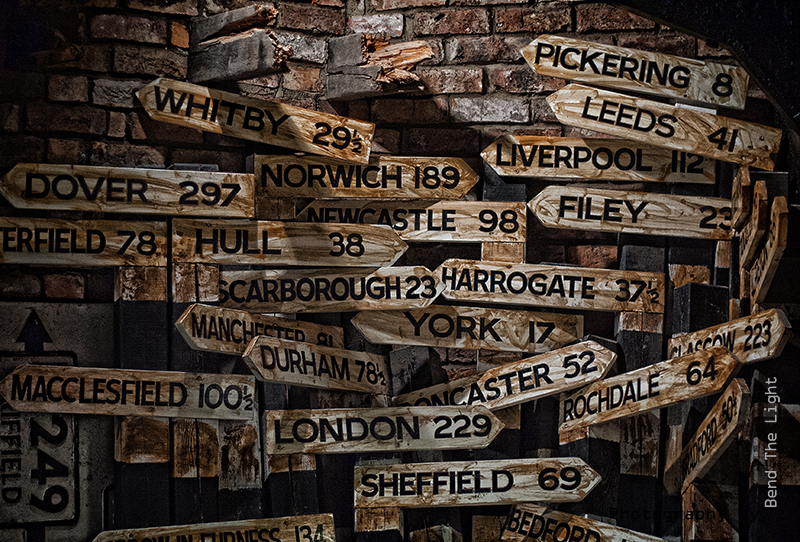
In wartime, it was common practise to alter, deface, or even remove direction signs. Local people would know their way around, but the enemy would not.
Here is a collection of removed signs which I thought made a nice picture. :)

What do you think?

11279251356_c73daec4a7_c.jpg
08Dec2013 Losing the Enemy by Bend The Light, on Flickr

Comments

  • supermarvin76supermarvin76 Registered Users Posts: 42 Big grins
    edited December 28, 2013
    I like everything about this photo. The subject is really cool; I'm fascinated with the European cities represented here, and equally as important, I think the lighting and processing really make this photo.

    Great work!
    "The Marines I have seen around the world have the cleanest bodies, the filthiest minds, the highest morale, and the lowest morals of any group of animals I have ever seen. Thank God for the United States Marine Corps!" -Eleanor Roosevelt, First Lady of the United States, 1945
  • pyrypyry Registered Users Posts: 1,733 Major grins
    edited December 28, 2013
    In wartime, it was common practise to alter, deface, or even remove direction signs. Local people would know their way around, but the enemy would not.
    Here is a collection of removed signs which I thought made a nice picture. :)

    What do you think?


    08Dec2013 Losing the Enemy by Bend The Light, on Flickr

    I like the idea.
    Is it just me fooled or is the image actually a 3d-graphic?
    Creativity's hard.

    http://pyryekholm.kuvat.fi/
  • Bend The LightBend The Light Registered Users Posts: 1,887 Major grins
    edited December 28, 2013
    I like everything about this photo. The subject is really cool; I'm fascinated with the European cities represented here, and equally as important, I think the lighting and processing really make this photo.

    Great work!

    Thank you. :)

    pyry wrote: »
    I like the idea.
    Is it just me fooled or is the image actually a 3d-graphic?

    It's the editing - a mixture of selective (de)saturation on one layer, and a mono layer above that and blended...seems to make the details stand out - really shows in the broken wooden beams at the top. It's a technique I have been using a lot recently - seems to make things stand out, but the mono layer and luminosity blending also seems to add "sharpness" to the image.

    Cheers
  • rwellsrwells Registered Users Posts: 6,084 Major grins
    edited December 29, 2013
    That's a really nice image you've got there thumb.gif
    • Lot's to look at to keep your eyes intrigued, and moving around the image
    • Nice comp
    • Great lighting
    • Very nice processing
    Randy
  • Bend The LightBend The Light Registered Users Posts: 1,887 Major grins
    edited December 29, 2013
    rwells wrote: »
    That's a really nice image you've got there thumb.gif
    • Lot's to look at to keep your eyes intrigued, and moving around the image
    • Nice comp
    • Great lighting
    • Very nice processing

    Thank you. :)
Sign In or Register to comment.