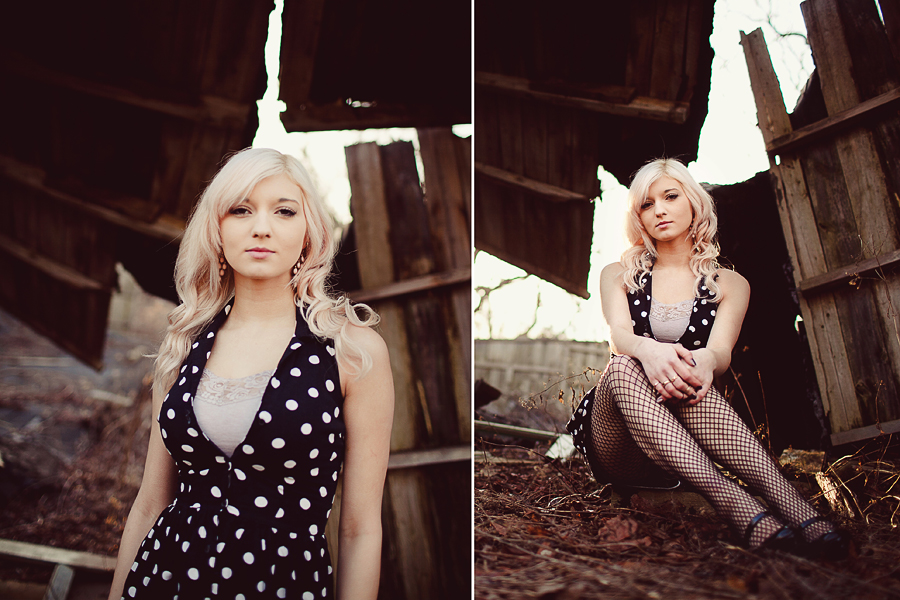
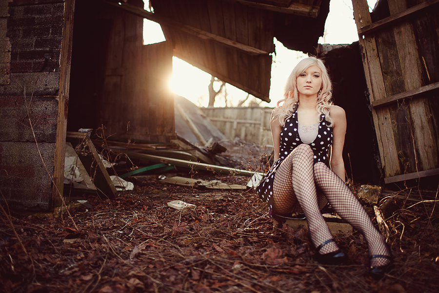
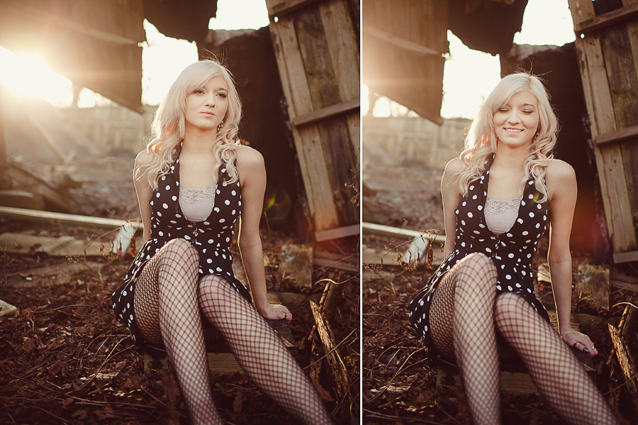
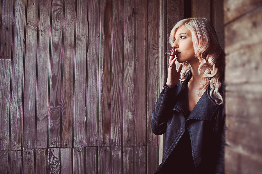
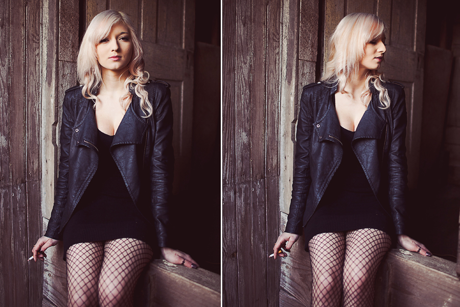
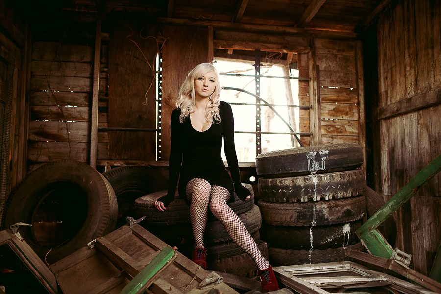
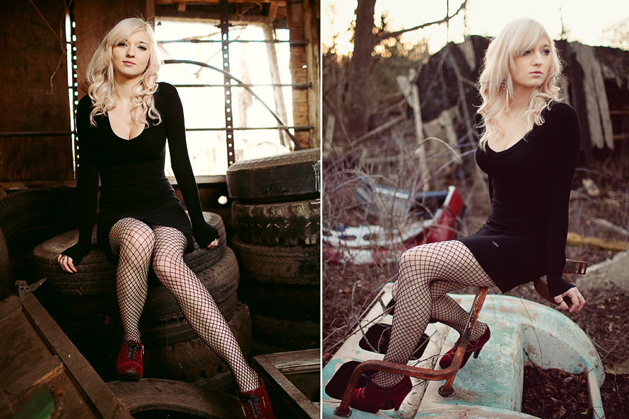
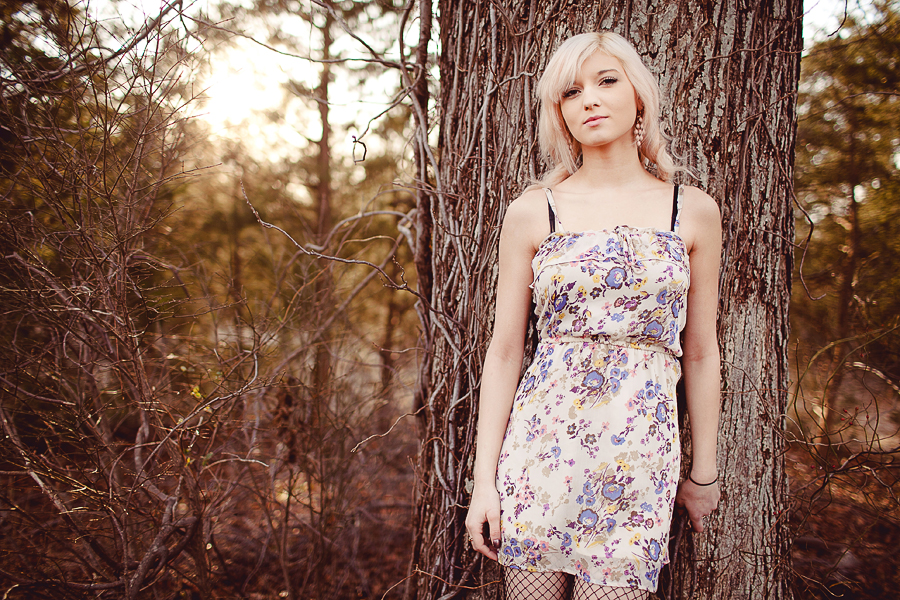
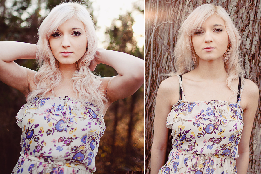
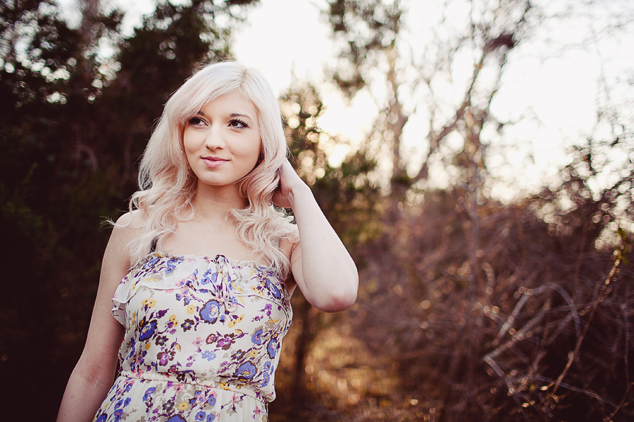
Grunge Themed Fashion Session

michaelglennmichaelglenn Registered Users Posts: 442 Major grins
edited January 18, 2014 in People
My buddy's girlfriend wants to delve into modeling. She's awesome..AND I got paid in cheesecake. Can't beat that.

1. 2983404_orig.jpg
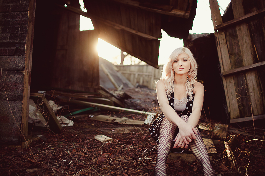
2. 5098021_orig.jpg
3. 2433266_orig.jpg
4. 7889504_orig.jpg
5. 8113668_orig.jpg
6. 9276458_orig.jpg
7. 1631529_orig.jpg
8. 556553_orig.jpg
9. 9425864_orig.jpg
10. 1628198_orig.jpg
11. 2955711_orig.jpg

The rest can be found on my blog

Thanks for viewing :)
wedding portfolio michaelglennphoto.com
fashion portfolio michaelglennfashion.com

Comments

  • jonh68jonh68 Registered Users Posts: 2,711 Major grins
    edited January 15, 2014
    This a nice set, but it doesn't scream grunge to me. This is a good lifestyle portrait session, but there is more to grunge than just posing in a rundown place. To me anyway, there is more control over light and more contrasty processing.
  • divamumdivamum Registered Users Posts: 9,021 Major grins
    edited January 15, 2014
    As always, I drool over your use of light, expression, sense of movement and processing. So much about these is not merely good, but GREAT BUT.... things which might not bother me for a lifestyle session, as potential model port material are maybe worth mentioning

    - cropping at weird points on limbs. Don't! She's got amputated feet in a few, and there are some awkward above and below knee crops too. Crop 'tighter to a better place, or composite them onto another shot which has the missing limbs :) EG #7. It is ROCKING... but that one half foot missing screams for attention. Find a shot, extend the canvas, and bolt it on. The shot is just cracking in all other ways, and one of the best of the set for modelling IMO (very similar to the next one, but the difference in expression is significant). #1 really suffers from the crop - SUCH a great shot but... where're her feet?! :)

    - she's gorgeous, and looks great BUT you can help her out by reminding her to keep space under her arms (hands on hips, slide arm up hip etc etc). She needs that waist-defining space, no matter how slim and gorgeous she is to start with.

    - careful with "armpit shots". She mostly gets away with it, but strongly recommend some healing/smoothing. Nobody has pretty pits. NOBODY.

    - #5 is just stupidly good. thumb.gif

    - #9 - shoulders are square to camera, arms are just hanging down - expresssion is good, but for modelling her body needs some SHAPES, not just a vertical column (lovely column though it is :D )

    - #2 - careful of her feet/legs coming straight towards camera. You get away with it here, iIMO, but it's always going to risk making what's closest to the camera look bigger than everything else. Big feet/knees not necessarily most women's finest assets :)

    - #11 - fabulous expression - love it!

    There is SO much to love about this set and as a lifestyle session it's gorgeous; for a model, pull in those details and it's solid gold.

    Dang, I guess my recent research/learn-athon regarding fashion/model posing has started paying off. I kind of know what i'm looking for :giggle
  • michaelglennmichaelglenn Registered Users Posts: 442 Major grins
    edited January 15, 2014
    jonh68 wrote: »
    This a nice set, but it doesn't scream grunge to me. This is a good lifestyle portrait session, but there is more to grunge than just posing in a rundown place. To me anyway, there is more control over light and more contrasty processing.

    What would you consider the setting to be? I'm not sure what to even call it! I was considering renaming it to be honest. And I'm glad you enjoyed the set!
    divamum wrote: »
    As always, I drool over your use of light, expression, sense of movement and processing. So much about these is not merely good, but GREAT BUT.... things which might not bother me for a lifestyle session, as potential model port material are maybe worth mentioning

    - cropping at weird points on limbs. Don't! She's got amputated feet in a few, and there are some awkward above and below knee crops too. Crop 'tighter to a better place, or composite them onto another shot which has the missing limbs :) EG #7. It is ROCKING... but that one half foot missing screams for attention. Find a shot, extend the canvas, and bolt it on. The shot is just cracking in all other ways, and one of the best of the set for modelling IMO (very similar to the next one, but the difference in expression is significant). #1 really suffers from the crop - SUCH a great shot but... where're her feet?! :)

    - she's gorgeous, and looks great BUT you can help her out by reminding her to keep space under her arms (hands on hips, slide arm up hip etc etc). She needs that waist-defining space, no matter how slim and gorgeous she is to start with.

    - careful with "armpit shots". She mostly gets away with it, but strongly recommend some healing/smoothing. Nobody has pretty pits. NOBODY.

    - #5 is just stupidly good. thumb.gif

    - #9 - shoulders are square to camera, arms are just hanging down - expresssion is good, but for modelling her body needs some SHAPES, not just a vertical column (lovely column though it is :D )

    - #2 - careful of her feet/legs coming straight towards camera. You get away with it here, iIMO, but it's always going to risk making what's closest to the camera look bigger than everything else. Big feet/knees not necessarily most women's finest assets :)

    - #11 - fabulous expression - love it!

    There is SO much to love about this set and as a lifestyle session it's gorgeous; for a model, pull in those details and it's solid gold.

    Dang, I guess my recent research/learn-athon regarding fashion/model posing has started paying off. I kind of know what i'm looking for :giggle


    Thanks for the points Madeleine!

    About the amputated feet...Laughing.gif

    - In #1, I do wish I hadn't cut off the feet. Although I felt her expression & overall vibe won me over with keeping this in the set.
    - As for some of the others that were inside that abandoned garage, it was a pretty tight space. I was tempted to use the 35, but stuck with the 50L which made it even tighter. I did it mainly to reduce lens distortion for the headshots I wanted to keep. It's important to note that shots like #8 where part of the foot is cut off, isn't actually cut off in the actual photo. It's just the way I spliced it together for my blog. But I do agree, I should have been a bit more mindful in a couple of these shots.

    - Seriously thinking about lightening up under the pits and doing a little smoothening. Love her facial expression though.

    - #2 I wasn't worried. If I had on the 35, I would avoid this type of shot due to distortion.

    - #11 & 7 are my personal favorites :)

    I'm glad you enjoyed it, and I'll take some pointers from the headshot queen! I really appreciate the input thumb.gif
    wedding portfolio michaelglennphoto.com
    fashion portfolio michaelglennfashion.com
  • jonh68jonh68 Registered Users Posts: 2,711 Major grins
    edited January 15, 2014
    I would just call it a portrait session. I disagree with Diva on 9. I like the simplicity of the picture. To make more shapes would change the mood of the picture. The black dress is the one that shows off the curves. I hope this doesn't sound too male prespectve, but if a woman has a nice rear, there are ways of posing that flatter without being overly sexy. I used to be shy about that, but now I suggest. When they see the pics those are chosen as favorites.

    Maybe some more in the black dress standing would have been good.What is distracting is the black bra straps and the stockings in 8. Those are nitpicks that I overlook as well when going through multiple looks. I think they would have been better with the bra off or straps tucked under the top and the stockings should have come off. It doesn't fit with the dress.

    Your editing, composition and choices for light are awesome.
  • divamumdivamum Registered Users Posts: 9,021 Major grins
    edited January 16, 2014
    Disclaimer: Obviously, John (and MG), I don't shoot models and you do, so take with a grain of salt. However, I'm kind of on a mission at the moment to learn more about this and incorporate more of it into my own work. As always, one tends to spot the things in others' work one is aware of/working on in one's own!! naughty.gif)
    It's important to note that shots like #8 where part of the foot is cut off, isn't actually cut off in the actual photo. It's just the way I spliced it together for my blog.
    thumb.gif
    I wasn't worried. If I had on the 35, I would avoid this type of shot due to distortion.

    Agreed. It works here, somehow, but if you look at it analytically in #3 for the sake of discussion - her feet definitely look disproportionately big which in some contexts would be a no-no :)

    jonh68 wrote: »
    I disagree with Diva on 9. I like the simplicity of the picture. To make more shapes would change the mood of the picture.

    I agree about the simplicity and mood - which I also like - and don't think it needed a huge change. BUT I do want to see more of that line down the side of her body, giving her more of a waist. The square-on position and blouson dress already mask her shape somewhat, so I think if she had just bumped her hip out a little more, and/or bent her front leg a little more, and/or given herself a little more airspace under that camera left arm, we'd have been (subtly) more aware of her great figure while retaining the simplicity. Small change that IMO would have taken it more towards a "model" shot without getting cheesy or overdone thumb.gif

    And in case my rambling nit-picking has masked it: I still freaking love this set. Light/processing and ENERGY in your shots always leave my jaw-dropped. I've seen you at work and I STILL don't quite know how you capture it!! thumb.gif
  • michaelglennmichaelglenn Registered Users Posts: 442 Major grins
    edited January 18, 2014
    jonh68 wrote: »
    I would just call it a portrait session. I disagree with Diva on 9. I like the simplicity of the picture. To make more shapes would change the mood of the picture. The black dress is the one that shows off the curves. I hope this doesn't sound too male prespectve, but if a woman has a nice rear, there are ways of posing that flatter without being overly sexy. I used to be shy about that, but now I suggest. When they see the pics those are chosen as favorites.

    Maybe some more in the black dress standing would have been good.What is distracting is the black bra straps and the stockings in 8. Those are nitpicks that I overlook as well when going through multiple looks. I think they would have been better with the bra off or straps tucked under the top and the stockings should have come off. It doesn't fit with the dress.

    Your editing, composition and choices for light are awesome.

    Part of my style, at least with what I call "lifestyle imagery" is that I will have a subject guide into a pose with some direction on my end, but I let them get into the pose. If it works, it works. If not, I guide them into something different. Sometimes I will go for something "sexy" if the subject is willing. For me, it's all about getting them relaxed and confident. I just need to find the light, and I'll find a way to artistically compose the shot.

    I agree about the bra straps. I saw them, and had her hide them a little bit. We were crunched for time, and with the amount of dress changes, I decided to run with it how they were. If I were to redo it again, the straps would be gone in a second thumb.gif

    Thanks for the compliments John, I appreciate your control of off camera flash a lot!
    divamum wrote: »
    Disclaimer: Obviously, John (and MG), I don't shoot models and you do, so take with a grain of salt. However, I'm kind of on a mission at the moment to learn more about this and incorporate more of it into my own work. As always, one tends to spot the things in others' work one is aware of/working on in one's own!! naughty.gif)


    thumb.gif


    Agreed. It works here, somehow, but if you look at it analytically in #3 for the sake of discussion - her feet definitely look disproportionately big which in some contexts would be a no-no :)


    I agree about the simplicity and mood - which I also like - and don't think it needed a huge change. BUT I do want to see more of that line down the side of her body, giving her more of a waist. The square-on position and blouson dress already mask her shape somewhat, so I think if she had just bumped her hip out a little more, and/or bent her front leg a little more, and/or given herself a little more airspace under that camera left arm, we'd have been (subtly) more aware of her great figure while retaining the simplicity. Small change that IMO would have taken it more towards a "model" shot without getting cheesy or overdone thumb.gif

    And in case my rambling nit-picking has masked it: I still freaking love this set. Light/processing and ENERGY in your shots always leave my jaw-dropped. I've seen you at work and I STILL don't quite know how you capture it!! thumb.gif

    I get what you're saying Madeleine. There is a certain style to developing fashion poses. I'm hoping to someday incorporate my style meshed into some of these poses to create something killer. Just wait till I get into some studio lighting. Shit will get real I promise. rolleyes1.gif
    wedding portfolio michaelglennphoto.com
    fashion portfolio michaelglennfashion.com
Sign In or Register to comment.