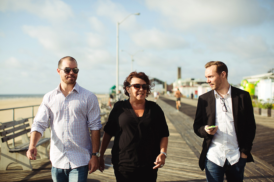
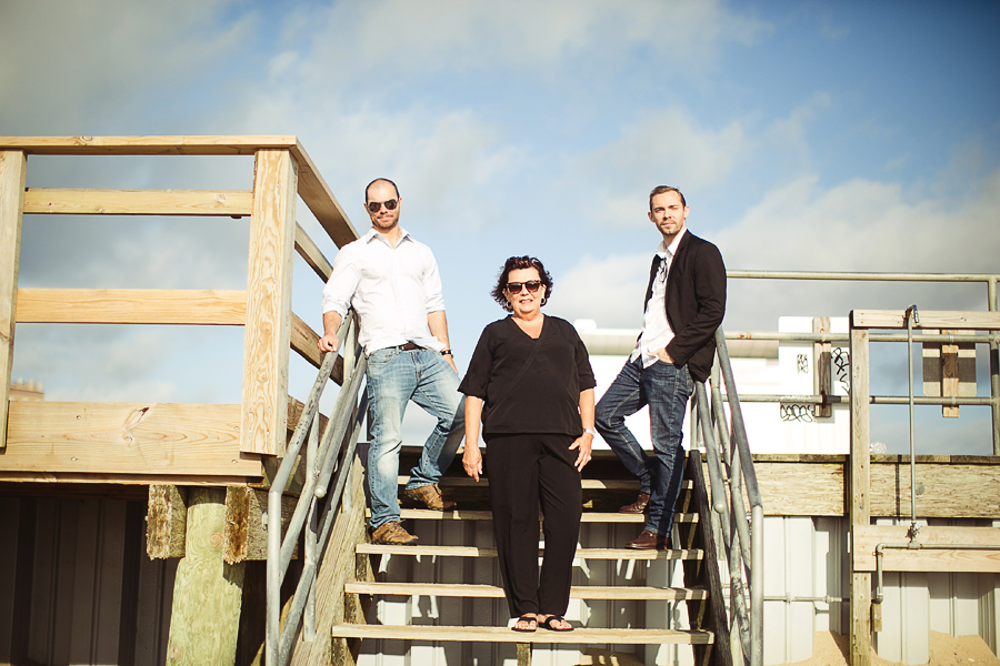
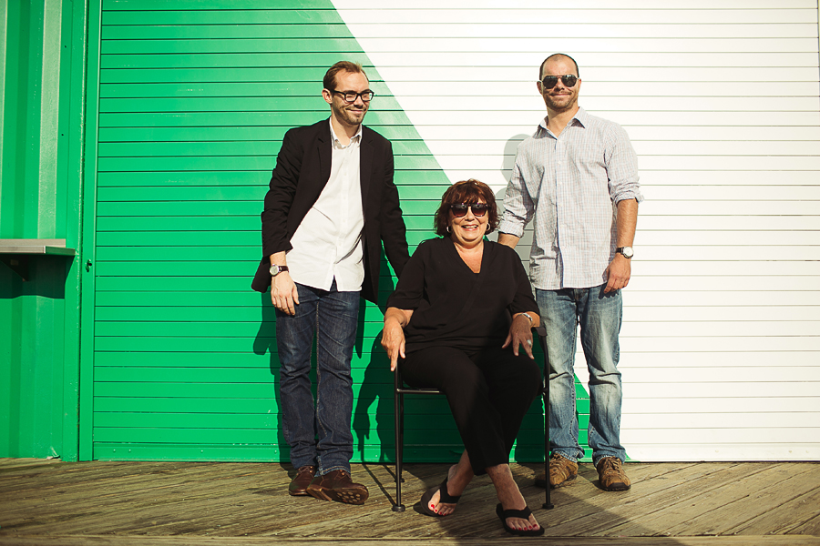
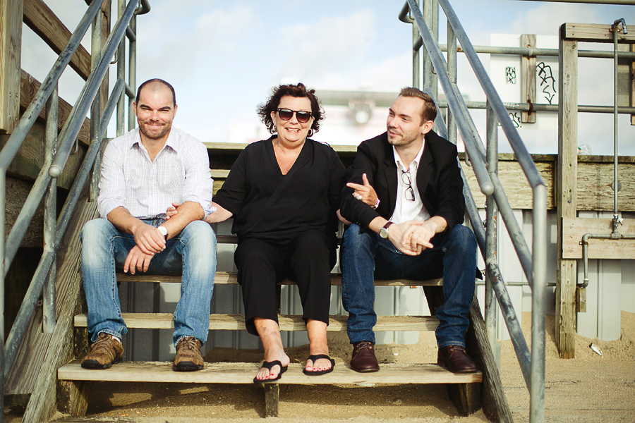
A stylish family photo session . asbury park . nj

michaelglennmichaelglenn Registered Users Posts: 442 Major grins
edited August 27, 2014 in People
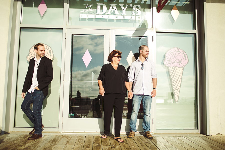
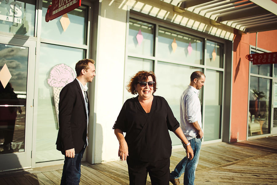
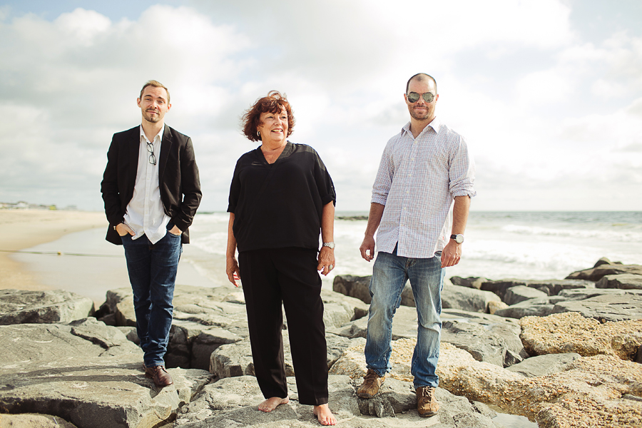
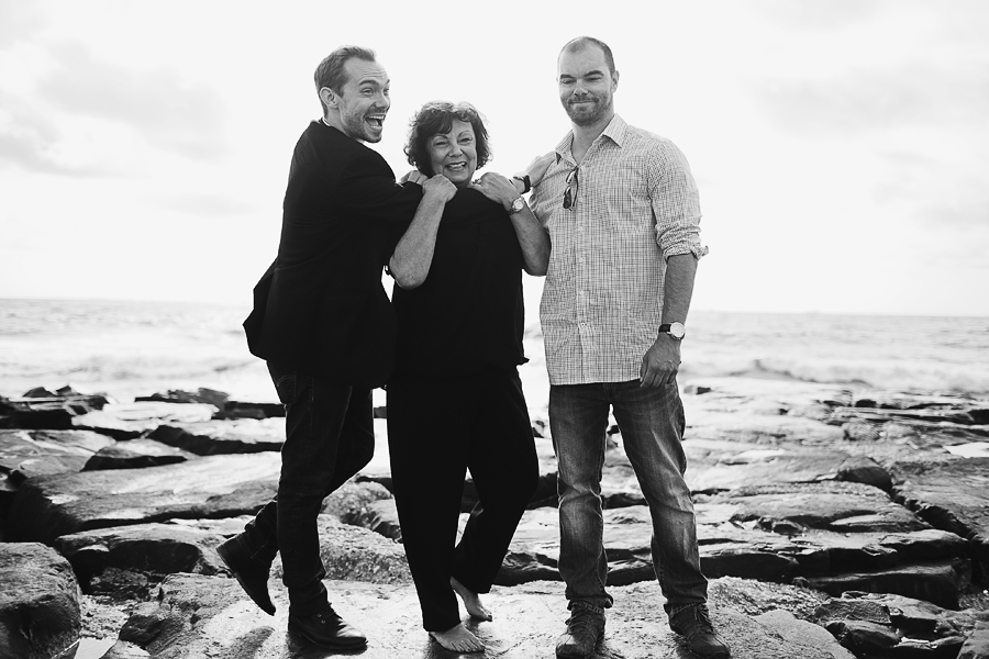
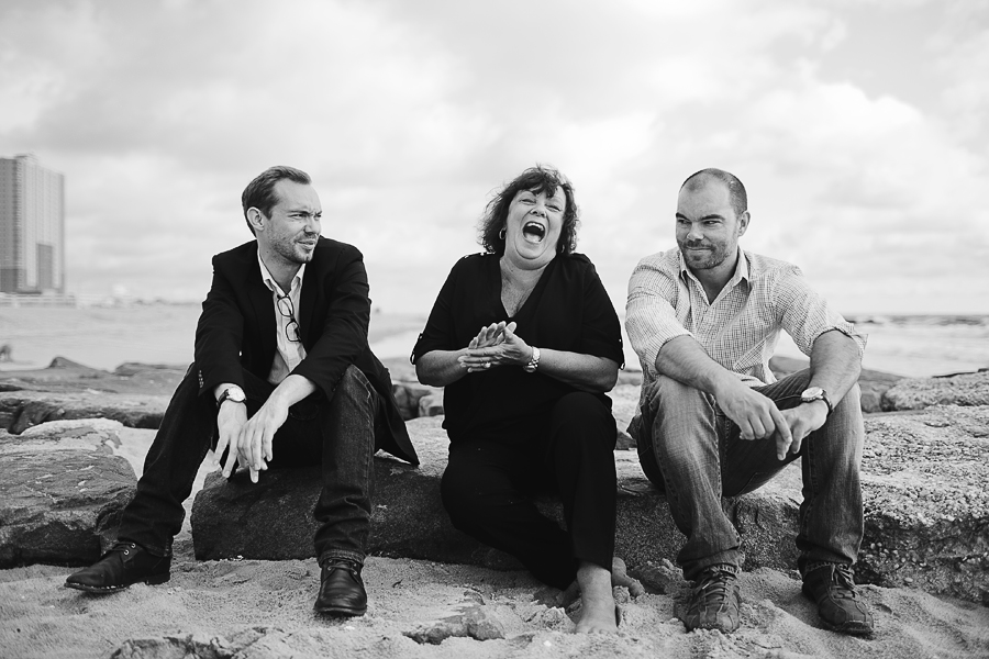
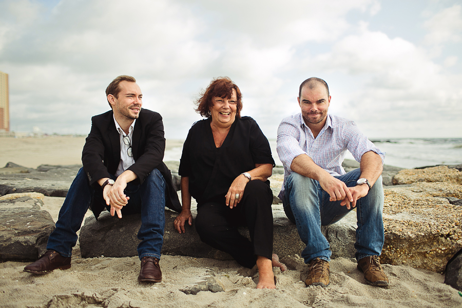
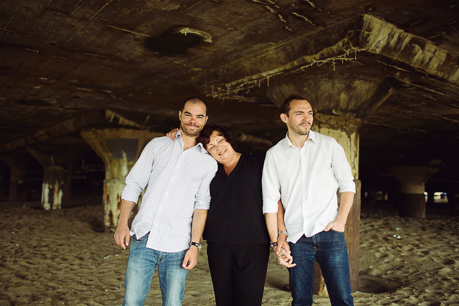
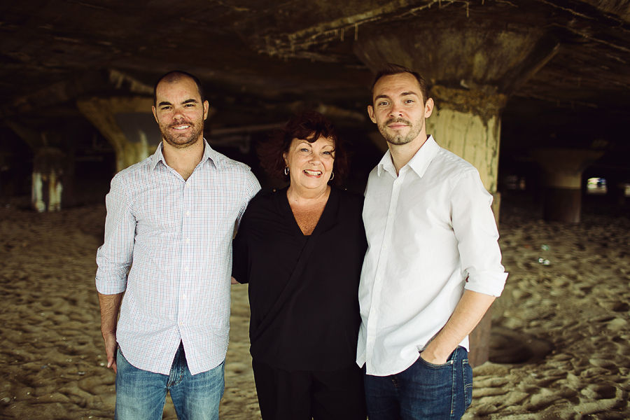
I feel like it's been a while since I've posted in the People forum, and I wanted to share this with all of you. This is not your typical family photo session, but I think that's why I really enjoyed this set. Here's what I captured:

1. 8009565_orig.jpg
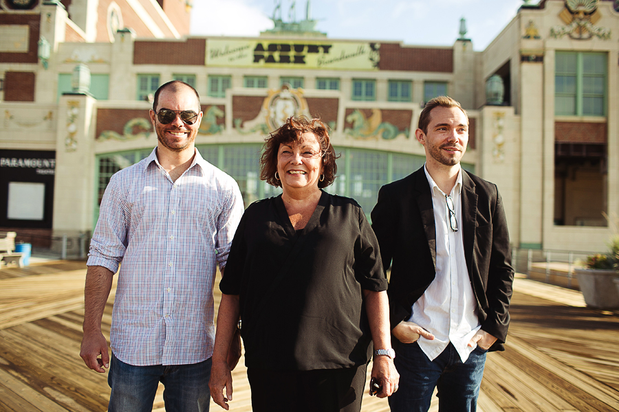
2. 1798490_orig.jpg
3. 9989439_orig.jpg
4. 9246748_orig.jpg
5. 816778_orig.jpg
6. 1253695_orig.jpg
7. 6361695_orig.jpg
8. 1969537_orig.jpg
9. 7803152_orig.jpg
10. 2538143_orig.jpg
11. 124639_orig.jpg
12. 3427504_orig.jpg
13. 9559712_orig.jpg
14. 6144908_orig.jpg
15. 5971697_orig.jpg

There's a few more on the blog. Thanks for viewing :)
wedding portfolio michaelglennphoto.com
fashion portfolio michaelglennfashion.com

Comments

  • jonh68jonh68 Registered Users Posts: 2,711 Major grins
    edited August 24, 2014
    I like it, good balance of background and keeping focus on the subjects. The color photos are nice as well as the BW. Some of the horizons are off but this gives the photographic version of shaky cam in movies and tv for the documentary feel for the shoot.
  • HackboneHackbone Registered Users Posts: 4,027 Major grins
    edited August 24, 2014
    Being a traditionalist these are not my cup of tea but.......12-14 and 15 are just exceptional!!!!
  • D3SshooterD3Sshooter Registered Users Posts: 1,188 Major grins
    edited August 25, 2014
    It certainly has some appeal, and the fact that the 3 are repeated in each picture creates a red line through the story. But the repetition makes it not that interesting to look at, it's kind of more of the same. Sure the people on the picture will love it, as they remember that great day , but we don't. Being and "old shool" photogarpher, I have an issue with falling lines, and I see in almost all the pictures that the camera was tilted ,not horizontal or both. That creates lines (doors,pillars etc…) that are not parallel the plane. That also means that your models are subject to the same deformation.
    But then again, it might be your style of working . So why not. This was just my view.
    A photographer without a style, is like a pub without beer
  • FoquesFoques Registered Users Posts: 1,951 Major grins
    edited August 25, 2014
    Hackbone wrote: »
    Being a traditionalist these are not my cup of tea but.......12-14 and 15 are just exceptional!!!!

    this.

    the very first one bugs me to no end with the crooked background :)

    1-10 look like a good posters for a mob TV show where the mob is run by the matriarch and her two sons..rolleyes1.gif
    Arseny - the too honest guy.
    My Site
    My Facebook
  • michaelglennmichaelglenn Registered Users Posts: 442 Major grins
    edited August 27, 2014
    jonh68 wrote: »
    I like it, good balance of background and keeping focus on the subjects. The color photos are nice as well as the BW. Some of the horizons are off but this gives the photographic version of shaky cam in movies and tv for the documentary feel for the shoot.

    Thanks John! I always tilt..it's a serious problem, but I've grown to accept it. A lot of it has to do with my photojournalistic style. I'm more concerned about capturing expressions than I am about perfect horizons. I do try to fix the ones that are too much of an eye sore though thumb.gif
    Hackbone wrote: »
    Being a traditionalist these are not my cup of tea but.......12-14 and 15 are just exceptional!!!!

    I know this set will be hit or miss for some photogs. It's not traditional by any means, but I'm glad you appreciate the last few frames!
    D3Sshooter wrote: »
    It certainly has some appeal, and the fact that the 3 are repeated in each picture creates a red line through the story. But the repetition makes it not that interesting to look at, it's kind of more of the same. Sure the people on the picture will love it, as they remember that great day , but we don't. Being and "old shool" photogarpher, I have an issue with falling lines, and I see in almost all the pictures that the camera was tilted ,not horizontal or both. That creates lines (doors,pillars etc…) that are not parallel the plane. That also means that your models are subject to the same deformation.
    But then again, it might be your style of working . So why not. This was just my view.

    I understand how you'd have a problem with the falling lines and crooked horizons. Also, I know this shoot has much more of a modern feel, so I totally understand those nits being a problem. The crooked horizons have become part of my style, but I do try to correct ones that become very distracting in my eyes.

    I'm not sure if I agree that the photos come off as boring or too repetitive though. I kept the family in the same order because I wanted the main focus to be the mother with her boys. This shoot happened to be her birthday present. But I tried to keep it interesting by switching up locations and mixing in PJ work as well as portraits.
    Foques wrote:
    the very first one bugs me to no end with the crooked background :)

    1-10 look like a good posters for a mob TV show where the mob is run by the matriarch and her two sons..

    Laughing.gif. I'm going to have to agree entirely that they are part of the mob. Thank god they liked the images, as I can't afford to have a finger chopped off! rolleyes1.gif
    wedding portfolio michaelglennphoto.com
    fashion portfolio michaelglennfashion.com
Sign In or Register to comment.