Paradox of Crestone

hstrynrdhstrynrd Registered Users Posts: 122 Major grins
edited January 18, 2015 in Street and Documentary
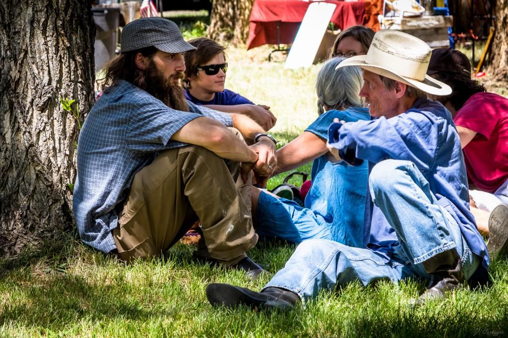
Back on 4 July we went to the annual parade at the town of Crestone, CO. I thought this image captured the two sides of this mountain town that tends to be a little eclectic. I called it "Hippie and the Cowboy." C&C welcome and appreciated.

1.
cowboyandthehippie-2625_zps38a70433.jpg

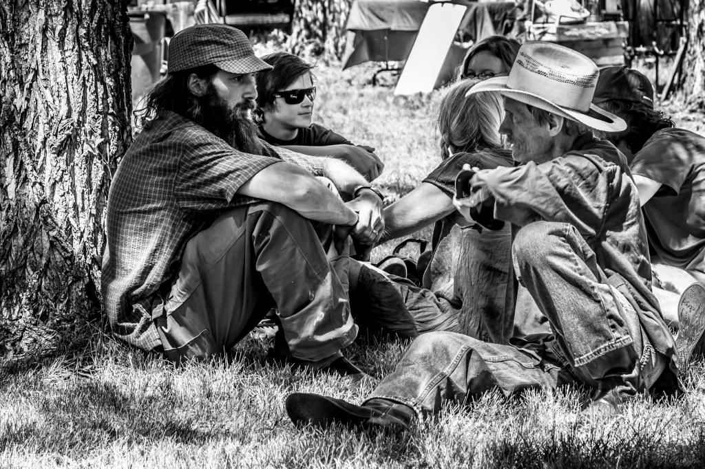
2. Attempted a b/w conversion in Lightroom to see if it worked better.
cowboyandthehippiebw-2625_zpsa09493fc.jpg

Comments

  • The Lazy DestroyerThe Lazy Destroyer Registered Users Posts: 127 Major grins
    edited January 14, 2015
    I think this was a good catch for a subject, looks like a really cool moment between the two and the look of "hippie" makes it. The people in the immediate background are a bit distracting but probably not something you could have avoided. I wonder if a shot from a little further left (isolating the guy on the left) would have worked. For this image I like the color version better. Since there is a bit going on behind them it helps to visually isolate the subjects, for me at least.
    ____Motoception Photography____
    www.motoception.com
  • hstrynrdhstrynrd Registered Users Posts: 122 Major grins
    edited January 14, 2015
    I think this was a good catch for a subject, looks like a really cool moment between the two and the look of "hippie" makes it. The people in the immediate background are a bit distracting but probably not something you could have avoided. I wonder if a shot from a little further left (isolating the guy on the left) would have worked. For this image I like the color version better. Since there is a bit going on behind them it helps to visually isolate the subjects, for me at least.

    Thanks for the feedback. I agree that the people in the background are distracting and wasn't sure what to do about it when I took the picture. I still have to get better with framing an image, but I'm glad the juxtaposition of these two came across for you.
  • KMCCKMCC Registered Users Posts: 717 Major grins
    edited January 17, 2015
    I generally use B&W for my street photography, but while both of these work; I think I like the color version of this one more. The colors just seem to make this shot more appealing.

    Kent
    "Not everybody trusts paintings, but people believe photographs."- Ansel Adams
    Web site
  • hstrynrdhstrynrd Registered Users Posts: 122 Major grins
    edited January 17, 2015
    KMCC wrote: »
    I generally use B&W for my street photography, but while both of these work; I think I like the color version of this one more. The colors just seem to make this shot more appealing.

    Thanks for the feedback!
  • puzzledpaulpuzzledpaul Registered Users Posts: 1,621 Major grins
    edited January 18, 2015
    hstrynrd wrote: »
    .... I thought this image captured the two sides of this mountain town that tends to be a little eclectic....

    [/IMG]

    I'd agree.

    Not really my area of interest, but several comments anyway

    The other people in the bkgd don't really bother me ... if the 2 main subjects had been on their own, (also with a 'clean' bkgd) it would've been a totally different shot and 'feel' ... almost a setup / posed shot?

    I wonder if you've considered cropping a bit off the tree ... and (for preserving aspect ratio?) a bit off the bottom ... is all of the cowboy's right boot really needed in frame anyway?

    For me, a major issue with the colour version is the 2 areas of red, which tend to 'pull the eye', but the bkgd 'problem' that's common to both, but worse with the BW (imo) is the angled object that's acting as a reflector - dunno if anything can be done about this?

    Interesting that the BW version has provided some ground detail around this object, compared with the col. version.

    pp
  • hstrynrdhstrynrd Registered Users Posts: 122 Major grins
    edited January 18, 2015
    I'd agree.

    Not really my area of interest, but several comments anyway

    The other people in the bkgd don't really bother me ... if the 2 main subjects had been on their own, (also with a 'clean' bkgd) it would've been a totally different shot and 'feel' ... almost a setup / posed shot?

    I wonder if you've considered cropping a bit off the tree ... and (for preserving aspect ratio?) a bit off the bottom ... is all of the cowboy's right boot really needed in frame anyway?

    For me, a major issue with the colour version is the 2 areas of red, which tend to 'pull the eye', but the bkgd 'problem' that's common to both, but worse with the BW (imo) is the angled object that's acting as a reflector - dunno if anything can be done about this?

    Interesting that the BW version has provided some ground detail around this object, compared with the col. version.

    pp

    Thanks for looking. Definitely some things for me to be aware of in the future.
Sign In or Register to comment.