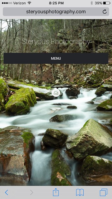
Mobile Display for 'Menu' and Instagram icon
Good evening...
I've recently done a design refresh on my website, and for the most part have things the way I want them on the desktop version. However, for the mobile version I have two questions.
1. Is there a way to make the Instagram icon appear at the bottom?
2. And also is there any way to change how the 'Menu' is displayed. You can see that it is currently showing up as a black bar that stretches across the screen and obscures the main page.
Website is www.steryousphotography.com
I've included a pic just to make it easy...
Thanks,
Kenton

0
Comments
I just spent the past few days redesigning my website and ran into the exact same requirement you ask about. The smug mug.com website has a small menu icon on their mobile site, however smug mug.com was not built using the same customizer that Smugmug's customers use.
I was told just now by Smugmug to check this site for advice. If you find the answer, please let me know. I will do the same for you.
Jeff Vogan
SPORTDAD Sports Photography
www.sportdad.ca
You would have to use some CSS to move your instagram-icon further down...
Let me see...this should do the trick, I think:
@media only screen and (max-height: 500px) {
    .sm-page-widget-social-links .sm-fonticon{
         margin-top: 200px !important;
    }
}
@media only screen and (min-height: 501px )  and (max-height: 640px){
    .sm-page-widget-social-links .sm-fonticon{
         margin-top: 350px !important;
    }
}
For your menu, well you could change the color of that bar, either going completely transparent or choosing a different a little less "heavy" color with this kind of CSS:
.sm-page-widget-nav .sm-page-widget-nav-mobile .sm-page-widget-nav-mobile-header{
background-color: transparent !important;
/* then you'll get no color but a transparent background. if you want a color you could specify one by using rgba(red_value, green_value, blue_value, alpha value), where the alpha_value would define the opacity between 0 and 1 and the red_- green_- and blue_value would have to be specified between 0 and 255), instead of the "transparent"-keyword*/
}
Good luck
Lille Ulven
I'd suggest turning off "collapse for mobile" in the menu settings:
Since there's nothing else on your homepage, there's no reason to make visitors take the extra step of pressing the menu button.
Dave
I don't know what options there are for seriously re-vamping it, but at least I have this, to adapt the color and border:
.sm-user-ui .sm-page-widget-nav-mobile .sm-page-widget-nav-mobile-header {
box-shadow: 0px 0px 6px 0px #000000;
background-color: transparent;
    }
I believe one can also change the text inside, but I haven't figure that out. So Menu might be replaced with "Click Here for Menu"? I think...