On the Drive Home

Colorado CJColorado CJ Registered Users Posts: 155 Major grins
edited March 15, 2016 in Landscapes
I spent the day doing one of my other hobbies down in Denver (FPV Racing). On the way back home, the light was kind of nice and I happened to have a new little camera with me to take a few quick photos.

Shot with a DP2 Merrill

25517259466_b01ae81e37_o.jpgOld Homestead 1 by Andrew Marjama, on Flickr
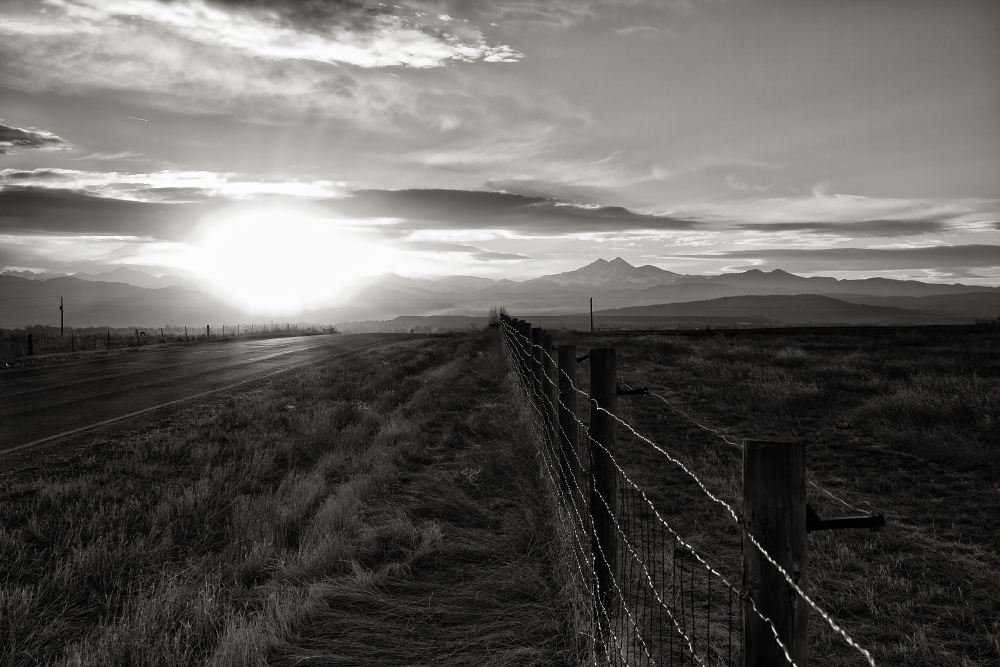
25247761600_30612bf0aa_o.jpgFence Line by Andrew Marjama, on Flickr

24912838084_2fedd06198_o.jpgOld Homestead 2 by Andrew Marjama, on Flickr

25450656101_7e0670825d_o.jpgHay Bales by Andrew Marjama, on Flickr

Comments

  • StumblebumStumblebum Registered Users Posts: 8,480 Major grins
    edited March 6, 2016
    Nice! #3 is super and #1 is nice too.
    I wish the sun in #2 had not gotten as hot...it happens...then that would be my favorite.
    Cheers!
  • EaracheEarache Registered Users Posts: 3,533 Major grins
    edited March 6, 2016
    Stumblebum wrote: »
    Nice! #3 is super and #1 is nice too.
    I wish the sun in #2 had not gotten as hot...it happens...then that would be my favorite.
    Cheers!
    Agree on #3 - nicely captures the austerity of the location.
    What differs on #3, is that it more conforms to the rule of composition that recommends avoiding a centered horizon (or apparent horizon)...
    The equal areas of sky and land in the other images jumped out at me... though, it might be something only photogs would consciously notice.
    Eric ~ Smugmug
  • StumblebumStumblebum Registered Users Posts: 8,480 Major grins
    edited March 6, 2016
    Earache wrote: »
    Agree on #3 - nicely captures the austerity of the location.
    What differs on #3, is that it more conforms to the rule of composition that recommends avoiding a centered horizon (or apparent horizon)...
    The equal areas of sky and land in the other images jumped out at me... though, it might be something only photogs would consciously notice.

    thumb.gifthumbthumb.gif
  • sarasphotossarasphotos Registered Users Posts: 3,863 Major grins
    edited March 6, 2016
    I love the mood you've captured here. #3 is my favorite too and I think Eric is spot on in his reasoning.

    Cheers, Sara
  • bocoboco Registered Users Posts: 710 Major grins
    edited March 7, 2016
  • EiaEia Registered Users Posts: 3,627 Major grins
    edited March 7, 2016
    #2 is my favorite with composition and b/w conversion. Agree that the sun is really too blown. I wonder if attempting to crop it would make a difference? I like the last one too! Those darn rules.... I like to think of principles! These are all very fine scenes regardless.
  • fool4thecityfool4thecity Registered Users Posts: 632 Major grins
    edited March 15, 2016
    Great capture of beautiful light!
Sign In or Register to comment.