Stepping up my game in 2016

Dooginfif20Dooginfif20 Registered Users Posts: 845 Major grins
edited June 15, 2016 in People
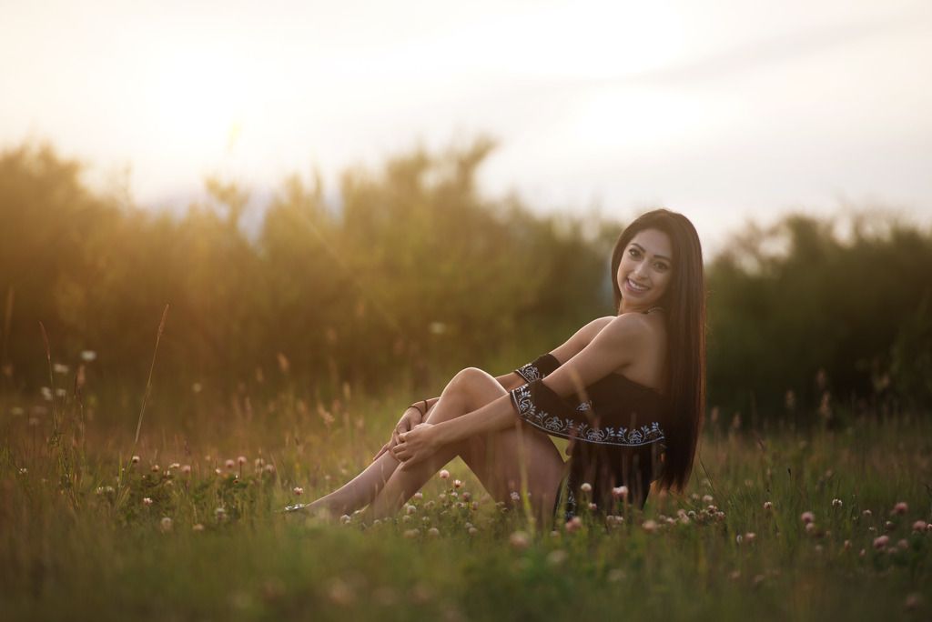
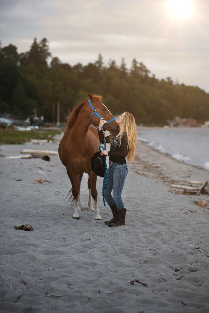
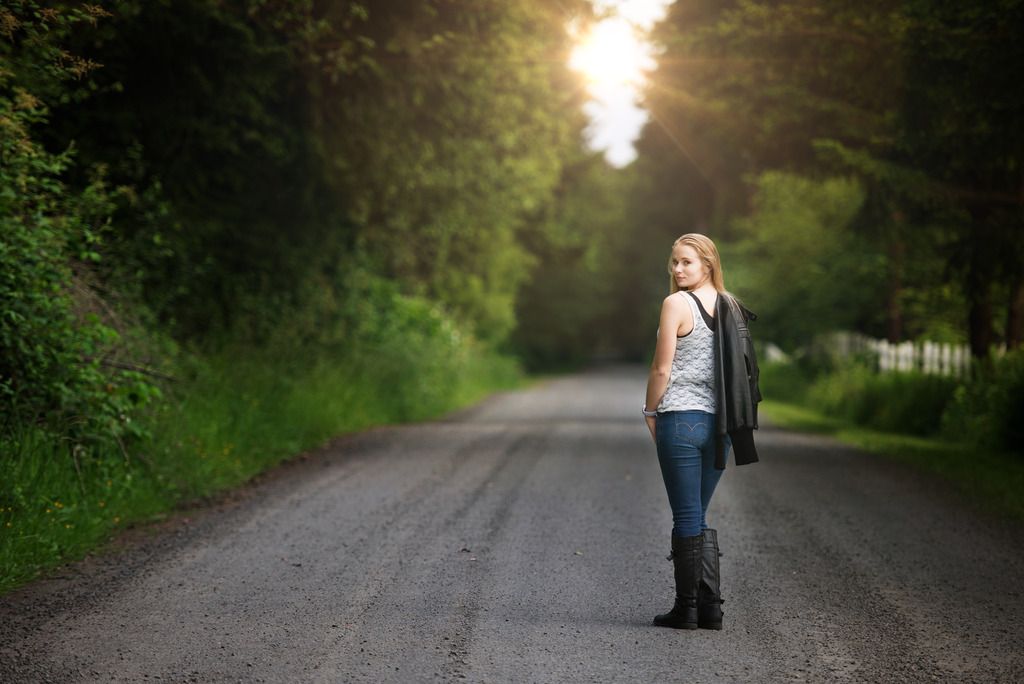
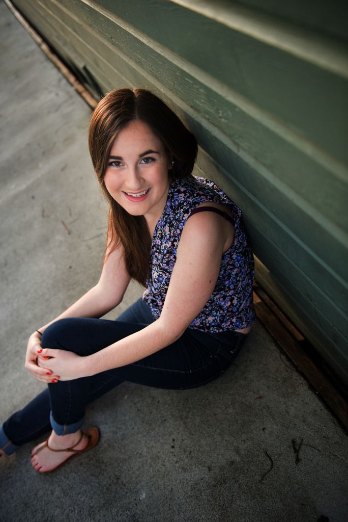
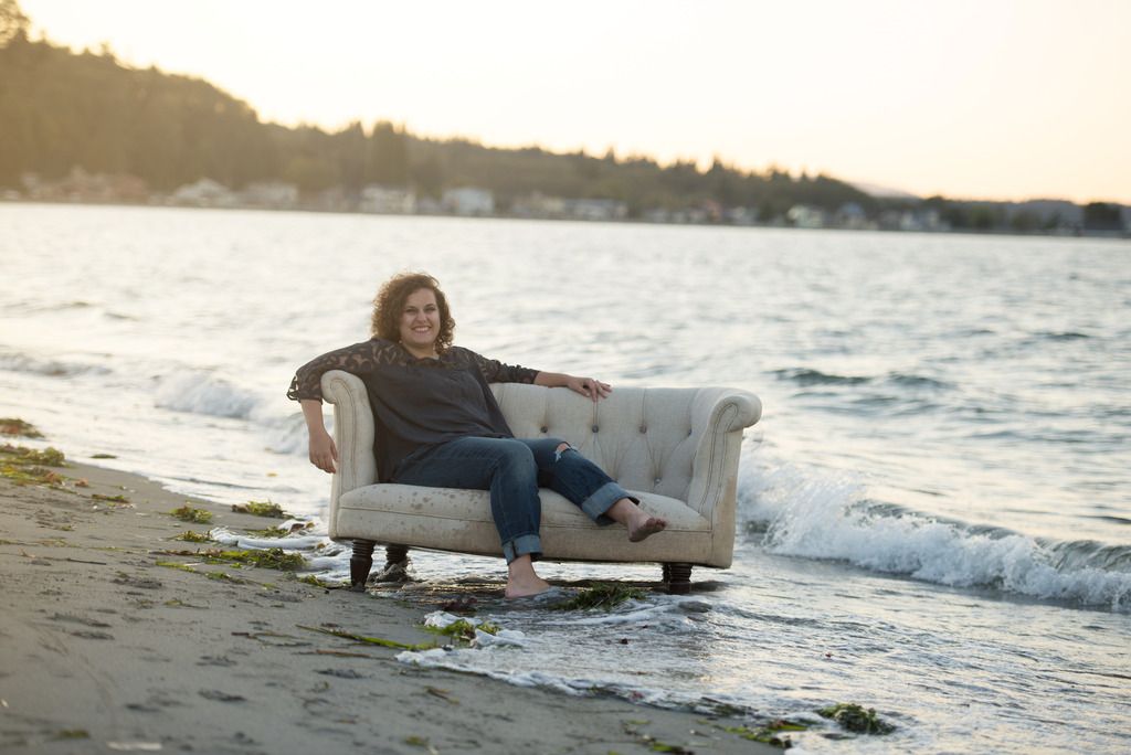
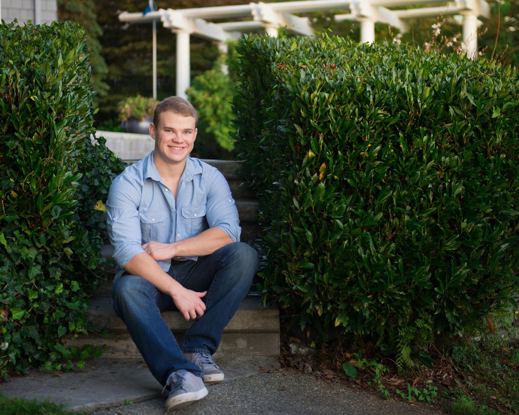
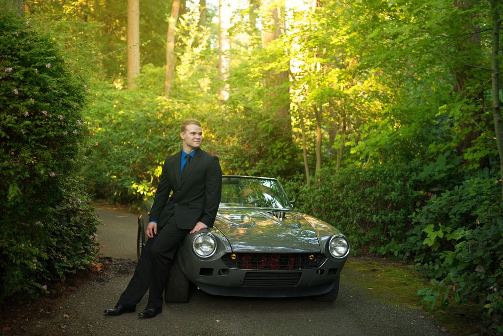
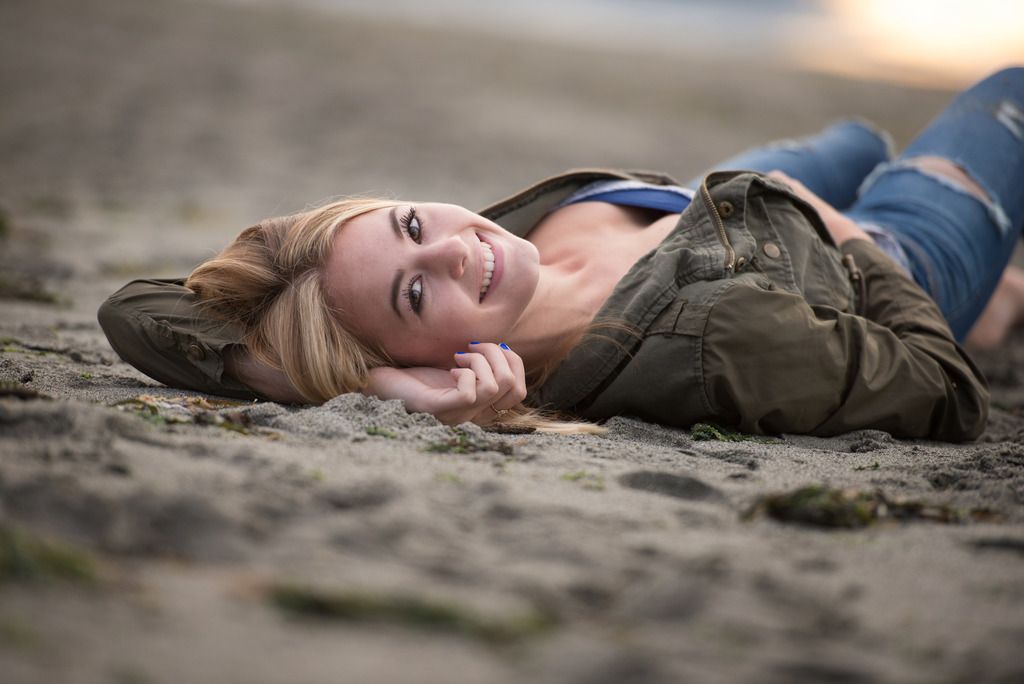
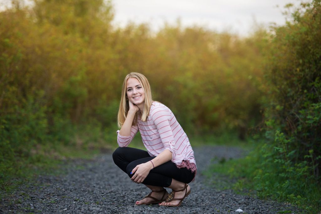
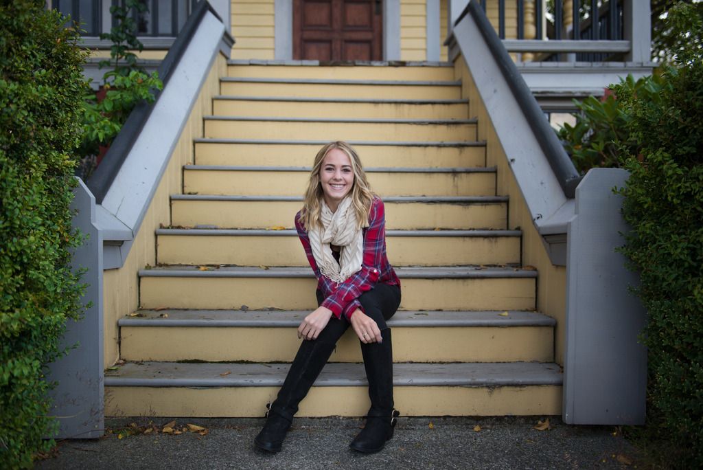
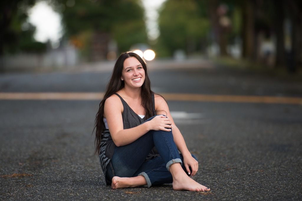
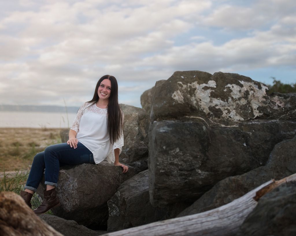
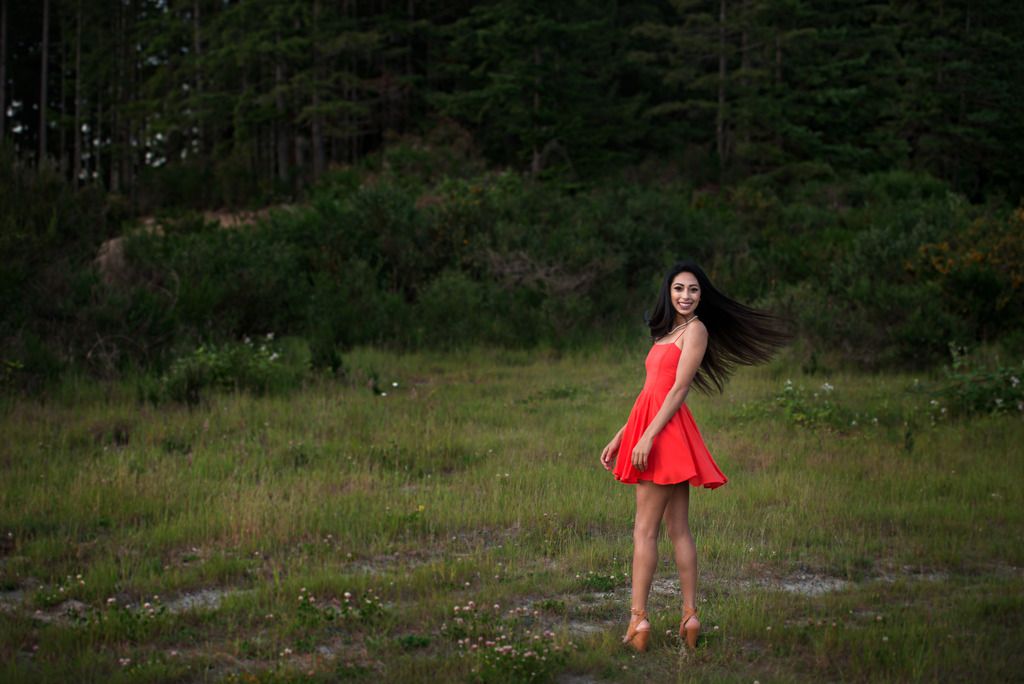
I don't know if many of you know me well enough to know really how far I have come, but the last two years I have been working on what I would call my style and this year I think I have concreted that! Due to the crash of an external hard drive I can't share with you stuff I shot when I started in 2008, but I can share with you stuff from this year! Lemme know what you think!
13140732_10154938061679569_1578488714_n_zpsndtilatb.jpg

DSC_7806_zps14uc0tan.jpg

DSC_7714_zpsr5ykyfk8.jpg

DSC_7553_zpsmqi4efmc.jpg

DSC_7376_zpsmrlkwijl.jpg

DSC_7266_zpspbkhwfzy.jpg

DSC_5080_zpsdqigqecf.jpg

DSC_2317ed_zpsacdni2tf.jpg

DSC_8465ed_zps7lnglkfe.jpg

DSC_8160ed_zpswiqx1oum.jpg

DSC_6784ed_zpslj5ldrom.jpg

DSC_6696ed_zpskwthki13.jpg

DSC_6566ed_zpsrnoingdx.jpg

DSC_6433ed_zps8sdemrwu.jpg

DSC_6075ed_zpshninkt6j.jpg

DSC_6204ed_zps5vtahx8m.jpg

DSC_6361ed_zpstwnvilmu.jpg

Comments

  • michaelglennmichaelglenn Registered Users Posts: 442 Major grins
    edited June 11, 2016
    Great stuff man, you're on fire! Expressions are on point as well as the editing and composition. Consistency is key to branding and you definitely got it. Keep it coming.
    wedding portfolio michaelglennphoto.com
    fashion portfolio michaelglennfashion.com
  • reyvee61reyvee61 Registered Users Posts: 1,877 Major grins
    edited June 11, 2016
    Hey there these are all pretty good with so many things done right with the most apparent being times of day so bravo to you.
    So I'm going to nit pick but mind you they're minor improvements to my eyes.
    So here goes:
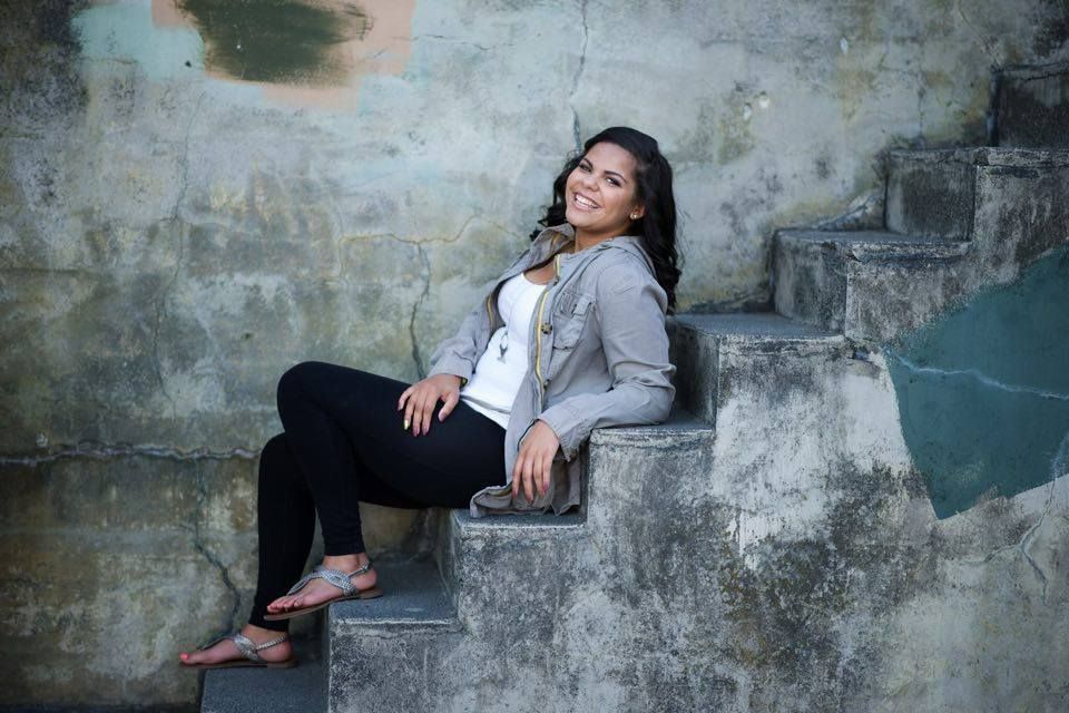
    #1 The subject is too static (center) for my taste and the rectangle paint spot (graffiti cover-up?) right of the frame just pulls my eyes enough away from the subject to distract.
    #4 The shore power cord bottom left of the frame is a bit distracting as well to my eyes.
    #7 Missing right foot just doesn't feel right especially where it's cropped to my eyes.
    #10 Horizon tilt (my pet peeve unless it's part of the story)
    #17 To my eyes composition is just a bit odd.

    Again very nice work overall
    I wish some of these were mine TBH :)
    Yo soy Reynaldo
  • Dooginfif20Dooginfif20 Registered Users Posts: 845 Major grins
    edited June 11, 2016
    Great stuff man, you're on fire! Expressions are on point as well as the editing and composition. Consistency is key to branding and you definitely got it. Keep it coming.


    Thanks Mike! That was my biggest focus this year was to be consisten! Thanks for the kind words!
  • Dooginfif20Dooginfif20 Registered Users Posts: 845 Major grins
    edited June 11, 2016
    reyvee61 wrote: »
    Hey there these are all pretty good with so many things done right with the most apparent being times of day so bravo to you.
    So I'm going to nit pick but mind you they're minor improvements to my eyes.
    So here goes:
    #1 The subject is too static (center) for my taste and the rectangle paint spot (graffiti cover-up?) right of the frame just pulls my eyes enough away from the subject to distract.
    #4 The shore power cord bottom left of the frame is a bit distracting as well to my eyes.
    #7 Missing right foot just doesn't feel right especially where it's cropped to my eyes.
    #10 Horizon tilt (my pet peeve unless it's part of the story)
    #17 To my eyes composition is just a bit odd.

    Again very nice work overall
    I wish some of these were mine TBH :)

    Rey thanks for the feedback! All of your feedback (with exception of #1) were all things that crossed my mind, but decided they weren't big enough to worry about. The horizon in the one is off (and it's a huge pet peeve of mine as well) but for some reason it looked off when I made it straight. #1 graffiti and paint kind of tells the story of location as it is an old WWII bunker that has gone through its times of vandalism only to receive funding to "fix" it. I really appreciate the feedback as I am really taking in as much as possible to continue to grow. Honestly I wish I could show some stuff for when I started as it was horrible compared to this!
  • reyvee61reyvee61 Registered Users Posts: 1,877 Major grins
    edited June 15, 2016
    Rey thanks for the feedback! All of your feedback (with exception of #1) were all things that crossed my mind, but decided they weren't big enough to worry about. The horizon in the one is off (and it's a huge pet peeve of mine as well) but for some reason it looked off when I made it straight. #1 graffiti and paint kind of tells the story of location as it is an old WWII bunker that has gone through its times of vandalism only to receive funding to "fix" it. I really appreciate the feedback as I am really taking in as much as possible to continue to grow. Honestly I wish I could show some stuff for when I started as it was horrible compared to this!

    Feedback is always great and I'm happy you received this well.
    Trust me I'm working on improving every time I go out to shoot.
    Yo soy Reynaldo
Sign In or Register to comment.