Ch61 (Wave 1):Buildings
any of these grab you?
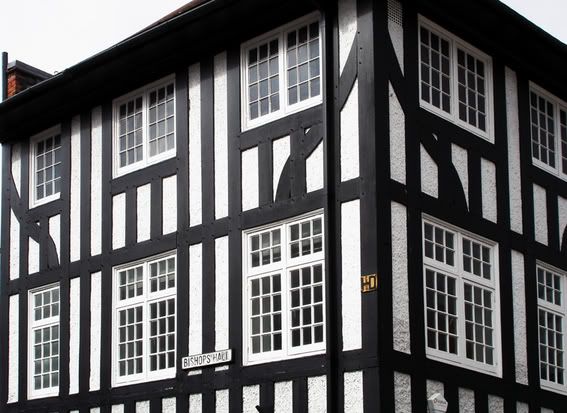
The yellow "HD" sign is for hydrant, for the fire brigade.
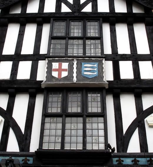
The three fishes is the town symbol
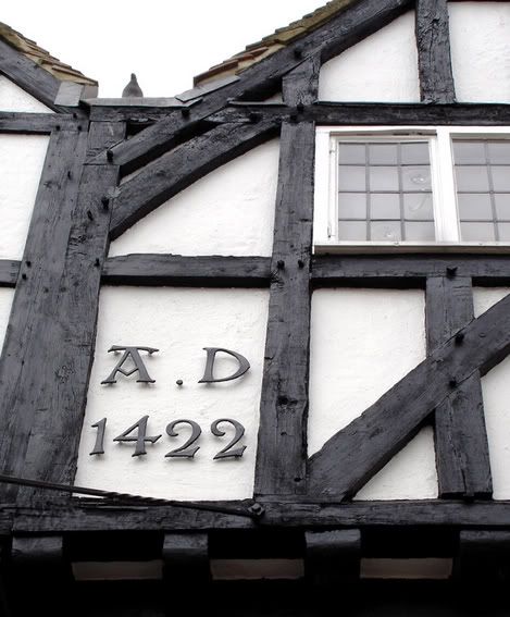
Yes, the building could well be 500years old but more than likely it's been modified & extended beyond all recognition.

Although the lens on my cam is, well, er, 'poor' these buildings really are not straight.
I have another 3-4 shots but not of buildings so I'll post those at a later date.
Fire away - I can take it.
The yellow "HD" sign is for hydrant, for the fire brigade.
The three fishes is the town symbol
Yes, the building could well be 500years old but more than likely it's been modified & extended beyond all recognition.
Although the lens on my cam is, well, er, 'poor' these buildings really are not straight.
I have another 3-4 shots but not of buildings so I'll post those at a later date.
Fire away - I can take it.
0
Comments
Interesting shots
I knew, of course, that trees and plants had roots, stems, bark, branches and foliage that reached up toward the light. But I was coming to realize that the real magician was light itself.
Edward Steichen
Just a thought.
Moderator of: Location, Location, Location , Mind Your Own Business & Other Cool Shots
I'd say #1 is the most "grabbing". Maybe reshoot/reframe a bit?
That street is quite narrow, so a straight pic would be hard & I may not have time to reshoot this week. I'll try a tighter crop.
Richard, I'd say from this set that one is also may fav., I wanted to boost the red in the tiles but considered that not to be in the spirit of this challenge.
thanks for you thoughts.
Adrian
my stuff is here.....