ch61 (wave 2):4 very different ones

adrian_kadrian_k Registered Users Posts: 557 Major grins
edited March 28, 2006 in The Dgrin Challenges
which one is your fav.?
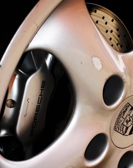
another building.
DSC00250new.jpg

an expensive mistake :uhoh
DSC00268a.jpg

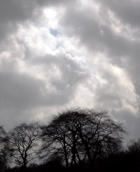
blue sky at last:clap .
DSC00314.jpg

don't often see these guys, so I made the most of it so I have *loads*
I had to shoot this at iso200 - which gives about the same noise as 3200 from a dslr. No colour here, just the blue/grey on the wings.
DSC00291.jpg

no colour adgjustments, just cropping and white/black point.
-=-=-=-=-=-=-=-=-=-=-=-=-=-=-=-=-=-=-=-=-=-=-=-=
Adrian
my stuff is here.....

Comments

  • ultravoxultravox Registered Users Posts: 776 Major grins
    edited March 27, 2006
    #1 i's ok, #2 expensive indeed but will not fit on ch.61, #3 closer to ch.61 but nothing more, #4 I am looking to a true B&W shot?ne_nau.gif whereis the color hint?
    On a personal level, #4 is my favorite, it is clean & nice.thumb.gif
    Cristian.
    [SIZE=-1]It's nice to be important, but it's more important to be nice. - John Lennon.[/SIZE]
  • RichardRichard Administrators, Vanilla Admin Posts: 19,961 moderator
    edited March 27, 2006
    ultravox wrote:
    #1 i's ok, #2 expensive indeed but will not fit on ch.61, #3 closer to ch.61 but nothing more, #4 I am looking to a true B&W shot?ne_nau.gif whereis the color hint?
    On a personal level, #4 is my favorite, it is clean & nice.thumb.gif
    15524779-Ti.gif What he said. #3 is the closest to the challenge but #4 is the best pic. Don't know about you, but this challenge is driving me nuts. :bash
  • saurorasaurora Registered Users Posts: 4,320 Major grins
    edited March 28, 2006
    Am I mistaken or does that bird have red on his beak??? It's a little small to see...would you be able to crop it, placing the bird not so dead center - maybe drop him to the bottom left??? A little larger and the color (if it's there!) would show up!!
  • adrian_kadrian_k Registered Users Posts: 557 Major grins
    edited March 28, 2006
    you *are mistaken :D , he's got a black beak. I could airbrush him a red beakmwink.gif.

    The only colour there is the blue/grey on his wings, seems that people are expecting a splodge of primary colour :cry .
    saurora wrote:
    Am I mistaken or does that bird have red on his beak??? It's a little small to see...would you be able to crop it, placing the bird not so dead center - maybe drop him to the bottom left??? A little larger and the color (if it's there!) would show up!!
    -=-=-=-=-=-=-=-=-=-=-=-=-=-=-=-=-=-=-=-=-=-=-=-=
    Adrian
    my stuff is here.....
  • adrian_kadrian_k Registered Users Posts: 557 Major grins
    edited March 28, 2006
    I know what you mean about 1 - it just doesn't work.

    Do you think the colour in 2 & 3 is too subtle? Is that why you say they don't fit.

    ultravox wrote:
    #1 i's ok, #2 expensive indeed but will not fit on ch.61, #3 closer to ch.61 but nothing more, #4 I am looking to a true B&W shot?ne_nau.gif whereis the color hint?
    On a personal level, #4 is my favorite, it is clean & nice.thumb.gif
    -=-=-=-=-=-=-=-=-=-=-=-=-=-=-=-=-=-=-=-=-=-=-=-=
    Adrian
    my stuff is here.....
  • RichardRichard Administrators, Vanilla Admin Posts: 19,961 moderator
    edited March 28, 2006
    adrian_k wrote:
    Do you think the colour in 2 & 3 is too subtle? Is that why you say they don't fit.
    Regarding #2, I would say just the opposite. The first impression is a color pic, not B&W, even though the colors are not highly saturated. #3 seems to be just right...looks B&W at first, then you notice the small patch of blue in the clouds. But it just isn't a compelling image, I'm afraid. ne_nau.gif
  • ultravoxultravox Registered Users Posts: 776 Major grins
    edited March 28, 2006
    15524779-Ti.gif
    Cristian.
    [SIZE=-1]It's nice to be important, but it's more important to be nice. - John Lennon.[/SIZE]
Sign In or Register to comment.