Chapter 5: The Key Is The K (pt 1)
(I would like to thank Rutt for generously allowing me to use two of his images from his Boston Ballet Set.)
This Chapter is all about black—in particular, the Black plate, which, by definition, means it's about CMYK, and about what can happen to your images when you move them into that cranky, misshapen, somewhat deformed color space, translating your pure pixels of clean light into halftone patterns of ink slathered onto paper.
Just for the record, here's what we're talking about:
sRGB
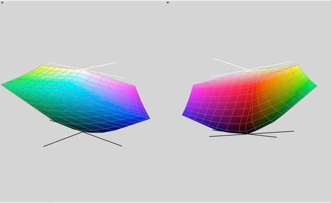
US Web Coated (SWOP) v2
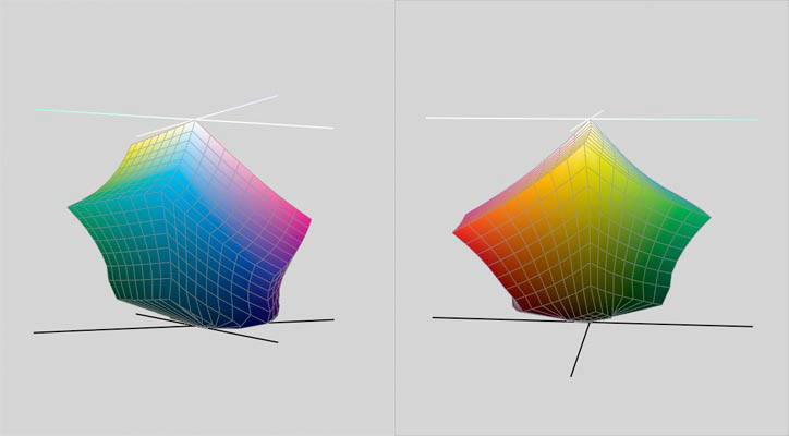
Not pretty, eh? Bright blues, greens and oranges, and most pastels suffer a heavy hit. After the investment in digital equipment, software and technique that allows you to capture the world in all its colorful majesty, why on earth would you want to lose so much of your hard-won gains by wandering into this color space? Simple. If your work is going to be printed at any point, CMYK is the only game in town, and you'll need to learn the rules.
Of course, you could just hand your files over to a "prepress professional" and trust that they'll work it out. You could also give a 15-year old $5,000 and tell him "Spend it wisely." In both cases you would be operating under a wholly unwarranted optimism. Dan refers elsewhere to the collapse of the Prepress industry. Technically that's not correct. Images are still going to press all the time, and, whatever is done to them by way of preparation is, more or less, prepress. What he means is the virtual extinction of dedicated establishments where seasoned pros gathered years of knowledge under one roof and assumed the responsibility for producing files and a proof that a client could sign off on, and that a printer could be reasonably expected to match on press. Those establishments have gone the way of middle-men everywhere, as printers, advertising agencies and magazines have brought their prepress work "in-house". I've worked in the prepress business for nearly two decades and I can state from personal experience that it is all too easy to find prepress departments, in high-end shops, agencies and art departments, that pay no attention whatsoever to the ideas Dan presents. The old-style pros are still out there and, while they may not adhere with numeric precision to all of Dan's suggestions, philosophically they're on the same page. The problem is, you have no idea any more who might end up turning your full-range RGB files into press-ready CMYK files, or what crucial issues might never occur to them.
So if you ever need to send your work to a printer, you'd be well adivsed to take charge of the conversion process, and that means, among other crucial details, mastering the production of the black plate. Elsewhere, Dan will address color-specific issues with ink—the weak nature of Cyan, dot gain compensation, various conversion models and how to shoehorn a large gamut into a smaller one. Here, he deals with the aspect of CMYK that most sets it apart from all other spaces: It contains a fourth channel, black, which is concerned with shadows only. In theory, at least, it contains no color information; in practice it takes some effort to keep color out of the shadows, and recognizing the problems that can arise with certain kinds of images can save you a lot of trouble at the point where you can least afford it: when the job is ready to run on press.
There are two reasons why the black plate is necessary. One is a due to the impure nature of the C,M and Y inks. In the best of all worlds, these three tints would behave precisely opposite of their RGB cousins, which is to say that equal amounts of each would produce neutral and 100% of each would yield a solid black shadow. Neither is the case. For reasons which will be discussed more fully in later chapters, equal amounts of the three inks produce a neutral that is so warm as to really be a species of red, as this sample of 40C 40M 40Y demonstrates:

This is owing to the particularly weak nature of Cyan, which requires 10% more than M and Y to create a balanced neutral. So, not only will 100% of each ink give a muddy, dark red, it won't be nearly dark enough. Here we see 100% of C, M and Y, compared with a real black.

Thus, the introduction of the black channel, which adds black to the darkest shadow areas, giving them the needed weight and depth. And raising a host of problems not present in RGB.
HOW MUCH?
In RGB or LAB, there's no such thing as "too dark." In virtually all printing environments, however, there is a limit to the amount of ink that can be placed on a sheet of paper. This is called the "ink density" and it's simply the sum of the percentage values of each of the four inks at a given point. Higher quality stock and printing technologies will accept higher densities but with one exception (Graveure printing) there is a limit to what the press can handle. If your image runs over that limit, your job will either get bounced, or the printer will run it anyway and leave you to explain the resulting mud to your client.
Because the maximum ink density is between 280% — 300% for SWOP standard (the standard for most of the work that goes to a press), adding black ink to shadows requires a corresponding reduction in the C, M and Y ink levels. This is handled automatically by Photoshop, but the way that it mixes the inks depends on the conversion settings; there are many ways to get it wrong.
Consider this image [Boston Ballet Fall Gala / 2006. Tai Jimmenez & Carlos Molina in Rudolf Nureyev's "Don Quixote".]
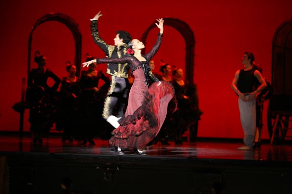
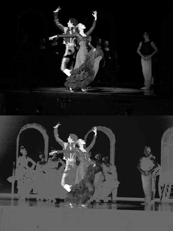
Compare these channels: RGB on top and their CMY equivalents on the bottom.
In the Red/Cyan combination
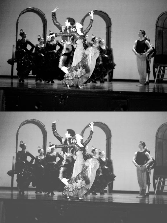
the detail level is similar, but the cyan channel is overall much lighter than it's red counterpart. The black areas stand out due to the lack of cyan in the red background.
In the Magenta/Green combination, and in the blue/yellow pair, we see dramatic evidence of the separation process.
Green/Magenta
Blue/Yellow
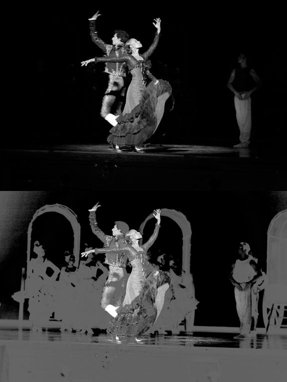
In both examples, all areas that read as black in the RGB image have had their magenta and yellow values clipped. In order to create these darkest shadows, CMY values are reduced and the the information that has been taken out is transferred to the black plate, shown here.
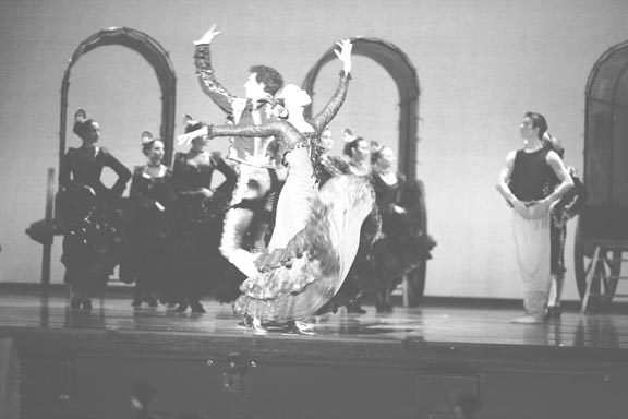
In this black plate, everywhere you see detail, a corresponding amount of ink has been removed from the three color plates, the darkest areas representing the greatest degree of substitution. Note In the background wall, and her dress, both areas of distinct color, there is almost no substitution.
This process is called Grey Component Removal, otherwise known as GCR and we have a wide degree of flexibility in the amount of black that we substitute for the grey component in the other three channels. The crucial question: how much is enough, how much is too much. Dan's precise answer, one which he likes to use often: "It depends."
CONVERSION SETTINGS
In order to custom design the black plate, we will need to gain control over the various parameters that govern the conversion process. The trick here is to not trust Photoshop's default profile for CMYK— US Web Coated (SWOP) v2. We can only see an approximation of this profile, by the way; the actual profile is not editable. The one that we are going to create, however, will be.
We use the command Edit > Convert to Profile in CS2, Image > Mode > Convert to Profile in CS1 and earlier versions. Assuming you haven't changed Photoshop's default color settings, this is what the first dialogue box will look like.
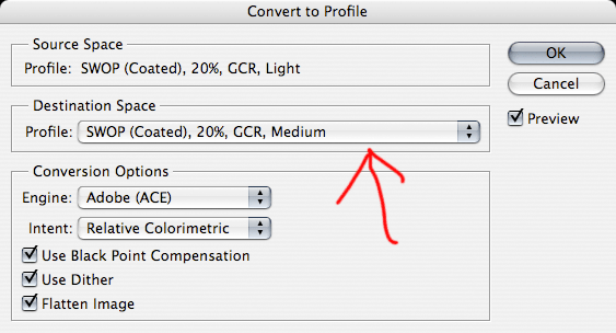
Click on the drop-down menu that is indicated, and you will see a listing of every profile that is available in your system, including custom profiles you might load from third-party sources, or ones you create yourself. Select Custom CMYK.
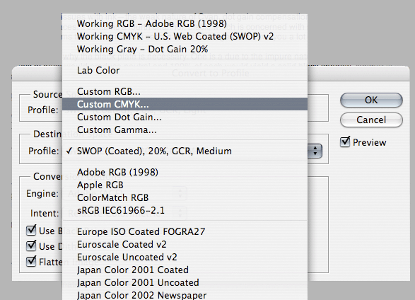
Now we get to the good stuff.
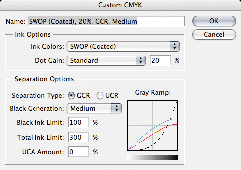
This is the window in which you will set the parameters for your image conversion. Note: As mentioned, the default profile, US Web Coated (SWOP) v2 can't be edited. The values in this window are actually the Photoshop 5 defaults. For the moment we'll just discuss the different parameters and explain Dan's own preferences; later, we'll actually save those settings as an alternate profile that you can call up with the Convert To Profile command.There are a number of ways to create a CMYK image from an RGB or LAB original, and each method can be codified in a profile and used as the situation warrants.
Ink Colors: default is SWOP Coated. The other two options that you will most likely encounter are SWOP Uncoated, and SWOP Newsprint. Dan doesn't spend a lot of time on this option other than to point out that if you are printing to newsprint, it makes sense to set this to SWOP Newsprint.
Dot Gain: This will be covered in detail in later chapters. It refers to the tendency of halftone dots of ink to spread when they hit paper; a larger dot means a darker tint. For this default setting, Photoshop assumes the image will become 20% darker, particiularly in the 1/4 to 3/4 range, and it performs an automatic lightening compensation. The relevance to this chapter is that the effect is far more pronounced in the black plate than the other three. In other words, if you underestimate the dot gain of your black ink, you will notice it at once, and it won't be pretty. (Note that this value is connected to the Ink Colors setting. SWOP Newsprint will cause the Dot Gain to jump to 30%. This is due to the really lousy quality of Newsprint, which causes much greater ink spead.)
Separation Options
GCR: the aforementioned Grey Component Removal. This cannot be deselected, since it is precisely the process that the entire conversion is designed to accomplish. We can only manipulate the degree to which it is implemented. The option to the right—UCR—is simply a version of the same process, though, in this case, the initials stand for Under Color Removal. Same thing, really.
Black Generation: The options are None, Light, Medium, Heavy and Maximum, and refer to the amount of black that will be substituted for the color neutrals. None will produce an image with only CMY inks. Maximum will suck all color out of shadows and use only black. Dan's contention is that using Photoshop's default of Medium produces a black plate that is too heavy in most circumstances. His recommendation is "Light". Note: If UCR is selected rather than GCR the black plate will be lighter than GCR LIGHT.
Black Ink Limit: This value will set a maximum allowable density for your black plate. Dan calls 100 Black a prescription for mud, and recommends no more than 85%. I've seen anywhere from 80% to 95% in various prepress environments, but in general, there is agreement with Dan that black should not be set at 100%.
Total Ink Limit (Maximum Density or dMax): The sum of the four ink density percentages will not exceed this value. Different print environments have different requirements. Newsprint is such a poor quality stock that the dMax value is usually no greater than 240. High quality stock can take up to 340. Most magazines call for 280—300, and the usual practice is to bring the value in at 280 just to be safe. You don't need to think about it, once you've set it; Photoshop handles the math. In most cases, the shadows will come in 10%—15% lighter than this maximum, giving you a little room to play with black plate adjustments. Keep in mind two things about this value: it is only relevant in dark areas that Photoshop identifies as black. In other areas, such as the background in the ballet image earlier used, the color inks are free to get as heavy as they need to be, since, by definition, all three inks won't be pushing the limits. Also, keep in mind that these values only hold for the actual conversion. Any subsequent color moves can push the numbers in any direction.
UCA: Stands for Undercolor addition. Dan passes quickly over this option, mentioning that in the only instance where it makes sense, there are better options available.
Gray Ramp: This visual graph shows the results of your previous settings. You can learn much about each setting just by watching this graph change. In particular, note the shape of the black curve as you move the Black Generation value from Maximum to none. Also, compare GCR Light with UCR, where black isn't introduced at all unless the values rise above the midpoint. Compare that with the Heavy setting, which allows black to start being introduced in highlights. In this default profile shown, Magenta and Yellow flatten out somewhere between 50% and 60%, Cyan somewhat higher, while black will be allowed to run all the way to 100%, while being totally absent in the lower value range. An RGB file with 0R 0G 0B will produce a black of 63C 53M 51Y 100K. The current US Web Coated (SWOP) v2, which will give a black of 75C 68M 67Y 90K).
But even this creates a black plate that is still too heavy, according to Dan. His recommended set up follows. Later, he will refine his approach to separation specs, but this will get us started:
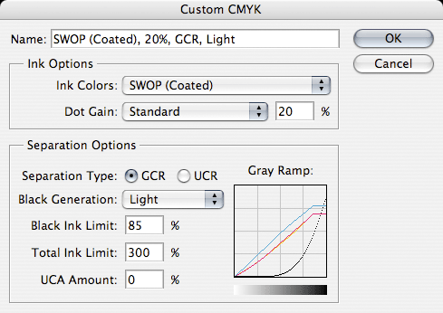
He has changed the GCR from Medium to Light, and the Maximum Black has shifted from 100% to 85%. Note: when you set these values, change the GCR setting first, then the Max Black. If you enter 85% first, then change the GCR, Photoshop will helpfully change your Max Black back to 100% and if you're in a hurry and overlook the switch, you'll negate everything this chapter is about. (This is called learning from someone else's mistake, instead of the way I did it.)
FAKE BLACKS AND REAL BLACKS
Let's see how a workflow might deal with (and take advantage of) the black plate, with this image. [Boston Ballet Fall Gala / 2006. Guest Artist Damian Woetzel in Jerome Robbins' "Suite of Dances".]
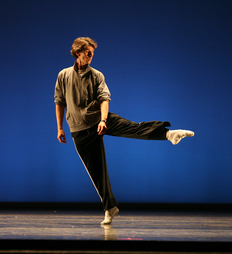
First, let's look at the black plates we produce with three different conversion settings.
First, with the custom defaults,: black at 100% and GCR at medium.
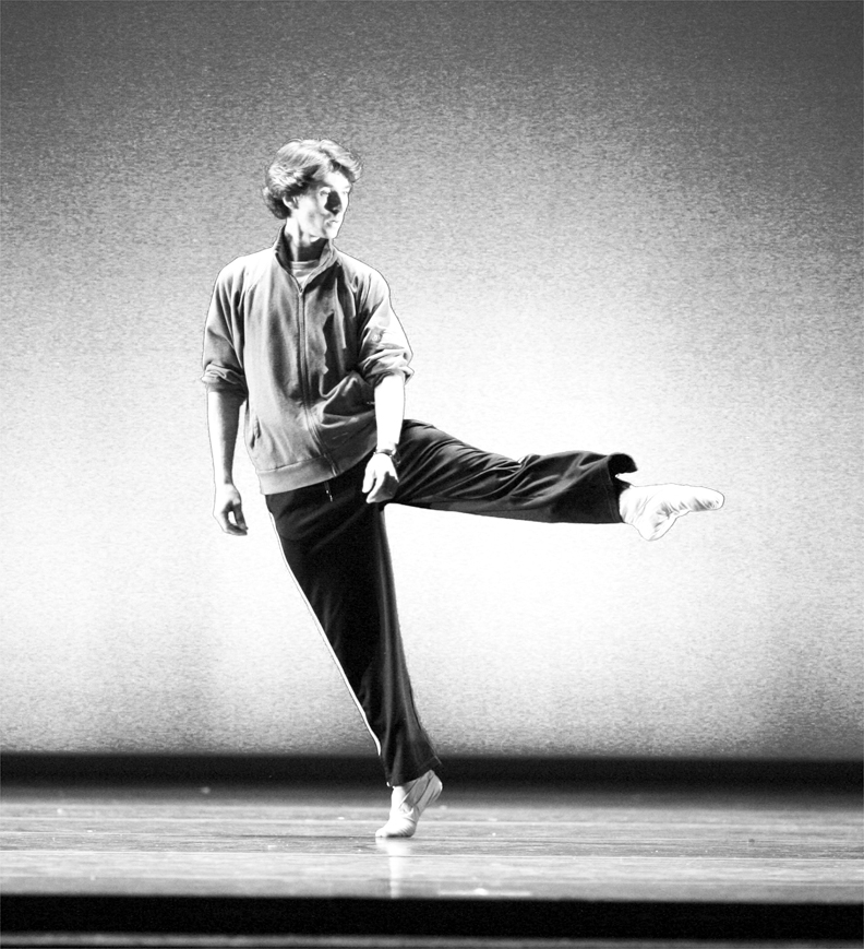
Next, using the current Photoshop default of US Web Coated (SWOP) v2
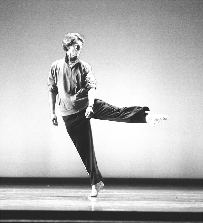
and finally, using Dan's settings.
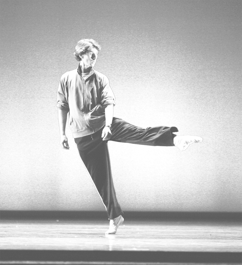
A quick look at a close-up of the original red channel will show why Dan claims CMYK is the best place to deal with the kind of shadow detail we find here.
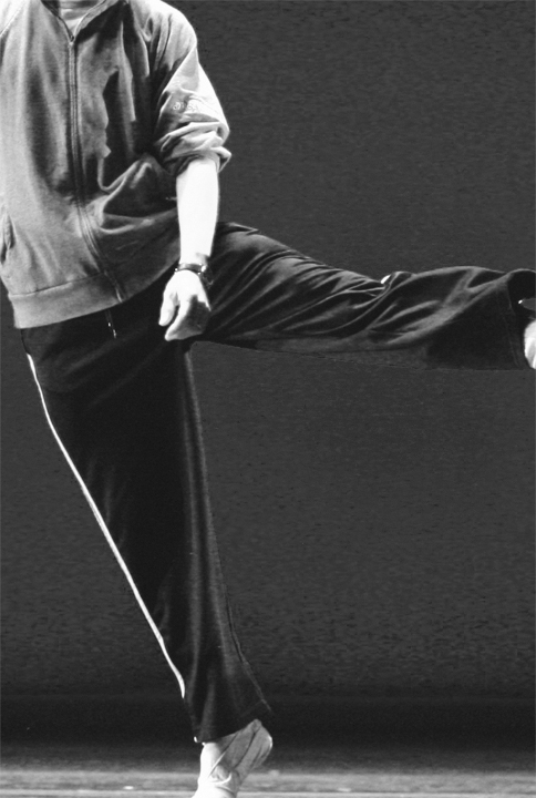
The subtle folds in th e dancer's pants and the inner regions of the shadows in his jersey are pretty much plugged up, as is, and can be expected to print as shapeless blobs. But any attempt to add contrast to those areas will adversely impact the background as well, which falls in the same range.
Looking at the C, M, and Y plates

It's clear that the separation process has obliterated all detail here. It's all been shifted over to the black plate, which will be the focus of our attention.
Here are close-ups of the full image, the default black plate and the black plate generated with Dan't settings.

Taken on their own, the Photoshop default looks to be the more attractive of the two plates: richer, with most of the detail that Dan's plate contains and much deeper shadow. But that's precisely the problem. Coaxing detail out of this area will require increasing the contrast in the black plate which means darkening the darks and lightening the lights. In the default plate, there's almost no room to go any darker. Our contrast curve would have to focus almost exclusively on lightening that area, at the expense of other regions where we don't want the black lightened. If you recall the graph of the grey ramp, a setting of Medium GCR introduces black much earlier in the value range, and those tones, not ordinarily thought of as shadows, would suffer. Dan's black plate has room to push darker in the areas that we most want to add weight, while leaving the lighter areas (and, hence, the rest of the image) alone. And, since Dan's black was generated with a GCR of Light, much more of the lower range of tones is black-free, and immune to our contrast moves.
In the old days, this was pretty much what we had to work with when we needed to bring life to shadow detail. Early editions of Dan's book contain some interesting techniques to create black plates that were intentionally pale, to permit radically steep contrast curves. That approach remains, but, just as Dan's scope has expanded beyond CMYK, so too has Photoshop offered tools that make life easier, or, at least, give us a much better head start before we bring our image into CMYK. Most significant among these developments is the Shadow/Highlight filter, which is a disaster in CMYK (in CS2, anyway; it wouldn't even work with CMYK in CS1), but quite good in RGB and extremely good in LAB (when targeted at the Lightness channel, of course). A quick analysis of this image suggests that along with plugged up shadow detail, it contains a serious yellow cast. It's an open question whether or not this is desired as an esthetic result. For our purposes, we'll assume that it is not. So, before converting to CMYK, we'll take a quick trip into LAB and avail ourselves of a couple of moves that will make our life easier once we reach our destination space.
But wait. Even though we're not yet ready to bring our image into CMYK doesn't mean we can't exploit that space, even before we make the actual conversion. Our first step will be to use the Shadow/ Highlight filter, which must be restricted to the areas that need it without letting the effect spill out into ranges that don't. The tonal range slider usually does this well enough, and Blend-if sliders can also help, but, even with these targeted parameters, the problem is similar to that of master RGB curves trying to target shadows. It's hard to distinguish color areas that might be dark in one or more channel and need to stay that way, from areas of genuine shadow. The solution is simple and effective and it makes use of the subject of this chapter: the black plate in CMYK.
While we could run the Shadow/Highlight filter on the Lightness channel and get a decent result, a couple extra steps makes the process much cleaner. Follow these steps and see if you don't agree. First, dupe the image and convert the copy to CMYK. This image won't be saved or used further; all we want is its black plate. As soon as we steal it, the image will be trashed. But it will have left us with a perfectly structured image of shadow detail and only shadow detail. As color intrudes, the black, of necessity, fades away. While there may not be a black plate in either RGB or CMYK, this offers us the next best thing: a layer mask that targets only those areas that Photoshop deems to be shadows and blacks. (cont...)
This Chapter is all about black—in particular, the Black plate, which, by definition, means it's about CMYK, and about what can happen to your images when you move them into that cranky, misshapen, somewhat deformed color space, translating your pure pixels of clean light into halftone patterns of ink slathered onto paper.
Just for the record, here's what we're talking about:
sRGB

US Web Coated (SWOP) v2

Not pretty, eh? Bright blues, greens and oranges, and most pastels suffer a heavy hit. After the investment in digital equipment, software and technique that allows you to capture the world in all its colorful majesty, why on earth would you want to lose so much of your hard-won gains by wandering into this color space? Simple. If your work is going to be printed at any point, CMYK is the only game in town, and you'll need to learn the rules.
Of course, you could just hand your files over to a "prepress professional" and trust that they'll work it out. You could also give a 15-year old $5,000 and tell him "Spend it wisely." In both cases you would be operating under a wholly unwarranted optimism. Dan refers elsewhere to the collapse of the Prepress industry. Technically that's not correct. Images are still going to press all the time, and, whatever is done to them by way of preparation is, more or less, prepress. What he means is the virtual extinction of dedicated establishments where seasoned pros gathered years of knowledge under one roof and assumed the responsibility for producing files and a proof that a client could sign off on, and that a printer could be reasonably expected to match on press. Those establishments have gone the way of middle-men everywhere, as printers, advertising agencies and magazines have brought their prepress work "in-house". I've worked in the prepress business for nearly two decades and I can state from personal experience that it is all too easy to find prepress departments, in high-end shops, agencies and art departments, that pay no attention whatsoever to the ideas Dan presents. The old-style pros are still out there and, while they may not adhere with numeric precision to all of Dan's suggestions, philosophically they're on the same page. The problem is, you have no idea any more who might end up turning your full-range RGB files into press-ready CMYK files, or what crucial issues might never occur to them.
So if you ever need to send your work to a printer, you'd be well adivsed to take charge of the conversion process, and that means, among other crucial details, mastering the production of the black plate. Elsewhere, Dan will address color-specific issues with ink—the weak nature of Cyan, dot gain compensation, various conversion models and how to shoehorn a large gamut into a smaller one. Here, he deals with the aspect of CMYK that most sets it apart from all other spaces: It contains a fourth channel, black, which is concerned with shadows only. In theory, at least, it contains no color information; in practice it takes some effort to keep color out of the shadows, and recognizing the problems that can arise with certain kinds of images can save you a lot of trouble at the point where you can least afford it: when the job is ready to run on press.
There are two reasons why the black plate is necessary. One is a due to the impure nature of the C,M and Y inks. In the best of all worlds, these three tints would behave precisely opposite of their RGB cousins, which is to say that equal amounts of each would produce neutral and 100% of each would yield a solid black shadow. Neither is the case. For reasons which will be discussed more fully in later chapters, equal amounts of the three inks produce a neutral that is so warm as to really be a species of red, as this sample of 40C 40M 40Y demonstrates:

This is owing to the particularly weak nature of Cyan, which requires 10% more than M and Y to create a balanced neutral. So, not only will 100% of each ink give a muddy, dark red, it won't be nearly dark enough. Here we see 100% of C, M and Y, compared with a real black.

Thus, the introduction of the black channel, which adds black to the darkest shadow areas, giving them the needed weight and depth. And raising a host of problems not present in RGB.
HOW MUCH?
In RGB or LAB, there's no such thing as "too dark." In virtually all printing environments, however, there is a limit to the amount of ink that can be placed on a sheet of paper. This is called the "ink density" and it's simply the sum of the percentage values of each of the four inks at a given point. Higher quality stock and printing technologies will accept higher densities but with one exception (Graveure printing) there is a limit to what the press can handle. If your image runs over that limit, your job will either get bounced, or the printer will run it anyway and leave you to explain the resulting mud to your client.
Because the maximum ink density is between 280% — 300% for SWOP standard (the standard for most of the work that goes to a press), adding black ink to shadows requires a corresponding reduction in the C, M and Y ink levels. This is handled automatically by Photoshop, but the way that it mixes the inks depends on the conversion settings; there are many ways to get it wrong.
Consider this image [Boston Ballet Fall Gala / 2006. Tai Jimmenez & Carlos Molina in Rudolf Nureyev's "Don Quixote".]

Compare these channels: RGB on top and their CMY equivalents on the bottom.
In the Red/Cyan combination

the detail level is similar, but the cyan channel is overall much lighter than it's red counterpart. The black areas stand out due to the lack of cyan in the red background.
In the Magenta/Green combination, and in the blue/yellow pair, we see dramatic evidence of the separation process.
Green/Magenta

Blue/Yellow

In both examples, all areas that read as black in the RGB image have had their magenta and yellow values clipped. In order to create these darkest shadows, CMY values are reduced and the the information that has been taken out is transferred to the black plate, shown here.

In this black plate, everywhere you see detail, a corresponding amount of ink has been removed from the three color plates, the darkest areas representing the greatest degree of substitution. Note In the background wall, and her dress, both areas of distinct color, there is almost no substitution.
This process is called Grey Component Removal, otherwise known as GCR and we have a wide degree of flexibility in the amount of black that we substitute for the grey component in the other three channels. The crucial question: how much is enough, how much is too much. Dan's precise answer, one which he likes to use often: "It depends."
CONVERSION SETTINGS
In order to custom design the black plate, we will need to gain control over the various parameters that govern the conversion process. The trick here is to not trust Photoshop's default profile for CMYK— US Web Coated (SWOP) v2. We can only see an approximation of this profile, by the way; the actual profile is not editable. The one that we are going to create, however, will be.
We use the command Edit > Convert to Profile in CS2, Image > Mode > Convert to Profile in CS1 and earlier versions. Assuming you haven't changed Photoshop's default color settings, this is what the first dialogue box will look like.

Click on the drop-down menu that is indicated, and you will see a listing of every profile that is available in your system, including custom profiles you might load from third-party sources, or ones you create yourself. Select Custom CMYK.

Now we get to the good stuff.

This is the window in which you will set the parameters for your image conversion. Note: As mentioned, the default profile, US Web Coated (SWOP) v2 can't be edited. The values in this window are actually the Photoshop 5 defaults. For the moment we'll just discuss the different parameters and explain Dan's own preferences; later, we'll actually save those settings as an alternate profile that you can call up with the Convert To Profile command.There are a number of ways to create a CMYK image from an RGB or LAB original, and each method can be codified in a profile and used as the situation warrants.
Ink Colors: default is SWOP Coated. The other two options that you will most likely encounter are SWOP Uncoated, and SWOP Newsprint. Dan doesn't spend a lot of time on this option other than to point out that if you are printing to newsprint, it makes sense to set this to SWOP Newsprint.
Dot Gain: This will be covered in detail in later chapters. It refers to the tendency of halftone dots of ink to spread when they hit paper; a larger dot means a darker tint. For this default setting, Photoshop assumes the image will become 20% darker, particiularly in the 1/4 to 3/4 range, and it performs an automatic lightening compensation. The relevance to this chapter is that the effect is far more pronounced in the black plate than the other three. In other words, if you underestimate the dot gain of your black ink, you will notice it at once, and it won't be pretty. (Note that this value is connected to the Ink Colors setting. SWOP Newsprint will cause the Dot Gain to jump to 30%. This is due to the really lousy quality of Newsprint, which causes much greater ink spead.)
Separation Options
GCR: the aforementioned Grey Component Removal. This cannot be deselected, since it is precisely the process that the entire conversion is designed to accomplish. We can only manipulate the degree to which it is implemented. The option to the right—UCR—is simply a version of the same process, though, in this case, the initials stand for Under Color Removal. Same thing, really.
Black Generation: The options are None, Light, Medium, Heavy and Maximum, and refer to the amount of black that will be substituted for the color neutrals. None will produce an image with only CMY inks. Maximum will suck all color out of shadows and use only black. Dan's contention is that using Photoshop's default of Medium produces a black plate that is too heavy in most circumstances. His recommendation is "Light". Note: If UCR is selected rather than GCR the black plate will be lighter than GCR LIGHT.
Black Ink Limit: This value will set a maximum allowable density for your black plate. Dan calls 100 Black a prescription for mud, and recommends no more than 85%. I've seen anywhere from 80% to 95% in various prepress environments, but in general, there is agreement with Dan that black should not be set at 100%.
Total Ink Limit (Maximum Density or dMax): The sum of the four ink density percentages will not exceed this value. Different print environments have different requirements. Newsprint is such a poor quality stock that the dMax value is usually no greater than 240. High quality stock can take up to 340. Most magazines call for 280—300, and the usual practice is to bring the value in at 280 just to be safe. You don't need to think about it, once you've set it; Photoshop handles the math. In most cases, the shadows will come in 10%—15% lighter than this maximum, giving you a little room to play with black plate adjustments. Keep in mind two things about this value: it is only relevant in dark areas that Photoshop identifies as black. In other areas, such as the background in the ballet image earlier used, the color inks are free to get as heavy as they need to be, since, by definition, all three inks won't be pushing the limits. Also, keep in mind that these values only hold for the actual conversion. Any subsequent color moves can push the numbers in any direction.
UCA: Stands for Undercolor addition. Dan passes quickly over this option, mentioning that in the only instance where it makes sense, there are better options available.
Gray Ramp: This visual graph shows the results of your previous settings. You can learn much about each setting just by watching this graph change. In particular, note the shape of the black curve as you move the Black Generation value from Maximum to none. Also, compare GCR Light with UCR, where black isn't introduced at all unless the values rise above the midpoint. Compare that with the Heavy setting, which allows black to start being introduced in highlights. In this default profile shown, Magenta and Yellow flatten out somewhere between 50% and 60%, Cyan somewhat higher, while black will be allowed to run all the way to 100%, while being totally absent in the lower value range. An RGB file with 0R 0G 0B will produce a black of 63C 53M 51Y 100K. The current US Web Coated (SWOP) v2, which will give a black of 75C 68M 67Y 90K).
But even this creates a black plate that is still too heavy, according to Dan. His recommended set up follows. Later, he will refine his approach to separation specs, but this will get us started:

He has changed the GCR from Medium to Light, and the Maximum Black has shifted from 100% to 85%. Note: when you set these values, change the GCR setting first, then the Max Black. If you enter 85% first, then change the GCR, Photoshop will helpfully change your Max Black back to 100% and if you're in a hurry and overlook the switch, you'll negate everything this chapter is about. (This is called learning from someone else's mistake, instead of the way I did it.)
FAKE BLACKS AND REAL BLACKS
Let's see how a workflow might deal with (and take advantage of) the black plate, with this image. [Boston Ballet Fall Gala / 2006. Guest Artist Damian Woetzel in Jerome Robbins' "Suite of Dances".]

First, let's look at the black plates we produce with three different conversion settings.
First, with the custom defaults,: black at 100% and GCR at medium.

Next, using the current Photoshop default of US Web Coated (SWOP) v2

and finally, using Dan's settings.

A quick look at a close-up of the original red channel will show why Dan claims CMYK is the best place to deal with the kind of shadow detail we find here.

The subtle folds in th e dancer's pants and the inner regions of the shadows in his jersey are pretty much plugged up, as is, and can be expected to print as shapeless blobs. But any attempt to add contrast to those areas will adversely impact the background as well, which falls in the same range.
Looking at the C, M, and Y plates

It's clear that the separation process has obliterated all detail here. It's all been shifted over to the black plate, which will be the focus of our attention.
Here are close-ups of the full image, the default black plate and the black plate generated with Dan't settings.

Taken on their own, the Photoshop default looks to be the more attractive of the two plates: richer, with most of the detail that Dan's plate contains and much deeper shadow. But that's precisely the problem. Coaxing detail out of this area will require increasing the contrast in the black plate which means darkening the darks and lightening the lights. In the default plate, there's almost no room to go any darker. Our contrast curve would have to focus almost exclusively on lightening that area, at the expense of other regions where we don't want the black lightened. If you recall the graph of the grey ramp, a setting of Medium GCR introduces black much earlier in the value range, and those tones, not ordinarily thought of as shadows, would suffer. Dan's black plate has room to push darker in the areas that we most want to add weight, while leaving the lighter areas (and, hence, the rest of the image) alone. And, since Dan's black was generated with a GCR of Light, much more of the lower range of tones is black-free, and immune to our contrast moves.
In the old days, this was pretty much what we had to work with when we needed to bring life to shadow detail. Early editions of Dan's book contain some interesting techniques to create black plates that were intentionally pale, to permit radically steep contrast curves. That approach remains, but, just as Dan's scope has expanded beyond CMYK, so too has Photoshop offered tools that make life easier, or, at least, give us a much better head start before we bring our image into CMYK. Most significant among these developments is the Shadow/Highlight filter, which is a disaster in CMYK (in CS2, anyway; it wouldn't even work with CMYK in CS1), but quite good in RGB and extremely good in LAB (when targeted at the Lightness channel, of course). A quick analysis of this image suggests that along with plugged up shadow detail, it contains a serious yellow cast. It's an open question whether or not this is desired as an esthetic result. For our purposes, we'll assume that it is not. So, before converting to CMYK, we'll take a quick trip into LAB and avail ourselves of a couple of moves that will make our life easier once we reach our destination space.
But wait. Even though we're not yet ready to bring our image into CMYK doesn't mean we can't exploit that space, even before we make the actual conversion. Our first step will be to use the Shadow/ Highlight filter, which must be restricted to the areas that need it without letting the effect spill out into ranges that don't. The tonal range slider usually does this well enough, and Blend-if sliders can also help, but, even with these targeted parameters, the problem is similar to that of master RGB curves trying to target shadows. It's hard to distinguish color areas that might be dark in one or more channel and need to stay that way, from areas of genuine shadow. The solution is simple and effective and it makes use of the subject of this chapter: the black plate in CMYK.
While we could run the Shadow/Highlight filter on the Lightness channel and get a decent result, a couple extra steps makes the process much cleaner. Follow these steps and see if you don't agree. First, dupe the image and convert the copy to CMYK. This image won't be saved or used further; all we want is its black plate. As soon as we steal it, the image will be trashed. But it will have left us with a perfectly structured image of shadow detail and only shadow detail. As color intrudes, the black, of necessity, fades away. While there may not be a black plate in either RGB or CMYK, this offers us the next best thing: a layer mask that targets only those areas that Photoshop deems to be shadows and blacks. (cont...)
There are two ways to slide through life: to believe everything or to doubt everything; both save us from thinking.
—Korzybski
—Korzybski
0
Comments
So, in our CMYK copy, go to the channels palette and select the black channel. Select everything with CMD-a. Then Copy the channel to the clipboard. in the original image, go to the channels palette and create a new channel. Again select all, and paste. The black plate has now become an alpha channel in your LAB image. Invert this channel. it is now ready to be used as a layer mask for any operations that need to isolate blacks. We'll run the Shadow/Highlight filter on the layer the same as we would have anyway, with only the lightness channel active. You'll find that you can push the intensity further, without damaging other areas in the image, because the layer mask is restricting the effect to shadows only.
Remember, the trick with shadow detail is not that you want to shine a light on it, you just want to keep it from vanishing into a black hole. For this image I pushed the Amount to 70 and pulled the Tonal Width back to 40. Without a mask I would probably have pulled Tonal Width down to 25 or so, to avoid corrupting the lower ranges, but this could have reduced the effect in areas where I needed it. This type of layer mask, has numerous applications, in both LAB and RGB: sharpening, color balancing, contrast, saturation/desaturation. It's a fake black plate, not quite a real one, but it offers many of the benefits of a black plate.
For the color cast, I took a shortcut, and liked the result. An image like this which is too red and too yellow, no matter what technique or color space is used, will call for introducing some measure of neutralizing tones to bring down the intensity. A Hue/Saturation adjustment layer with the Yellow Saturation slider pulled to -77 and the Red slider pulled to -35 killed the cast and brought some believability to the skin tones. A final move takes advantage of LAB's ability to pump tonal value into highlights and shadows. The rectangular shadow on top of his left hand and those on his jersey have gone neutral and lifeless after the previous move, so a color layer with tones sampled from nearby regions pulled both areas back just a bit. To this layer I added the same black channel layer mask used for the Shadow/Highlight layer, making sure that the color shifts didn't contaminate lighter areas. And now that there's some life back in the shadows, I add a slight overall lightening curve. Perhaps this isn't necessary. It's a question of mood more than image clarity.
Now we're ready for CMYK, where the moves will be targeted towards increasing contrast, but, as a by-product, we'll get a needed color shift as well. But first convert back to RGB, always a necessary intermediate move when going from LAB to CMYK. Now go through the process described earlier with Convert to Profile. Set Black Generation to Light, Max Black to 85%.
This is our image after conversion.
It's not in bad shape; compared to the original, we have definitely brought out more detail, but we've left the darkest areas in the pants looking a little pale, compared to the rich black in the original. The black values in the darkest shadow are coming in around 70%. Yes, Dan's profile allows for 85% Max Black, but it's not uncommon for both the Max Black and the Total ink density to actually separate lower than the maximum values. In this case it's a good thing because we have room to darken the deepest shadows with a steep black curve.
This puts our shadow at 80C 68M 69Y 85K, or 300 Maximum density. Bingo. We've managed to retain the detail we first revealed with the Shadow/Highlight filter, and brought our darkest shadows back to the richness they deserve, without turning everything to mud.
Checking the rest of the image, it's clear that the skin tones are too cold. True, we could have used less of a desaturation move back in LAB on the reds and yellows, but LAB is a poor space to try to refine skin tones. The numbers here, 21C 44M 54Y 1K (along his right cheek) suggest a simple move in Cyan and Yellow (with an additional tweak to black to get rid of that 1%). We already like the values in the blacks, so we'll target the bottom half of the tonal range with this curve:
And now the same region reads 11C 44M 47y 0K). As it happens, this pushes the jersey back to a warm neutral, but, given that it's appropriate for the skin tone, we'll assume it's appropriate for other areas similarly affected. But notice that we haven't just affected the color of the skin and the jersey. To a greater degree than in RGB, CMYK curves have a more direct, linear affect on light and dark values. Less ink means lighter tone. Our face curve enhanced the contrast considerably, giving us that oh-so-desired "Pop." In other contexts, it's more effective to attack contrast apart from color, as in LAB. In this case, (and in most cases with skin tones), hitting them at the same time with CMYK curves can yield superior results.
A final comparison shows that we've come a long way. In a real-world work flow, there would be other steps that have been eliminated here, some serious sharpening among them. But since that's a topic for a future chapter, there seemed to be no point in adding even more images to this piece.
MATCHING SPECS
So great, you now have this press-ready CMYK image that is a pretty good representation of your original intent, and that should print without any surprises. But just to be certain, you talk to the pressman at the publication and you discover that, oops, they have a 280 dMax limit. After working so hard on those nice rich blacks, do you now have to reduce all your inks to bring things down to this new, unexpectedly lower bar?
There are a couple of different directions you can take. Dan would possibly target the blacks with a selective color adjustment layer, reducing C, M and Y until the correct density was reached, but I think, in this case, that would prove too extreme. The overall profile of the image would shift too much. In this case, I would let Photoshop do the work for me. And here, we take advantage of the fact that there are many ways to create a CMYK file, and they all depend on the numbers we plug into the conversion setup.
This time, we'll simply reconvert, (or, "reseparate" to use the archaic but slightly more accurate term), once again plunging into the Convert-To-Profile dialogue, and once again choosing Dan's set up. This will do what it always does: take the colors as they are, and reconfigure them based on our requirements for the generation of the black plate. The last time we did this, we were converting the original LAB image; this time we're converting the finished CMYK image, but in both cases, we want the same result: a CMYK separation that matches our specs. In this conversion, we'll simply lower the Total Ink Limit from 300 to 280, plug in Dan's other two values (GCR-Light, and Max Black of 85%) like this
and hit the button.
But a side-by-side comparison suggests that we've lost our rich black.
However, once again Photoshop gives us a bit of wiggle room, bringing in the values below our maximum limit. In our new conversion, we read dMax levels of around 270, and black levels of 75%. And, notice, we don't have to worry about the shadow detail, since it's already been engineered into the separation. All we need is a simple curve to make the darkest blacks a little blacker. But, just to be certain that I don't create a different image, I first enlist my black plate once again as a layer mask for this final black curve. And that brings us to this point:
We have a dMax of 280, and blacks topping out at 85%.
THE RULES
While Dan's suggested conversion settings are meant to pump less tone into the black plate, and thereby give you more flexibility in how you approach color and contrast moves, there are times when it is advisable to use a heavier black conversion. For instance, if your image has predominantly neutral objects: white gowns, metallic surfaces, silverware, etc., a heavier black plate will offer some protection against a press run with one of the color inks out of balance. A skeleton black plate means that all the way into the midtones the neutrals will be built with CMY, which must be in precise balance to achieve neutral. Adding black into the mix, and correspondingly reducing the influence of CMY will produce a more consistent result. On the other hand, if bright colors are the desired result, black will just get in the way. He lists nine specific conditions to look out for, and whether to use GCR or avoid it. In each case, the bottom line is avoiding problems on press. Understanding the kinds of situations that can arise will allow you to create CMYK separations that maximize detail and minimize headache.
CREATING PROFILES
It can be a pain having to plug in your conversion settings each time you use Convert To Profile. Here's how to save a custom CMYK Profile that you can use instead of Custom CMYK.
We are going into the Color Settings Dialogue. In CS2 this is accessed under the Edit Menu. In CS1 and earlier, it is found under the Photoshop system menu.
It should look something like this.
We're going to access Custom CMYK, but through the menu that opens when you click on the CMYK setting.
The dialogue that comes up is the one we're already familiar with. Make the necessary changes and in the top field, give it a name. I call mine Dan's SWOP.
Close the window and you will see that this profile is now listed as the active CMYK profile. Click on it again and this time, go up to Save CMYK.
A Save window will open with your profile already prenamed. In OSX there are several places to save profiles. I use /users/mydirectory/Library/ColorSync/Profiles. I'm not sure where the proper spot is for Windows, but I'd be willing to bet that the default location that opens when you select Save CMYK will do the trick. If anyone knows otherwise, please enlighten us.
Once you save, if you wish to make this profile your default CMYK profile, you're done. In the future, any time you convert a file with Image > Mode > CMYK, this will be the profile that is used. Otherwise, if you choose to use a different profile as your default, Dan's SWOP will be available in the Convert-To-Profile dialogue. If you find you need to do a lot of convertions, under different conditions, you could easily create several profiles with varying settings for Black Generation and other parameters as appropriate, give each a name and have them available when you want.
—Korzybski
by upping the screen resolution as far as it would go I was able to get part 2 to fit, but part 1 was still too wide-
even thought it was ie7 so I went to ff-
if anyone can tell me what I can do (besides moving the text back and forth) please do so-
FF 2.0, 1600x1200 pixel monitor, full screen, no bookmarks worked for me.
Two images were 20" in width and the text couldn't wrap to a smaller line than that. I reduced them to 14" in width. See if that helps.
—Korzybski
Portfolio • Workshops • Facebook • Twitter
ff 2.0, resolution as high as it coud go, reduced images---
now where are my dang reading glasses!!!-
thanks!-
There is one point that I'd like to emphasize. Even if the CMYK isn't the target color model, it can be very useful in improving blacks and indeed all shadows.
In the summary, the LAB moves with the K channel mask were very helpful even if the image weren't targeted to RGB. In the book, the cowgirl comes to life in a way that would have been much harder (impossible?) in RGB or LAB.
Edgework taught me the trick of using the K channel as a mask for LAB moves. These days, I use it inverted to blur the shadow noise in high ISO images. I use it blurred (and not inverted) to limit sharpening to midtones and highlights in high ISO images. I use it inverted to target a curve layer to the shadows, something that is nearly always a good idea. This kind of thing helps almost every image, even if sRGB is the target color space.
It's a rather advanced chapter (at least for the first half of the book), and you've dealt with it beautifully!
When you are creating a black plate do you start with 'Dan's swop' when converting your copy to CMYK? Or does this depend on what you intend to use the black plate for?
Thanks,
Gloria
Consider Dan's set-up your default, which you'll use for most situations. Exceptions are clearly described in his 9 rules section.
—Korzybski
I may have been dropped on my head a few too many times as a baby, but I'm having trouble reducing noise like you suggest. I'm sure I'm missing something obvious. Would you have time to go through a quick example (probably in another thread)?
Here is a better idea. Post your example. A pointer to full sized is best.
So you want me to work, eh? I'll dink around with it a bit more so I have a good image/better questions. Maybe I'll even figure it out.
great summary-
thank you-
A couple of questions do arise though (as always). First, to all, I'm not quite sure what the big deal about setting a total ink limit is. If it is in your default and is set up the minute you change to CMYK then it more or less worthless because you have to watch your totals yourself since you can overstep that limit with your corrections regardless of what the limit is. It appears that it would have to be the last thing you did for it to help you in any way. Also, if your ink limit is say 320%, then what does switching from RGB do? I would think nothing since the max for RGB would be 300%.
Second question (for all) concerns the rules. It seems like the chances of one rule applying in an image is somewhere between slim and none. Dan mentions nothing of what rules take precedence over others. If you have an image with dark areas and areas of bright colors do you choose no GCR or heavy GCR or medium GCR? I know the answer is "it depends" but maybe you can guide me along a little as to importance etc.
Third, Edgework, when you were working on the picture of the guy you used hue/sat to get rid of the colorcast when you were in LAB. Why? I would think it would be a ton easier and more exact to use curves in LAB. The one reason I can think of is because of the background and that it didn't get the cast like the guy did due to lighting.
Thanks in advance and great work Edgework
Isaac
It's all about the shadows. That's the benefit of doing those moves in CMYK, after the other color corrections have been handled in RGB or LAB. In CMYK blacks can be targeted apart from the rest of the image.
You mention a max for RGB. Don't do that. There is no max for RGB. Whatever colors you have created in RGB will only come up against the maximum density restriction when they are translated into ink values. And they are only an issue with shadows, because, by definition, any areas of color will be lacking in at least one of the color inks. Only in shadows do you run into the problem of all three inks coming into play to provide neutral, as well as black, to provide depth.
So, assume you've done your shadow moves, and your values are now over the top. Dan demonstrated that exact situation with his cowgirl image, and his solution was to use a Selective Color adjustment layer, targeted at blacks only, reducing C, M and Y until the numbers came back into line.
In theory, you can reduce 5% each of C, M, and Y, and replace it with 5% of black (or any values) which is the whole idea behind GCR. Dan did it manually with Selective Color.
Note that using a selective color layer like this in RGB before converting to CMYK won't be effective, since you're not actually working with ink values. Whatever you end up with will still be seen by Photoshop as black, and it will be converted according to your profile values.
Dan's always dealing with trade-offs in his approach. What's the most important part of the image? In his shot of the silver utensils against a linen table cloth, clearly the important point would be to prevent hue drift. Using a heavier black plate helps this, but raises the risk that black might print too heavy if the press is out of whack. His point is that a heavier black is more acceptable in this instance than a heavier magenta, cyan or yellow.
If you have a lot of skin tones, you want to keep blacks to a minimum in the most important part of the range, highlights through the midtones. If the press goes south and you end up with green skin, the pressman is contractually obligated to re run the job anyway (assuming you've presented him with a contract proof).
Very few of Dan's techniques can be distilled down to simple recepies where you just connect the dots and follow the numbers. Judgment is called for because, well... it depends.
As I said in the write-up, I took a short-cut. Actually, one of the reasons that it took me so long to produce this article was that I kept changing my work flow. Truth is, with an image like this one, there would be many options in LAB, and quite often, curves, coupled with Blend-if sliders would be called upon to reduce the cast. But the chapter wasn't about LAB, or color at all. While I didn't want to cheat and say something like "I took it into LAB and here's the result," neither did I want to get sidetracked on an irrelevant set of LAB techniques that were off the main message. I tried the Hue/Saturation move just before I finalized the whole thing and thought SHAZAAM!, that's not bad. And it's not. The two points I made are valid: any move, in any space, would involve desaturating Reds and Yellows, and LAB is not the space to fine-tune skin tones. The result was something I could live with (enough so that I'm keeping that move in mind the next time I come up with a heavy cast like this}, and it allowed me to get to the real point of the chapter.
—Korzybski
I used to work for the biggest belgian newspaper for 13 years, and I don't have the color knowledge that you have... (I did not work in the repro, that could explain my sad level of color management knowledge)
I bow for your mastermind...
Having said that, and not being able to get to grips with your article, are you saying that SRGB is doomed and that the Coated one is the one to go for?
Sorry if this is the wrong question...:D
http://photocatseyes.net
http://www.zazzle.com/photocatseyes
The answer to my third question was good. I thought you were taking 2 or 3 steps when you could accomplish the same thing with 1 in some cases and didn't understand the use of the selective color command but now I do. It's the point you were trying to make and what the topic was that effected what you were doing. I'll have to read your initial posts again to better understand the other things. As I said this is a very weak area for me.
The second question basically got the answer I thought it would. It is difficult to determine what that area of importance is sometimes and this seems to be a difficult area when it comes to the rules and which ones to use. It's just a matter of experience to know the real answer for each photo individually. While I knew the answer would be it depends and what you said, I suppose I was hoping that there would be something more to work with. As always, there isn't.
The first question is the one that I had the most trouble with regarding your answer. The idea of RGB not having a max helped. It helped to restate the fact that we are simply working with shadows here even though I knew that. The bottom line though is that if you make any further corrections in the shadows in CMYK, the total ink limit you set becomes irrelevant and you must keep an eye on that yourself. Since CMYK is where you often make changes in the shadows, isn't the total ink limit not as relevant? I am going to assume that the same applies to the black ink limit as well. You will often come into CMYK under the total ink limit and then raise the black ink value to improve shadows. The total ink limit only makes sure that everything is kosher when you switch to CMYK from another colorspace. I understood that raising the black ink value by x and lowering the other three by x will lower the total ink amount. I also understood that if you have a color then the total ink limit is not in danger.
This final issue of the total ink limit is more of a technicality than anything as I understand that there is a total ink limit and a black ink limit and what those limits are. I may be making this more complicated than I need to and may not be asking my question properly. I guess what I'm saying is that total ink limit helps you not at all once you get into CMYK. Dan did mention that it only assists you in the conversion from one colorspace to CMYK. I suppose that it is nothing more than a little initial help in the process and nothing more. Am I getting this?
I'm not the mastermind you were looking for but I think I can say that you are talking about two different colorspaces there. Also, coated deals with a CMYK profile and SRGB is simply a colorspace.
With coated you can have the coated version that is the default of PS which is not so good or the coated version that Dan recommends which is better (generally speaking). Coated is simply a starting point that you use to establish a custom profile for CMYK for most cases. If you were to be doing something for newsprint like you did you wouldn't even be using the coated starting point. You'd be using the newsprint one as the starting point. After establishing that you can go on to adjust things like GCR etc which varies depending on the photo you are working with and the area of imortance within that photo (for instance, the face of a person).
Not quite sure I get what you're getting at. The dMax is set by the printer. Publications usually provide specs that tell you how they want the files prepped so they'll print properly for their system. So you need to keep an eye on the numbers as you work on your shadows. But it's not a magical thing. You would think to yourself, I can't go over 280 dMax in the same way you'd think I can't make pink salt, green skies or blue skin. In all cases, the range of acceptability is a known quantity and you have to be judicious in your color moves to keep within the lines.
What you say about the dMax values not helping once you get into CMYK is absolutely true, in that you can push curves all you want and wind up way past the proper values. But, if your job requires a 280 dMax, converting with that as the target will generate a set of plates that are consistent throughout the entire range. The beauty of CMYK is that you can target shadows (where all the problems arise) without causing the rest of the image to suffer a hit.
—Korzybski
I did just think of something though. CMYK is used for USM. Especially if that's your output space. I can see areas possibly going over the total ink limit with that move. I understand that photoshop gives you a little wiggle room with your dmax when it converts though and I also understand that the darkened edges produced by USM would be so insignificant that even if they were over the limit it wouldn't be by enough to get your project bounced. I guess I'm just wondering if I'm describing that correctly.
No.
Most images these days start out, if not in sRGB, in some variant of the RGB color space.
To print the image, you have to move it into CMYK. It's not a question of one being better than the other so much as simply conforming to the speciications needed to produce the desired result.
RGB information is all about light intensities. CMYK is about ink distribution. Different media, different output, different requirements.
—Korzybski
Many decades ago, my mother painted a portrait of her Aunt. Last year the aunt died of old age well into her 90s. Not long after that I visited went for a Rosh Hashanah celebration at my cousin's house (daughter of the subject of the portrait, my 1st cousin, once removed.) All four of her children were there (my second cousins). In the course of the evening the portrait was brought down from the wall and each of the grandchildren expressed a desire to own it. Of course this was an impossible situation, but I had my camera, and so we laid the paining on the floor, I stood on a chair and shot it the best I could under the halogen lights.
Now it's time for me to make the four prints and send them as gifts. Basically, I treated the painting like a portrait shot under artificial light. Because it's a painting, the artist already intensified the flesh colors, so I was careful about the LAB overlay blend step (similar to curve steepening) from the portrait technique. I did use Edgework's excellent idea with ahsdow/highlight through an inverted K channel mask.
But in the end, I couldn't get deep rich blacks in LAB or RGB without plugging the shadow details. Even steepening the dark end of the L curve THROUGH the an inverted K channel mask, something that usually works, wasn't doing it.
Here is the image at this point:
Looks OK, but just crying out for a dark point. I converted to CMYK using Dan's default parameters and measured the black at a few points I thought should be black points. A radical K curve:
got me this result:
and now I'm a happy camper. My printer is RGB (Epson R4k + ImagePrint), so it made the trip to RGB and that's that. Moral: CMYK isn't just for images headed for photo offset presses.
John,
The ultimate destination to CMYK is apparent in the book's overall thrust. ( I am not sure that people like Reichman or Briot, or many other photographers who print and sell their own fine art prints made from inkjet printers, should be called weenies exactly.:D )
Is this expectation of going to CMYK also, maybe, one of the books limitations for those of us who do not intend for our images to go to a printing press, but rather a fine art ink jet printer that needs images in RGB, not CMYK?
Or should we taking our images on a pass through CMYK even though the gamut of the inkjet printers inks we use are larger than those of a printing press? ( I do understand some of the usefullness of being able to work with all 10 individual channels )
Does Dan discuss fine inkjet printers gamut versus printing presses in his classes? I have not seen any discussion of this issue yet in this book.
Moderator of the Technique Forum and Finishing School on Dgrin
Dan has a big point these days: moving between color spaces with non matching gamuts is the heart and soul of color correction. Our visual reality has a much wider gamut (and dynamic range) than any camera can capture. Some cameras capture more gamut and dynamic range than jpegs can represent. Monitors in general have more (at least different) gamut and dynamic range than printers. You get the idea.
Oh, and hey, Mr Chapter 7, what about B&W conversion? That's just another example of mapping a wider dynamic range into a narrower one. We want the result to capture the essence of the image, even though we have to lose a lot of information to get there.
Dan loves to make his students convert to B&W and CMYK because it teaches the basic lesson that a photo is a representation of reality not a recreation of it. We are going to lose something, but we want to convey the basic experience in spite of that; sometimes we can enhance and/or focus the basic experience with less information (as in B&W conversion or a beautiful print which has less gamut than the shot on the monitor.)
All that said, there is another point. Learn to use that K channel and you won't regret it, even if you aren't preparing output for a press. I think CMYK is very valuable and I NEVER have had to prepare a CMYK file for a printing press. Look at the example above. Later in the book (I forget where) Dan shows how to make wide gamut CMYK profiles so you can get the benefits of a separate black channel without losing gamut. At least there was something in the beta version. I'll try to recover this memory, but in the meantime, google found this. I didn't read it, so I can't vouch for its quality. But you get the idea.
Wide gamut CMYK, interesting, is that coming in printers with 8, 10, or 12 inks also?? They are certainly wider than standard printing press CMYK aren't they?
Moderator of the Technique Forum and Finishing School on Dgrin
Dan claims the paper is the biggest difference between ink jets and presses. There is an issue about pastels in CMYK which is partially addressed with those light inks.
More inks doesn't automatically mean wider gamut. Think of it this way. If your press (or ink jet nozzle) can deliver a very very light coat of magenta reliably, you may not need a light magenta ink. If your yellow and cyan inks can mix well, you won't need a green ink. It's sort of an engineering trade off. More inks may be an easier way to engineer certain colors than learning to apply/mix few inks better.
Here is another way to think of it. Consider analog color enlargers. I think color photographic paper has three emulsion layers, CMY. (Am I wrong about that? A little research didn't turn up a clear answer.} No light magenta or green or different shades of gray. Yet you can get great results with this process. Why? Because exposing via light is a much finer process than inking. The most beautiful digital prints I've ever seen were made with digitally controlled enlargers and photographic paper. I'm pretty sure Durst makes one of these, and a company called LightJet. I think EZPrints uses something like this. Portland Color does for sure. The best examples I ever was were Annie Liebovitz originals produced at a pro lab called Box in NYC.
I hope that made sense.
"It is a magical time. I am reluctant to leave. Yet the shooting becomes more difficult, the path back grows black as it is without this last light. I don't do it anymore unless my husband is with me, as I am still afraid of the dark, smile.
This was truly last light, my legs were tired, my husband could no longer read and was anxious to leave, but the magic and I, we lingered........"
Ginger Jones
Thanks for posting this.
Is this the kind of directory that someone will have to go searching for, or does Photoshop save profiles there by default?
—Korzybski