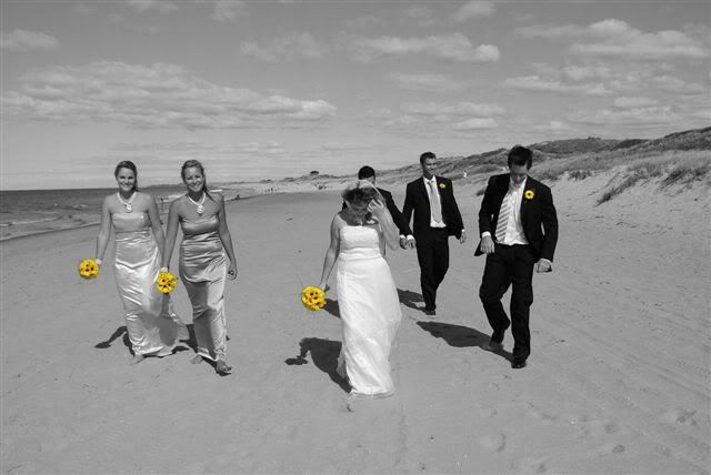
Selective colour wedding party
OK , I don't like the idea of using photoshop to save bad photographs but occasionally I play around with it for special effects , and to give the B&G something different from the usual ...


Nikon D80 , D50 , SB600 , SB800 , Nikon 18-200VR , Tamron 28-75 di 2.8 , Sigma 10-20 f4-5.6 , Nikon 50mm 1.8 . Tamron 17-50 f2.8 , Nikon 70-200 VR f2.8 .
0
Comments
It's something that either works or doesn't.
Really the shot is not all that bad you know
.
Skippy (Australia) - Moderator of "HOLY MACRO" and "OTHER COOL SHOTS"
ALBUM http://ozzieskip.smugmug.com/
:skippy Everyone has the right to be stupid, but some people just abuse the privilege :dgrin
Canon 30d
EF 28-105mm 1:3.5-4.5 USM II
EF 100-300mm 1:4.5-5.6 USM
Speedlight 380EX
Sekonic L-28c2 Studio Deluxe
http://photography.daleestes.com
I am partial to yellow and sunflowers though!!
Skippy is right.....people eith like the selective coloring or they don't! It either works or it doesn't!
But like I said....I think fun when I look at your image and I do like it.
Heather
Shane
Blogs:
www.imagesbyshane.blogspot.com
Canon 20d and 40d
Canon 50mm 1.4
Canon 85mm 1.8
Canon 70-200L IS 2.8
You can see what I did here with one of my photos here: http://www.tippiepics.com/gallery/2082559#107341580. In this, I have lowered the saturation for the entire photo and then colorized the leave and then lowered the saturation for that again. It was just TOO much for me. So it's someplace in between....
Great shot, though!!
www.tippiepics.com
All I did was 'magnetic lasso' the flowers , selct inverse , and ctrl/shift/u remove colour from what was left . I never enhanced the flowers in any way [ besides 'vivid' setting ]
if you still want to leave them as it is, I'd decrease the saturation of the flowers so it's a little more subtle - no so "HEY! look at those FLOWERS!!!!!" and not "Oh this is a such a cool picture!"
I love the picture, and I think it would be a true classic if you took out the flowers and made them black and white as well.
- RE
P.S. - the two guys in the back look like they're about hold hands
www.rossfrazier.com/blog
My Equipment:
Canon EOS 5D w/ battery grip
Backup Canon EOS 30D | Canon 28 f/1.8 | Canon 24 f/1.4L Canon 50mm f/1.4 | Sigma 50mm f/2.8 EX DI Macro | Canon 70-200 F/2.8 L | Canon 580 EX II Flash and Canon 550 EX Flash
Apple MacBook Pro with dual 24" monitors
Domke F-802 bag and a Shootsac by Jessica Claire
Infiniti QX4
A couple of people comment on the guys at the back holding hands , the groom could have been in a better position and some comment that the bride should be looking up ..... next time I will pose them a bit since this was a snapshot between poses . It was only my second wedding and a I appreciate all the feedback , I'd rather have someone tell me outright that a picture doesn't work than tiptoe around the subject leaving me to believe that it does work when it doesn't . This is the "jump shot " taken minutes later ....
Like the jump shot too -- esp. the bride and groom.
www.candidglimpses.com
www.candidglimpses.smugmug.com
However the yellow flowers shot doesn't work for me. In it you only got reasonable views of 3 out of the 6 members faces. The bride, who looks like she is in place to be the center of the photo, is looking at the ground and completely blocking the view of one of the other party members. The selective coloring seems to be an attempt to redirect attention away from the people to the flowers, but I can't really accept this shot as a flower picture. IMO, it really has to be about the people.