Brand new neice!
Ok guys, don't laugh....I'm not a studio shooter, so I don't have the proper eqpt. I shot these with a plain white sheet draped over my sister's sofa, and a flood light (that I keep for emergencies)....lol. Anyway, I think the came out ok considering....haha. Open to c/c ") Oh, and the one with her holding the baby had a red wall showing in the upper right corner, how can I make it look more like the rest of the pic?
Oh, and the one with her holding the baby had a red wall showing in the upper right corner, how can I make it look more like the rest of the pic?
1)

2)

3)
4)

1)
2)
3)
4)
Shannon 
Canon Digital Rebel XTI, 430ex, sigma 24-70 f2.8 macro, a crummy kit lens, 4gb cf, and tons of batteries.
www.heatonphotography.net
http://picasaweb.google.com/heatonphotography
www.myspace.com/heatonphotography
Canon Digital Rebel XTI, 430ex, sigma 24-70 f2.8 macro, a crummy kit lens, 4gb cf, and tons of batteries.
www.heatonphotography.net
http://picasaweb.google.com/heatonphotography
www.myspace.com/heatonphotography
0
Comments
I would also crop-off #4 at the top... There is a "V" in the couch that looks like a wall behind it - above the toes of the left foot.
Really minor, though. I mean, how can you NOT love these as-is?
Maybe one of the technical geniuses will have a different take.
#1 - Next time have the baby's face more towards the light. I can see it brighter behind the baby, but it would have been more flattering if it had been in front maybe to your left.... Also, try cropping that photo from the top and the left side to bring more focus on the baby...
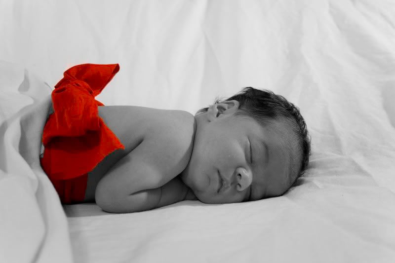
#2 - You can see what I did below - let me know if you want me to remove it. I brightened the whole image (which messed up the color of the bow, but you get the idea) - I think all of these could use more contrast and brightness.... Then I used PS (or you can use PSE) to create a blurred vignette around the baby bringing it out more. VERY precious!!
#3 - Very cute! Once again, bring the light closer to the front of the baby's face - you can see some shadows below the eyes that are a little too exaggerated. Very adorable!
#4 - Once again, crop really close! Also, next time try using a black sheet - I like the fuzzy ones you can get at Walmart for cheap if you are on a budget - the light skin against a dark background makes the baby's feet and the mom's hands really pop.
These are REALLY well done! Good for you for trying a lot of different ideas! No laughing here, that's for sure!
www.tippiepics.com
You have no idea how much I appreciate any pointers I can get
Thank you,
Shannon:D
Canon Digital Rebel XTI, 430ex, sigma 24-70 f2.8 macro, a crummy kit lens, 4gb cf, and tons of batteries.
www.heatonphotography.net
http://picasaweb.google.com/heatonphotography
www.myspace.com/heatonphotography