Purified's Ch. 32 Attempt

purifiedpurified Registered Users Posts: 173 Major grins
edited February 11, 2005 in The Dgrin Challenges
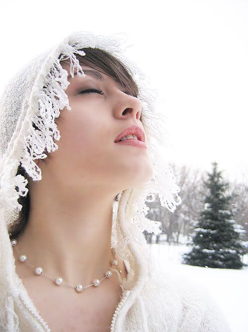
I tried to take a portrait with white for its pre-dominant color. The only thing I did was screen the layer, but it does make the picture a little grainy. I believe it's allowed. If not, it can be fixed. :)

So, how does it fit? Does the contrast of the face take away from the white? :dunno Comments?
d4e0021e.jpg


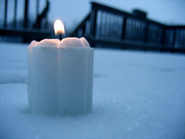
I also took this photo the day after the voting... but I'm not so sure about it as it has a candle and that was our last theme and combines the two...:uhoh
880b815d.jpg
Purified Photography
Updated June 5 2007


-Kelly

Comments

  • ginger_55ginger_55 Registered Users Posts: 8,416 Major grins
    edited February 9, 2005
    The first one is way better, IMO. I don't know about the face, I am confused on that issue myself. I mean combining colors. The face does not take away from the fact that you have a very nice high key picture.

    I don't know if other colors are allowed, such as skin, a bit of blue in mine, when the thing is brown.

    Also, I did not think you could use layers it.

    It is a beautiful photograph. I love high key.

    ginger
    After all is said and done, it is the sweet tea.
  • AngeloAngelo Super Moderators Posts: 8,937 moderator
    edited February 9, 2005
    whatever the decision it's a beautiful picture. i love the tree in the distance, it gives a great sense of depth
  • NirNir Registered Users Posts: 1,400 Major grins
    edited February 10, 2005
    Very nice shot!

    Could use a little fixing up of the background to the right of model's chin and neck, something seems wrong there.
    __________________

    Nir Alon

    images of my thoughts
  • purifiedpurified Registered Users Posts: 173 Major grins
    edited February 10, 2005
    Nir wrote:
    Very nice shot!

    Could use a little fixing up of the background to the right of model's chin and neck, something seems wrong there.
    Thanks!

    I don't see anything... is it the fuzz from the hood? They look like a background distortion but it's not. I could PS it out but I wouldn't be able to enter it. But then again, I'm not sure it fits anyway. ne_nau.gif
    Purified Photography
    Updated June 5 2007


    -Kelly
  • hqsbudhqsbud Registered Users Posts: 23 Big grins
    edited February 10, 2005
    I think the first photo fits the challenge beautifully. When I saw it, my immediate first thought was Krzysztof Kieslowski's film, White, from the Tri-Color trilogy, except not as depressing.
  • AngeloAngelo Super Moderators Posts: 8,937 moderator
    edited February 10, 2005
  • NirNir Registered Users Posts: 1,400 Major grins
    edited February 10, 2005
    purified wrote:
    Thanks!

    I don't see anything... is it the fuzz from the hood? They look like a background distortion but it's not. I could PS it out but I wouldn't be able to enter it. But then again, I'm not sure it fits anyway. ne_nau.gif
    Absolutely right! Sorry!
    __________________

    Nir Alon

    images of my thoughts
  • lynnmalynnma Registered Users, Retired Mod Posts: 5,208 Major grins
    edited February 10, 2005
    I think it's a beautiful shot.. I'm not sure If I would enter it as a challenge shot tho.. to me, the face is the predominent factor and the white is secondary.. lovely shot thoughclap.gif
  • miketaylor01miketaylor01 Registered Users Posts: 318 Major grins
    edited February 10, 2005
    Nice
    First one definitely IMO. The funny thing about it is that you could go weither way on the predominant color. The face and neck take up almost half the iumage so could you say that is the predominant color? or the predominant white in the rest of the image. I think I would go with the skin color as predominant, but that is just me. Its like h\she is jumping out of the image and that uis why i think the skin dominates the image. very nice work either way. the candle didnt do much for me though. :D
    Mike

    Sigma SD9, SD14, and DP1
    http://miketaylor.giph.com
  • digital faeriedigital faerie Registered Users Posts: 667 Major grins
    edited February 11, 2005
    First one definitely IMO. The funny thing about it is that you could go weither way on the predominant color. The face and neck take up almost half the iumage so could you say that is the predominant color? or the predominant white in the rest of the image. I think I would go with the skin color as predominant, but that is just me. Its like h\she is jumping out of the image and that uis why i think the skin dominates the image. very nice work either way. the candle didnt do much for me though. :D
    as someone pointed out in my "empty love potion" picture the challenge is looking for a monochromatic look I believe. But great shots regardless!
  • ChristianChristian Registered Users Posts: 37 Big grins
    edited February 11, 2005
    It's a shame we can't control the weather. The only think I could imagine that would make this photo better would be to have large white snow flakes floating across her face.
  • ehughesehughes Registered Users Posts: 1,675 Major grins
    edited February 11, 2005
    The first picture is Excellent.. thumb.gif

    Ed
  • purifiedpurified Registered Users Posts: 173 Major grins
    edited February 11, 2005
    Christian wrote:
    It's a shame we can't control the weather. The only think I could imagine that would make this photo better would be to have large white snow flakes floating across her face.
    Thank you! It actually was snowing, and that's why it was taken with the subject looking up, but they were falling so slowly they just didn't show in this one. :/
    Purified Photography
    Updated June 5 2007


    -Kelly
Sign In or Register to comment.