Feeling Blue About These Challenges.....

imaximax Registered Users Posts: 691 Major grins
edited February 14, 2005 in The Dgrin Challenges
Any Thoughts?


15702325-L.jpg


15702324-L.jpg


15702323-L.jpg

Comments

  • AngeloAngelo Super Moderators Posts: 8,937 moderator
    edited February 11, 2005
    cute and creative. following your thread, shouldn't #1 be titled "steel blue" and #3 be titled "sky blue"?
  • ginger_55ginger_55 Registered Users Posts: 8,416 Major grins
    edited February 11, 2005
    No, Light Blue is where I started laughing. That is a photo of a light there. So it is light blue and a play on words "light" and blue.

    I don't see it in the others. May be there. But since I laughed when I saw the second one, I like that one best. Laughing is good. :lol4

    ginger:D
    After all is said and done, it is the sweet tea.
  • ChristianChristian Registered Users Posts: 37 Big grins
    edited February 11, 2005
    How about re-naming the third to "In Plane Blue"
    no? to corny? ok, I'll be quite now.
  • DoctorItDoctorIt Administrators Posts: 11,951 moderator
    edited February 11, 2005
    That's a nice clean sensor you go there lol3.gif

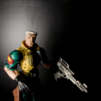
    I like #1 the best. I'm a big big fan of simplicity, but 2 and 3 go a bit above and beyond. 1 has some very interesting lines placed very well. Only thing I'd reframe, that bit of a "ghost" in the upper left corner. Once you see it, distracts the heck out of you.
    Erik
    moderator of: The Flea Market [ guidelines ]


  • NoNoNoNo Registered Users Posts: 14 Big grins
    edited February 11, 2005
    Perhaps "Jet Blue" for #3? Interesting idea, well executed. Personally I like #2 the best. The light just jumps out and it's not as busy as #1.
  • JennyJenny Registered Users Posts: 96 Big grins
    edited February 11, 2005
    I like the first one. It is just so simplistic, but at the same time so complex.
  • imaximax Registered Users Posts: 691 Major grins
    edited February 11, 2005
    Keeping it Simple, I like that. Perhaps I should go with Red
    15721683-L.jpg


    Or Maybe Black


    15721686-L.jpg
  • hqsbudhqsbud Registered Users Posts: 23 Big grins
    edited February 11, 2005
    I really like the street light the most because it just looks like light-person checking out the viewer!
  • imaximax Registered Users Posts: 691 Major grins
    edited February 13, 2005
    Another red One

    15836601-M.jpg
  • imaximax Registered Users Posts: 691 Major grins
    edited February 13, 2005
    Maybe Purple


    15837735-L.jpg
  • snapapplesnapapple Registered Users Posts: 2,093 Major grins
    edited February 14, 2005
    imax wrote:
    Keeping it Simple, I like that. Perhaps I should go with Red
    15721683-S.jpg


    I think I like this the best. I love the lines. The diagonal line and the curve give it so much interest. The red is a great color, and it is definitely dominant. Good composition and creativity. Can you make it just a little brighter? I find it a bit dark. I would also eliminate the text. Put that in your post title and leave the picture clean. It detracts from the image.
    "A wise man will make more opportunities than he finds." - Francis Bacon
    Susan Appel Photography My Blog
Sign In or Register to comment.