First ever engagement shoot!

Deadeye008Deadeye008 Registered Users Posts: 168 Major grins
edited October 1, 2007 in Weddings
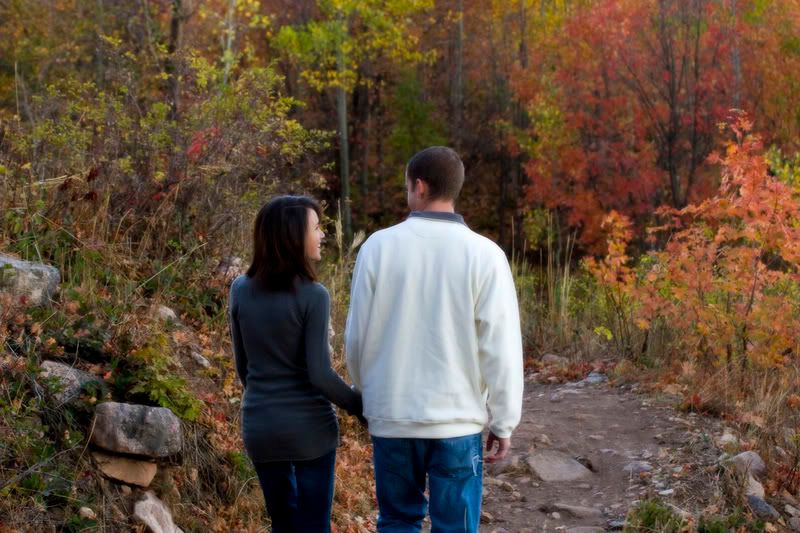
This is my first engagement shoot so C&C is greatly appreciated. We got these done just as a huge storm was coming in. There is probably about a foot of snow up there now where we took these.Thanks for looking!
1.
IMG_1914web.jpg
2.
IMG_1934web.jpg
3.
IMG_1944web.jpg
4.
IMG_1945web.jpg
5.
IMG_1955web.jpg
6.
IMG_1979web.jpg
7.
IMG_1975web.jpg
8.
IMG_2019web.jpg

Comments

  • jeffreaux2jeffreaux2 Registered Users Posts: 4,762 Major grins
    edited September 30, 2007
    I'd be glad to give some C&C here....

    First it looks like you had a beautiful setting with the fall colors, and also a great looking couple to work with.

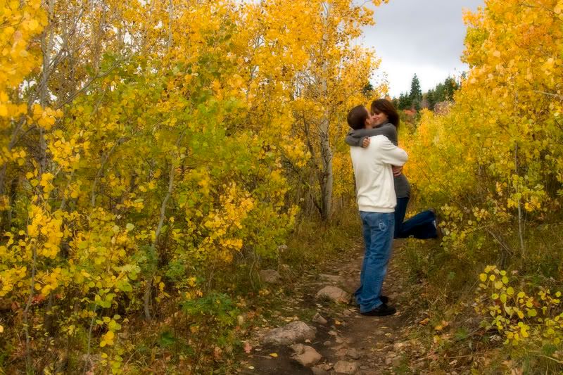
    1 This probably could have benifited from some fill flash, or possibly a huge reflector if you could have worked out the angle. I like the sidelighting, and shadows are natural, but I think a little fill would have helped soften the effect on the dark side of her face. The light looks pretty warm also....maybe a bit too warm, but it is a nice photograph. I think it would benifit most from a different shooting angle like you used in 7.

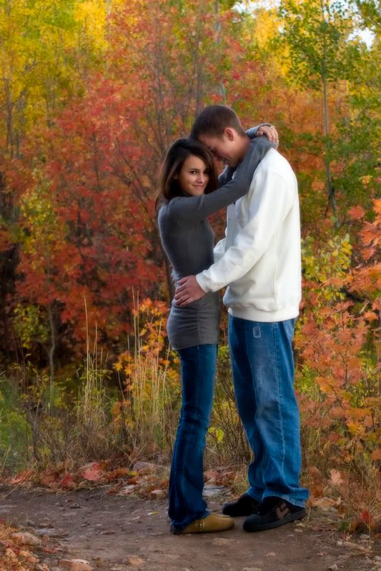
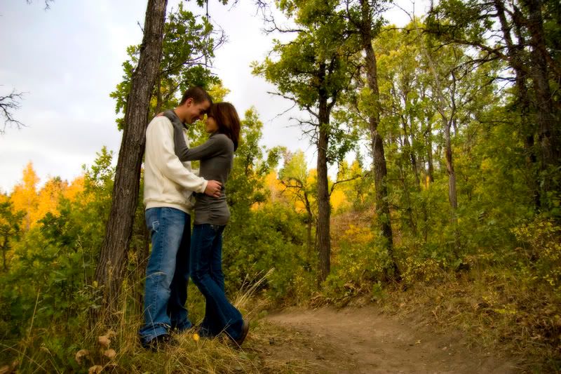
    2 The composition doesnt really grab me. Maybe a shallower depth of focus(DOF).

    3 Nice pose, but either positioning them so the sun was at your back or using fill flash would have helped.

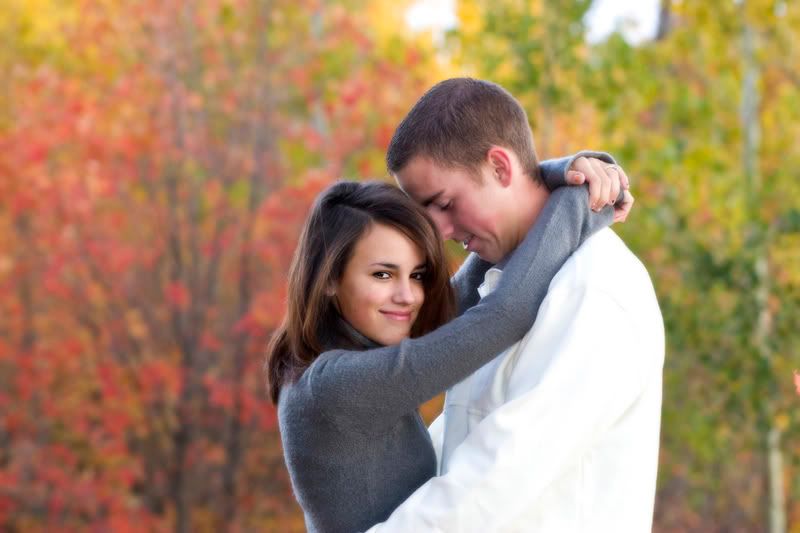
    4 Nice!!. I like the DOF. Is she scared to look at him? or is he scared to look at the camera? This would be great if they were looking into each other's eyes. Something is happening white balance wise here. His shirt isn't this white in any of the other shots. Also, his skin tones are very very red.

    5 Very very nice composition, but your forground including the couple is under exposed( do you calibrate your monitor?). I would bump it up in levels, and if the sky blows......so be it. IMO a portrait is about exposing for the people.

    6 Very cute. I think a levels adjustment would make it pop. Wish I could see more of his profile here.

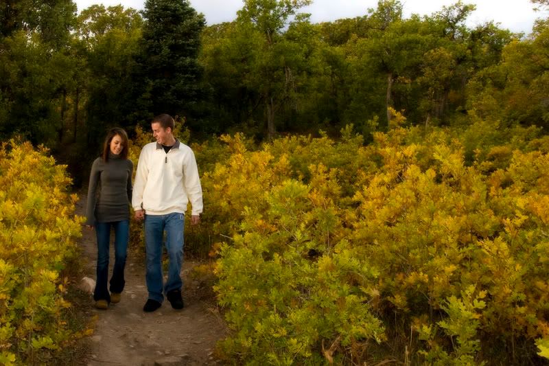
    7 Best so far....IMO...composition. Subjects could stand to be a little brighter, but I like it as is. Great use of thirds here.

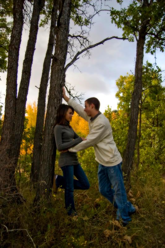
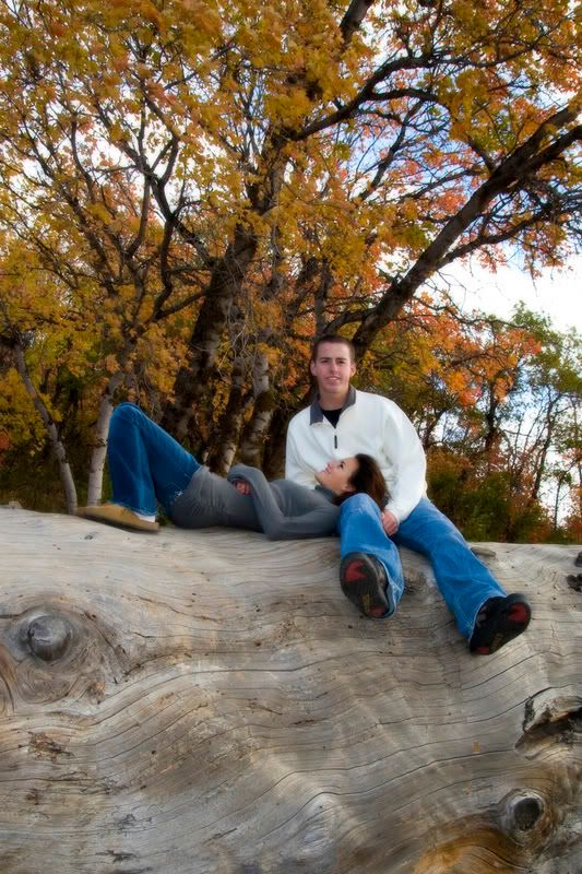
    8 Awesome idea, but wouldn't it have been better if the tree they are sitting on had its upper edge at the lower third instead of nearly the middle?

    These are of course only opinions. I really think most of them could use a little bump up in exposure, and then some slight vignetting to help focus the eyes on them and not the scenery. Over all I think you did a great job for your first try. I really like no.7....and I bet the couple will be pleased with them.
  • boulderNardoboulderNardo Registered Users Posts: 180 Major grins
    edited September 30, 2007
    I don't have any technical input on your work as I'm not qualified to do so... However, I have one comment about #3 and #7: I DON'T SEE THE LOVE!!!

    Those guys are either really shy, or just aren't used to showing off emotions in public. In #3 they're soo far apart, they look like the typical middle-school kids' first time dance, afraid to touch each other. I would've loved to see them literally "squeeeeezed" together, looking at EACH OTHER (why is she looking at the camera?).

    #7 is better in that aspect, but still has tons more emotional potential on their side.

    Just my 2 cents :)
    BEAUTIFUL pictures otherwise, love em!
    Canon 1D MkII, Canon 17-40 f/4L, Canon 70-200 f/2.8L, Canon 50 f/1.4, Canon 100 f/2
    Bogen 055XPROB
    Elinchrom Ranger RX Speed AS, FreeLite A, Skyports, 3x Vivitar 285HV
  • rusticrustic Registered Users Posts: 199 Major grins
    edited September 30, 2007
    Hi Deadeye,

    Despite the comments above, I really like these shots. They lighting looks natural, and I would kinda guess that the poses reflect their personalities. I think that if I had a similar shoot done, it would look much like this.

    I think that my only complaint would be that many of them are pretty wide shots. I like the crop of #5, but the others seem kinda far away.

    What kind of PP did you do on the images? They have a nice softness, and the subjects seem to stand out a bit (nicely) from the background.
  • nicoleshillidaynicoleshilliday Registered Users Posts: 549 Major grins
    edited September 30, 2007
    I agree with Rustic. This is a very good looking couple...so crop a little closer on some of the shots. Give us more of a variety.

    With that said... I think these are some great shots. #7 seems to stand out the most.
    Nicole
    D3, and other Nikon goodies
    Shilliday Photography
    Blog
    Facebook
  • Deadeye008Deadeye008 Registered Users Posts: 168 Major grins
    edited September 30, 2007
    jeffreaux2 wrote:
    I'd be glad to give some C&C here....

    First it looks like you had a beautiful setting with the fall colors, and also a great looking couple to work with.

    1 This probably could have benifited from some fill flash, or possibly a huge reflector if you could have worked out the angle. I like the sidelighting, and shadows are natural, but I think a little fill would have helped soften the effect on the dark side of her face. The light looks pretty warm also....maybe a bit too warm, but it is a nice photograph. I think it would benifit most from a different shooting angle like you used in 7.

    2 The composition doesnt really grab me. Maybe a shallower depth of focus(DOF).

    3 Nice pose, but either positioning them so the sun was at your back or using fill flash would have helped.

    4 Nice!!. I like the DOF. Is she scared to look at him? or is he scared to look at the camera? This would be great if they were looking into each other's eyes. Something is happening white balance wise here. His shirt isn't this white in any of the other shots. Also, his skin tones are very very red.

    5 Very very nice composition, but your forground including the couple is under exposed( do you calibrate your monitor?). I would bump it up in levels, and if the sky blows......so be it. IMO a portrait is about exposing for the people.

    6 Very cute. I think a levels adjustment would make it pop. Wish I could see more of his profile here.

    7 Best so far....IMO...composition. Subjects could stand to be a little brighter, but I like it as is. Great use of thirds here.

    8 Awesome idea, but wouldn't it have been better if the tree they are sitting on had its upper edge at the lower third instead of nearly the middle?

    These are of course only opinions. I really think most of them could use a little bump up in exposure, and then some slight vignetting to help focus the eyes on them and not the scenery. Over all I think you did a great job for your first try. I really like no.7....and I bet the couple will be pleased with them.

    Thanks for all the comments and critique! I really love it when someone takes the time to do this. It was a really overcast day so there wasn't a whole lot of light to work with. For example, in 3 the sun was at my back, the same as in 4. I was standing in the exact same spot and the pictures were taken about 3 seconds apart just I zoomed in on 4. I'm having to use my laptop lately because we are in the middle of a move and the desktop isn't available so that might be why some are underexposed or the color is a little off. Can a laptop monitor be calibrated? Thanks again for the help. Looks like from some of the other comments that I need to do some cropping on them too. Thanks
  • Deadeye008Deadeye008 Registered Users Posts: 168 Major grins
    edited September 30, 2007
    I don't have any technical input on your work as I'm not qualified to do so... However, I have one comment about #3 and #7: I DON'T SEE THE LOVE!!!

    Those guys are either really shy, or just aren't used to showing off emotions in public. In #3 they're soo far apart, they look like the typical middle-school kids' first time dance, afraid to touch each other. I would've loved to see them literally "squeeeeezed" together, looking at EACH OTHER (why is she looking at the camera?).

    #7 is better in that aspect, but still has tons more emotional potential on their side.

    Just my 2 cents :)
    BEAUTIFUL pictures otherwise, love em!
    Thanks for the comments. This couple did seem a little shy so maybe that was it.:D
  • Deadeye008Deadeye008 Registered Users Posts: 168 Major grins
    edited September 30, 2007
    rustic wrote:
    Hi Deadeye,

    Despite the comments above, I really like these shots. They lighting looks natural, and I would kinda guess that the poses reflect their personalities. I think that if I had a similar shoot done, it would look much like this.

    I think that my only complaint would be that many of them are pretty wide shots. I like the crop of #5, but the others seem kinda far away.

    What kind of PP did you do on the images? They have a nice softness, and the subjects seem to stand out a bit (nicely) from the background.

    Thanks rustic, I'll have to make some crops on these and see how they look. For PP I have and action that I used on all of these. It bumps up the contrast a little, saturates a little and then adds a masked guassian blur that allows me to paint detail back into the picture.
  • Deadeye008Deadeye008 Registered Users Posts: 168 Major grins
    edited September 30, 2007
    I agree with Rustic. This is a very good looking couple...so crop a little closer on some of the shots. Give us more of a variety.

    With that said... I think these are some great shots. #7 seems to stand out the most.

    Thanks! Looking at some of the other comments it looks like cropping is what I need to do to make these better.
  • ShannonHeatShannonHeat Registered Users Posts: 222 Major grins
    edited September 30, 2007
    I'm dying to know your setup/pp! I love the softness, and how they seem to stand out of the background, it is just beautiful!clap.gif
    Shannon :D
    Canon Digital Rebel XTI, 430ex, sigma 24-70 f2.8 macro, a crummy kit lens, 4gb cf, and tons of batteries.
    www.heatonphotography.net
    http://picasaweb.google.com/heatonphotography
    www.myspace.com/heatonphotography
  • rwellsrwells Registered Users Posts: 6,084 Major grins
    edited October 1, 2007
    Overall good job thumb.gif


    I'll agree on the above that some are underexposed and would like tighter crops.

    I have a question:

    In the first 4 pictures the lighting looks strange to me. #1 looks like a Gaussen mask to make the couple stand out from the surroundings, no issues there, but in #2, 3 & 4 the light on the womans clothes don't seem to match the surroundings light. Looks like her clothes show a strong back-light, but the scene doesn't.

    Please clue me in...
    Randy
  • Deadeye008Deadeye008 Registered Users Posts: 168 Major grins
    edited October 1, 2007
    rwells wrote:
    Overall good job thumb.gif


    I'll agree on the above that some are underexposed and would like tighter crops.

    I have a question:

    In the first 4 pictures the lighting looks strange to me. #1 looks like a Gaussen mask to make the couple stand out from the surroundings, no issues there, but in #2, 3 & 4 the light on the womans clothes don't seem to match the surroundings light. Looks like her clothes show a strong back-light, but the scene doesn't.

    Please clue me in...

    Thanks for the kind words!
    Now that I look at it, it does look strange to me as well. Shots 2,3 &4 were taken with my 70-200 f4L. In #2 they were about 15 ft away and in 3 &4 they were about 30 ft away and I don't believe I fired my flash. As I stated in a previous post, it was very overcast so there was no direct harsh light. Also the sun was at my back during these shots. Perhaps there was something that was reflecting light on her from left to right, but the only thing there was a hill with trees. Now you've got me wondering tooheadscratch.gif
  • rwellsrwells Registered Users Posts: 6,084 Major grins
    edited October 1, 2007
    Deadeye008 wrote:
    Thanks for the kind words!
    Now that I look at it, it does look strange to me as well. Shots 2,3 &4 were taken with my 70-200 f4L. In #2 they were about 15 ft away and in 3 &4 they were about 30 ft away and I don't believe I fired my flash. As I stated in a previous post, it was very overcast so there was no direct harsh light. Also the sun was at my back during these shots. Perhaps there was something that was reflecting light on her from left to right, but the only thing there was a hill with trees. Now you've got me wondering tooheadscratch.gif


    Did you apply a mask in PP? Might have gotten a strange halo from that if you did.
    Randy
  • Deadeye008Deadeye008 Registered Users Posts: 168 Major grins
    edited October 1, 2007
    rwells wrote:
    Did you apply a mask in PP? Might have gotten a strange halo from that if you did.
    Yes, the action I used on them applies a masked guassian blur but I don't believe that this is the case because looking at the original images it still has the same lighting. Perhaps the guassian blur just emphasizes it.
Sign In or Register to comment.