LPS #14 Say Hello....
 imax
Registered Users Posts: 692 Major grins
imax
Registered Users Posts: 692 Major grins
To My Daughters Little Friend

Any thoughts
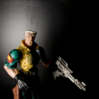
Joe
Sammy
They have a hard time getting him to come out of his shell, maybe the cats have something to do with it. Anyway, I thought it fit the theme
Another version

Another version
Any thoughts
Joe
0
Comments
I could totally hear Al Pacino doing the voice over.
www.feliciabphotography.com
I was thinking that as well....I guess it would also look cool...to me...if he (she???) was on a pain of glass..with a nice reflection.
Best of luck,
Emily
Edit: oh nm, Pat beat me too it.
pyroPrints.com/5819572 The Photo Section
Nikon D300
Nikon 70-200mm f/2.8
Nikon 18-200mm f/3.5-5.6
Nikon 50mm f/1.8D
[SIZE=-3]Mary Beth Glasmann Photography[/SIZE]
Nikon D300
Nikon 70-200mm f/2.8
Nikon 18-200mm f/3.5-5.6
Nikon 50mm f/1.8D
[SIZE=-3]Mary Beth Glasmann Photography[/SIZE]
ShutterGlass.com
OnlyBegotten.com
Back In Black
Reflection
A Crab And His Friend
500
500
Thanks for looking and thanks for your thoughts........
Joe
In the black series, the one you called "Reflection" is really neat!
http://lrichters.smugmug.com
I am partial to white backgrounds though so... take that for what its worth
I actually like the second version of Sammy (white) better than #1 due to the detail in the legs and eyes - overall just feels more emotional for me.
ShutterGlass.com
OnlyBegotten.com
I still love the richness of his color in #1, but I love the feel of his "coyness" emotion (if crabs can portray that..lol) in #2
Virginia
"A photograph is a secret about a secret. The more it tells you, the less you know." Diane Arbus
Email
Great idea! What a cute little guy.
Jesse
I titled it Where's Sammy because he was nowhere to be found on this day. Thanks again for the replies and best of luck to all
Joe
Emily
The jagged edges of the little guy's exoskeleton makes it 'craggy' (is that the word they used?
I also like the shell shot. I really like the brown-coffee tone to it. I wish you could make it somewhat sharper though, maybe its just my monitor. ;p I like the shadows in the bottom of the shell as well, nicely done.