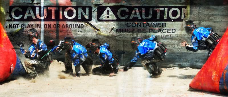
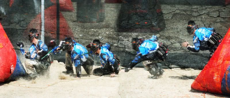
Which one looks better?

Deadeye008Deadeye008 Registered Users Posts: 168 Major grins
edited November 16, 2007 in Sports
I applied some different textures to a paintball series I did of my brother. I can't decide on which one I like better. I would just show them to my brother and let him choose but I want it to be a surprise for his B-day. Please help me choose. Other C&C welcome as well. Thanks

1.
AdamPaintTexture4web.jpg

2.
AdamPaintTexture1web.jpg

Comments

  • jonh68jonh68 Registered Users Posts: 2,711 Major grins
    edited October 22, 2007
    It's a tossup. However, to me, the writing overpowers your brother in the first one. I notice it more than him. If it were an advertising campaign, it would be the one to go with.

    Maybe tone it down it down and highlight your brother's moves more? The shadows on the wall in number 1 also overpower your brother as they ar enot as bad in #2.
  • tjl1388tjl1388 Registered Users Posts: 94 Big grins
    edited October 22, 2007
    jonh68 wrote:
    It's a tossup. However, to me, the writing overpowers your brother in the first one. I notice it more than him. If it were an advertising campaign, it would be the one to go with.

    Maybe tone it down it down and highlight your brother's moves more? The shadows on the wall in number 1 also overpower your brother as they ar enot as bad in #2.

    How was that affect achieved? I really would like to learn how to do that.
  • jonh68jonh68 Registered Users Posts: 2,711 Major grins
    edited October 22, 2007
    Ditto what he said. I am impressed with how you did this and it would be nice to see step by step or at least a little walkthough.
  • Deadeye008Deadeye008 Registered Users Posts: 168 Major grins
    edited October 23, 2007
    tjl1388 wrote:
    How was that affect achieved? I really would like to learn how to do that.

    Are you refering to the texture effect or the multiple person effect?

    Thanks for the comments jonh68!
  • z_28z_28 Registered Users Posts: 956 Major grins
    edited October 23, 2007
    I like #1 much more,
    but #2 isn't bad too.
    thumb.gif
    D300, D70s, 10.5/2.8, 17-55/2.8, 24-85/2.8-4, 50/1.4, 70-200VR, 70-300VR, 60/2.8, SB800, SB80DX, SD8A, MB-D10 ...
    XTi, G9, 16-35/2.8L, 100-300USM, 70-200/4L, 19-35, 580EX II, CP-E3, 500/8 ...
    DSC-R1, HFL-F32X ... ; AG-DVX100B and stuff ... (I like this 10 years old signature :^)
  • m_granitem_granite Registered Users Posts: 146 Major grins
    edited October 23, 2007
    z_28 wrote:
    I like #1 much more,
    Nice shot! 1 is my fave too.
    Alex Q.
  • RaphyRaphy Registered Users Posts: 431 Major grins
    edited October 23, 2007
    #1 works for me... the colours stand out more...
  • Deadeye008Deadeye008 Registered Users Posts: 168 Major grins
    edited October 23, 2007
    Thanks z_28, m_granite and Raphy! Looks like #1 is in the lead.
  • jonh68jonh68 Registered Users Posts: 2,711 Major grins
    edited October 24, 2007
    Oh, I like 1 the best, but I think your brother stands out more in 2. The darkness behind him 2 is not as bad as in 1. Your brother looks better in 1 so if you keep your brother as is, but lighten the background, you have a winner.
  • RaphyRaphy Registered Users Posts: 431 Major grins
    edited November 15, 2007
    Whats that 'multiplying' effect called ? ne_nau.gif
  • beetle8beetle8 Registered Users Posts: 677 Major grins
    edited November 15, 2007
    #2
    Just because of the caution text being too much for me. I'd actually like to see it without the texture layer and maybe just a tiny bit off the top and bottom for a more pano look
    Either way it's gonna be a cool shot. myphotopipe has some cool options for printing panos
  • PhotosbychuckPhotosbychuck Registered Users Posts: 1,239 Major grins
    edited November 16, 2007
    Hi, Deadeye008

    I like #2 the best less distraction from your brother as the main subject.

    Take Care,
    Chuck,
    D300S, 18-200mm VR, 70-300mm VR

    Aperture Focus Photography
    http://aperturefocus.com
Sign In or Register to comment.