Just a few more of my gf...please share your thoughts on lighting, poses, composition, etc...Thanks,Sodjdobe
Absolutely beautiful girlfriend/model. Fabulous eyes! She is obviously very comfortable in front of the camera.
How do YOU like the pics? That's what is really important!
Overall I think these are very good shots & I certainly wouldn't have posted otherwise, but you did specifically request thoughts on them.
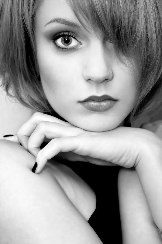
#1
I like the lighting, but I find the crop distracting. I like the shot with everything below her little finger gone. Actually, I find the hand draws my attention away from her face and that amazing eye.
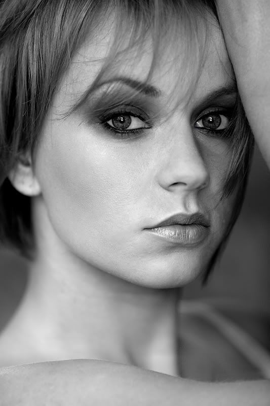
#2
I find the partial (half-cropped) arms distracting items/angles, at least with only that amount of them showing. Since I don't know the look you were after with this shot I could be off base, but she has such amazing eyes and your lighting has them dark and secondary to her cheek. They do look a bit mysterious, but I think they should be the main subject.
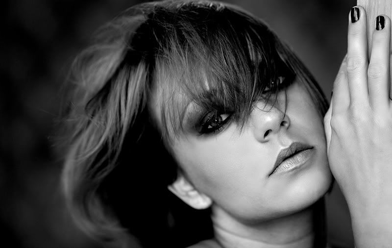
#3
Guess I'm just not a "hands" guy
The camera perspective makes it look like she's got man-hands, which I'm sure she doesn't. Also the hand is in great focus, which pulls my eye away from her face.
Again, take my input with a grain of salt... (without knowing what someone's work looks like to you, how can their input be taken with any weight?)
I think that with this model and your skills, your going to come out with a bunch of killer shots.
I'm not a fan of the cropping of the hand in #3, but really really like the dramatic contrast of both tone and texture in her face and hair. It's got some energy in it, emphasized by the composition. #1 is very safe and just not very interesting. #2 would have been a very solid shot without the bit of arm.
I agree with the cropping comments. I also have to mention that these shots are way better than anything I've ever produced and I really enjoyed looking at your work. Beautiful gf/model and your black and white conversion is sublime. I want to see more of your work!
the first is stunning. what I think really makes this one is the pupil of her eye...it is really wide open. Did you have a very dark room in this shot compared to the others?
The second is nice, but her skin is not a flattering
The only one I would really change would be the first picture, her hand position, I'm not really liking her fingers curled up. The second one I read someone didn't really like the arm - I don't mind it there, only because you can see her upper arm in the lower part of the frame, and for me I kind of filled in the blanks so-to-say. Nice work! J.Cleveland
"Take my picture, Tonight I feel beautiful..."
-Marilyn Monroe

Comments
Absolutely beautiful girlfriend/model. Fabulous eyes! She is obviously very comfortable in front of the camera.
How do YOU like the pics? That's what is really important!
Overall I think these are very good shots & I certainly wouldn't have posted otherwise, but you did specifically request thoughts on them.
#1
I like the lighting, but I find the crop distracting. I like the shot with everything below her little finger gone. Actually, I find the hand draws my attention away from her face and that amazing eye.
#2
I find the partial (half-cropped) arms distracting items/angles, at least with only that amount of them showing. Since I don't know the look you were after with this shot I could be off base, but she has such amazing eyes and your lighting has them dark and secondary to her cheek. They do look a bit mysterious, but I think they should be the main subject.
#3
Guess I'm just not a "hands" guy
The camera perspective makes it look like she's got man-hands, which I'm sure she doesn't. Also the hand is in great focus, which pulls my eye away from her face.
Again, take my input with a grain of salt... (without knowing what someone's work looks like to you, how can their input be taken with any weight?)
I think that with this model and your skills, your going to come out with a bunch of killer shots.
Looking forward to seeing more of your work
I like #3.
www.conary.org
new paintings
Photos that don't suck / 365 / Film & Lomography
Great eye contact at the lens(?)
So #3 s just a bit off in compo. The direction the photo pulls eyes is at her hand passing her face.
50mm 1.4, 85mm 1.8, 24-70 2.8L, 35mm 1.4L, 135mm f2L
ST-E2 Transmitter + (3) 580 EXII + radio poppers
Im digging these for sure, very nice job.
Setup: One camera, one lens, and one roll of film.
www.tippiepics.com
The second shot is good, but the arm knocks it down a notch for me.
The third one is the weakest of the bunch. I find myself staring at her dark nails. The cropped hand is also distracting.
http://clearwaterphotography.smugmug.com/
The second is nice, but her skin is not a flattering
-Marilyn Monroe