Waters of Honduras
I took this picture of my sister and her boyfriend in Honduras while we were there recently. The scenery just begged to be photographed and so did they. Any suggestions or hints would be greatly appreciated.
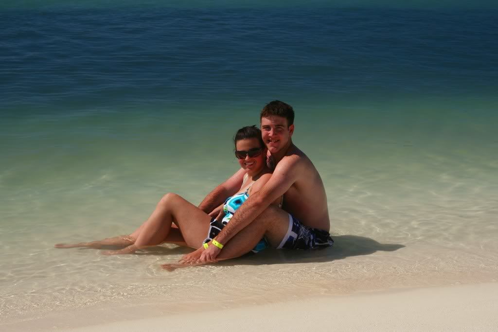
Thanks for looking!
Thanks for looking!
~Nicole
Currently using a Canon Digital Rebel XT
18-55mm kit lens
50mm f/1.8 lens
Currently using a Canon Digital Rebel XT
18-55mm kit lens
50mm f/1.8 lens
0
Comments
Thanks for posting this............
Bauerman, thanks for the suggestions. This is a different picture taken at the same place. Do you like this one better?
I think I like the people filling up most of the frame, and the background looks almost fake to me (without any adjustments or editing).
Currently using a Canon Digital Rebel XT
18-55mm kit lens
50mm f/1.8 lens
Las Cruces Photographer / Las Cruces Wedding Photographer
Other site
The addition of the ship in the background adds an interesting element as well. Both are good photos - but the second one is better in many ways to my eye. Thanks for posting both.
Currently using a Canon Digital Rebel XT
18-55mm kit lens
50mm f/1.8 lens
The composition itself in the second is a little better, but I do have a couple of sugesstions. First, the horizon seems just a tad tilted and ought to be perfectly straight since this is obviously NOT a tilted type of photograph. Second, removing the buoys wouldn't be an aweful thing to do.
Lastly, in the second photo, a tad more planning could have set this shot up to follow the rule of thirds. The subjects on a third(from right), the shipwreck on a third(from left), the horizon on a third(from top) and maybye even that color shift just beyond where beach and water meet at on third (from bottom). Would have been fun to try and achieve at any rate.
Oh, almost forgot.......
I would personally like to be the stand in model for any retakes!!!! Looks very relaxing!
Thanks for sharing.
Jeff
-Need help with Dgrin?; Wedding Photography Resources
-My Website - Blog - Tips for Senior Portraiture