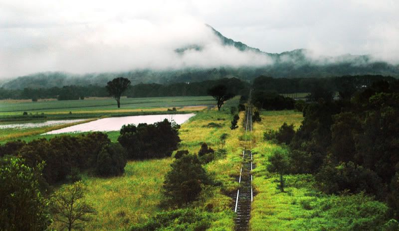
Last minute change - landscape?

JetJet Registered Users Posts: 233 Major grins
edited February 3, 2008 in The Dgrin Challenges
Hello all,
I was able to take a few shots of a completely different idea... the weather has been shocking and it was pouring rain so my position was limited. Please hurry (LPS ends soon!) and tell me if you think it is better than my current entry.
Current Entry
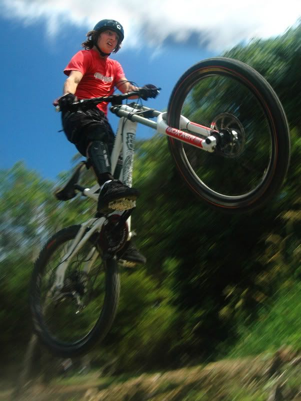
tyson3.jpg
New idea
traintracks2.jpg
Jethro :D
My Blog
Jethro Kingston Photography
Use this coupon code to get $5 off when joining smugmug: eO3NU7AM85scE

Which pic for LPS SF#4? 12 votes

Current entry - Mountain biking
25% 3 votes
New Idea - Train tracks
75% 9 votes

Comments

  • pyroPrints.compyroPrints.com Registered Users Posts: 1,383 Major grins
    edited February 3, 2008
    Lanscape, but maybe punch up the contrast/levels
    pyroPrints.com (my little t-shirt shop)
    pyroPrints.com/5819572 The Photo Section
  • JetJet Registered Users Posts: 233 Major grins
    edited February 3, 2008
    updated with more contrast...
    I also was mucking around with B&W... what do you think?
    traintracksbw.jpg
    Jethro :D
    My Blog
    Jethro Kingston Photography
    Use this coupon code to get $5 off when joining smugmug: eO3NU7AM85scE
  • GreensquaredGreensquared Registered Users Posts: 2,115 Major grins
    edited February 3, 2008
    Jet wrote:
    updated with more contrast...
    I also was mucking around with B&W... what do you think?
    traintracksbw.jpg

    I like it, but I think it needs straightening.

    Best of luck!
    Emily
    Psalm 62:5-6

  • LiquidAirLiquidAir Registered Users Posts: 1,751 Major grins
    edited February 3, 2008
    I like it, but it needs straightening.

    My thoughts in a nutshell.
  • pyroPrints.compyroPrints.com Registered Users Posts: 1,383 Major grins
    edited February 3, 2008
    Ditto on the straightening, and I do like the B&W but i think between levels/contrast and selective color, you could have yourself something really nice.
    pyroPrints.com (my little t-shirt shop)
    pyroPrints.com/5819572 The Photo Section
  • JetJet Registered Users Posts: 233 Major grins
    edited February 3, 2008
    Is this straight? I'm trying to find a balance between the tracks and the horizon both being somewhat straight. How would I do selective colouring? Its nearly all green!
    bw3copy.jpg
    Jethro :D
    My Blog
    Jethro Kingston Photography
    Use this coupon code to get $5 off when joining smugmug: eO3NU7AM85scE
  • LiquidAirLiquidAir Registered Users Posts: 1,751 Major grins
    edited February 3, 2008
    Jet wrote:
    Is this straight? I'm trying to find a balance between the tracks and the horizon both being somewhat straight.

    My advice is straighen the horizon and let the tracks fall as they may.
  • kwalshkwalsh Registered Users Posts: 223 Major grins
    edited February 3, 2008
    I like the train tracks the best. I do like the color version quite a bit. You need to straighten the horizon even if the tracks end up not straight. The other option in photoshop is to actually transform the image, you can get both the tracks and the horizon straight that way. Doing this in ps is identical to what a large format photographer would do with camera movement to achieve the same effect. Short of that, the horizon usually trumps all other compositional elements, so make that straight for sure.

    Good luck!

    Ken
  • pyroPrints.compyroPrints.com Registered Users Posts: 1,383 Major grins
    edited February 3, 2008
    Jet wrote:
    Is this straight? I'm trying to find a balance between the tracks and the horizon both being somewhat straight. How would I do selective colouring? Its nearly all green!

    Definitely straighten the horizon.

    And "selective color" not selective coloring, it's an adjustment layer that lets you adjust specific hues individually. Try it, it's fun =c)
    pyroPrints.com (my little t-shirt shop)
    pyroPrints.com/5819572 The Photo Section
Sign In or Register to comment.