Which one?

will-jumwill-jum Registered Users Posts: 105 Major grins
edited February 24, 2008 in Landscapes
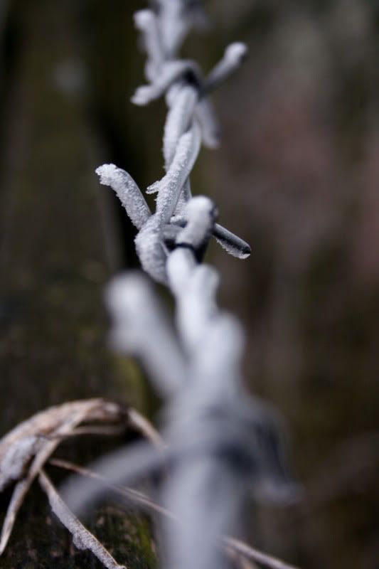
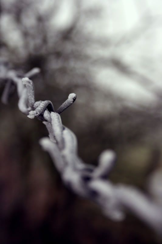
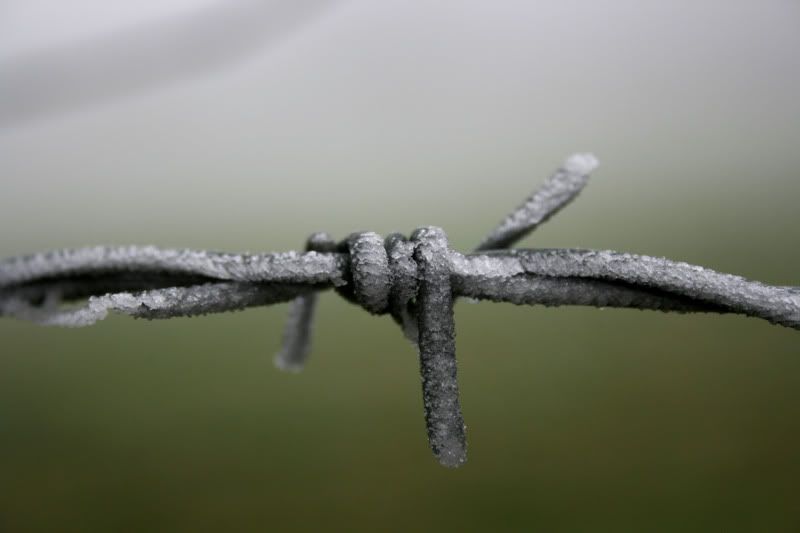
Go these in the morning frost, though i don't know which is best. Please place a vote and say why you chose it, many thanks!!

#1
IMG_2463.jpg

#2
IMG_2462.jpg

#3
IMG_2461.jpg

C&C is also welcome (y)

Which one? 20 votes

#1
0% 0 votes
#2
40% 8 votes
#3
60% 12 votes

Comments

  • anwmn1anwmn1 Registered Users Posts: 3,469 Major grins
    edited February 20, 2008
    I think all of these have great potential but are all too centrally composed and focused. Move your selective focus to one side or the other and have the barb in focus at the front or in the back to create more depth.

    These are just okay and of these I prefer the last because of the sweet background.
    "The Journey of life is as much in oneself as the roads one travels"


    Aaron Newman

    Website:www.CapturingLightandEmotion.com
    Facebook: Capturing Light and Emotion
  • eoren1eoren1 Registered Users Posts: 2,391 Major grins
    edited February 20, 2008
    That last one is very well done.
    The upper left corner detracts from the smooth gradient though.
    E
  • TallyHoTallyHo Registered Users Posts: 48 Big grins
    edited February 20, 2008
    number 3 is great but as mentioned above, maybe try and clone out the upper left hand side.
  • will-jumwill-jum Registered Users Posts: 105 Major grins
    edited February 20, 2008
    eoren1 wrote:
    That last one is very well done.
    The upper left corner detracts from the smooth gradient though.
    E

    Yeh i agree, gonna clone it out now, will post the result soon!

    Thanks for all your comments guys!
  • will-jumwill-jum Registered Users Posts: 105 Major grins
    edited February 20, 2008
    Here it is (i also changed the levels to make the whole thing less 'dull')
    IMG_2461-1.jpg

    So watcha think?
  • ElaineElaine Registered Users Posts: 3,532 Major grins
    edited February 20, 2008
    I think your revised version is the winner! clap.gif
    Elaine

    Comments and constructive critique always welcome!

    Elaine Heasley Photography
  • TallyHoTallyHo Registered Users Posts: 48 Big grins
    edited February 20, 2008
    Yep, love the revised version, its a keeper :)

    Not sure its my failing monitor but it looks theres a slight circular "blob" on the far left just above the wire. to my eye it looks like a clone stamp which hasnt quite merged with the surrounding area.
  • will-jumwill-jum Registered Users Posts: 105 Major grins
    edited February 20, 2008
    TallyHo wrote:
    Yep, love the revised version, its a keeper :)

    Not sure its my failing monitor but it looks theres a slight circular "blob" on the far left just above the wire. to my eye it looks like a clone stamp which hasnt quite merged with the surrounding area.

    Yeh i see a little something, but i'm done with it for tonight!

    Thanks for the comments guys!
  • ulrikftulrikft Registered Users Posts: 372 Major grins
    edited February 20, 2008
    I like number two, the background is very soothing in that one.. :) Reminds me of an old swedish photographer/photoshopper (Beck, satansrike.com guy if any knew/know him). The redish/darkish corner over into a lighter grey are really gives it a desolate and cold look. I love it! :D

    (guess I'm the odd one out :P )
    -Ulrik

    Canon EOS 30D, Canon 50mm f/1.4, Sigma 70-200 f/2.8, Sigma 18-50 f/2.8, Tokina 12-24 f/4. Sigma 1.4 TC, Feisol 3401 Tripod + Feisol ballhead, Metz 58 AF-1 C, ebay triggers.
  • will-jumwill-jum Registered Users Posts: 105 Major grins
    edited February 21, 2008
    ulrikft wrote:
    I like number two, the background is very soothing in that one.. :) Reminds me of an old swedish photographer/photoshopper (Beck, satansrike.com guy if any knew/know him). The redish/darkish corner over into a lighter grey are really gives it a desolate and cold look. I love it! :D

    (guess I'm the odd one out :P )

    Thanks man, yeh i also quite like the background of that one and your not at all the odd one out, two others think #2> #3 :D!
  • Telf22Telf22 Registered Users Posts: 3 Beginner grinner
    edited February 21, 2008
    2! I love where its focused.
  • will-jumwill-jum Registered Users Posts: 105 Major grins
    edited February 22, 2008
  • Awais YaqubAwais Yaqub Registered Users Posts: 10,572 Major grins
    edited February 22, 2008
    Great last one is amazing here is 2 of my 1 2
    Thine is the beauty of light; mine is the song of fire. Thy beauty exalts the heart; my song inspires the soul. Allama Iqbal

    My Gallery
  • will-jumwill-jum Registered Users Posts: 105 Major grins
    edited February 22, 2008
    Great last one is amazing here is 2 of my 1 2

    Thanks!
  • CatOneCatOne Registered Users Posts: 957 Major grins
    edited February 22, 2008
    I like #3 the best... especially with the updated treatment.
  • KhaosKhaos Registered Users Posts: 2,435 Major grins
    edited February 23, 2008
    I have to disagree with most of the comments. I see #2 as the most interesting. The focus area and how the subject blends into and out of a very interesting and cool bokeh makes for a much superior photo over a technically nice but boring #3.
  • will-jumwill-jum Registered Users Posts: 105 Major grins
    edited February 23, 2008
    CatOne wrote:
    I like #3 the best... especially with the updated treatment.

    Thank you.

    Khaos wrote:
    I have to disagree with most of the comments. I see #2 as the most interesting. The focus area and how the subject blends into and out of a very interesting and cool bokeh makes for a much superior photo over a technically nice but boring #3.

    I think i agree, i've always liked #2 more =o! But it seems people are going for #3, down to personal prefrence i guess.
  • ElaineElaine Registered Users Posts: 3,532 Major grins
    edited February 23, 2008
    I really like #2 as well. If I had not seen the new version of #3, I would have said #2 was my favorite. I think the new #3 is better than the old #3, but #2 is very nice! thumb.gif
    Elaine

    Comments and constructive critique always welcome!

    Elaine Heasley Photography
  • will-jumwill-jum Registered Users Posts: 105 Major grins
    edited February 24, 2008
    Elaine wrote:
    I really like #2 as well. If I had not seen the new version of #3, I would have said #2 was my favorite. I think the new #3 is better than the old #3, but #2 is very nice! thumb.gif

    Thank you!!
Sign In or Register to comment.