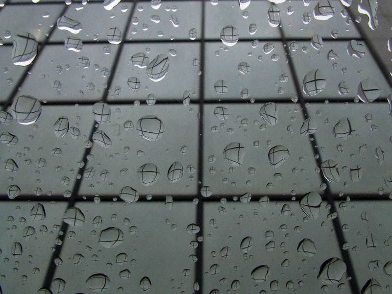
Crossroads
Somethin' about a B&W always makes me feel stark, this was the doctor's office window, personally I like the tall shot better.


It's gotta be true, I saw it in a picture.
0
Comments
I prefer the lighting on the second one.
That's a great pattern the glass is throwing up on the water droplets!
I'd probably clone out that stray golden spot of light on the upper right of the second image, it looks out of place.
Good shot terdelyi
.
Skippy (Australia) - Moderator of "HOLY MACRO" and "OTHER COOL SHOTS"
ALBUM http://ozzieskip.smugmug.com/
:skippy Everyone has the right to be stupid, but some people just abuse the privilege :dgrin
I'm wondering to myself what it would look like with less water droplets.. maybe it would make the effect more powerful.
Great shot terdelyi
My Blog
Jethro Kingston Photography
Use this coupon code to get $5 off when joining smugmug: eO3NU7AM85scE