Match
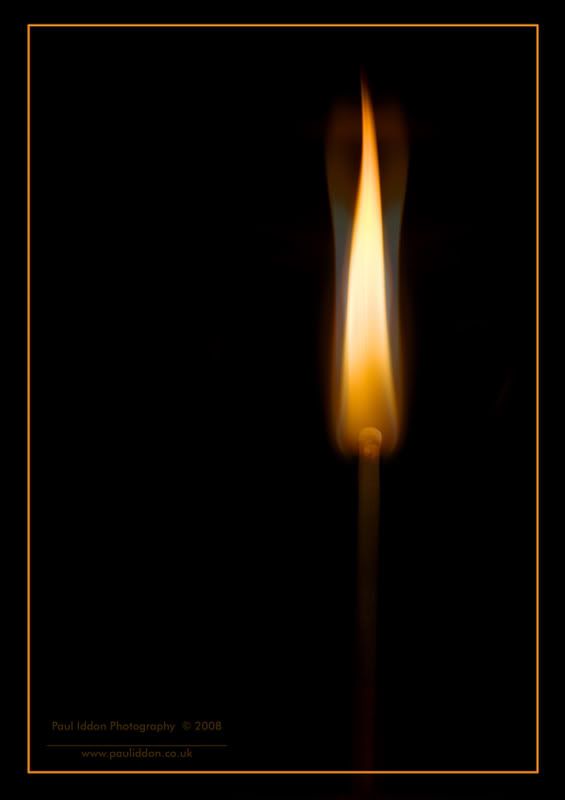
Two RAW files combined to give this final image.
First image layer produced the main flame and the second one was "more wavey" due to the movement of my hand away from the lighting match. So this second image looked poo as it was, so I blended it into the other, before duplicating the layer and transforming it along the horizontal to create the same effect symmetrically. Then all layers were blended together using overlay and opacity. Then finally I made a rectangular marque and stroked a 10 pixel wide line to put the internal border overlapping the match (look carefully, you can see the matchstalk below the border line. Flattened and added © before uploading.
1/800th sec @ F/5.6 in Manual mode.

Paul.
First image layer produced the main flame and the second one was "more wavey" due to the movement of my hand away from the lighting match. So this second image looked poo as it was, so I blended it into the other, before duplicating the layer and transforming it along the horizontal to create the same effect symmetrically. Then all layers were blended together using overlay and opacity. Then finally I made a rectangular marque and stroked a 10 pixel wide line to put the internal border overlapping the match (look carefully, you can see the matchstalk below the border line. Flattened and added © before uploading.
1/800th sec @ F/5.6 in Manual mode.

Paul.
0
Comments
I really like the colours in this one and the two different flames.
michellelegg.com
http://legg.smugmug.com/
Photoshop.
Paul.
Link to my personal website: http://www.pauliddon.co.uk
AHH, thanks for letting me know - That's the next thing on my list of things to buy.
michellelegg.com
http://legg.smugmug.com/
It is expensive.
Try Adobe Elements 6 - its a lot cheaper, not as complex. Download it from the Adobe website - they have a 30 day fully working demo.
Paul.
Link to my personal website: http://www.pauliddon.co.uk
Brian V.
http://www.flickr.com/photos/lordv/
http://www.lordv.smugmug.com/
It is different and that helps too I think.
Paul.
Link to my personal website: http://www.pauliddon.co.uk
This turned out nice Paul
Very nicely done
.
Skippy (Australia) - Moderator of "HOLY MACRO" and "OTHER COOL SHOTS"
ALBUM http://ozzieskip.smugmug.com/
:skippy Everyone has the right to be stupid, but some people just abuse the privilege :dgrin
Paul.
Link to my personal website: http://www.pauliddon.co.uk
Setup was the match stuck in blu-tac, and in front of a piece of black paper. Simple.
Paul.
Link to my personal website: http://www.pauliddon.co.uk
oh wow. easy enough.
thanks
stan