TDC - Pyro's Path

pyroPrints.compyroPrints.com Registered Users Posts: 1,383 Major grins
edited May 24, 2008 in The Dgrin Challenges
The Path
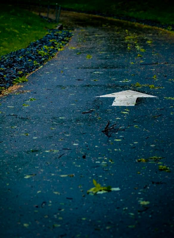
forward2_pyro.jpg

I guess I'll start =c)
Date/time: 5/12/2008 9:27:54 PM
Exposure time: 1/1000 s
F-number: f/2
ISO speed ratings: ISO 400
Focal length: 50 mm


Whacha think?
pyroPrints.com (my little t-shirt shop)
pyroPrints.com/5819572 The Photo Section

Comments

  • anwmn1anwmn1 Registered Users Posts: 3,469 Major grins
    edited May 12, 2008
    Fits the theme perfectly..

    I like that it leads you off to the top corner. I am undecided on the two branches that are before the arrow though- I would have maybe moved them out of the way as they are debris.

    What were your thoughts when shooting this?
    "The Journey of life is as much in oneself as the roads one travels"


    Aaron Newman

    Website:www.CapturingLightandEmotion.com
    Facebook: Capturing Light and Emotion
  • NikolaiNikolai Registered Users Posts: 19,035 Major grins
    edited May 12, 2008
    The Path
    I guess I'll start =c)
    Whacha think?
    Nice image, but too straightforward IMHO. Understandable given the timeframe. But why rush? ne_nau.gif
    Also, the path leads to a dark unknown. Seeing this I don't want to "move forward", I want to hit the breaks mwink.gif
    HTH
    "May the f/stop be with you!"
  • pyroPrints.compyroPrints.com Registered Users Posts: 1,383 Major grins
    edited May 12, 2008
    anwmn1 wrote:
    Fits the theme perfectly..

    I like that it leads you off to the top corner. I am undecided on the two branches that are before the arrow though- I would have maybe moved them out of the way as they are debris.

    What were your thoughts when shooting this?

    I kinda like the branches =c)

    I don't know I figured I'd shoot something straight forward, pun intended. I'm still mulling over some concepts.
    pyroPrints.com (my little t-shirt shop)
    pyroPrints.com/5819572 The Photo Section
  • pyroPrints.compyroPrints.com Registered Users Posts: 1,383 Major grins
    edited May 13, 2008
    Nikolai wrote:
    Nice image, but too straightforward IMHO. Understandable given the timeframe. But why rush? ne_nau.gif
    Also, the path leads to a dark unknown. Seeing this I don't want to "move forward", I want to hit the breaks mwink.gif
    HTH

    I'm still thinking of some concepts, but I figured i'd do a straight forward street shot.

    >>Seeing this I don't want to "move forward", I want to hit the breaks mwink.gif

    Wuss rolleyes1.gif
    pyroPrints.com (my little t-shirt shop)
    pyroPrints.com/5819572 The Photo Section
  • swintonphotoswintonphoto Registered Users Posts: 1,664 Major grins
    edited May 13, 2008
  • pyroPrints.compyroPrints.com Registered Users Posts: 1,383 Major grins
    edited May 13, 2008
    Lovely.

    Thankee
    pyroPrints.com (my little t-shirt shop)
    pyroPrints.com/5819572 The Photo Section
  • anwmn1anwmn1 Registered Users Posts: 3,469 Major grins
    edited May 13, 2008
    Nikolai wrote:
    Nice image, but too straightforward IMHO. Understandable given the timeframe. But why rush? ne_nau.gif
    Also, the path leads to a dark unknown. Seeing this I don't want to "move forward", I want to hit the breaks mwink.gif
    HTH

    With all those guns you have?

    We are putting you out front! :D
    "The Journey of life is as much in oneself as the roads one travels"


    Aaron Newman

    Website:www.CapturingLightandEmotion.com
    Facebook: Capturing Light and Emotion
  • anwmn1anwmn1 Registered Users Posts: 3,469 Major grins
    edited May 13, 2008
    I kinda like the branches =c)

    I don't know I figured I'd shoot something straight forward, pun intended. I'm still mulling over some concepts.

    I think the branches may have worked better if the were at the bottom of the frame. Like you are moving forward from the storm or distruction towards a new life. Something like that. ne_nau.gif
    "The Journey of life is as much in oneself as the roads one travels"


    Aaron Newman

    Website:www.CapturingLightandEmotion.com
    Facebook: Capturing Light and Emotion
  • pyroPrints.compyroPrints.com Registered Users Posts: 1,383 Major grins
    edited May 21, 2008
    Reshoot and some different styles of post processing, let me know what you guys think

    1. A Curve
    forwardVer2_1_pyro.jpg


    2. Ahead
    forwardVer2_2_pyro.jpg

    3. That way be dragons
    forwardVer2_3_pyro.jpg
    pyroPrints.com (my little t-shirt shop)
    pyroPrints.com/5819572 The Photo Section
  • NikolaiNikolai Registered Users Posts: 19,035 Major grins
    edited May 22, 2008
    Reshoot and some different styles of post processing, let me know what you guys think
    1. A Curve
    2. Ahead
    3. That way be dragons

    #3 for me, just clone out those white spots...
    "May the f/stop be with you!"
  • pyroPrints.compyroPrints.com Registered Users Posts: 1,383 Major grins
    edited May 22, 2008
    Nikolai wrote:
    #3 for me, just clone out those white spots...

    Thanks Nik

    Final version:

    This way be dragons...
    forwardVer2_4_pyro-1.jpg

    or current version

    The Path
    forward2_pyro.jpg
    pyroPrints.com (my little t-shirt shop)
    pyroPrints.com/5819572 The Photo Section
  • NikolaiNikolai Registered Users Posts: 19,035 Major grins
    edited May 22, 2008
    Thanks Nik
    Final version:
    This way be dragons...
    thumb.gif
    "May the f/stop be with you!"
  • Pat664422Pat664422 Registered Users Posts: 225 Major grins
    edited May 22, 2008
    Pyro,

    I liked your first pic, but I like "This way be dragons" even better. I really like the way the arrow glows and is much more dominant than in the first pic. I also prefer the night-glowey mood more to the storm destruction of the original. But I think both are worthy entries. I don't know about the "dragons" title though. Had to ding you somewhere! rolleyes1.gif
  • pyroPrints.compyroPrints.com Registered Users Posts: 1,383 Major grins
    edited May 22, 2008
    Pat664422 wrote:
    Pyro,

    I liked your first pic, but I like "This way be dragons" even better. I really like the way the arrow glows and is much more dominant than in the first pic. I also prefer the night-glowey mood more to the storm destruction of the original. But I think both are worthy entries. I don't know about the "dragons" title though. Had to ding you somewhere! rolleyes1.gif

    Thanks. What do you think about some Shakespeare then:
    O, that way madness lies
    pyroPrints.com (my little t-shirt shop)
    pyroPrints.com/5819572 The Photo Section
  • NikolaiNikolai Registered Users Posts: 19,035 Major grins
    edited May 23, 2008
    Thanks. What do you think about some Shakespeare then:
    O, that way madness lies
    "Mirkwood next exit", in case you're JRRT fan:-)
    "May the f/stop be with you!"
  • Pat664422Pat664422 Registered Users Posts: 225 Major grins
    edited May 24, 2008
    Thanks. What do you think about some Shakespeare then:
    O, that way madness lies


    thumb.gif
  • Scott MacKenzieScott MacKenzie Registered Users Posts: 24 Big grins
    edited May 24, 2008
    I like your first one.
    I like it for many reasons.
    One, the colors lend me a feeling of wanting to be warm and dry, and I Had Better Stay On The Path to get where I need to be, Two, I like cool colors naturally, Three, the arrow isn't Exactly where the road goes, but it Might get you where you need to go, Four, it doesn't interrupt me with unnecessary information, such as a title that limits, or an argumentive point of interest in the image, (like a plant, or anything else that take away from the subject).
    Also, I like all the clutter, as if the arrow is leading you forward, through the...
    Yeah, I like me summa that First Foto!
    I like images that feel like I am the Walrus sounds.
Sign In or Register to comment.