Lone Scooter, Please give me your thoughts...
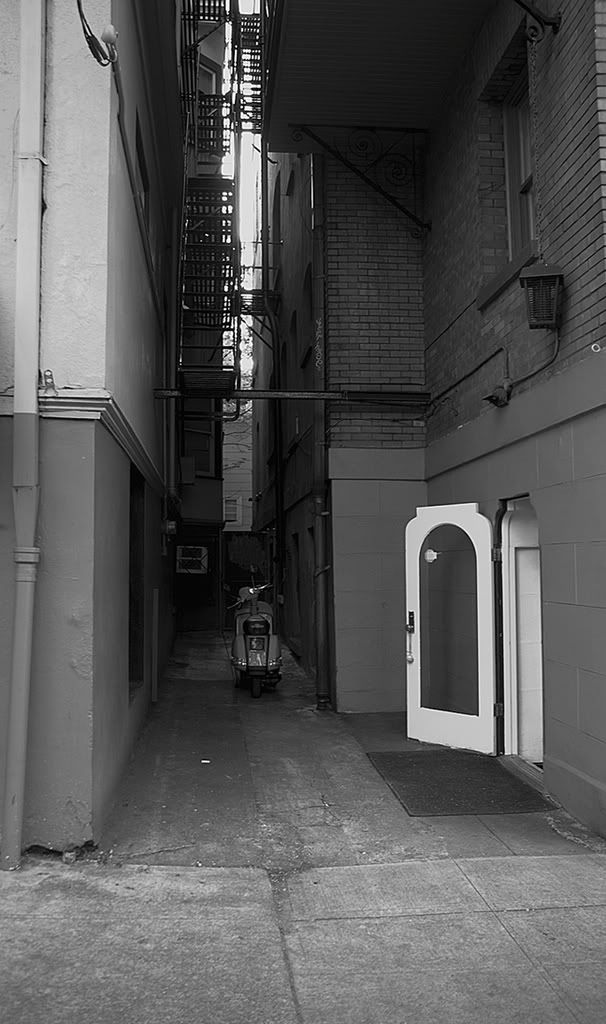
I put this photo in into the whipping post, and got some feedback so I decided to try out some different techniques and would love to hear what people have to say and why they feel the way they do.
Here is the photo I posted in the "Whipping Post"
Here are the other techniques-
A
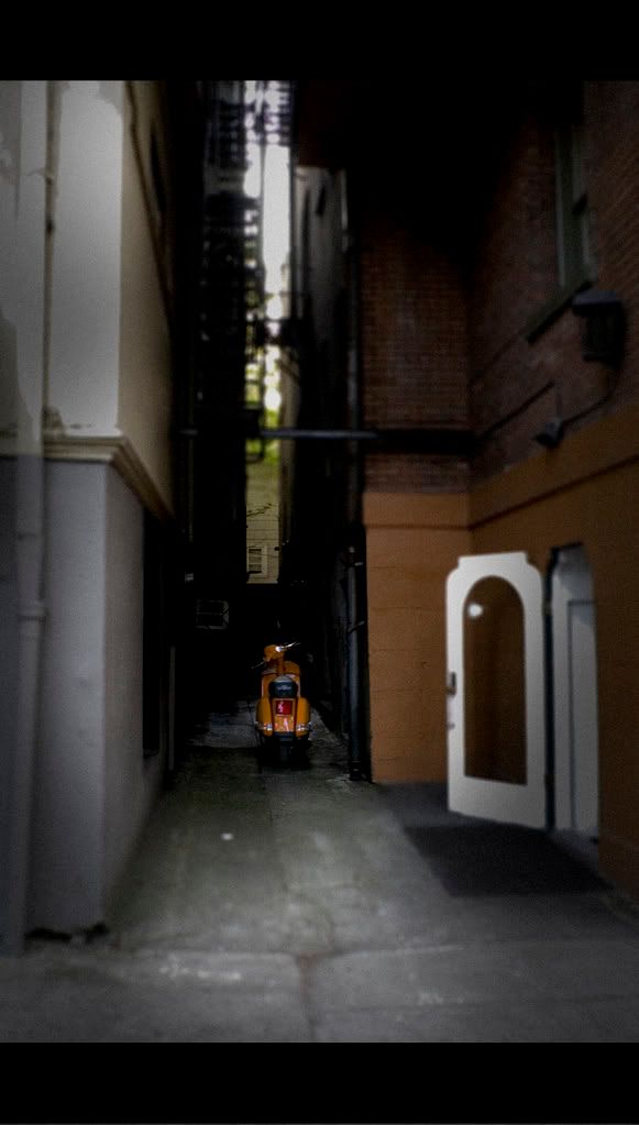
B
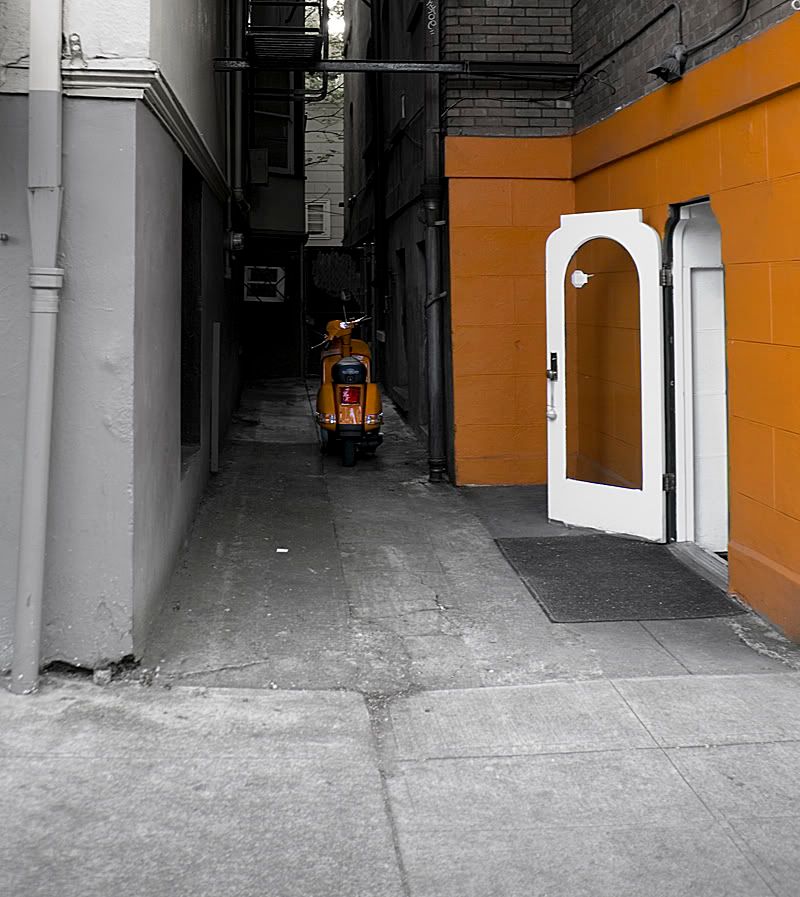
C
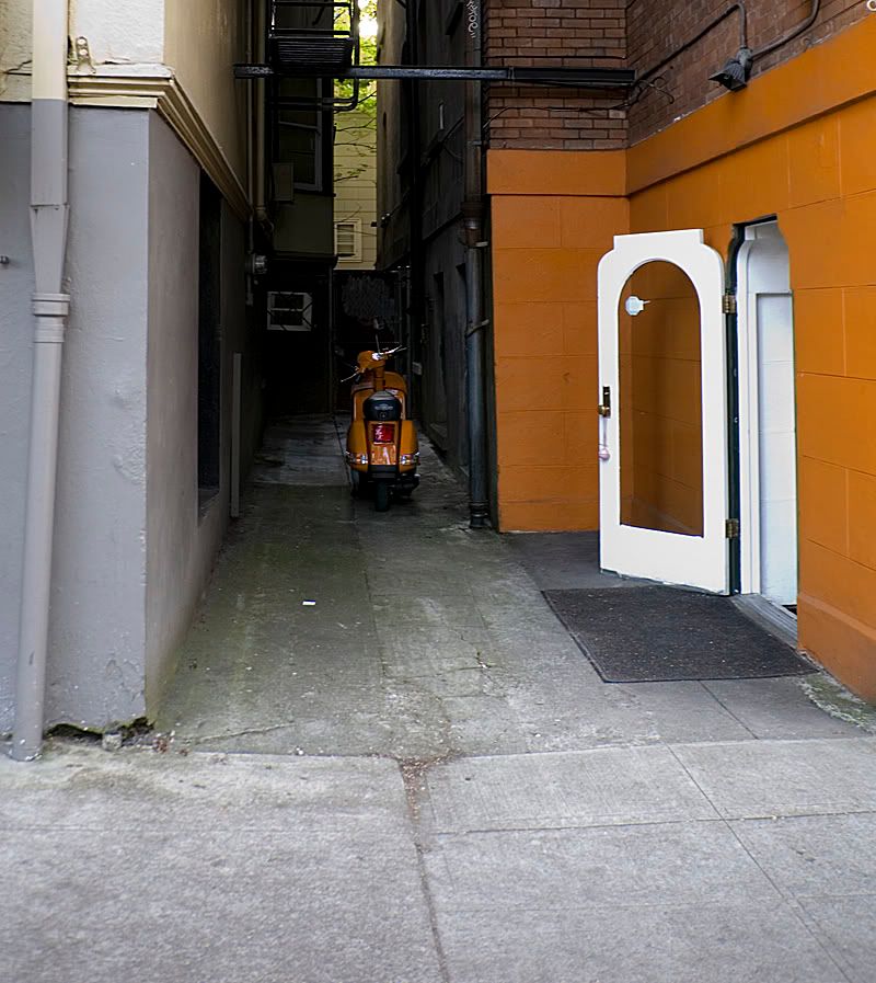
D
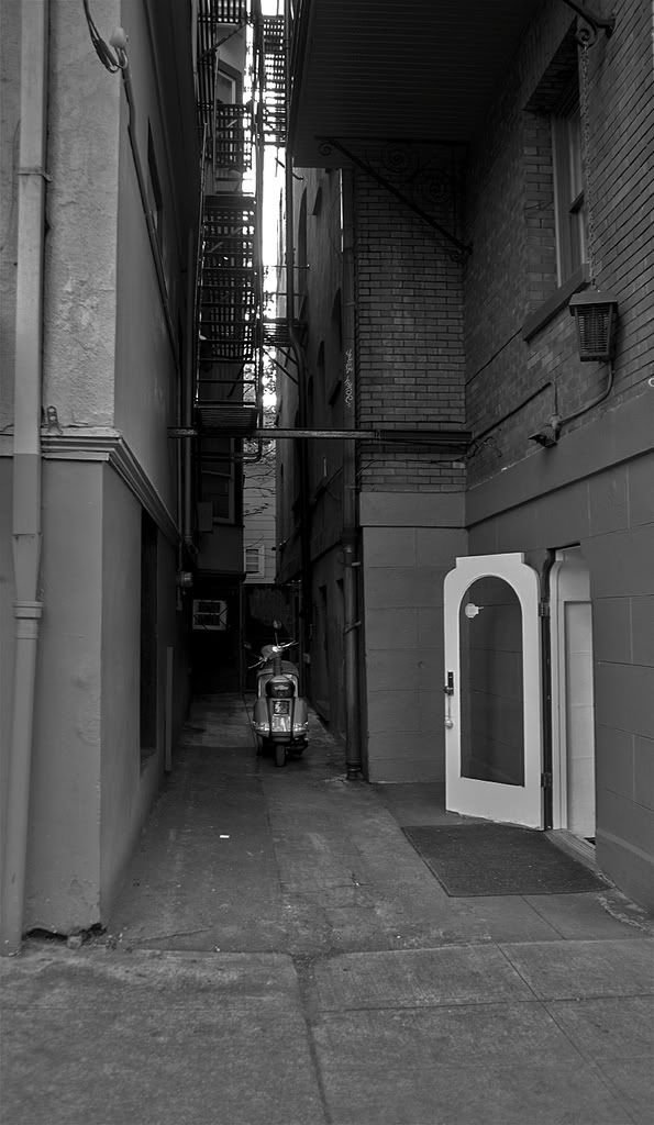
Again I am very interested in what everyone has to say, so please let me know what you like dis-like and why?
Here is the photo I posted in the "Whipping Post"

Here are the other techniques-
A

B

C

D

Again I am very interested in what everyone has to say, so please let me know what you like dis-like and why?
Brandon Perron Photography
www.brandonperron.com
www.brandonperron.com
0
Comments
That open door is what my eye is immediately drawn to in every shot.
The bike is lost in the image, it's almost part of the background.
The bike also looks out of focus, personally I don't think the composition of this image is good at all ....... sorry
.
Skippy (Australia) - Moderator of "HOLY MACRO" and "OTHER COOL SHOTS"
ALBUM http://ozzieskip.smugmug.com/
:skippy Everyone has the right to be stupid, but some people just abuse the privilege :dgrin
Scooter has been fixed...thanks for the comments.
www.brandonperron.com
Tough one to critique, lots of different things going on, all of which could be the subject.
If your going for the Scooter, I'd say rename it "The Scooter" crop only the Scooter and the walls on each side and about 3 feet in front of it and about 10 feet about it, and you'd have a very neat image.
Neat image with lots of potential.
Craig
Burleson, Texas
Thanks... I guess my taste is a little more complex or confusing then most peoples...I think you are right I need to work on the title...I loved the door being open to the scooter with no one around like everything has been deserted or someone was in a major hurry...
thanks for your comments and taking the time!
www.brandonperron.com
I know how you feel, but there are just too many things going on in the image to concentrate on and be able to enjoy the image.
I had a Judge tell me one time, turn the image upside down, is the main subject the thing you see first??????? or your attention is drawn to something else??????
Good compostion and technique lends itself to all kinds of images, complex or simple, the rules such as "Thirds" is a serious guideline, but not a hard an fast rule.
Hang in there, keep refining your thoughts and ideas, I know I still do after almost 40 years of shooting.
Craig
Burleson, Texas