Pyro's - Moving Forward - Hockey Edition

pyroPrints.compyroPrints.com Registered Users Posts: 1,383 Major grins
edited May 15, 2008 in The Dgrin Challenges
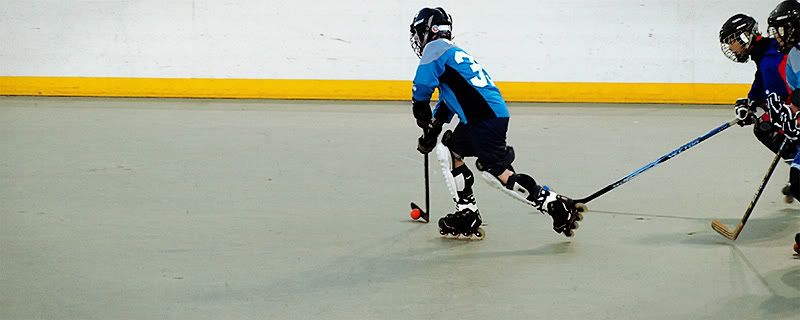
So here is another take on the moving forward. I'm not sure if adding the noise, helps or hurts the image. I was also thinking about cleaning up the walls and the floor, but i'm not sure that'd be beneficial to the image. I'd love to get some feedback.


The Chase
slight added noise
forwardStars_noise.jpg

no noise
forwardStars_noNoise.jpg
pyroPrints.com (my little t-shirt shop)
pyroPrints.com/5819572 The Photo Section

Comments

  • darkdragondarkdragon Registered Users Posts: 1,051 Major grins
    edited May 15, 2008
    I really like this. I prefer the one without noise - at least on my monitor here the noise just makes everything darker and the white wall looks gray.

    Love the composition on this and the player look very sharp, awesome thumb.gif
    ~ Lisa
  • VisualXpressionsVisualXpressions Registered Users Posts: 860 Major grins
    edited May 15, 2008
    Not really feeling this shot, Pyros, I would like it better with some motion blur... I think I like your road arrow better though...ne_nau.gif

    Winston
  • TentacionTentacion Registered Users Posts: 940 Major grins
    edited May 15, 2008
    This to me is a nice shot, but it would look more like moving forward if you had captured that puck zinging thru the air..
    You're only as good as your next photo....
    One day, I started writing, not knowing that I had chained myself for life to a noble but merciless master. When God hands you a gift, he also hands you a whip; and the whip is intended solely for self-flagellation...I'm here alone in my dark madness, all by myself with my deck of cards --- and, of course, the whip God gave me." Truman Capote
Sign In or Register to comment.