Very nice pictures but, IMO, poorly cropped.
Why use 3:2 format when there's lot of empty space, 3:2 costs more to print and much more to frame?
These seem much tighter to me.
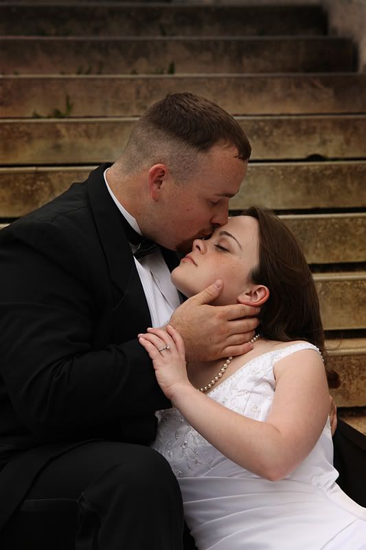
I like the mood of these. My preference is #2....but I am willing to bet it would have been #3 if you had shown us that one with a treatment similar to the color in 1 and 2. Thanks for sharing!!
Many of the folks in the "people" forum(myself included) do not crop just to display photos to the forum. We keep the original aspect of the photo until we actually order prints to allow for flexibility when printing various aspects such as would be used for 5x7, 8x10, or 11x14.
Very nice pictures but, IMO, poorly cropped.
Why use 3:2 format when there's lot of empty space, 3:2 costs more to print and much more to frame?
These seem much tighter to me.
Many of the folks in the "people" forum(myself included) do not crop just to display photos to the forum. We keep the original aspect of the photo until we actually order prints to allow for flexibility when printing various aspects such as would be used for 5x7, 8x10, or 11x14.
Interesting.
I am surprised just because to me placement in the frame is a very important compositional element.
Perhaps I will stick to the whipping post from now on.
Interesting.
I am surprised just because to me placement in the frame is a very important compositional element.
Perhaps I will stick to the whipping post from now on.
Well,
A proof for a portrait client could be printed and or cropped any number of ways. The whipping post is supposed to be for a portfolio ready photo...which should be cropped to maximize the composition.
Placement in the frame in a finished print is always important. The op hasn't responded yet, but my guess was that the empty space at the top was her attempt to leave room for those dreaded hard cuts.
Very nice pictures but, IMO, poorly cropped.
Why use 3:2 format when there's lot of empty space, 3:2 costs more to print and much more to frame?
These seem much tighter to me.
Lew...thanks for the comment...and I totally know what you are saying...but I shoot loose to allow for cropping. I can't tell you how many times I've shot tight and regretted it - a big mistake you can't take back. Although I try not to shoot too loosely as not to lose data as well - but shooting RAW helps me there as well - as my images are 5000x3500 @ 21MP. You show the client the actual image in it's original format, and then you show the client how the end result will look.
Yes I agree not cropping to show the forum will probably raise an eyebrow and have someone say..."Wow too much head room on top"...but I know what my end result will be.
I totally appreciate your comment. Thanks so much.
I like the mood of these. My preference is #2....but I am willing to bet it would have been #3 if you had shown us that one with a treatment similar to the color in 1 and 2. Thanks for sharing!!
Thank you Jeff, I was undecided as to which image I should PP. Thanks for the kind words...coming from you I totally appreciate it; for I totally love your work!
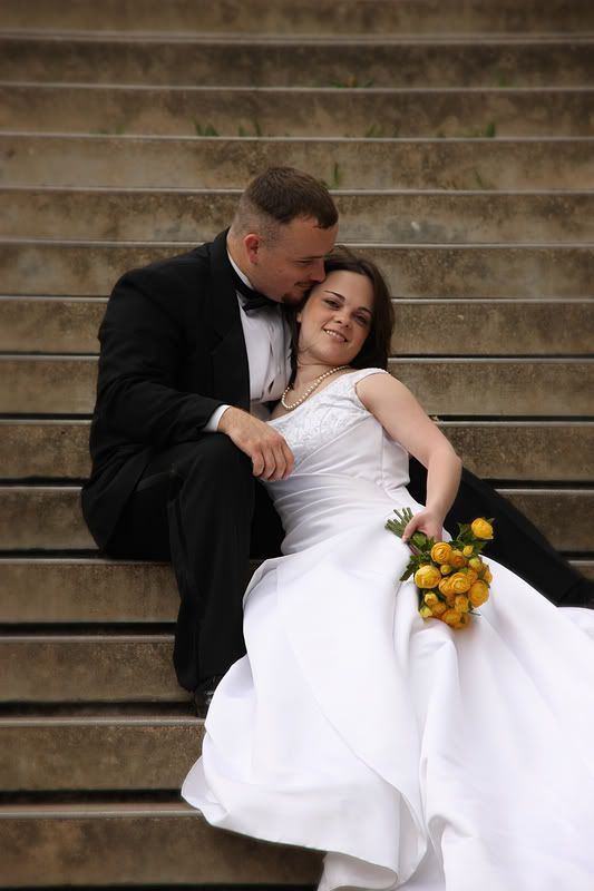
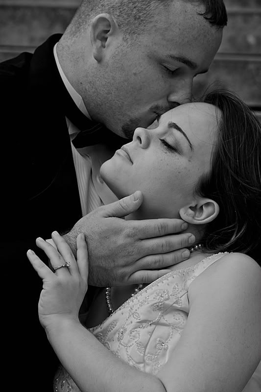
I like no3 the best the closer crop than No2 allow you to see more features on pair bodies (hair on his hands), the black and white converts add to the closeness rather than having the colour which I think distracts would from the closeness. The girls pose in No1 looks a little unnatural.
I like #1, but she looks a tad awkward and I can't place it... Still nice, though - and great processing.
#2 is much better and I like it a lot more.
#3 is stunning, but your processing is really flat and muddy. If you boost the contrast, I think it might be even better!!!
Awesome job! (And I now crop everything to 5x7 because I try not to sell 4x6 prints anymore... And some of the crops look odd, but I completely know where you're coming from! !)
Comments
www.davidsnookphotography.com
www.davidsnookphotography.com/blog
www.jonbakerphotography.com
I'm a Nikon Girl:tuesday
www.BriShayPhotography.com
Las Cruces Photographer / Las Cruces Wedding Photographer
Other site
Thank you David!
Thank you Uncle Jon...that was is probably my favorite too.
It was muggy that day...we had a huge cloud looming overhead so the flowers and the hair were dying quickly.
I added a dark/light filter to 2 of them for that mysterious look. I probably should go back and take out a little bit of it.
Thanks for your comments.
Why use 3:2 format when there's lot of empty space, 3:2 costs more to print and much more to frame?
These seem much tighter to me.
Jeff
-Need help with Dgrin?; Wedding Photography Resources
-My Website - Blog - Tips for Senior Portraiture
Jeff
-Need help with Dgrin?; Wedding Photography Resources
-My Website - Blog - Tips for Senior Portraiture
Interesting.
I am surprised just because to me placement in the frame is a very important compositional element.
Perhaps I will stick to the whipping post from now on.
Well,
A proof for a portrait client could be printed and or cropped any number of ways. The whipping post is supposed to be for a portfolio ready photo...which should be cropped to maximize the composition.
Placement in the frame in a finished print is always important. The op hasn't responded yet, but my guess was that the empty space at the top was her attempt to leave room for those dreaded hard cuts.
Jeff
-Need help with Dgrin?; Wedding Photography Resources
-My Website - Blog - Tips for Senior Portraiture
Lew...thanks for the comment...and I totally know what you are saying...but I shoot loose to allow for cropping. I can't tell you how many times I've shot tight and regretted it - a big mistake you can't take back. Although I try not to shoot too loosely as not to lose data as well - but shooting RAW helps me there as well - as my images are 5000x3500 @ 21MP. You show the client the actual image in it's original format, and then you show the client how the end result will look.
Yes I agree not cropping to show the forum will probably raise an eyebrow and have someone say..."Wow too much head room on top"...but I know what my end result will be.
I totally appreciate your comment. Thanks so much.
Sen
Thank you Jeff, I was undecided as to which image I should PP. Thanks for the kind words...coming from you I totally appreciate it; for I totally love your work!
Tim
#2 is much better and I like it a lot more.
#3 is stunning, but your processing is really flat and muddy. If you boost the contrast, I think it might be even better!!!
Awesome job! (And I now crop everything to 5x7 because I try not to sell 4x6 prints anymore... And some of the crops look odd, but I completely know where you're coming from!
www.tippiepics.com