My apologies Julie...I meant to comment on these when I first saw them, but have been consumed with several events I have photographed as well as a photo I worked that has made the finalist list in the dgrin challenge. So I got sidetracked.
Overall, I like the contrast and color in these better than the last couple you posted....that I remember...the ones I kinda bumped up a notch in contrast and warmth. These are pretty doggone good to my eye.
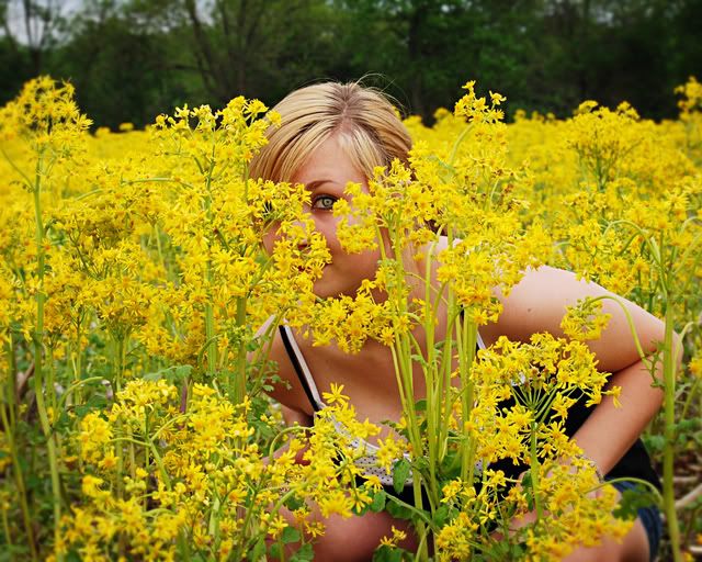
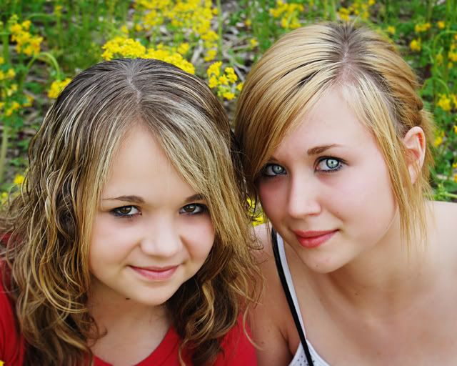
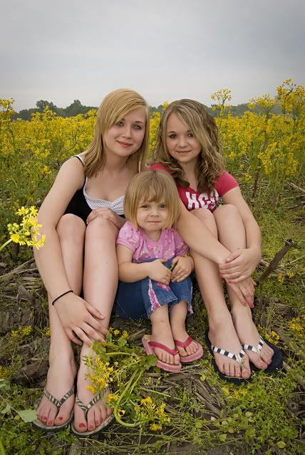
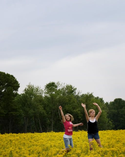
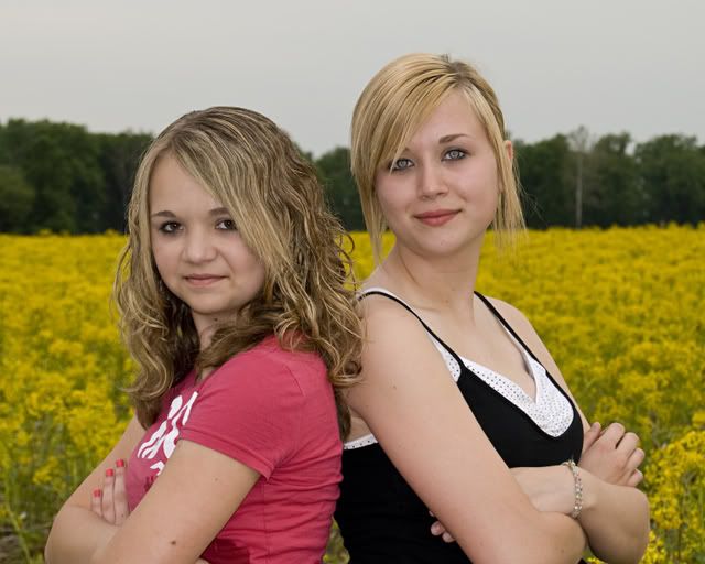
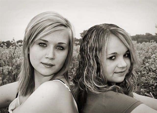
The composition in 1 and 2 dont reallt do much for me, but I like ALL of the rest of them. My wish is that the girls had dressed from the same color pallette. I think that was reinforced when I saw the one you chose to do monotone, which may be a good choice for all of these. One last comment....the eyes in #3 look great!
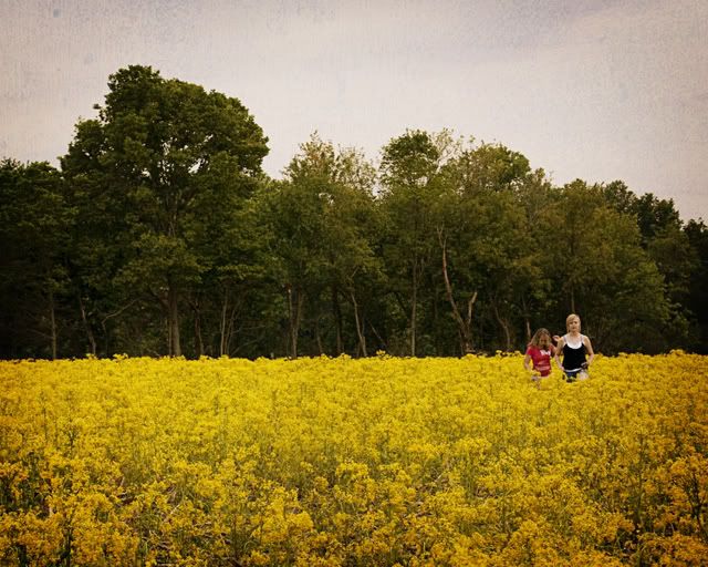
Julie, I love this series. The color and contrast looks great to me. My fav's are 1, 3, and 6. I especially like your compositional choice in 6, and you've captured the moment very well.
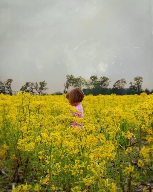
Nitpicks: I'm not sure any of these photos are well suited for your textured overlay. The texture makes the sky look, well, just weird in 2 and 4, and the foreground (flowers) is too busy to see the texture. I also think you could come in closer with 4.
Thanks for your comments, i really appreciate it. I have to be honest though, I REALLY have a hard time with posing. Seriously, I liken the feeling to almost stage fright. Does anyone else ever get that way? It's almost like I can't think of anything. How do I overcome that, or is it because I've been using these girls so much that I run out of ideas.
Comments
Those are some pretty girls! Do you think they would model for me?
Thanks for the comment.:D I tried using some textured overlays on some of these. I love photos that have this technique applied to it.
My blog
My Facebook
My blog
My Facebook
My apologies Julie...I meant to comment on these when I first saw them, but have been consumed with several events I have photographed as well as a photo I worked that has made the finalist list in the dgrin challenge. So I got sidetracked.
Overall, I like the contrast and color in these better than the last couple you posted....that I remember...the ones I kinda bumped up a notch in contrast and warmth. These are pretty doggone good to my eye.
The composition in 1 and 2 dont reallt do much for me, but I like ALL of the rest of them. My wish is that the girls had dressed from the same color pallette. I think that was reinforced when I saw the one you chose to do monotone, which may be a good choice for all of these. One last comment....the eyes in #3 look great!
Jeff
-Need help with Dgrin?; Wedding Photography Resources
-My Website - Blog - Tips for Senior Portraiture
Nitpicks: I'm not sure any of these photos are well suited for your textured overlay. The texture makes the sky look, well, just weird in 2 and 4, and the foreground (flowers) is too busy to see the texture. I also think you could come in closer with 4.
But overall I really like these!!
Phil Collum Photography
San Diego, CA, USA
Equipment list in my profile
My blog
My Facebook