Untouched Senior Portraits
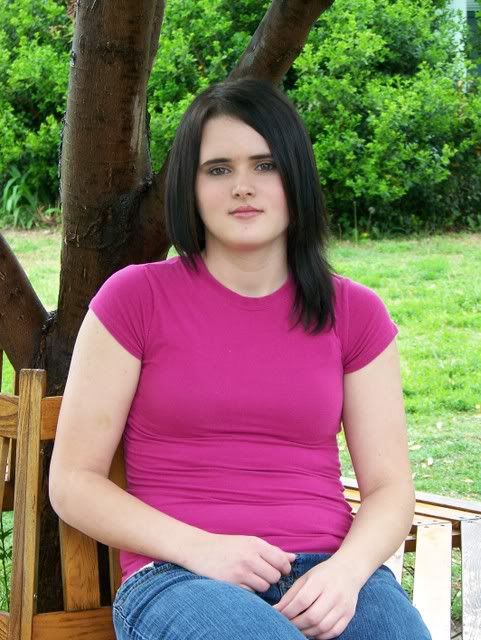
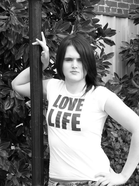
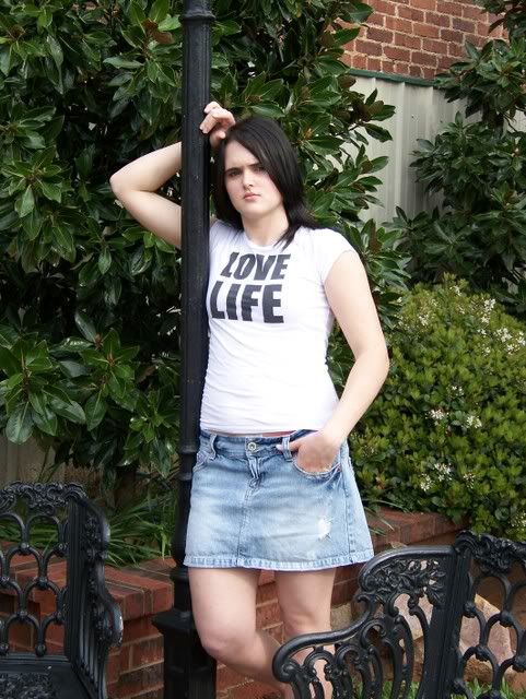
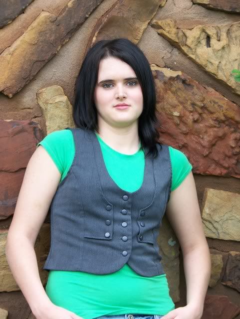
Here are some senior portraits I did a few weeks ago. All photos are completely untouched. CC not only welcome, but needed!
1.
2.
3.
4.
5.
6.
7.
8.
9.
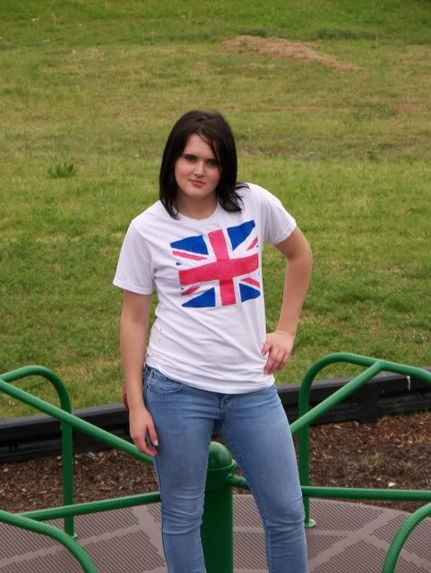
10.
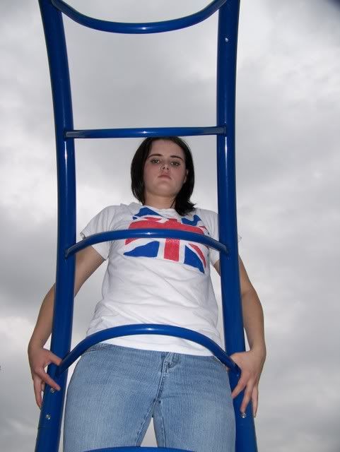
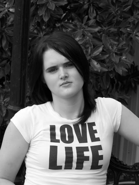
The b/w weren't converted using my PC, I set my camera to the b/w setting. Would any of you be pleased with these? Hope you enjoy, and like I said, I NEED all the CC I can get. I'm new to photography, but it is my passion, and I have SOOOOO much more to learn!
1.

2.

3.

4.

5.

6.

7.

8.

9.

10.

The b/w weren't converted using my PC, I set my camera to the b/w setting. Would any of you be pleased with these? Hope you enjoy, and like I said, I NEED all the CC I can get. I'm new to photography, but it is my passion, and I have SOOOOO much more to learn!
Lissa Gail:wink
0
Comments
Lissa, I'm not the best critic of "People" shots. I'm primarily an architectural photographer. BUT I know what I find appealing. Only two of your shots evoke any emotion in me, and those are 5 & 6. That's 'cause they're the only ones in which your subject isn't looking dead at the camera. Maybe that direct look really exemplifies her personality, but I think they look a bit like mug shots. The two I mentioned are really nice though. Just my $.02.
Natural selection is responsible for every living thing that exists.
D3s, D500, D5300, and way more glass than the wife knows about.
Las Cruces Photographer / Las Cruces Wedding Photographer
Other site
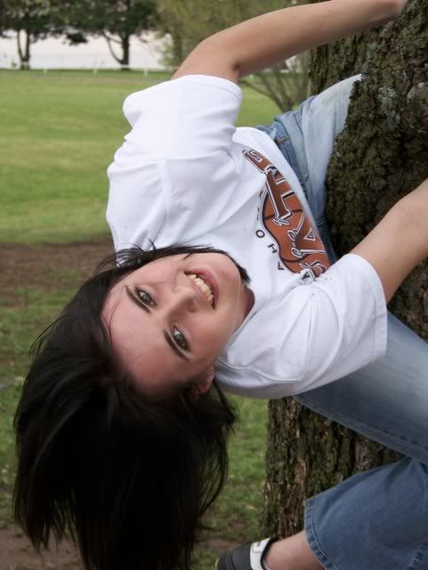
- Square to the camera, poor posture, no expression. Smiles not required, but she looks like she's just "putting up with it" to keep someone else happy. Very flat light.
- This is better, better angle to the camera, better attitude. Might think about cropping from the top and just a bit from the left as she's a little centered in the shot. Words on clothing for senior shots - not usually successful.
- Centered. Frown? Expression does not match the words on her shirt. Bench at her knee is not adding to the shot.
- The pose is good. Turn her face to her left and move the camera to her left to catch the her boddy more in profile for a much better composition. Appears camera focused on the wall as her face is quite soft. She's centered in the frame - boring. Might want to think about cropping some from the bottom.
- Finally, some life! The cut off foot is distracting. I think a different crop would improve the photo.
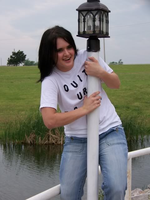
- She and the post are pretty centered. Exposure seems to be about 1 stop dark. Some fill flash for her eyes is REQUIRED here.
- Use of fill flash to balance the sky - good idea. But, flash illuminated the shirt more than anything else. Suggest some off-camera flash?
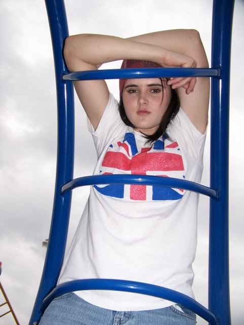
- Frown? Centered.
- Centered, dark, dark eyes.
- See comments on #7
This is going to sound very harsh (sorry about that) - were I in your shoes, I would strongly consider a second shooting session. Getting a book on posing might be something to also consider.My Photos
Thoughts on photographing a wedding, How to post a picture, AF Microadjustments?, Light Scoop
Equipment List - Check my profile
Your job is to complement your model....to make them look GOOD. It's not about taking some shots. Look through the viewfinder and move around and see what grabs you.
Flat light with square body positions generally ends in poor results. Find backgrounds that "go with" your subject. There are telephone poles, wires, aluminum siding next to folaige, bird doo on the edging of the playground area......look for those details...get rid of them. If you don't catch it at the time of the shoot, then learn how to remove distractions in post processing.
Also, change up the DOF as everything in focus leads the veiwer to look at everything. Your subject is the one we want to view, not distracting elements.
NAPP Member | Canon Shooter
Weddings/Portraits and anything else that catches my eye.
www.daveswartz.com
Model Mayhem site http://www.modelmayhem.com/686552