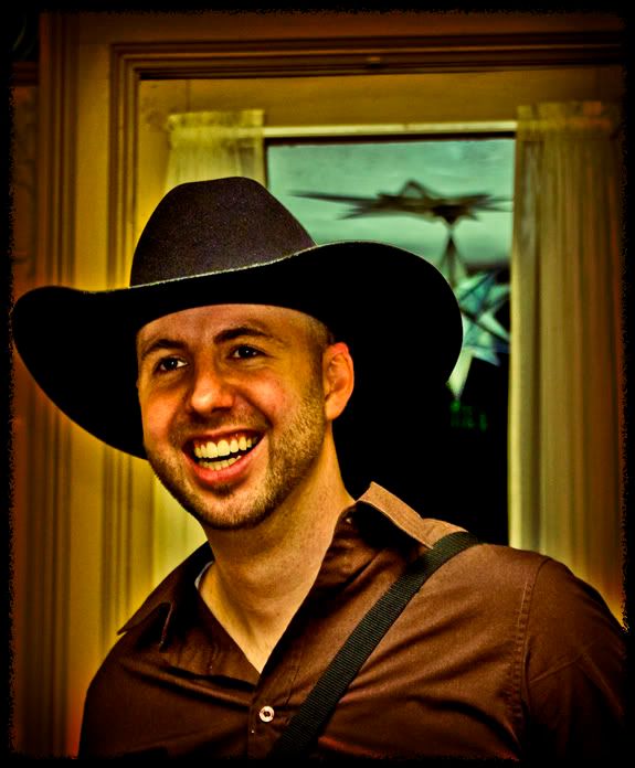
Guy in hat....

BPerronBPerron Registered Users Posts: 464 Major grins
edited June 7, 2008 in People
I just wanted to see what people thought of this image, it was taken at a birthday party, the guy in the photo was messing around and took the cowboy hat from someone and tried it on (if you knew the guy he would not be caught dead in a cowboy hat, LOL), I had to take the photo...C&C is always welcome, but I am more curious about what people think of the PP more then anything...

BlakeincowboyhatborderLOpsd.jpg
Brandon Perron Photography
www.brandonperron.com

Comments

  • DonRicklinDonRicklin Registered Users Posts: 5,551 Major grins
    edited June 6, 2008
    Looks like a real nice capture, but the jaundice tone is totally unflattering to the otherwise joyous look of this guy. EVen B&W would be better!


    Don
    Don Ricklin - Gear: Canon EOS 5D Mark III, was Pentax K7
    'I was older then, I'm younger than that now' ....
    My Blog | Q+ | Moderator, Lightroom Forums | My Amateur Smugmug Stuff | My Blurb book Rust and Whimsy. More Rust , FaceBook
    .
  • BPerronBPerron Registered Users Posts: 464 Major grins
    edited June 6, 2008
    DonRicklin wrote:
    Looks like a real nice capture, but the jaundice tone is totally unflattering to the otherwise joyous look of this guy. EVen B&W would be better!


    Don

    I can see what you are saying I played around with it some...less yellow and blue...
    Blakeincowboyhatwithboarder3net.jpg
    Brandon Perron Photography
    www.brandonperron.com
  • NateWagnerNateWagner Registered Users Posts: 142 Major grins
    edited June 6, 2008
    well, it's an interesting PP job.

    Personally, I'm not a huge fan of this one, but I'm not entirely sure why not. I do like the second one better, though I think it is still a little yellow/reddish colored.

    I think one thing that is greatly distracting from the photo is that there seems to be a huge mask over his eyes, it looks a bit like a raccoon.

    Otherwise it's an interesting shot, I do like the eyes, and the genuine smile.
    Thanks,
    -Nate

    Equipment
    Canon Stuff (and third party stuff as well)
    Tampa Bay Wedding Photography
  • BPerronBPerron Registered Users Posts: 464 Major grins
    edited June 6, 2008
    NateWagner wrote:
    well, it's an interesting PP job.

    Personally, I'm not a huge fan of this one, but I'm not entirely sure why not. I do like the second one better, though I think it is still a little yellow/reddish colored.

    I think one thing that is greatly distracting from the photo is that there seems to be a huge mask over his eyes, it looks a bit like a raccoon.

    Otherwise it's an interesting shot, I do like the eyes, and the genuine smile.

    Thanks for taking the time..Yeah, I am trying different tech. in photoshop seeing if I can generate a positive repsonse...but it seems it may be a bit much for most people. It does have a still slight yellow and red cast showing through, but I am not wanting it to be super perfect, but I do agree it is an improvement over the first one...There was over head lighting, he was almost directly under it, and the dark raccoon-esk over his eyes you are describing is due to the brim of the hat (it is acutally serving its purpose, to shade the eyes of the person who wears it...it is in the original photo...I tried to get it out of there, but there is just no real way...But I agree it is distracting...
    Brandon Perron Photography
    www.brandonperron.com
  • joshhuntnmjoshhuntnm Registered Users Posts: 1,924 Major grins
    edited June 6, 2008
    it looks a little over processed to me. I'd be curious to see how it came out of the camera.
  • BPerronBPerron Registered Users Posts: 464 Major grins
    edited June 6, 2008
    joshhuntnm wrote:
    it looks a little over processed to me. I'd be curious to see how it came out of the camera.
    Yes it is very over processed, that was my intention...
    Brandon Perron Photography
    www.brandonperron.com
  • thegreeneggthegreenegg Registered Users Posts: 551 Major grins
    edited June 6, 2008
    I understand you want overprocessed to be kind of like a style for you but you have to pick and choose what goes and sometimes doesn't. I would not mind the yellow kind of tone- it brings atmosphere- but there is part of the post-processing that doesn't make it look intentional. It looks like a mistake and I think if you toned it down it would be better
    I'm referring to what looks like over sharpening.
    It just doesn't look right to me because of this. Other aspects of the picture are really good. Again, I don't mind the experiment with color tone, I'm just not big on the over-sharpening. :P my two cents.
    a.
    Green is the way to be!
    ashleyharding.smugmug.com
  • shatchshatch Registered Users Posts: 798 Major grins
    edited June 7, 2008
    Your aggressive post on this would make a dynamic album cover. Fun
  • BPerronBPerron Registered Users Posts: 464 Major grins
    edited June 7, 2008
    I understand you want overprocessed to be kind of like a style for you but you have to pick and choose what goes and sometimes doesn't. I would not mind the yellow kind of tone- it brings atmosphere- but there is part of the post-processing that doesn't make it look intentional. It looks like a mistake and I think if you toned it down it would be better
    I'm referring to what looks like over sharpening.
    It just doesn't look right to me because of this. Other aspects of the picture are really good. Again, I don't mind the experiment with color tone, I'm just not big on the over-sharpening. :P my two cents.
    a.

    Thank you...I know what you mean about over sharpening, I am not a big fan of it either...I will play around with it some and see what I can get with less sharpening...Thanks for taking the time...
    Brandon Perron Photography
    www.brandonperron.com
  • BPerronBPerron Registered Users Posts: 464 Major grins
    edited June 7, 2008
    shatch wrote:
    Your aggressive post on this would make a dynamic album cover. Fun
    Thank you clap.gif
    Brandon Perron Photography
    www.brandonperron.com
Sign In or Register to comment.