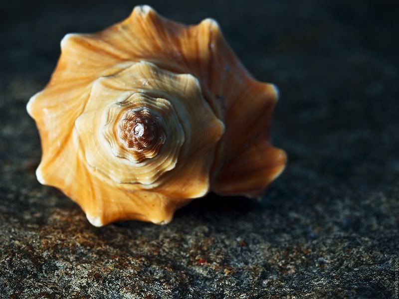
I like your idea but would like to see a little more DOF so the entire front of the shell were in focus. Maybe a little more dramatic lighting too. Just my 2 cents.
I agree. The blue lighting on the right side throws me off and the center of the shell should be sharper. I'd like a little turn to it. Like turning the shell towards the light a little or have another light o nthe second side. The golden rule is a great thing to look at and I love seeing the spirals and nautilus theme.
I think you have a ton of potential with that nautilus shell. This particular shot is just "OK" -- I know you can do better. Perhaps some more dramatic lighting? A different angle?
I like the angle you have chosen - I think it puts the focus on where it needs to be for the theme. But by all means, try some reshoots on different angles and let us see
I agree with Shatch's comments, I would very much like to see it with more DOF and maybe some more drammatic lighting - let us see all of it's natural geometry clearly.
I couldn't wait to see where you were going with this one! And, it's been worth the wait!
The blue-lit stones and reflections add good drama to the pic. My preference is the one with the tighter crop (#2). The large area of black in #1 is too distracting.
All right, all right, geez! Why you gonna make me go live up to my potential?
...
Some titles:
Fractals in Nature
Fractal Sunrise
I like it. Great play on both themes!
Few things:
Reflection is a very strong point. Maybe choose a crop accomodating for it? Currently it looks as a side effect.
Blue stones in the water are too bright. Maybe a gobo to block that part from lighting, making reflection much stronger? Or even lower angle, again making reflection stronger and refraction (and henceforth see-through effect) weaker.
I personally think that the second reflection one is nice, but I do think it needs to be straight on, not shot at an angle. When I look at your second attempt vs your first post I lose the "fractlness" of the object when it isn't shot straight on.
Comments
Some of My Photos: app.electrikfolio.com/v/steven-hatch
*
http://member.onemodelplace.com/member.cfm?P_ID=214042
http://lrichters.smugmug.com
I agree with Shatch's comments, I would very much like to see it with more DOF and maybe some more drammatic lighting - let us see all of it's natural geometry clearly.
Whacha think? Also which crop?
Wide
Tight
Some titles:
Fractals in Nature
Fractal Sunrise
pyroPrints.com/5819572 The Photo Section
The blue-lit stones and reflections add good drama to the pic. My preference is the one with the tighter crop (#2). The large area of black in #1 is too distracting.
http://lrichters.smugmug.com
*
http://member.onemodelplace.com/member.cfm?P_ID=214042
I like it.
Few things:
- Reflection is a very strong point. Maybe choose a crop accomodating for it? Currently it looks as a side effect.
- Blue stones in the water are too bright. Maybe a gobo to block that part from lighting, making reflection much stronger? Or even lower angle, again making reflection stronger and refraction (and henceforth see-through effect) weaker.
HTHJust my 2 cents...
Some of My Photos: app.electrikfolio.com/v/steven-hatch
I like #2 best.
Virginia
"A photograph is a secret about a secret. The more it tells you, the less you know." Diane Arbus
Email