I think it is a well thought out comp and a sweet exposure on a very nice
scene. But dang, I see more blur and less art than anything. Starts in
the front and falls back to the rear. Things seem mushed together more
like camera shake than an artful filter / et.... used.
For artful, I guess impressionist may do more but I don't know zip about
the rights and wrongs of art. I just know what I think my eyes see and
like. To me this take is not carrying your shot to art. I think maybe you
could rack some other filter bars that may or may not gain you more
impact on such a nice photo.
Just my regular..... I now give $.05 cents per anything.... to this work of yours. Don't ask for change if you go split opinion.
Dang. Don't ya just hate to step out.
Appreciate your patience Paul. Art is after all in the eye of the
beholder.
I respect the shot and the idea of where you would
make the effort to move it further along in any artful direction
beyond the native take.
Its a great candidate to do so. That said the original is a very nice
well done stand alone shot.
To me there is a great distinction between the two and the original wins
this round. Thats my eye et... hardly means I'm near right.
I like the sharpness and greater detail in the original. The work up seems
too soft / minor blurry not working somehow for a more powerful impact
that this particular image could nicely relay. Besides the fact that it
nicely relays it by itself as is.
I liek them both and appreciate the Manet/Impressionist direction you were going. It has the layout of VanGogh's later paintings... not to say you are on the verge of killing yourself. At least you don't have crows over a cornfield.
That might be a great challenge, to recreate a famous work of art with this effect and a picture.
")
Comments
scene. But dang, I see more blur and less art than anything. Starts in
the front and falls back to the rear. Things seem mushed together more
like camera shake than an artful filter / et.... used.
For artful, I guess impressionist may do more but I don't know zip about
the rights and wrongs of art. I just know what I think my eyes see and
like. To me this take is not carrying your shot to art. I think maybe you
could rack some other filter bars that may or may not gain you more
impact on such a nice photo.
Just my regular..... I now give $.05 cents per anything.... to this work of yours. Don't ask for change if you go split opinion.
Michael
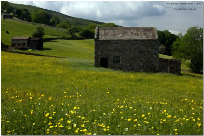
Maybe you'd prefer the original?
Paul.
Link to my personal website: http://www.pauliddon.co.uk
Appreciate your patience Paul. Art is after all in the eye of the
beholder.
I respect the shot and the idea of where you would
make the effort to move it further along in any artful direction
beyond the native take.
Its a great candidate to do so. That said the original is a very nice
well done stand alone shot.
To me there is a great distinction between the two and the original wins
this round. Thats my eye et... hardly means I'm near right.
I like the sharpness and greater detail in the original. The work up seems
too soft / minor blurry not working somehow for a more powerful impact
that this particular image could nicely relay. Besides the fact that it
nicely relays it by itself as is.
Whack me if you like...
:whip Good luck with that....
Oooh kinky....
I appreciate your wisdom m8. Thanks for the detailed input.
Paul.
Link to my personal website: http://www.pauliddon.co.uk
That might be a great challenge, to recreate a famous work of art with this effect and a picture.
*
http://member.onemodelplace.com/member.cfm?P_ID=214042