Engagement pictures

KTBoom2006-E510KTBoom2006-E510 Registered Users Posts: 437 Major grins
edited July 7, 2008 in Weddings
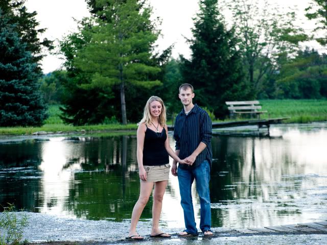
Didn't know I was going to take engagement pictures during a family photoshoot. But here they are, first time... They told me they wanted wide views of their land. So that is why that pictures aren't cropped very much.


1.
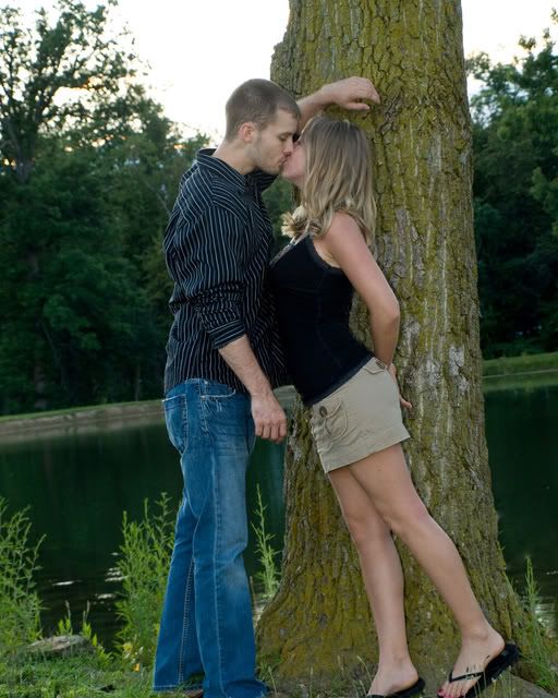
P6299620copy.jpg

2.
326771233_p6299634.jpg

3.
326534099_p6299571.jpg

4.
326557151_p6299593.jpg

5.
326556010_p6299588.jpg

6.
P6299598.jpg

7.
326772230_p6299640.jpg

8.
326558412_p6299585.jpg

9.
326550823_p6299613.jpg
~Katie~
:barb

http://www.kc1stphotography.com


2 Canon Rebel XSi
Tamron 70-200mm f2.8
2 Canon 14-55mm
Canon 55-250mm f4.0
Canon 580EX
Canon 580EX II

Comments

  • joshhuntnmjoshhuntnm Registered Users Posts: 1,924 Major grins
    edited July 6, 2008
    wonderful series

    a little blue color balance to me. did you shoot it on the shade wb?


    also, one or two have a little too much room above the head from my eye.

    overall great series. great emotion. fun. romantic.
  • KTBoom2006-E510KTBoom2006-E510 Registered Users Posts: 437 Major grins
    edited July 6, 2008
    joshhuntnm wrote:
    wonderful series

    a little blue color balance to me. did you shoot it on the shade wb?


    also, one or two have a little too much room above the head from my eye.

    overall great series. great emotion. fun. romantic.

    Thanks, I think I shot it on the shade. Or sun. It was a little bit hard to adjust the colors because the girl had a redish tint and the boy had a greenish tint. But it was fun, I just wish I would've known we were doing that too so that we could've went to a different, better, location.
    ~Katie~
    :barb

    http://www.kc1stphotography.com


    2 Canon Rebel XSi
    Tamron 70-200mm f2.8
    2 Canon 14-55mm
    Canon 55-250mm f4.0
    Canon 580EX
    Canon 580EX II
  • joshhuntnmjoshhuntnm Registered Users Posts: 1,924 Major grins
    edited July 6, 2008
    Thanks, I think I shot it on the shade. Or sun. It was a little bit hard to adjust the colors because the girl had a redish tint and the boy had a greenish tint. But it was fun, I just wish I would've known we were doing that too so that we could've went to a different, better, location.

    did you shoot RAW?
  • NateWagnerNateWagner Registered Users Posts: 142 Major grins
    edited July 7, 2008
    I agree with Josh, the white balance on many of them looks a little blue.
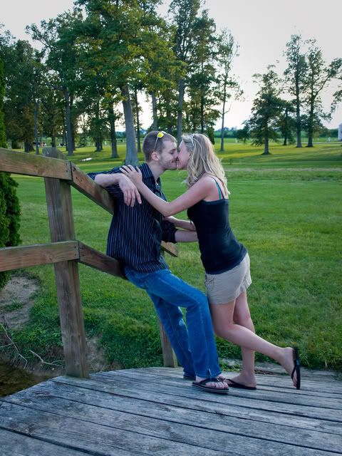
    1. I like the idea, it's a little centered though, and unfortunately the feet are cut off. I might crop it more so that it doesn't chop off half of the feet. (her pose is cute though)
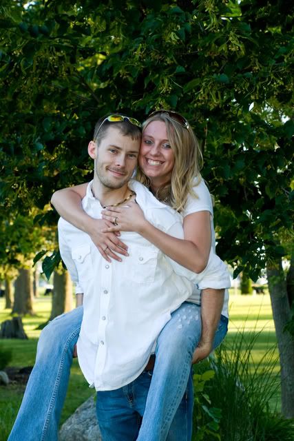
    2. it looks like her eyes are closed, hard to tell though. I think it would look better with clearly opened eyes. Also, something I'm currently learning, but would have helped (I think) is if the guy had his other hand, say, behind her back or something. And she had her other hand maybe resting on a hip or something.
    3. I definitely like this one, only nits are that her face looks a little red, and there is a visible car in the background. In addition, like Josh said, it would be nice to crop this a bit and get rid of some of the tree above her.
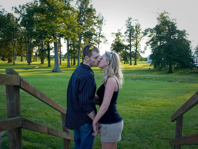
    4. nice shot... I am a sucker for the sweet kissing shots. However, again this is rather centered (not necessarily bad) also, I would recommend cropping out the railing on the right, as I think it is rather distracting and just there. (just my opinion though.
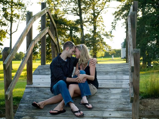
    5. probably my favorite or right up there. Though, it may have been nice to see their eyes just a bit. There is a ton of head room, but you also left the top of the bridge, so whether or not to take it out is your call. I probably would, but only to show that the main subject is the couple and not the bridge.
    6. very cute shot. I would just fix the WB on this, and crop off the tree from the left, and the piece of the house from the right, and you'll be all set.
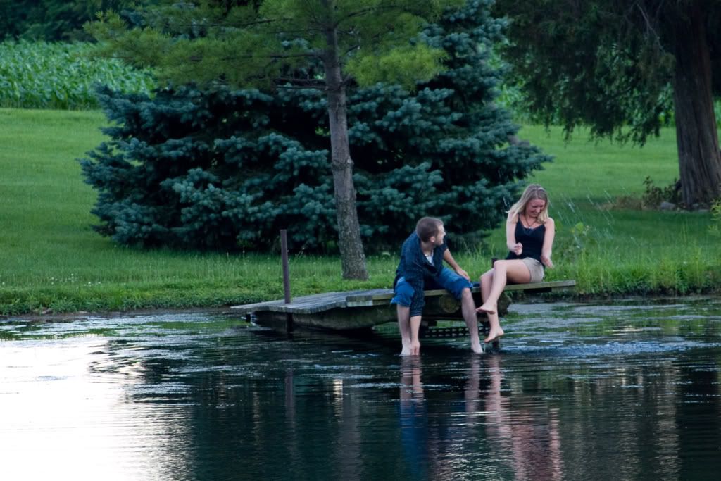
    7. fun action shot. Personally, I would probably toss it, because it is blurry. If you were to keep it though, you have a lot of dead space on the left of the photo for cropping out.
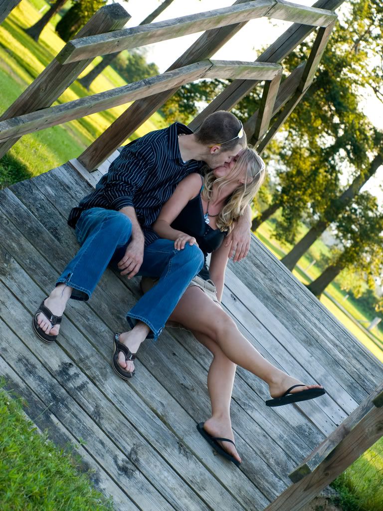
    8. yet another kissing photo... I like it... cute, the tilt is a little odd for me (I think I usually tilt the other way). in general it's one of my favs of the set though
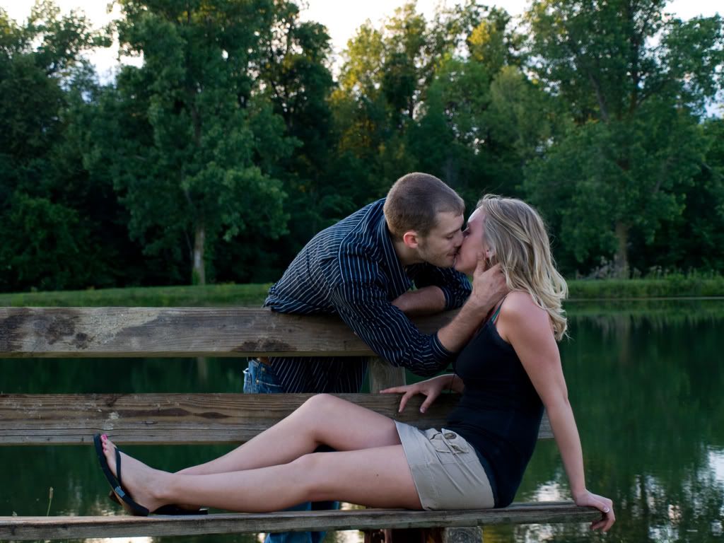
    9. another cute shot. A fill flash might have been nice, as her face is rather dark.

    Overall, there was really only 1 or maybe 2 shots that had the couple looking at the camera. You probably have others, but for personal preference I would have liked to see more eyes and less kissing (though that's all well and good.)

    Good set overall, I enjoyed looking through them. Keep up the work.
    As always, what I said is only my opinion, your mileage may vary.
    Thanks,
    -Nate

    Equipment
    Canon Stuff (and third party stuff as well)
    Tampa Bay Wedding Photography
  • Scott_QuierScott_Quier Registered Users Posts: 6,524 Major grins
    edited July 7, 2008
    General comments
    • They are all centered. Some are bulls-eyed - where the subject is centered both vertically and horizontally.
    • If getting some of the scenery into the shot was an objective, it works well if you put your subject toward one side or the other of the image and have them interact with their environment (like in #7).
    • Carrying a gray card is a good idea. This way you can, if you use it, know what a neutral WB would be and so you have something to deviate from.
    Comments on individual photos:
    1. Pose is nice, different and fun. The sky is blown, may because you were exposing for them? Well, they are under-exposed. Might have worked better with some fill light of some kind.
    2. WB. Titled, but not enough to say that it was on purpose - looks accidental. Hand position looks unnatural. They are interacting with the camera more than they are with each other.
    3. They are almost dead-centered in the image. The car. Fill light would be good to lighten her face a touch. His shirt seems blown (but that could just be this POS monitor, which is why I'm not discussing color too much:D). If you had lowered the orientation of the camera a touch, you could have gotten all of her legs in the shot.
    4. This is nice and the light is about 1/2 way there. It would have been nice to have had a touch of light on this side of them - they look a touch under exposed. Also, that fill light would have allowed you to better control the luminosity of the sky behind them.
    5. I really like this pose (and I'm going to steal the whole idea!). I like how they are interacting with each other rather than with the camera. It's nice to get a mix. Lighting comments - same as in #4.
    6. Lighting comment same as #4. Pos is nice. Photo seems to be tilted to the left a touch, but
      not enough to look like it was done intentionally.
    7. Light, blurred. Otherwise, this would have been a keeper.
    8. For me, tilt is a little much. Like the way the sun in almost rim-lighting them. If you had had additional light on this side of them, you would have had more success controlling the exposure of the sky and grass behind them.
    9. This is very sweet - love the posing here. Might have wanted to see her right hand touching him rather than on the back of the bench. This one screams for some fill light!
    I hope these comments are useful for you as that was my intent.
  • cmorganphotographycmorganphotography Registered Users Posts: 980 Major grins
    edited July 7, 2008
    I recognize these two. She's still smiling. I know these re engagement pictures and all but they are kissing a lot. I don't know if it's because he's troublesome, rolleyes1.gif from previous sessions I surmise, but even a serious face in the right pose can look good. It looks like you chose a nice shaded area for the picsthumb.gif and the tilts of the camera work for me. She wore a miniskirt and that limited what she could do rolleyes1.gif , sometimes people just don't think about that stuff. I think I'll assemble a list of clothing that's inappropriate like a miniskirt, busy patterns, or a plunging neckline. ne_nau.gif People wear some cah-razy stuff to get their portraits taken.
  • KTBoom2006-E510KTBoom2006-E510 Registered Users Posts: 437 Major grins
    edited July 7, 2008
    I recognize these two. She's still smiling. I know these re engagement pictures and all but they are kissing a lot. I don't know if it's because he's troublesome, rolleyes1.gif from previous sessions I surmise, but even a serious face in the right pose can look good. It looks like you chose a nice shaded area for the picsthumb.gif and the tilts of the camera work for me. She wore a miniskirt and that limited what she could do rolleyes1.gif , sometimes people just don't think about that stuff. I think I'll assemble a list of clothing that's inappropriate like a miniskirt, busy patterns, or a plunging neckline. ne_nau.gif People wear some cah-razy stuff to get their portraits taken.

    actually only 2 pictures were under shade. My flash helped pretty dang good. And I agree with the whole miniskirt thing, this is my second girl who had a short short skirt on, and well... You REALLY have to watch it.
    ~Katie~
    :barb

    http://www.kc1stphotography.com


    2 Canon Rebel XSi
    Tamron 70-200mm f2.8
    2 Canon 14-55mm
    Canon 55-250mm f4.0
    Canon 580EX
    Canon 580EX II
  • KTBoom2006-E510KTBoom2006-E510 Registered Users Posts: 437 Major grins
    edited July 7, 2008
    General comments
    • They are all centered. Some are bulls-eyed - where the subject is centered both vertically and horizontally.
    • If getting some of the scenery into the shot was an objective, it works well if you put your subject toward one side or the other of the image and have them interact with their environment (like in #7).
    • Carrying a gray card is a good idea. This way you can, if you use it, know what a neutral WB would be and so you have something to deviate from.
    Comments on individual photos:
    1. Pose is nice, different and fun. The sky is blown, may because you were exposing for them? Well, they are under-exposed. Might have worked better with some fill light of some kind.
    2. WB. Titled, but not enough to say that it was on purpose - looks accidental. Hand position looks unnatural. They are interacting with the camera more than they are with each other.
    3. They are almost dead-centered in the image. The car. Fill light would be good to lighten her face a touch. His shirt seems blown (but that could just be this POS monitor, which is why I'm not discussing color too much:D). If you had lowered the orientation of the camera a touch, you could have gotten all of her legs in the shot.
    4. This is nice and the light is about 1/2 way there. It would have been nice to have had a touch of light on this side of them - they look a touch under exposed. Also, that fill light would have allowed you to better control the luminosity of the sky behind them.
    5. I really like this pose (and I'm going to steal the whole idea!). I like how they are interacting with each other rather than with the camera. It's nice to get a mix. Lighting comments - same as in #4.
    6. Lighting comment same as #4. Pos is nice. Photo seems to be tilted to the left a touch, but
      not enough to look like it was done intentionally.
    7. Light, blurred. Otherwise, this would have been a keeper.
    8. For me, tilt is a little much. Like the way the sun in almost rim-lighting them. If you had had additional light on this side of them, you would have had more success controlling the exposure of the sky and grass behind them.
    9. This is very sweet - love the posing here. Might have wanted to see her right hand touching him rather than on the back of the bench. This one screams for some fill light!
    I hope these comments are useful for you as that was my intent.

    I was using fill flash, is there something more I can do? Maybe a light, but I don't have any equipment for that yet.... headscratch.gif hmm, I had my disc with us, but didn't think to use it to reflect light from the other side. And I didn't even notice some of the pictures were tilted a little bit. I must not be able to see it very well. Good eyes! I didn't have a gray card, but I shot the pictures in raw, so I could mess with them more. Thanks, everyone's comments to help
    ~Katie~
    :barb

    http://www.kc1stphotography.com


    2 Canon Rebel XSi
    Tamron 70-200mm f2.8
    2 Canon 14-55mm
    Canon 55-250mm f4.0
    Canon 580EX
    Canon 580EX II
  • KTBoom2006-E510KTBoom2006-E510 Registered Users Posts: 437 Major grins
    edited July 7, 2008
    NateWagner wrote:
    I agree with Josh, the white balance on many of them looks a little blue.
    1. I like the idea, it's a little centered though, and unfortunately the feet are cut off. I might crop it more so that it doesn't chop off half of the feet. (her pose is cute though)
    2. it looks like her eyes are closed, hard to tell though. I think it would look better with clearly opened eyes. Also, something I'm currently learning, but would have helped (I think) is if the guy had his other hand, say, behind her back or something. And she had her other hand maybe resting on a hip or something.
    3. I definitely like this one, only nits are that her face looks a little red, and there is a visible car in the background. In addition, like Josh said, it would be nice to crop this a bit and get rid of some of the tree above her.
    4. nice shot... I am a sucker for the sweet kissing shots. However, again this is rather centered (not necessarily bad) also, I would recommend cropping out the railing on the right, as I think it is rather distracting and just there. (just my opinion though.
    5. probably my favorite or right up there. Though, it may have been nice to see their eyes just a bit. There is a ton of head room, but you also left the top of the bridge, so whether or not to take it out is your call. I probably would, but only to show that the main subject is the couple and not the bridge.
    6. very cute shot. I would just fix the WB on this, and crop off the tree from the left, and the piece of the house from the right, and you'll be all set.
    7. fun action shot. Personally, I would probably toss it, because it is blurry. If you were to keep it though, you have a lot of dead space on the left of the photo for cropping out.
    8. yet another kissing photo... I like it... cute, the tilt is a little odd for me (I think I usually tilt the other way). in general it's one of my favs of the set though
    9. another cute shot. A fill flash might have been nice, as her face is rather dark.

    Overall, there was really only 1 or maybe 2 shots that had the couple looking at the camera. You probably have others, but for personal preference I would have liked to see more eyes and less kissing (though that's all well and good.)

    Good set overall, I enjoyed looking through them. Keep up the work.
    As always, what I said is only my opinion, your mileage may vary.

    I actually have more pictures, some in which aren't centered. I have a habit of that. My camera only has 3 focusing dots which make it hard to focus anywhere besides the middle..

    Here is my camera's dots in example:

    lets say this is the camera's lens ( . . . ) the dots in the middle are my focusing points. But yet they are still in the middle. When I focus on a spot and keep my finger half way down to keep it focused (and not change), then I move it to get a different angle or not centered, the pictures don't look sharp. I try to get the same distance with the focusing, but I just haven't got this down yet..... Anyone know what to do that might work better?

    I liked # 7 A LOT too, but I was very far away (because it was a pond) and was zoomed in as close as I could be. And it was still a far shot, so I had to crop it to get it closer. So .... that's what happened. But the couple still wanted the picture. Wanted a 4x6 and wallets. And I have more pictures where they are kissing... lol
    ~Katie~
    :barb

    http://www.kc1stphotography.com


    2 Canon Rebel XSi
    Tamron 70-200mm f2.8
    2 Canon 14-55mm
    Canon 55-250mm f4.0
    Canon 580EX
    Canon 580EX II
  • Scott_QuierScott_Quier Registered Users Posts: 6,524 Major grins
    edited July 7, 2008
    I was using fill flash, is there something more I can do?

    Fill flash 101 (in an all manual world or using off-camera flash without communication between your flash unit and your camera) -
    • Determine your ISO, shutter speed, and aperture for a decent exposure for the background, keeping your shutter speed at or below your x-sync speed.
    • Now, determine how much you want to under-expose your ambient, if at all.
    • Adjust your aperture, shutter speed (keeping it below your x-sync speed) or ISO accordingly. For example, if you want to under-expose your ambient, stop down the lens, increase your shutter speed, decrease the ISO, or any combination of these three.
    • Set the power/duration of your flash to something - it's a WAG at this point.
    • Take a shot and review your histogram and/or LCD.
    • If needed, adjust the power/duration of your flash and repeat.
    • When you think you have a good exposure, bracket your flash exposure 'cause your LCD will LIE to you and it's hard to judge flash exposure using the histogram.
    Wheew - that's an effort:D The good news is that, once you've done it a couple of times, it becomes very easy.

    Canon ETT-L makes this soooo much easier:
    • Set your camera to Av mode
    • Set your ISO and desired aperture.
    • Set your exposure compensation to desired level to over/under expose the ambient.
    • Check your shutter speed to make sure it's not too slow. Also check that it's below your x-synch (usually 1/250). If it's not below the x-sync, then set your flash to HSS. Make adjustments as required.
    • Set Flash Exposure compensation to -1 (it's a good starting point)
    • Take a test shot and look at LCD and histogram
    • Adjust EC and/or FEC to taste, repeat
    • Bracket the FEC, 'cause ....
    I don't know what your Oly offers to make this easier for you - which is why I included the "manual" way of doing things. It provides more of conceptual overview of the process that can be modified to better fit your equipment.

    :deadhorse mwink.gif:D
    Fill light should be enough to open up the shadows without being so strong that all shadows are completely obliterated.

    Does this help a bit?
  • KTBoom2006-E510KTBoom2006-E510 Registered Users Posts: 437 Major grins
    edited July 7, 2008
    Fill flash 101 (in an all manual world or using off-camera flash without communication between your flash unit and your camera) -
    • Determine your ISO, shutter speed, and aperture for a decent exposure for the background, keeping your shutter speed at or below your x-sync speed.
    • Now, determine how much you want to under-expose your ambient, if at all.
    • Adjust your aperture, shutter speed (keeping it below your x-sync speed) or ISO accordingly. For example, if you want to under-expose your ambient, stop down the lens, increase your shutter speed, decrease the ISO, or any combination of these three.
    • Set the power/duration of your flash to something - it's a WAG at this point.
    • Take a shot and review your histogram and/or LCD.
    • If needed, adjust the power/duration of your flash and repeat.
    • When you think you have a good exposure, bracket your flash exposure 'cause your LCD will LIE to you and it's hard to judge flash exposure using the histogram.
    Wheew - that's an effort:D The good news is that, once you've done it a couple of times, it becomes very easy.

    Canon ETT-L makes this soooo much easier:
    • Set your camera to Av mode
    • Set your ISO and desired aperture.
    • Set your exposure compensation to desired level to over/under expose the ambient.
    • Check your shutter speed to make sure it's not too slow. Also check that it's below your x-synch (usually 1/250). If it's not below the x-sync, then set your flash to HSS. Make adjustments as required.
    • Set Flash Exposure compensation to -1 (it's a good starting point)
    • Take a test shot and look at LCD and histogram
    • Adjust EC and/or FEC to taste, repeat
    • Bracket the FEC, 'cause ....
    I don't know what your Oly offers to make this easier for you - which is why I included the "manual" way of doing things. It provides more of conceptual overview of the process that can be modified to better fit your equipment.

    :deadhorse mwink.gif:D
    Fill light should be enough to open up the shadows without being so strong that all shadows are completely obliterated.

    Does this help a bit?

    WOW, thanks for the details... I will have to get my camera at home and sit with it while reading this stuff to see if I follow. But I really appreciate all the effort you put in this for me. I really enjoy how everyone on this forum helps each other out.
    ~Katie~
    :barb

    http://www.kc1stphotography.com


    2 Canon Rebel XSi
    Tamron 70-200mm f2.8
    2 Canon 14-55mm
    Canon 55-250mm f4.0
    Canon 580EX
    Canon 580EX II
  • urbanariesurbanaries Registered Users Posts: 2,690 Major grins
    edited July 7, 2008
    But I really appreciate all the effort you put in this for me. I really enjoy how everyone on this forum helps each other out.

    As far as help goes around here, Scott is the man! He's always more than generous with his advice, and has a wonderful ability to break it down into understandable language.

    And, unlike some folks on the 'net, he doesn't shoot from the hip, he really does know his stuff, and if he's not 110% certain about something...he'll tell you.

    Great review on fill, Scott...you have been through this with me a few times and I'm still learning from your posts! clap.gif
    Canon 5D MkI
    50mm 1.4, 85mm 1.8, 24-70 2.8L, 35mm 1.4L, 135mm f2L
    ST-E2 Transmitter + (3) 580 EXII + radio poppers
  • Scott_QuierScott_Quier Registered Users Posts: 6,524 Major grins
    edited July 7, 2008
    WOW, thanks for the details... I will have to get my camera at home and sit with it while reading this stuff to see if I follow. But I really appreciate all the effort you put in this for me. I really enjoy how everyone on this forum helps each other out.
    Just so as you know - I didn't invent this stuff. I'm just repeating what I've read around here."wink - so I can't and don't want to take any credit for it. The only thing I might add is an ability to break things down into small steps - but anyone can do that. Actually, this is stuff that I've actually used and found it to work for me.

    If you run into problem with this information - just start up another thread (probably in the Techniques forum) and you'll get more help than you'll know how to handle.
    urbanaries wrote:
    As far as help goes around here, Scott is the man! He's always more than generous with his advice, and has a wonderful ability to break it down into understandable language.

    And, unlike some folks on the 'net, he doesn't shoot from the hip, he really does know his stuff, and if he's not 110% certain about something...he'll tell you.

    Great review on fill, Scott...you have been through this with me a few times and I'm still learning from your posts! clap.gif
    Hey Lynne - it's been a long time since I've seen a post from you and you had to go and do something like this. What ever am I to do with you?

    Oh and BTW - some of the content above is concepts I've learned from reading the strobist - in particular his lighting 101 series.
  • KTBoom2006-E510KTBoom2006-E510 Registered Users Posts: 437 Major grins
    edited July 7, 2008
    urbanaries wrote:
    As far as help goes around here, Scott is the man! He's always more than generous with his advice, and has a wonderful ability to break it down into understandable language.

    And, unlike some folks on the 'net, he doesn't shoot from the hip, he really does know his stuff, and if he's not 110% certain about something...he'll tell you.

    Great review on fill, Scott...you have been through this with me a few times and I'm still learning from your posts! clap.gif

    Do you know where Muncie, Indiana is Lynn?
    ~Katie~
    :barb

    http://www.kc1stphotography.com


    2 Canon Rebel XSi
    Tamron 70-200mm f2.8
    2 Canon 14-55mm
    Canon 55-250mm f4.0
    Canon 580EX
    Canon 580EX II
Sign In or Register to comment.