Pyro's Infrared Filter
whacha think?
Edited to replace with current version.
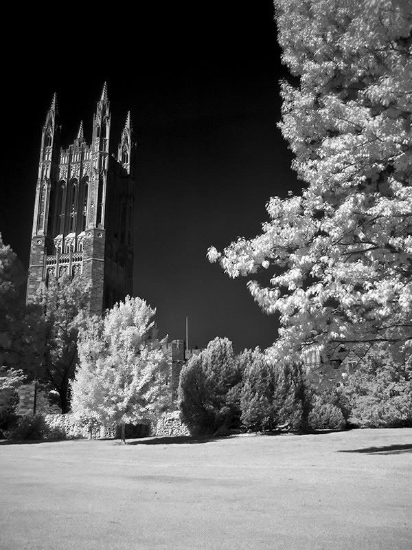
Invisible Light Captured
Crop A
Crop B
Crop C
perspective correction:
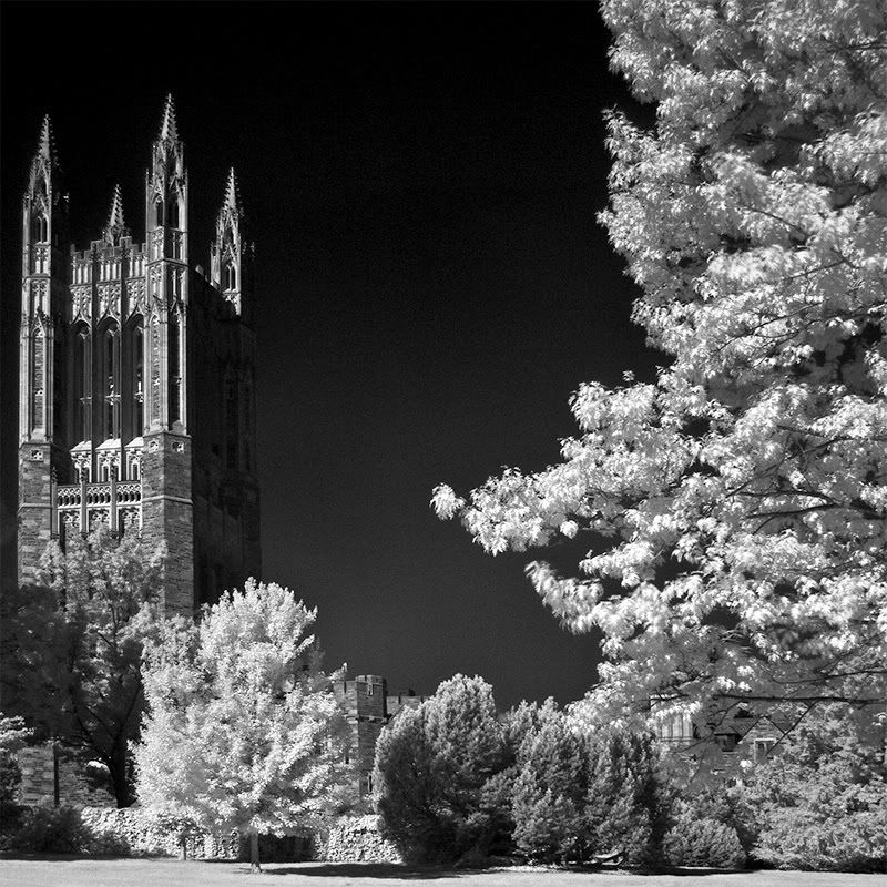
Edited to replace with current version.
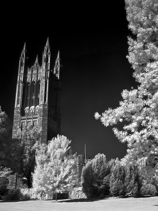
Invisible Light Captured
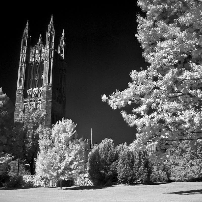
Crop A
Crop B
Crop C
perspective correction:
0
Comments
Both compositions are nice but in general both look like they need a curves adjustment or something. The whites should look a little brighter, IMO.
The tilt of the building bothers me. I prefer to see it with the perspective adjusted. But that's just me.
Of the two, I like the closer crop you did on #2. There's just a little too much foreground in #1. You can try cropping #1 to the path in the grass and see how you like that. A curves adjustment should make that path a bit more visible and add some interest to the foreground that won't conflict too much with your main subject.
http://lrichters.smugmug.com
Yup. about 5 minutes from my job.
pyroPrints.com/5819572 The Photo Section
About 10 minutes from my job when there's not too much traffic on Route 1.
http://lrichters.smugmug.com
pyroPrints.com/5819572 The Photo Section
Some of My Photos: app.electrikfolio.com/v/steven-hatch
Way to go!!
http://lrichters.smugmug.com