Dana & Shane.

chris5olsonchris5olson Registered Users Posts: 76 Big grins
edited January 3, 2011 in Weddings
Hi there, this is my first post with Digital Grins & I am looking for some CC please. I shot these in October. The wedding was a civil war theme!!!! lots of fun!

1. IMG_7603.jpg
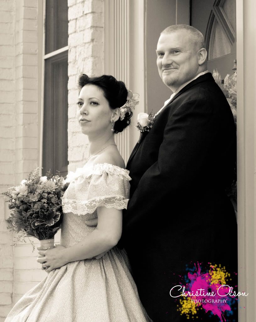
(EF 28-135mm @ 1/250 f/8)

2.IMG_7593.jpg
(EF 28-135mm @ 1/250 f/8)

3.IMG_7436.jpg
(EF 28-135mm @ 1/60 f/3.5)

4.IMG_7588.jpg
(EF 28-135mm @ 1/250 f/8)

I appreciate any CC. :)
In My Bag:
Canon Rebel XSi. Canon 50mm f/1.4. Canon 28-135mm f/3.5-5.6. Speedlite 430exII
Coming Soon
Canon 5DmkII. Canon 24-70mm f/2.8L

Comments

  • Aspecto5Aspecto5 Registered Users Posts: 311 Major grins
    edited December 27, 2010
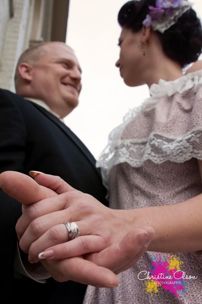
    ok, so number 2, I would've cleaned up his hands in photoshop a bit. Even if he's known as a hard worker with rough hands, it's still distracting to me as a viewer.

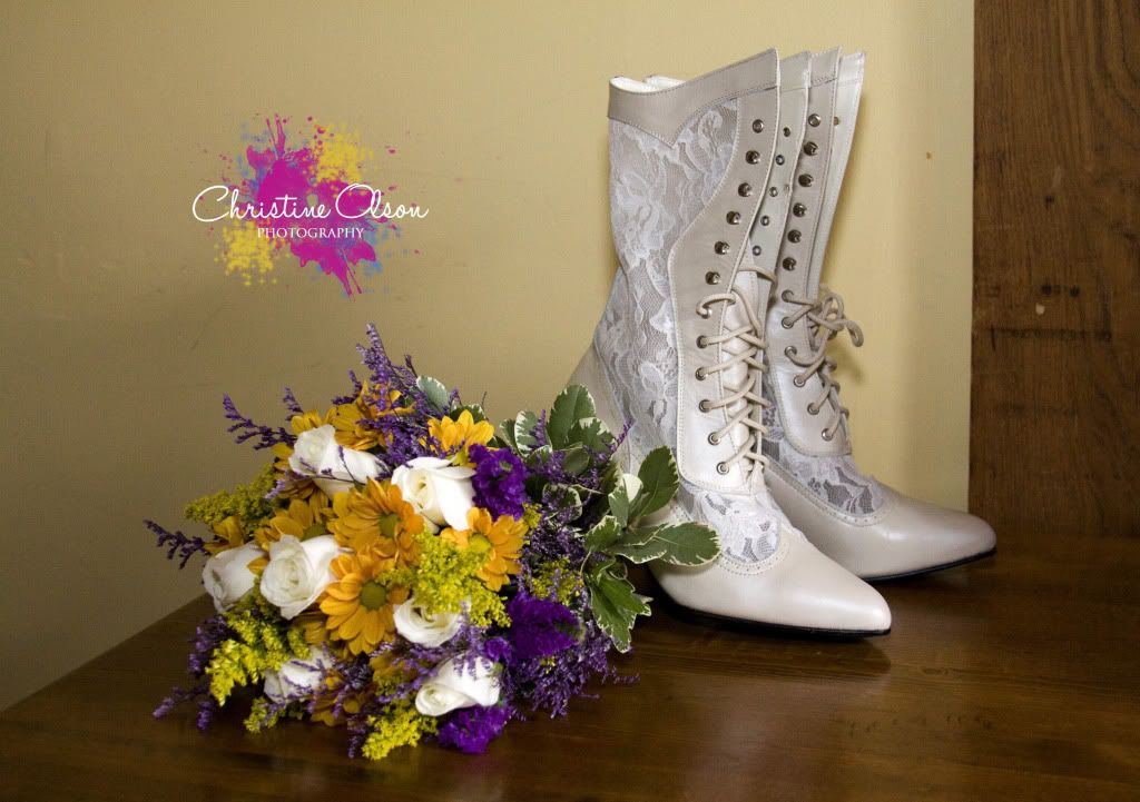
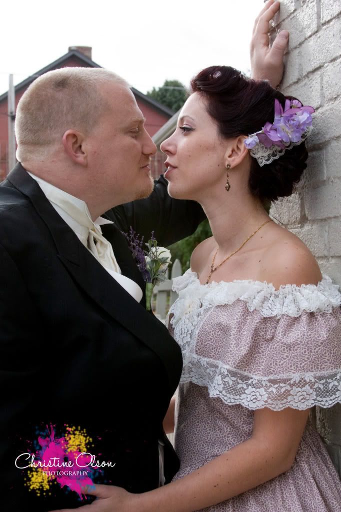
    On both 2 and 4, I probly would've had them at f/4 to blurr out the background better. Then playing with some vibrance and saturation to make his and her flowers pop a little. I love my images warm, but that's not everyone's taste. But i'm feelin that her hair would've come to life with some adjustments too. You have to do some hard work to make an image overpower a watermark like the one your using. :B
    Canon 7D Shooter

    Nelson Lehner
    Dreamin' of a resolution!:D
  • chris5olsonchris5olson Registered Users Posts: 76 Big grins
    edited December 27, 2010
    Aspecto5 wrote: »
    ok, so number 2, I would've cleaned up his hands in photoshop a bit. Even if he's known as a hard worker with rough hands, it's still distracting to me as a viewer.

    On both 2 and 4, I probly would've had them at f/4 to blurr out the background better. Then playing with some vibrance and saturation to make his and her flowers pop a little. I love my images warm, but that's not everyone's taste. But i'm feelin that her hair would've come to life with some adjustments too. You have to do some hard work to make an image overpower a watermark like the one your using. :B

    thanks for the CC. I'm always a little timid when it comes to vibrance & saturation bc i dont want to over do it. But i went back and played with the raw file and I really liked number 4 after i did some saturation work on it.
    here it is.
    IMG_7588-1.jpg
    any better?
    In My Bag:
    Canon Rebel XSi. Canon 50mm f/1.4. Canon 28-135mm f/3.5-5.6. Speedlite 430exII
    Coming Soon
    Canon 5DmkII. Canon 24-70mm f/2.8L
  • WeiselWeisel Registered Users Posts: 235 Major grins
    edited December 30, 2010
    My opinion: I like the new version you posted a lot better. Also, the new(or other) logo/watermark is way way better. The other big splotchy one is way too loud, especially for wedding photos.

    I also agree that you could have definately shot some of these wide open, at f3.5 or 4, whichever you could do. Subject/background seperation is often paramount in getting a pleasing image.

    Looks like you have some great new gear rolling in soon. I hope it all materializes. I finally just bought my 24-70 2.8L, and it's my baby.
    Canon 5D MK IV | 24-70 2.8L USM | 50mm F1.4 USM | 70-200mm F2.8L | AB 800 light | 430EXII speedlight (x2) | Lowel iLight | Cybersync remotes | bag of trail mix |
    My Weddings WebsiteBlog
  • Aspecto5Aspecto5 Registered Users Posts: 311 Major grins
    edited January 2, 2011
    thanks for the CC. I'm always a little timid when it comes to vibrance & saturation bc i dont want to over do it. But i went back and played with the raw file and I really liked number 4 after i did some saturation work on it.
    here it is.

    any better?

    Sorry for the late reply. I like your watermark a lot more then the previous. As far as the saturation and vibrance of the new one, it's better, but i'd go further. But only in certain areas. A layer mask would take care of this. Only doing the areas that you want to give some punch to.

    I see you have an 85mm 1.8 coming. I'm soooooo jealous. Would love to get my hands on one of those. :B Happy New Year!!! And welcome to the 7D family! :D
    Canon 7D Shooter

    Nelson Lehner
    Dreamin' of a resolution!:D
  • SenecaSeneca Registered Users Posts: 1,661 Major grins
    edited January 2, 2011
    Interesting choice of dress and shoes. All good images. On number 4 I would have loved to see her hand on his arm showing the rings. Your logo looks like he got paint all over his tux.

    Looks like it was a fun wedding.
  • TravelTravel Registered Users Posts: 276 Major grins
    edited January 3, 2011
    #1 has good expressions and the background is not distracting. #2 is an interesting angle quite imaginative. You did good! Let's look at how you could have made these from good to great. #1 the bodies need to be turned a little toward the camera so we are not looking at the sides of the bodies. Next the man's nose cuts into the eye, you should have skin on both sides of the eye. Their eyes need to appear centered from camera position they are not. Her flowers are covering her bust line, tilt the flowers straight toward the camera this will clear the bust line and and cover her hands. parts of his fingers are coming out of her arm it would be better to have him gently hold her elbow. Their heads are far apart, he needs to bend at the waist so they can get the heads together. Picture #2 it is almost there! Watch the background plain would be best. They both need to bend at the waist so they are tilted toward the ground. Then they tilt their heads so that the heads are parallel to the plane of the front of the lens. This will mean your not shooting up the nose. Also your photographing more of the back of the brides head, both of their heads need to be in profile. You did good! That is probably enough if you want me to talk about the other pictures let me know.
  • chris5olsonchris5olson Registered Users Posts: 76 Big grins
    edited January 3, 2011
    Seneca wrote: »
    Interesting choice of dress and shoes. All good images. On number 4 I would have loved to see her hand on his arm showing the rings. Your logo looks like he got paint all over his tux.

    Looks like it was a fun wedding.

    they are really into the civil war! it was so fun. I changed my logo too lol i like my newer more simplistic one better.

    Thanks for the feedback!
    In My Bag:
    Canon Rebel XSi. Canon 50mm f/1.4. Canon 28-135mm f/3.5-5.6. Speedlite 430exII
    Coming Soon
    Canon 5DmkII. Canon 24-70mm f/2.8L
Sign In or Register to comment.