1st Official Engagement Photoshoot

Robert_CRobert_C Registered Users Posts: 80 Big grins
edited August 29, 2012 in Weddings
This is my very 1st official engagement shoot. My coworker, Jessica, asked me to take photos of her and her fiance, Evan. These photos are taken on 8-15 at a ranch in Aguanga (near Temecula). I was kind of nervous at first but both of them are easy to work with and we had a lot of fun the whole afternoon. This is a really fun learning experience for me. Here are some of the photos from that day.

Comments and Critiques are welcome. Thanks for looking.

I need help on post processing and need to warm up the photos a bit. How would you fix it? Thanks in advance.

1.
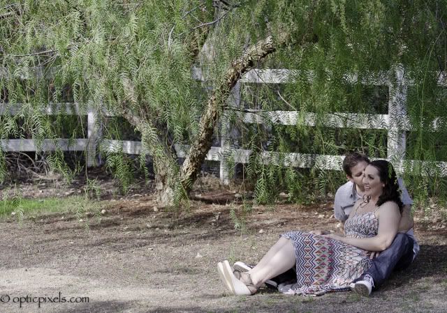
_BOB7380-1.jpg

2.
_BOB7358-1.jpg

3.
_BOB7302-1.jpg

4.
_BOB7292-1.jpg

5.
_BOB7265-1.jpg
www.bobbycanlobophotos.com

“Photography is not about cameras, gadgets, and gismos. Photography is about photographers. A camera didn't make a great picture any more than a typewriter wrote a great novel.” - Peter Adams, photographer ( Sydney, 1978 )

Comments

  • VayCayMomVayCayMom Registered Users Posts: 1,870 Major grins
    edited August 17, 2012
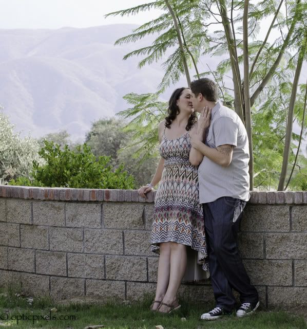
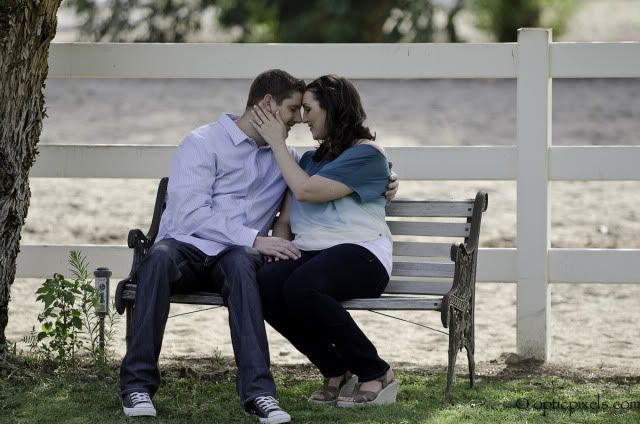
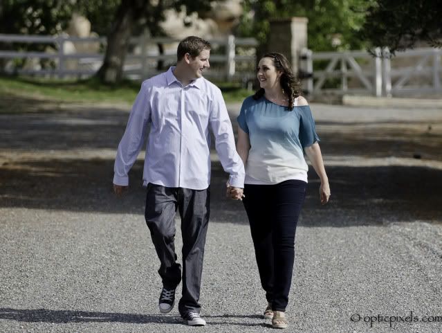
    Ok here are my first impressions just as a casual photographer...I know it tends to be quite smoggy down there, I used to live in Riverside and Moreno Valley, that tends to dull everything. Do you think you would like them more or less if you popped the colors? Maybe even warmed them up just for fun. The skintones on my monitor are not as attractive as they could be. #1 Could be cropped tighter, look how little of the groom to be's face can be seen. #2 his shirt makes him look fat, maybe use the liquify took on his tummy. And in #3 her shirt is not doing her any favors but I like it in and in 5 which is my favorite!! It has a gentle softness that is just enough.. love that one !! I would not know this was your first e session, nice job.
    Trudy
    www.CottageInk.smugmug.com

    NIKON D700
  • Robert_CRobert_C Registered Users Posts: 80 Big grins
    edited August 17, 2012
    VayCayMom wrote: »
    Ok here are my first impressions just as a casual photographer...I know it tends to be quite smoggy down there, I used to live in Riverside and Moreno Valley, that tends to dull everything. Do you think you would like them more or less if you popped the colors? Maybe even warmed them up just for fun. The skintones on my monitor are not as attractive as they could be. #1 Could be cropped tighter, look how little of the groom to be's face can be seen. #2 his shirt makes him look fat, maybe use the liquify took on his tummy. And in #3 her shirt is not doing her any favors but I like it in and in 5 which is my favorite!! It has a gentle softness that is just enough.. love that one !! I would not know this was your first e session, nice job.

    I was thinking of a warmer effect but i don't want to over saturate them or the scenery. Plus I was aiming for a softer look. Maybe I should mess around with it a few more times to see if the warmer look looks better. #1 I was thinking of cropping it but I wanted to show the whole tree and the fence more. #2 It does doesn't it? but I don't have Photoshop right now. #3 She wanted her shirt out. Thanks a lot for all of your useful comments.
    www.bobbycanlobophotos.com

    “Photography is not about cameras, gadgets, and gismos. Photography is about photographers. A camera didn't make a great picture any more than a typewriter wrote a great novel.” - Peter Adams, photographer ( Sydney, 1978 )
  • joshhuntnmjoshhuntnm Registered Users Posts: 1,924 Major grins
    edited August 18, 2012
  • Robert_CRobert_C Registered Users Posts: 80 Big grins
    edited August 18, 2012
    joshhuntnm wrote: »
    I would really warm these up.

    Oh ok. Thanks. I'll tweak the temp level up more.
    www.bobbycanlobophotos.com

    “Photography is not about cameras, gadgets, and gismos. Photography is about photographers. A camera didn't make a great picture any more than a typewriter wrote a great novel.” - Peter Adams, photographer ( Sydney, 1978 )
  • QarikQarik Registered Users Posts: 4,959 Major grins
    edited August 18, 2012
    processing is not good. The skin tones look very ashy and grey.
    D700, D600
    14-24 24-70 70-200mm (vr2)
    85 and 50 1.4
    45 PC and sb910 x2
    http://www.danielkimphotography.com
  • Robert_CRobert_C Registered Users Posts: 80 Big grins
    edited August 18, 2012
    Qarik wrote: »
    processing is not good. The skin tones look very ashy and grey.

    I kinda figured that out. Just wondering how would you fix it?
    www.bobbycanlobophotos.com

    “Photography is not about cameras, gadgets, and gismos. Photography is about photographers. A camera didn't make a great picture any more than a typewriter wrote a great novel.” - Peter Adams, photographer ( Sydney, 1978 )
  • Robert_CRobert_C Registered Users Posts: 80 Big grins
    edited August 18, 2012
    so kind of like this??

    before

    _BOB7380-1.jpg


    after

    _BOB7380.jpg


    I need help on this part before give all the photos to my coworker. Thanks
    www.bobbycanlobophotos.com

    “Photography is not about cameras, gadgets, and gismos. Photography is about photographers. A camera didn't make a great picture any more than a typewriter wrote a great novel.” - Peter Adams, photographer ( Sydney, 1978 )
  • smurfysmurfy Registered Users Posts: 343 Major grins
    edited August 18, 2012
    I'd go back to the originals, and import them into lightroom, if that's what you are using, with about a 10% preset on brightness added, and then do very little with the natural skintones that the camera captured. These don't look like either Canon or Nikon. What were they shot with, and what did you do to the files in processing? Just undoing it should help. They look like they were desaturated some. The vibrance and warmify tools will be helpful if you no longer have the originals for some reason. They also all look a bit too dark, with the exception of number four.

    Number two could be cropped horizontally to get rid of his belly issue with that shirt, but because of it's composition, is my favorite. Overall, though, less kissing and more genuine interactions would be nice.
  • Robert_CRobert_C Registered Users Posts: 80 Big grins
    edited August 19, 2012
    smurfy wrote: »
    I'd go back to the originals, and import them into lightroom, if that's what you are using, with about a 10% preset on brightness added, and then do very little with the natural skintones that the camera captured. These don't look like either Canon or Nikon. What were they shot with, and what did you do to the files in processing? Just undoing it should help. They look like they were desaturated some. The vibrance and warmify tools will be helpful if you no longer have the originals for some reason. They also all look a bit too dark, with the exception of number four.

    Number two could be cropped horizontally to get rid of his belly issue with that shirt, but because of it's composition, is my favorite. Overall, though, less kissing and more genuine interactions would be nice.

    I do use Lightroom 3 and I used my Nikon D7000 with the 70-200 2.8. I basically converted my raw photos to jpeg and I still have the raw files. I did desaturate some. These are helpful informations. Thanks for the tips.
    www.bobbycanlobophotos.com

    “Photography is not about cameras, gadgets, and gismos. Photography is about photographers. A camera didn't make a great picture any more than a typewriter wrote a great novel.” - Peter Adams, photographer ( Sydney, 1978 )
  • VayCayMomVayCayMom Registered Users Posts: 1,870 Major grins
    edited August 19, 2012
    new edit looks much better !!
    Trudy
    www.CottageInk.smugmug.com

    NIKON D700
  • Matthew SavilleMatthew Saville Registered Users, Retired Mod Posts: 3,352 Major grins
    edited August 19, 2012
    Robert_C wrote: »
    so kind of like this??

    before

    _BOB7380-1.jpg


    after

    _BOB7380.jpg


    I need help on this part before give all the photos to my coworker. Thanks

    Still a little green, could use a bump or two in the Tint. (Up)

    Processing aside, though, my critique would be that the images overall are simply too busy for the viewer's eye to lock onto the subjects' faces for more than a split second. I don't know what lens or sensor format you're shooting, but in my opinion these could all stand to get a lot more shallow. Or, if shallow depth is not an option, (maybe shooting on a crop sensor with an f/3.5-5.6 lens?) ...then much, much better attention needs to be paid to framing the couple against a simple, un-distracting background. Here is an example that I always use to demonstrate this kind of framing...

    831698005_CUVnw-O.jpg

    This image was shot using completely natural light, at one of the worst times of day. All I cared about was the direction of light, and the framing of the subject's head / shoulders. The only editing I performed was to deepen the blacks and add a little contrast, so that the image "popped", but I didn't touch saturation or vibrance, and my white balance was probably nearly spot-on just because I've been shooting Kelvin for years and years now...

    The only other thing I did was to photoshop a twig in the background that came too close to her face; even though it was blurry it was still subtracting from a viewer's ability to focus on the subject...

    Hope this helps!
    =Matt=
    My first thought is always of light.” – Galen Rowell
    My SmugMug PortfolioMy Astro-Landscape Photo BlogDgrin Weddings Forum
  • Robert_CRobert_C Registered Users Posts: 80 Big grins
    edited August 20, 2012
    VayCayMom wrote: »
    new edit looks much better !!

    Thanks. I tried.
    www.bobbycanlobophotos.com

    “Photography is not about cameras, gadgets, and gismos. Photography is about photographers. A camera didn't make a great picture any more than a typewriter wrote a great novel.” - Peter Adams, photographer ( Sydney, 1978 )
  • Robert_CRobert_C Registered Users Posts: 80 Big grins
    edited August 20, 2012
    Still a little green, could use a bump or two in the Tint. (Up)

    Processing aside, though, my critique would be that the images overall are simply too busy for the viewer's eye to lock onto the subjects' faces for more than a split second. I don't know what lens or sensor format you're shooting, but in my opinion these could all stand to get a lot more shallow. Or, if shallow depth is not an option, (maybe shooting on a crop sensor with an f/3.5-5.6 lens?) ...then much, much better attention needs to be paid to framing the couple against a simple, un-distracting background. Here is an example that I always use to demonstrate this kind of framing...

    831698005_CUVnw-O.jpg

    This image was shot using completely natural light, at one of the worst times of day. All I cared about was the direction of light, and the framing of the subject's head / shoulders. The only editing I performed was to deepen the blacks and add a little contrast, so that the image "popped", but I didn't touch saturation or vibrance, and my white balance was probably nearly spot-on just because I've been shooting Kelvin for years and years now...

    The only other thing I did was to photoshop a twig in the background that came too close to her face; even though it was blurry it was still subtracting from a viewer's ability to focus on the subject...

    Hope this helps!
    =Matt=

    That's an awesome shot Matt. Nice DOF too. I've been waiting for your response. All these photos, I was shooting with a Nikon D7000 with a 70-200 2.8. I kind of did mess with the vibrance and saturation was placed to a -6. But I will try your methods. It might work best when the wedding comes up. Thanks for the useful information.

    By the way, I see you work for Lin an Jirsa. I saw Chris and the others shooting last night at my friends wedding, Marc and Lillian Arias. You guys have a great crew.
    www.bobbycanlobophotos.com

    “Photography is not about cameras, gadgets, and gismos. Photography is about photographers. A camera didn't make a great picture any more than a typewriter wrote a great novel.” - Peter Adams, photographer ( Sydney, 1978 )
  • Quincy TQuincy T Registered Users Posts: 1,090 Major grins
    edited August 20, 2012
    Hi Robert,

    Firstly, I'd like to say that there is something I immediately appreciate about your images. You're here, asking for critique (#1), and you're doing it with images that aren't great, but at least you don't have a watermark that you look like you spent ages on. I'm always flabbergasted to see folks come here with elaborate graphics all over their images, and then the shots look really poor. Priorities, folks! But, you haven't done that, so maybe your heart is in the right place! :D

    As for the shots. Firstly, I would ask myself in #1: Why are they sitting there of all places? Kind of an odd choice, but you could've made it work, had you gotten in closer, and at an interesting angle. In fact, had you moved over to the rear-right of the couple you could've included a lovely bokeh of tree, with what appears to be a nice little lens flare based on the direction of the light. It still wouldn't explain why they are sitting there in the dirt, away from the tree itself, but it would at least be visually pleasing.

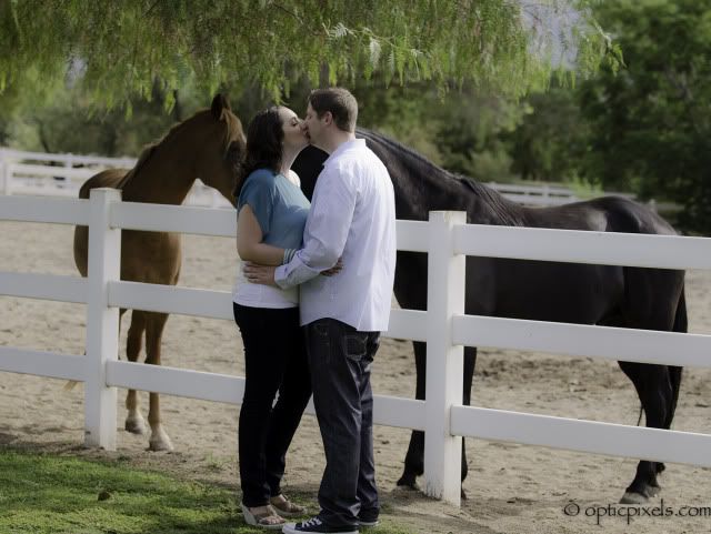
    As Matt has already said, you should take advantage of the lens you have, and shoot with a small DOF. This will eliminate the extremely distracting backgrounds in most of these images. That being said, three and the last image are nice, but I feel you're too far away still. If you look at Matt's image, he is certainly not right up in the subject's grill, but he has used all the fundamentals of lighting, composition, aperture choice, and the decisive moment (possibly) of her hand in her hair to bring us straight to the interesting focal point of his image. I'm not saying I can do this on a regular basis in any way, in fact I don't have a single image that looks that good really, but this is what you want to strive for obviously. You have to direct us to the point of interest somehow, and none of these pictures do that strongly.

    Another nitpick, is in the last image with the horses, it looks as though you've dropped the clarity on the entire thing, to create a "soft" look. Unfortunately, that looks kind of odd applied to the entire image. Some things are better left sharp! You can use a brush in Lightroom, or, preferably, you can use a layer mask on Gaussian Blur in photoshop, and then brush the areas you want soft (women's skin), lowering the opacity of that layer to about 35%...whatever looks natural.

    I had to abandon this post for an hour, but I think that's all I wanted to say. To sum up, get closer, draw the eye, and don't soften the entire image.
  • Robert_CRobert_C Registered Users Posts: 80 Big grins
    edited August 20, 2012
    Quincy T wrote: »
    Hi Robert,

    Firstly, I'd like to say that there is something I immediately appreciate about your images. You're here, asking for critique (#1), and you're doing it with images that aren't great, but at least you don't have a watermark that you look like you spent ages on. I'm always flabbergasted to see folks come here with elaborate graphics all over their images, and then the shots look really poor. Priorities, folks! But, you haven't done that, so maybe your heart is in the right place! :D

    As for the shots. Firstly, I would ask myself in #1: Why are they sitting there of all places? Kind of an odd choice, but you could've made it work, had you gotten in closer, and at an interesting angle. In fact, had you moved over to the rear-right of the couple you could've included a lovely bokeh of tree, with what appears to be a nice little lens flare based on the direction of the light. It still wouldn't explain why they are sitting there in the dirt, away from the tree itself, but it would at least be visually pleasing.

    As Matt has already said, you should take advantage of the lens you have, and shoot with a small DOF. This will eliminate the extremely distracting backgrounds in most of these images. That being said, three and the last image are nice, but I feel you're too far away still. If you look at Matt's image, he is certainly not right up in the subject's grill, but he has used all the fundamentals of lighting, composition, aperture choice, and the decisive moment (possibly) of her hand in her hair to bring us straight to the interesting focal point of his image. I'm not saying I can do this on a regular basis in any way, in fact I don't have a single image that looks that good really, but this is what you want to strive for obviously. You have to direct us to the point of interest somehow, and none of these pictures do that strongly.

    Another nitpick, is in the last image with the horses, it looks as though you've dropped the clarity on the entire thing, to create a "soft" look. Unfortunately, that looks kind of odd applied to the entire image. Some things are better left sharp! You can use a brush in Lightroom, or, preferably, you can use a layer mask on Gaussian Blur in photoshop, and then brush the areas you want soft (women's skin), lowering the opacity of that layer to about 35%...whatever looks natural.

    I had to abandon this post for an hour, but I think that's all I wanted to say. To sum up, get closer, draw the eye, and don't soften the entire image.

    Okay.. Thanks for the tip.
    www.bobbycanlobophotos.com

    “Photography is not about cameras, gadgets, and gismos. Photography is about photographers. A camera didn't make a great picture any more than a typewriter wrote a great novel.” - Peter Adams, photographer ( Sydney, 1978 )
  • Ed911Ed911 Registered Users Posts: 1,306 Major grins
    edited August 22, 2012
    thumb.gif Matt is spot on. BTW...nice image Matt.
    Remember, no one may want you to take pictures, but they all want to see them.
    Educate yourself like you'll live forever and live like you'll die tomorrow.

    Ed
  • Matthew SavilleMatthew Saville Registered Users, Retired Mod Posts: 3,352 Major grins
    edited August 23, 2012
    Robert_C wrote: »
    That's an awesome shot Matt. Nice DOF too. I've been waiting for your response. All these photos, I was shooting with a Nikon D7000 with a 70-200 2.8. I kind of did mess with the vibrance and saturation was placed to a -6. But I will try your methods. It might work best when the wedding comes up. Thanks for the useful information.

    By the way, I see you work for Lin an Jirsa. I saw Chris and the others shooting last night at my friends wedding, Marc and Lillian Arias. You guys have a great crew.

    Yep, I just rendered 1:1 previews for that wedding last night! Looked like the images turned out awesome...

    BTW, the image I shot was, I believe, made on a D300 with a Sigma 50-150 2.8. And as I mentioned, very little processing was applied.

    In general, it's always all about the light. When you put your subject in the right spot, and frame the shot correctly, often times processing is barely even required. Of course there is a whole other aspect of artistry involved in post-production, and some images are just a "foundation" upon which you build in Lightroom / Photoshop. But for the average portrait or detail shot, in my opinion, the image needs to stand on it's own two feet even before any editing...

    Take care,
    =Matt=
    My first thought is always of light.” – Galen Rowell
    My SmugMug PortfolioMy Astro-Landscape Photo BlogDgrin Weddings Forum
  • Robert_CRobert_C Registered Users Posts: 80 Big grins
    edited August 24, 2012
    Yep, I just rendered 1:1 previews for that wedding last night! Looked like the images turned out awesome...

    BTW, the image I shot was, I believe, made on a D300 with a Sigma 50-150 2.8. And as I mentioned, very little processing was applied.

    In general, it's always all about the light. When you put your subject in the right spot, and frame the shot correctly, often times processing is barely even required. Of course there is a whole other aspect of artistry involved in post-production, and some images are just a "foundation" upon which you build in Lightroom / Photoshop. But for the average portrait or detail shot, in my opinion, the image needs to stand on it's own two feet even before any editing...

    Take care,
    =Matt=

    Thanks for the great info Matt. This will really help me out in the future.
    www.bobbycanlobophotos.com

    “Photography is not about cameras, gadgets, and gismos. Photography is about photographers. A camera didn't make a great picture any more than a typewriter wrote a great novel.” - Peter Adams, photographer ( Sydney, 1978 )
  • coolpinskycoolpinsky Registered Users Posts: 211 Major grins
    edited August 29, 2012
    yea - in my opinion after /temp/ is much better
Sign In or Register to comment.