Options

Am I onto anything here?

BPerronBPerron Registered Users Posts: 464 Major grins
edited August 8, 2008 in Other Cool Shots
I took these recently...I like think they turned out, but not sure what others might think...Would love to hear thoughts on any aspect both praise and criticism. Thanks for looking.

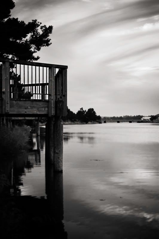
Dock - just thought it was a cool shot...
Dock.jpg

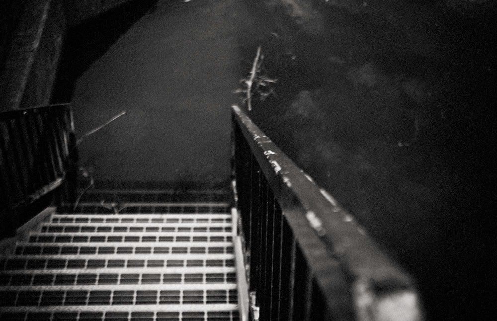
Stairs - they were cool, and I wanted to play with DOF.
stairs.jpg
Brandon Perron Photography
www.brandonperron.com

Comments

  • Options
    DaddyODaddyO Registered Users Posts: 4,466 Major grins
    edited August 8, 2008
    Doesn't a mother love her children something like 98% of the time?
    I know I'm that way. My neighbors definitely have other thoughts. :D
    Michael
  • Options
    BPerronBPerron Registered Users Posts: 464 Major grins
    edited August 8, 2008
    DaddyO wrote:
    Doesn't a mother love her children something like 98% of the time?
    I know I'm that way. My neighbors definitely have other thoughts. :D

    So that is No from you?
    Brandon Perron Photography
    www.brandonperron.com
  • Options
    pyrypyry Registered Users Posts: 1,733 Major grins
    edited August 8, 2008
    I think you are onto something.

    The first could use fill light on the foreground and maybe move the comp just a bit so the pier is more central, it looks a bit like it's been pushed to the side.
    I like the sky, the reflections and the bridge in the backround there thumb.gif

    A clear focal point is lacking in the second, all of the steps are oof and the rail is too dark to catch a look. Btw, did you try a polarizer to lose the reflections and show the steps all the way under water? Worth a re-shoot.

    My 0.02 € :D
    Creativity's hard.

    http://pyryekholm.kuvat.fi/
  • Options
    BPerronBPerron Registered Users Posts: 464 Major grins
    edited August 8, 2008
    pyry wrote:
    I think you are onto something.

    The first could use fill light on the foreground and maybe move the comp just a bit so the pier is more central, it looks a bit like it's been pushed to the side.
    I like the sky, the reflections and the bridge in the backround there thumb.gif

    A clear focal point is lacking in the second, all of the steps are oof and the rail is too dark to catch a look. Btw, did you try a polarizer to lose the reflections and show the steps all the way under water? Worth a re-shoot.

    My 0.02 € :D

    Thanks for the comments...To your second comment...I wanted to leave some mystery to it thus the steps being OOF...as for the polarizer, no...but in the original you can tell that is water and see the steps going into it...it is the black and white treatment I used...maybe I will play with a couple of other black and white treatments to see what it looks like...also the reason the rail is not bright.
    Brandon Perron Photography
    www.brandonperron.com
  • Options
    DaddyODaddyO Registered Users Posts: 4,466 Major grins
    edited August 8, 2008
    BPerron wrote:
    So that is No from you?

    I suspect I'm just not enthusiastic about either one as much as I
    would like to be. Mind you thats just me. :D Michael
    Michael
  • Options
    BPerronBPerron Registered Users Posts: 464 Major grins
    edited August 8, 2008
    pyry wrote:

    ...all of the steps are oof and the rail is too dark to catch a look. Btw, did you try a polarizer to lose the reflections and show the steps all the way under water? Worth a re-shoot.

    My 0.02 € :D

    Here is a BW conversion where the rail is lighter...
    stairs2.jpg
    Brandon Perron Photography
    www.brandonperron.com
  • Options
    BPerronBPerron Registered Users Posts: 464 Major grins
    edited August 8, 2008
    DaddyO wrote:
    I suspect I'm just not enthusiastic about either one as much as I
    would like to be. Mind you thats just me. :D Michael

    Ok, just wanting a clarifier :-) thanks for the time.
    Brandon Perron Photography
    www.brandonperron.com
  • Options
    DaddyODaddyO Registered Users Posts: 4,466 Major grins
    edited August 8, 2008
    BPerron wrote:
    Ok, just wanting a clarifier :-) thanks for the time.

    For the record, I should point out that I am not that enthusiastic about
    98% of my own photographic efforts. Like your I try to "get onto something".
    Michael
    Michael
  • Options
    BPerronBPerron Registered Users Posts: 464 Major grins
    edited August 8, 2008
    DaddyO wrote:
    For the record, I should point out that I am not that enthusiastic about
    98% of my own photographic efforts. Like your I try to "get onto something".
    Michael

    Laughing.gif...ok it is noted for the record.
    Brandon Perron Photography
    www.brandonperron.com
  • Options
    pyrypyry Registered Users Posts: 1,733 Major grins
    edited August 8, 2008
    DaddyO wrote:
    For the record, I should point out that I am not that enthusiastic about
    98% of my own photographic efforts. Like your I try to "get onto something".
    Michael

    Yeah, the flags in Lightroom (pick, unflagged and reject) stand for "yes", "no", and "really no" rolleyes1.gif
    Creativity's hard.

    http://pyryekholm.kuvat.fi/
  • Options
    pyrypyry Registered Users Posts: 1,733 Major grins
    edited August 8, 2008
    BPerron wrote:
    Here is a BW conversion where the rail is lighter...

    It's a little bit better, but I still think one or two of the steps should be in focus.
    Creativity's hard.

    http://pyryekholm.kuvat.fi/
  • Options
    BPerronBPerron Registered Users Posts: 464 Major grins
    edited August 8, 2008
    pyry wrote:
    It's a little bit better, but I still think one or two of the steps should be in focus.

    Fair enough...thanks for the time...
    Brandon Perron Photography
    www.brandonperron.com
  • Options
    ArvanArvan Registered Users Posts: 888 Major grins
    edited August 8, 2008
    I can go with the second one, the first is just a b&w image like many others out there. Not meaning that it´s not a good picture for some.

    the second one look dirty and cold...harsh. I like it. I guess you put noise in it? you should do that in 3steps with different size of the noise grains. I think that looks better..I´m not saying i have right :D
  • Options
    BPerronBPerron Registered Users Posts: 464 Major grins
    edited August 8, 2008
    Arvan wrote:
    I can go with the second one, the first is just a b&w image like many others out there. Not meaning that it´s not a good picture for some.

    the second one look dirty and cold...harsh. I like it. I guess you put noise in it? you should do that in 3steps with different size of the noise grains. I think that looks better..I´m not saying i have right :D

    I see what you are saying about the first one...

    I am glad you can appreciate the second one...you nailed the dirty, cold and harsh...which is what I wanted. As for the noise 3 step thing, can you elboarte the process you are talking about?

    Thanks for the time.
    Brandon Perron Photography
    www.brandonperron.com
  • Options
    trippy64trippy64 Registered Users Posts: 55 Big grins
    edited August 8, 2008
    INHO the first one is much better than the second. The second is not composed properly for the DOF you are attempting.

    On the first one, a little different exposure, and it looks like it needs some better focus as well, and it could be really nice.
    trippy64.smugmug.com
    A man can do as he wills, but not will as he wills.

    An opinion should be the result of thought,not the replacement of it.:scratch
  • Options
    [Deleted User][Deleted User] Major grins Bournemouth, UKPosts: 0 Major grins
    edited August 8, 2008
    I found the foreground and the lower left corner a bit to dark on the first picture but I liked the overall concept, the second picture just did nothing for me, sorry.

    Tim
  • Options
    ArvanArvan Registered Users Posts: 888 Major grins
    edited August 8, 2008
    BPerron wrote:
    I see what you are saying about the first one...

    I am glad you can appreciate the second one...you nailed the dirty, cold and harsh...which is what I wanted. As for the noise 3 step thing, can you elboarte the process you are talking about?

    Thanks for the time.

    make a new layer. fill it with 50% grey. Add noise and make sure its in gausian(spell) an monochrome. Then replicate this step 2 more times but for each time put more noise in it...When it´s done. Just and a hard unsharp mask..Blend mode = overlay and woallah..
  • Options
    BPerronBPerron Registered Users Posts: 464 Major grins
    edited August 8, 2008
    trippy64 wrote:
    INHO the first one is much better than the second. The second is not composed properly for the DOF you are attempting.

    On the first one, a little different exposure, and it looks like it needs some better focus as well, and it could be really nice.

    The compostion was left that way, it was inteded that way...

    Thakns for the comments...I tend to like my photos slightly on the darker side, especially my BW...

    but I appreciate you taking the time...
    Brandon Perron Photography
    www.brandonperron.com
  • Options
    ArvanArvan Registered Users Posts: 888 Major grins
    edited August 8, 2008
    trippy64 wrote:
    INHO the first one is much better than the second. The second is not composed properly for the DOF you are attempting.

    On the first one, a little different exposure, and it looks like it needs some better focus as well, and it could be really nice.


    If everybody was thinking about the "rules" all photos will look the same?

    Just a thought. .. just a thought.
  • Options
    BPerronBPerron Registered Users Posts: 464 Major grins
    edited August 8, 2008
    draggin wrote:
    I found the foreground and the lower left corner a bit to dark on the first picture but I liked the overall concept, the second picture just did nothing for me, sorry.

    Tim

    Thank you very much...I can see how the 2nd one is not for most people's tastes. I have had one taker on it, Laughing.gif....so I will take that.
    Brandon Perron Photography
    www.brandonperron.com
Sign In or Register to comment.